
Speaking of traveling the world and looking at money —
a few months ago, several of us attended the fantastic Typofest conference in Bulgaria organized by Krista Radoeva and Boril Karaivanov. Several, but apparently there were even more type colleagues present than we knew would be coming. Maria Doreuli spotted him first while we were still in Sofia …
Author Archives → Indra Kupferschmid
Alphabettes News February–June (yeah, sorry)
July! That means half of 2016 is already over! Gotta catch up with the news (we’ll thank us in a couple of years). So what happened since the last round-up …
February: We published our Love Letter Series
Feb 2: Diana Ovezea released her type series Equitan Sans and Slab with ITF
Feb 16: The exhibition “A+: 100 years of graphic communication by women at Central Saint Martins” opened in London, organized by Ruth Sykes
Alphabettes go Typographics
Next week, the whole (type) world will look and travel to New York City for the incredible Typographics festival. I thought TypoBerlin this year would be impossible to top regarding number of Alphabettes in attendance and in town. But given that no less than ~21 ’bettes are living in NYC*, plus us global trotters who are visiting from abroad, next week’s event will probably be the record breaking meeting of our little club to date.
The organizers Cara di Edwardo, Alexander Tochilovsky and Roger Black did a really great job at putting together an interesting diverse line up (the first 50/50 female/male speakers event I know of!). Elizabeth, Nina, Marta, Fiona, Victoria, and I are speaking, Tânia is giving a workshop, Sara can be visited on a studio tour, and at the free Type Lab Isabel is doing a demo, and Amy and Bianca are organizing the Alphabettes Variety Show on Saturday afternoon. Stay tuned for details about that. If you are unable to join us at the lab, you may be in luck …
Check our Twitter and Instagram feeds for live reportage and other nonsense. And if you don’t have a ticket yet and are anywhere close to York Neue, this is your chance to see us in person, so register already. Or for the free Type Lab days. (Oops, I see the two events mentioned above are the only women on the Type Lab program. Girls, get out there!)
* Here is a map of us all I put together back in March for no reason; not totally up to date but giving a rough overview (pins are not showing actual location! No, Lynne is not actually living on the East River.)
Please, no more Open Sans for a while
If you are also tired of seeing the ever same fonts and style on the web, and the rich typefaces getting richer, here is a running shortlist of potential body copy typefaces for alphabettes.org I once compiled. I did not test how they look in extended text yet, nor rendering across platforms/browsers. That would be the next step (and we’re also still quite happy with Elido although see that we could use more extensive language support). But maybe you are looking for a fresh, lesser seen typeface and want to check some out anyway. Trying on new clothes is luckily quite easy if you have a website up already, e. g. with tools/bookmarklets that swap out the fonts you currently use, like Webtype’s Font Swapper or FontShop’s Webfonter. Also, most of the typefaces below are available on Fontstand or as trial versions from the foundries, so you can test them locally or in mockups. Let us know if you end up using any at some point.
Elido by Sibylle Hagmann
… and a bit about type on the web in general.
It’s long overdue that we introduce you to Elido more. I won’t even need that many specimen images because it’s the typeface you are reading right now. When we were discussing the fonts for the Alphabettes blog, we were after something that looks appropriate for very diverse content that we didn’t have yet — potentially long or maybe short, serious, delightful, angry or funny — and that is comfortable to read and rendering well on the web. All demands that many editorial sites share.
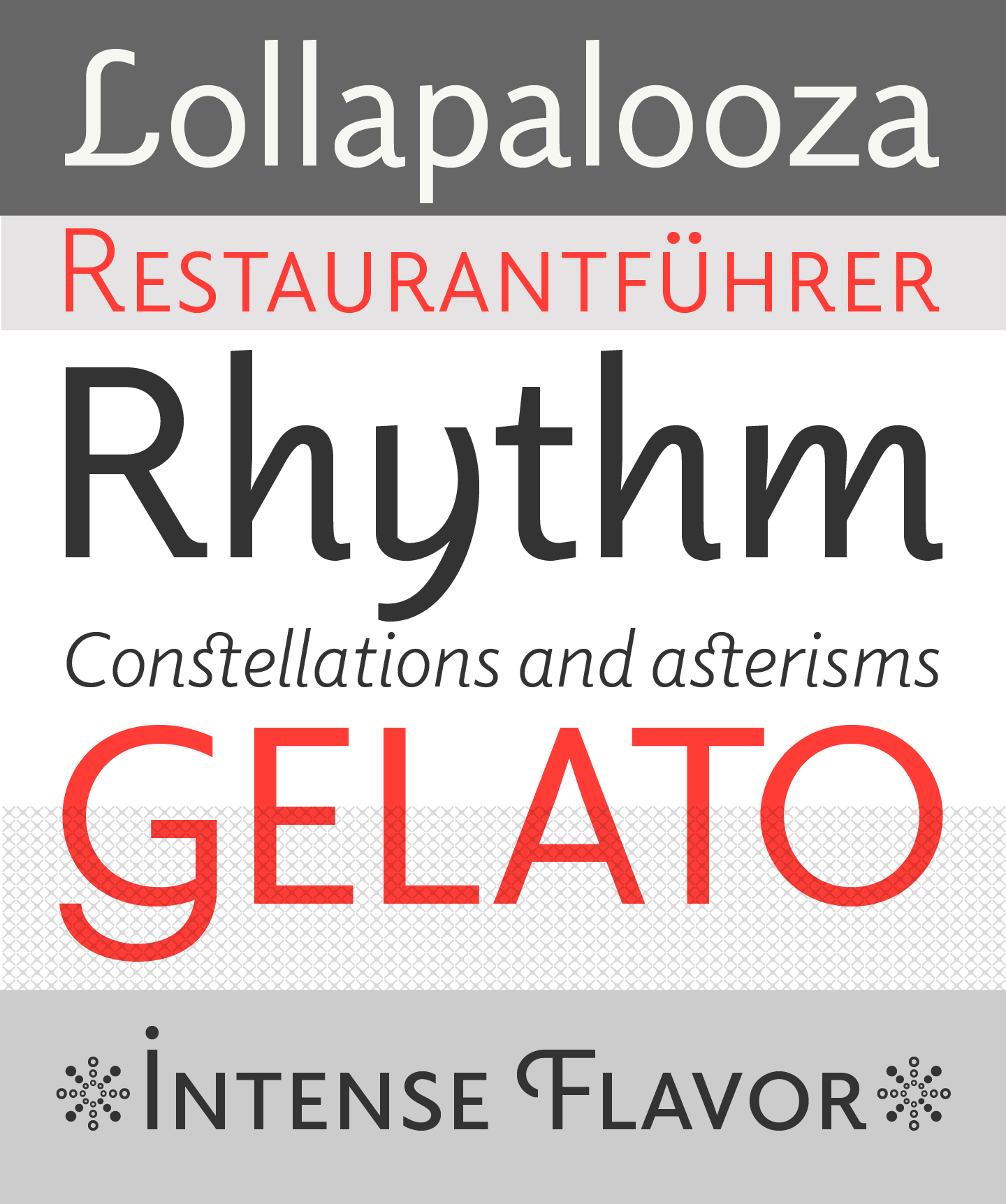
Elido specimen images by Sibylle Hagmann
Our Favourite Typefaces of 1915
It’s been an exciting year in type; one that saw many technical innovations, company mergers and restructuring, as well as some delightful new font releases which we will surely encounter in printed matter around the world soon.
But let’s start with the biggest loss for our industry in 1915: Georges Peignot, type founder in Paris and one of our greatest type designers — of Grasset, Auriol, or Cochin to name a few — died in battle, only 43 years old. Curious to see how long the foundry will be able to remain independent without its head :/ Another substantial loss was the death of Wilhelm Woellmer’s CEO Siegmund Borchardt. His son Fritz (34) suceeded him at the Berlin foundry.
Koralle
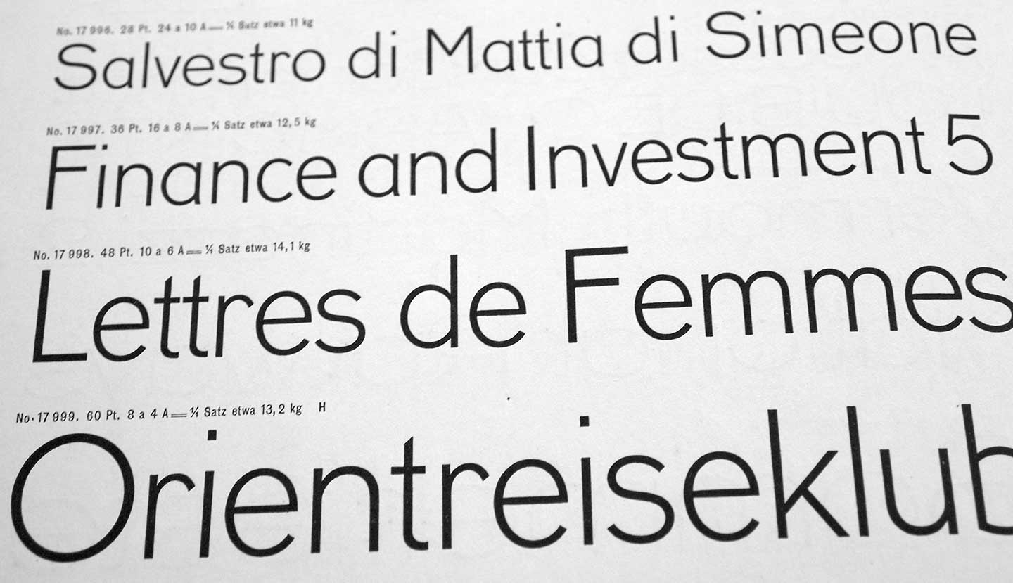
Koralle by Schelter & Giesecke, Leipzig, is a breath of clear fresh air after the surge of gnarly grots and artsy spawn of recent years. Neither totally geometric nor too hyggelig humanist, it combines simplified letterforms — e. g. its signature lowercase a — with traditional proportions for good readability. (What I used to tag as “trans-sans”?)
Caslon Openface
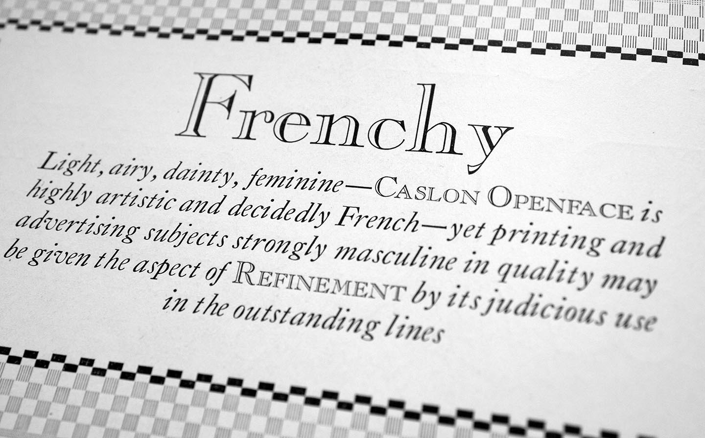
It’s talked about everywhere — typefaces are expected to be available in large series these days, not just a handful of fonts. The good folks of ATF-division Barnhart Brothers & Spindlers listened and added an open/inline variant to their popular Caslon Series (as others are doing, too). According to BB & S’s marketing material, it’s “light, airy, dainty [blah…] and decidedly French”. This is a fun stretch as almost all of us would think of Caslon as decidedly English. Compared to Caslon’s Inline, Caslon Openface features many totally different letterforms and has a much smaller x-height.
Bodoni
You know the problem: you set your mind on a typeface and then it’s not available in your size, format, or for the machine you have. 😞 In the case of Bodoni, this just got a little less likely to happen.
Yum. Fake Small Caps
Card Bodoni for one is the latest style in the expansive ATF Bodoni series. Like virtually everything at ATF, it was drawn by Morris Fuller Benton as an adaption of their standard smash hit to an all-caps titling face (meaning, cast on the full body without descenders). This is especially handy for the setting of forms, cards (duh) and other stationary. A few glyphs like J, Q and punctuation were changed so that they do not reach below the baseline.
Indra Loves Buttermann
This is the first in a series of letter love Love Letters where we’re showing a piece of letter-related ephemera we love.
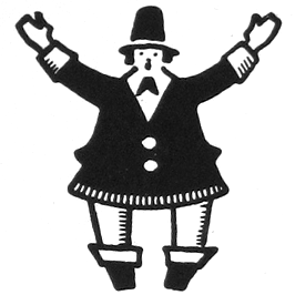
I love Buttermann (butter man), the logo/mascot of the Dresden Brüder Butter type foundry (later Schriftguss A.-G.) from the 1920s. It is so joyful and affable like no other logo today, at least not in any type related business. Buttermann cheers to you from specimen books, merchandise coins, or hurries through poster type with a spoon of lead in his hand.