A Letterpress Calendar for 2024

Leah Rosen is a fourth year Industrial Design and Psychology student at the Rochester Institute of Technology, in Rochester, New York, USA. Since 2020, she has been a Student Assistant in the RIT Cary Graphic Arts Collection. Her roles vary from setting up the new Cary Pressroom, shelving rare books and handling archival items in the collection. This year Leah was also the Teaching Assistant in RIT’s Letterpress Printmaking course. She initiated a personal letterpress project. Despite her busy schedule, she was not discouraged to dedicate a significant amount of time and effort to typesetting and printing a calendar for 2024. She shares her process, challenges, and some valuables lessons. The outstanding outcome speaks for itself.

The 2024 letterpress Calendar by Leah Rosen.

Continue reading

Ismar David’s visitors’ book design for The Jewish Palestine Pavilion at the 1939 New York World’s Fair

This profile is part of a series of interviews chronicling the experiences of researchers who use The New York Public Library’s collections for the development of their work.
The interview was conducted by Dr. Lyudmila Sholokhova, Curator of the Dorot Jewish Division. It was originally posted on the NYPL blog, July 5, 2022.

the visitor's book at the Jewish Palestine Pavilion at the 1939 New York World's Fair.

The visitor’s book of The Jewish Palestine Pavilion at the 1939 New York World’s Fair.

Continue reading

Calling All Mentors!


Join us for the autumn term to make a real impact! Simply fill in this form and wait to be matched.

* Not sure you could be a mentor? If you are unsure you are a good fit to join as a Mentor send us message we will chat with you about it. Most likely you ARE a great fit, and can really help making a change in people’s lives
* Worried about the commitment? If this is a busy time for you, you can sign up for as little as a 1 month program (about 4 sessions). You get to decide with the Mentee your preferred method of communication: Zoom, email, Slack or a combination
* How is the schedule? The sessions are flexible in time and dates, and you set them with your Mentee in a way which will make it work for both of you
* Will I need to be a mentor forever? We have two annual terms: spring and autumn. After every term, we check in to confirm with you that you are happy to continue. If you feel like you need a break, you can always pause
* What if I’m not a type designer? We have so many topics that Mentees are seeking guidance on: research, education, lettering, font production, business, writing, typography. If you are in type, you can be a huge help!
* Can only women be Mentors? Not at all! Everyone is welcome. Since Alphabettes is a network supporting woman, we centre a woman in every pair
* Want to hear more? We can send you a recording of a previous Q&A session we did for Mentors. Just email us at mentorship@alphabettes.org

We look forward to having you on our team!
Alessia, Eleni, Liron, Veronika and Shani

Thank you Alphabettes Mentors!

As we are wrapping up the Mentorship spring term we wish to thank all our dedicated Mentors from the bottom of our hearts. THANK YOU for being so generous with your time and for your invaluable guidance. Your help made a huge difference and we truly appreciate it!

The AMP team,
Alessia, Eleni, Liron, Shani, and Veronika

Thank you Mentors!

Remember December:
The Important Job of the Left Thumb

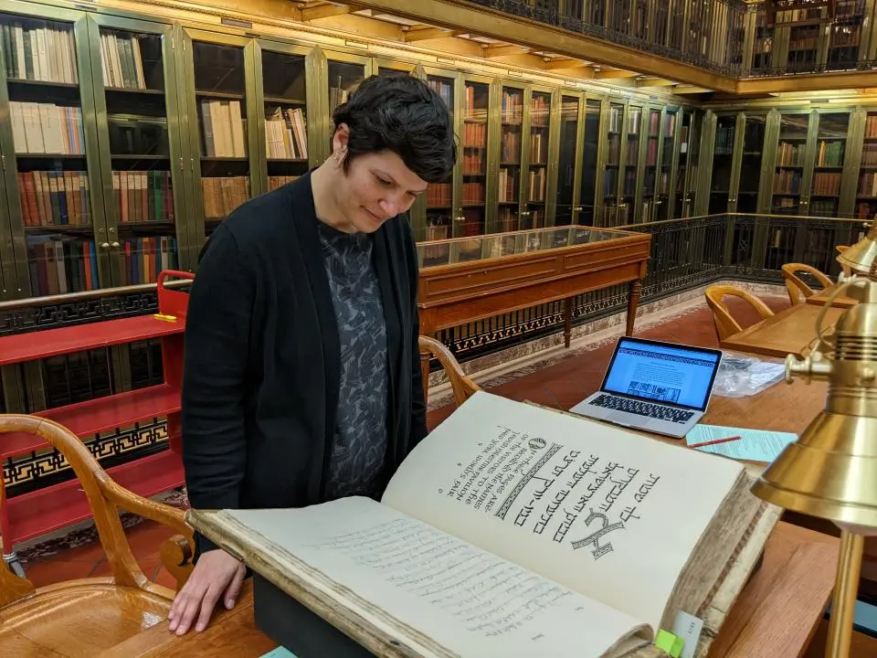
Let me tell you the story of how I learnt to appreciate my left thumb. In the summer of 2017 I had the privilege of receiving the RIT Cary Graphic Arts Collection summer research fellowship.
This fellowship is offered yearly to scholars so that they can come and use the collection in person. I spent one heavenly month studying the archive of Ismar David, the designer of the first comprehensive Hebrew typeface family.

The Cary Graphic Arts Collection (aka: The Cary) is a rare book library on the history of the graphic arts. The original collection was assembled by Melbert B. Cary, Jr. during the 1920s and 1930s. Cary was the director of the Continental Type Founders Association, a former president of the AIGA and the proprietor of the Woolly Whale Press. He collected printers’ manuals, type specimens, and books on the art of printing. In 1969, his collection of some 2,300 items was presented to the RIT. Today, it houses around 40,000 volumes, manuscripts and correspondence, on bookbinding, paper making, type design, calligraphy and book illustration.

One of the exciting things about The Cary is that although many of the items in the library are rare, access is given to visitors. With the supervision and assistance of the staff, the resources can be examined and studied in the reading room, in very LOW temperatures. So, after making your appointment, be sure to bring a sweater and you can enjoy the rare items and be well preserved with them.

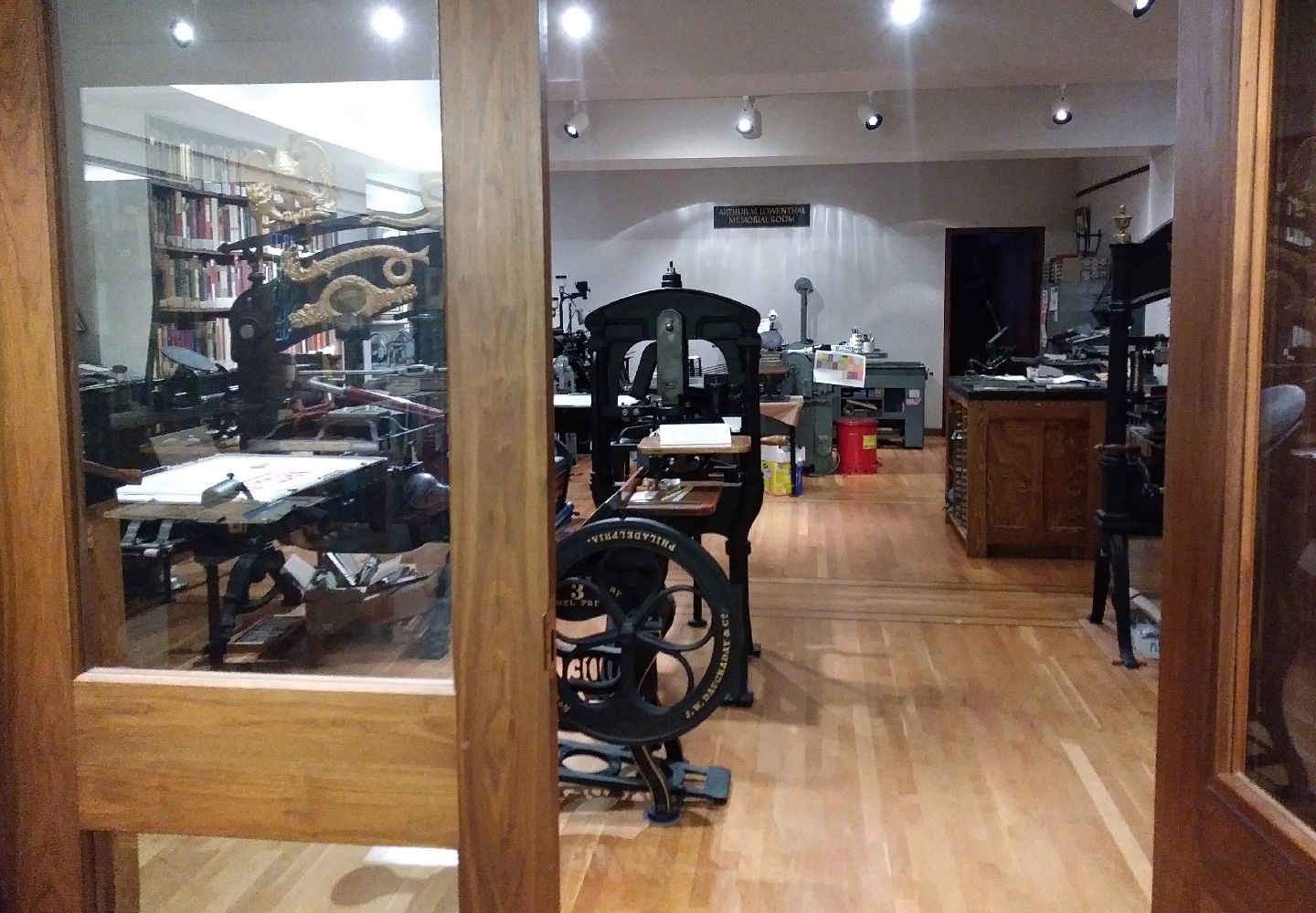
Another thrilling aspect of The Cary is that it is not only a collection of printed matter, it is also a collection of the technology used for its production. The Arthur M. Lowenthal Memorial Pressroom holds some historic printing presses including a 1874 Columbian press, an Albion press that was once owned by Goudy, a Vandercook press from the 60s and a William Morris’ Kelmscott Press. All the presses are functional and regularly maintained. Complementing the presses the collection holds various kinds of metal and wood typefaces.
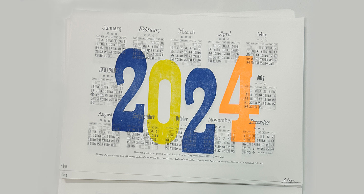
The Arthur M. Lowenthal Memorial Pressroom
Continue reading

Lost and found
(and lost again)

Exploring the first multi-style Hebrew typeface family

Lost
Hebrew was the language of the Israelite and Judean people for over 1,300 years when around 200 BCE, it died as an everyday language and was confined to religious use.1 This affected the Hebrew script heavily, since it only developed those attributes that were necessary to present specific religious texts. Therefore, Hebrew is lacking the typographic tools that would have evolved and developed from an ongoing secular use. Moreover, the Hebrew script was considered sacred. The scribes that were permitted to write manuscripts were concerned with preserving the letterform appearance, even at the expense of the ease and speed in which they could be read.2
Hebrew was reintroduced as a spoken language in the 1880s. Since then, it experienced an accelerated process of revival. The shift from the written form to movable type was a hastened and interrupted one and did not allow for refinement and distillation of the letterforms.

Setting type in the Hebrew script was and still is a frustrating experience. Not only there is a shortage in typefaces which sufficiently address specific Hebrew script issues, but the few that are available mostly consist of a single regular style, accompanied by a small number of weight variations. So, what is a Hebrew typesetter to do when trying to create differentiation within a text? I remember how pleased I was when I found a book published in 1905 in Minsk. In it I spotted one spread that seemed tailor-made to answer my question. The typesetter used different typefaces, different sizes, increased letter spacing and underlining. These were amongst the popular typographic solutions throughout the 20th century.


A spread from the book printed in 1905 in Minsk showing the various ways to handle word differentiation and emphasis without a typeface family: 1. Underlining a word. 2. A different typeface, in a different size. 3. Increased letter spacing.

Continue reading