
Bely is the first release by french type designer Roxane Gataud. Selected in 2014 for TypeTogether’s Typeface Publishing Incentive Program, it came out this week with a really strong voice. Described as having “both restraint and freedom throughout the text weights and into the unique display weight.” The family is nothing but striking.
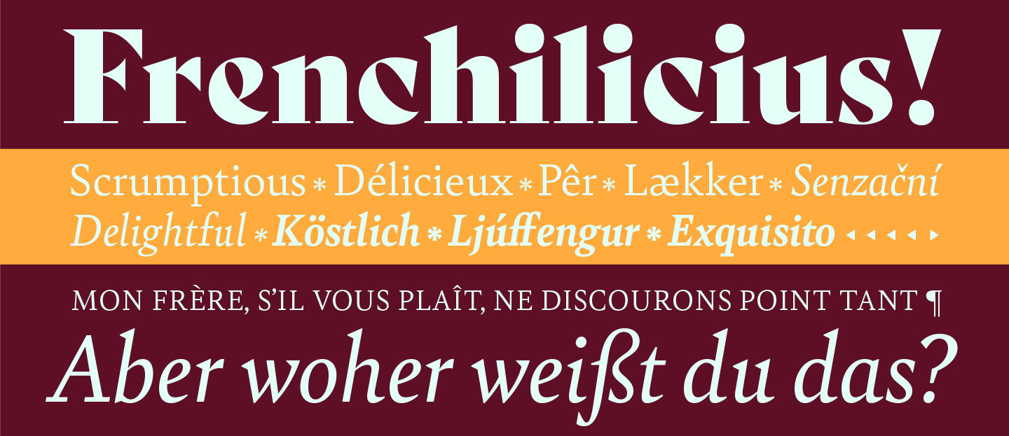
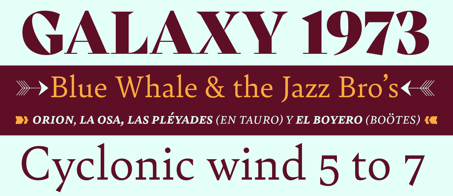
It brings to the table a sharp, contemporary text family with a daring display weight that will stand out in every use. “There is no fear in this type family, but only great respect for both the tradition of reading and the opportunity to make an impression.” It is a generous family that extends to a Latin A Character Set giving the user a range of options and Open Type features, including multiple language support, a couple stylistic sets per weight, small caps, lining & tabular figures.
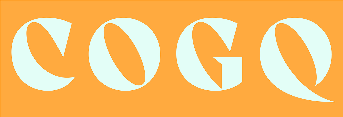
It’s a nice surprise to see the triangular serifs in the text weights become one of the main features of the Bold Display. Also, I’m drawn to how its offset axis gives a borderline uncomfortable and daring feeling of glyphs-turning-into-pure-form, almost as if they want to be released from being. Emphasizing this, the diagonal stress seems to pull each glyph to an extreme in an almost poetic manner.
A few thoughts by the designer
What was the inspiration behind Bely?
I started designing Bely during my studies in Amiens, at the post-graduate course in typeface design. As my first design ever, I’ve been inspired by my past graphic design experiences. I wanted to design a type family that I could use widely, meaning: optimized text weights and an expressive display face for powerful headlines in an editorial context.
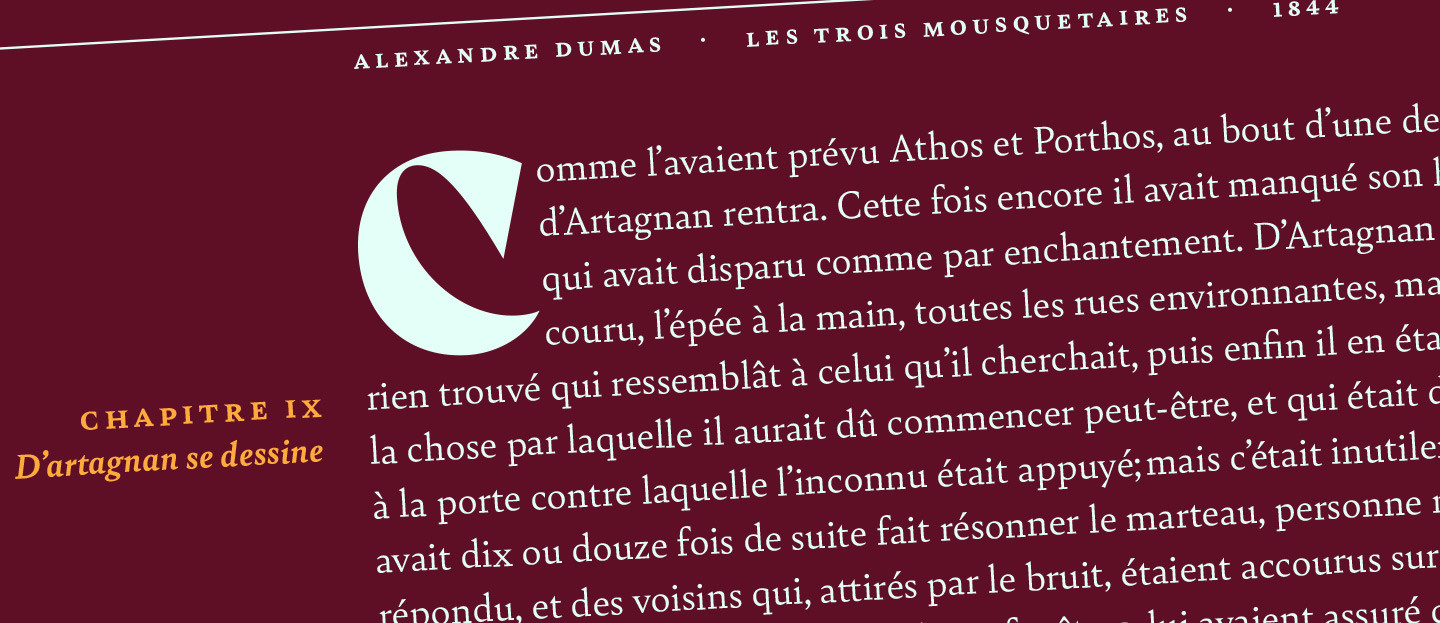
The text weight’s design is the result of a long experiment process as well as the reflection of my learning process in the field. Both serifs shapes came from an experiment, the proportions came from the intense study of Old Style typefaces. It was while doing research on optical sizes that the idea of an extreme display came to me. I designed it more spontaneously, keeping regular structures and increasing at the extreme its features, while having fun with the extreme weight and contrast. In the end, the display is a different design from the regular, but still related to it.
What was the biggest challenge you encountered?
I have two answers here.
In terms of design, I would say the extreme slanted axis on the display were really hard to fix and extend! I had to sketch a lot, and it always seemed to work better on paper than on screen.
The other big challenge was to simply… finish the job! To be able to find enough time during the week to develop the family. I know I’m already extremely lucky to have received financial support from Type Together’s scholarship, it allowed me to buy software, and to dedicate the time to focus on the development, which is already a luxury. But let’s face it, developing a typeface is a long process, especially when it’s your first. I started finishing the designs and developing it for the release around three months after my graduation; so in the mean time, I needed to work a lot in order to start my independent designer career and make enough money the pay the rent.
I also often found myself stuck, because as my first typeface I wanted Bely to be PERFECT. I’ve never drawn anything before my studies in Amiens, even with bézier curves. So, the more I would gain experience from my day job, the more I wanted to refine the typeface, change subtle design details here and there. I’m not saying that paying attention to detail is bad (really, it isn’t!), but it took me quite some time to calm down and accept the fact that it still was my first typeface, not the only typeface I would ever design. It was fine as it was: a typeface I started designing as a student. If I hadn’t realized that, I’m sure that still today I would be going over and over tiny details and making minor changes.
I am really happy to have finally finished it, and I am very grateful to Type Together: they gave me an amazing opportunity and I’ve learned so much with them.
What would you like to design next?
Among the other ideas for typefaces I have, I guess a sans serif could be my next challenge!