Alternatives to Gill Sans

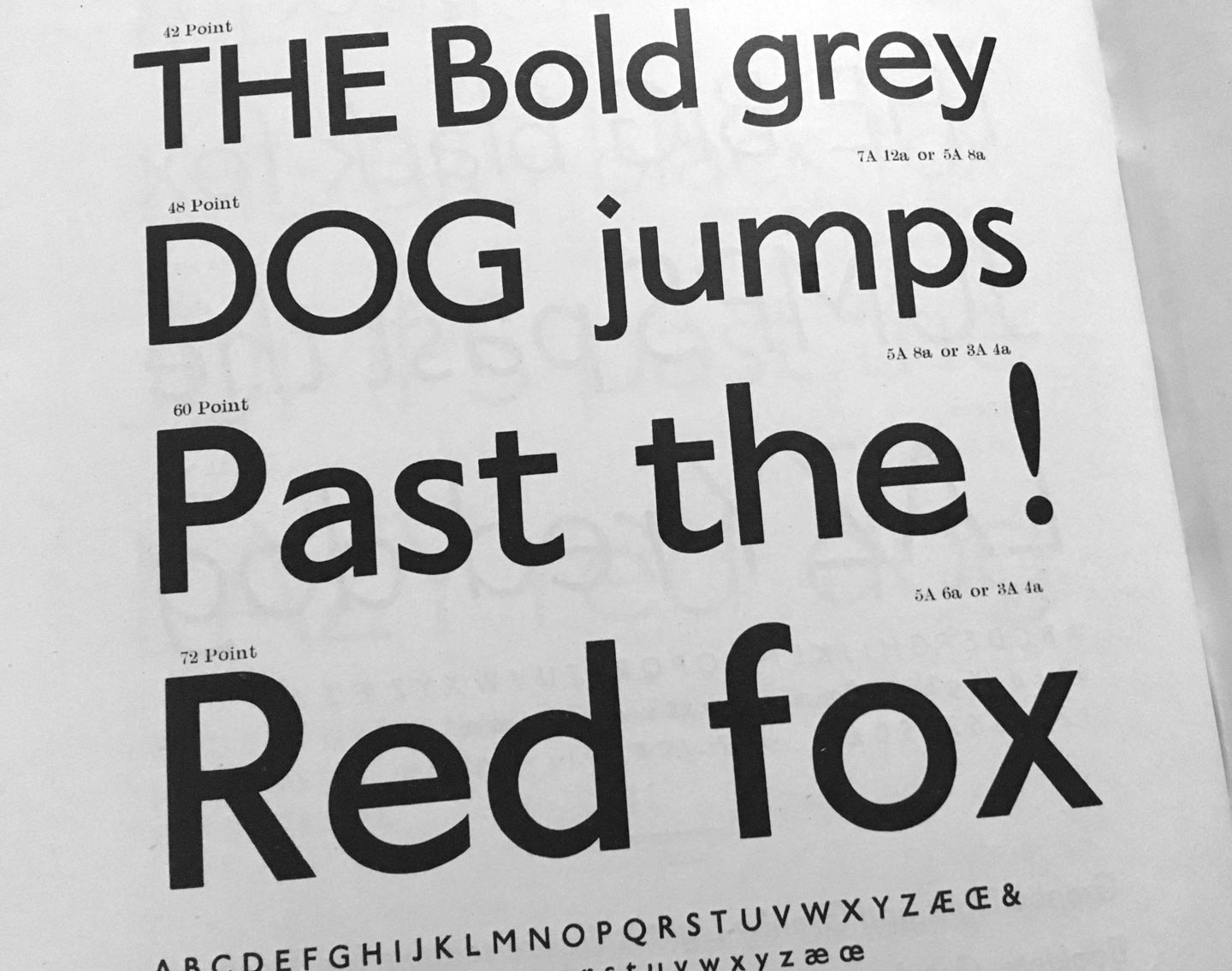
Granby by Stephenson Blake (1930). From: Specimen of Printing Type, Stephenson Blake / The Caslon Letter Foundry Sheffield, 1953

If you are looking for a humanist sans-serif with a slight English flair, here are some less overused and ambivalent alternatives:

Agenda, Greg Thompson, Font Bureau
Apres, David Berlow, Font Bureau
Astoria, Alan Meeks, Alan Meeks Collection
Bliss, Jeremy Tankard, Jeremy Tankard Typography
Cronos, Robert Slimbach, Adobe Type
Documenta Sans, Frank Blokland, DTL
Dover Sans Text and Display, Robin Mientjes, Tiny Type Co
Edward, Hendrik Weber, formally Ourtype
Granby, Stephenson Blake, Elsner + Flake, Scangraphic
Halifax, Dieter Hofrichter, Hoftype
Johnston, Edward Johnston, David Farey, ITC
(Johnston) Underground, Edward Johnston, Richard Kegler, P22
London, Henrik Kubel, A2-Type
Mallory, Tobias Frere-Jones, Frere-Jones Type
Metro Office, Akira Kobayashi, Linotype
Mr. Eaves, Zuzana Licko, Emigre
New Atten, Miles Newlyn, Newlyn Type
Relay, Cyrus Highsmith, Occupant Fonts
Rowton Sans, Julien Priez, Hugo Dumont, Jérémie Hornus and Alisa Nowak, Font You
Seravek, Eric Olson, Process Type
Today Sans, Volker Küster, Elsner + Flake
Yoga Sans by Xavier Dupret, Monotype
Zeitung, Akiem Helmling, Bas Jacobs, Sami Kortemäki, Underware

Alternatives to Prokyon

Semplicità by Alessandro Butti (1930). From: Campionario caratteri Nebiolo, ca. 1962

Spurless humanist sans-serifs were all the rage in the early 2000s, but not anymore. If you still really have to use one, try one of these:

Aad, Aad van Dommelen, Font Font / Monotype
Aller Typo, Marc Weymann, Dalton Maag
Barmeno, Hans Reichel, Berthold
Branding, Alfonso García, Daniel Hernández, Luciano Vergara, Latinotype
Beau Sans, Panos Vassiliou, Parachute
Bega, Sabina Chipară, Diana Ovezea, Fontstore/ITF
Co, Bruno Maag, Ron Carpenter, Dalton Maag
Conto, Nils Thomsen, Type Mates
Dax, Hans Reichel, Font Font / Monotype
Daxline, Hans Reichel, Font Font / Monotype
Diodrum, Jérémie Hornus, Clara Jullien, Alisa Nowak, Indian Type Foundry
Etelka, František Štorm, Storm Type Foundry
Generis, Erik Faulhaber, Linotype
Karbon, Kris Sowersby, Klim
Kuro, Jonathan Hill, The Northern Block
Legal, Hellmut Bomm, Linotype
Netto, Daniel Utz, Font Font / Monotype
Phoenica, Ingo Preuss, Preuss Type
Ribera, Jörn Oelsner, URW
Ringo, Łukasz Dziedzic, Typoland
Sari, Hans Reichel, Font Font / Monotype
Signa, Ole Søndergaard, Font Font / Monotype

Oof, I think that’s more than you ever want to use in this century. Better try a less modisch humanist sans of which there are plenty of.

Alternatives to DTL Fleischmann

From: Atlas zur Geschichte der Schrift. Das 18. Jahrhundert. Technische Hochschule Darmstadt, 1995

The typefaces of punchcutter Johann Michael Fleischmann have inspired many to design close and not so close revivals of classic Dutch old-style text faces. (A typeface of similar colour and sparkle is the one you are reading right now here on the blog – Dover Text by Robin Mientjes – although she took inspiration from Caslon’s typefaces more than from Fleischmann.)

Adobe Text, Robert Slimbach, Adobe
Berlingske Serif Text, Jonas Hecksher, Playtype
Ehrhardt, Adobe, Monotype
Equity, Matthew Butterick, MB Type
Eudald News, Mário Feliciano, Feliciano Type Foundry
Expresso, Mário Feliciano, Feliciano Type Foundry
Farnham, Christian Schwartz, Font Bureau
Fleischmann BT Pro, Johann Fleischmann, Charles Gibbons, Bitstream
Freight, Joshua Darden, Garage Fonts
Glosa, Dino dos Santos, DS Type
Garvis, James Todd, James Todd Design
Guyot, Ramiro Espinoza, ReType
Janson, Scangraphic
Janson Text, Miklós Kis, from Adobe, Monotype, URW
Kis, Miklós Kis, Bitstream, ParaType, RMU
Kis Classico, Miklós Kis, Franko Luin, Linotype
Mercury, Tobias Frere-Jones, Jonathan Hoefler, Hoefler & Co
Pradell, Andres Balius, Typerepubic
Quercus, František Štorm, Storm Type Foundry
Rosart, Jacques-François Rosart, Katharina Köhler, Camelot
Tyrnavia, Miklós Kis, Gábor Kóthay, T-26

Cooking with Peter Pauper Press

My connection with the Peter Pauper Press cookbook series started during the first years I was living in California.
I recall the first time I found a book from the collection was at the Recycle Bookstore in San Jose, CA — one of the best second-hand bookstores in the Bay Area. During the years living in California I found so many great books in this bookstore and they also have two great cats.

Recycle Bookstore, Ender the cat taking care of business and my friend Calvin browsing through books, San Jose, CA. Photos by Frank Grießhammer

The first book I got was Simple French Cookery. I was in awe: from the colour combination to the type choice and the effective and simple illustrations.

Simple French Cookery (1958)

Continue reading

Give us some credit

Photo credit: Michael Bundscherer

At the past AtypI held in Antwerp, I took part in the panel about Collaboration, Authorship and Contribution set up by Joana Correia with María Ramos Silva, Viktoriya Grabowska and myself. Since the authorship part seemed to have resonated most with the audience, I thought it might be useful to post this article about crediting in the type industry. It is based on a talk I gave together with José Scaglione at 2017’s ATypI in Montreal. We intended to suggest a thorough crediting system and open it up for discussion.

Continue reading

This post has no title and no real point but comments are open

Bless you, native English speaker. Your life is so easy. You don’t have to decide, reason, argue, or fight about many things other languages have to reason, argue, and fight about or for. No diacritics, no accents (unless creätively imported by intellectual pedants), no problems properly composing or displaying your language’s letters and glyphs on paper or screen. No inner struggle whether to duz or siez someone (informally or formally saying “you”, which implies complex conjugation, different grammar and spelling), nor whether you are in the right position or have the right age “to offer someone the Du” (to offer that from now on they can address you informally, usually sealed with a handshake or a kiss) and, oh yeh, how to address students?!

You do not have to heatedly debate on a national level and in national periodicals which version of gender-specific words should be used if they have male and female versions or which artificial compound neologism could be introduced now to solve the eternal debate of Kanzler oder Kanzlerin or KanzlerIn or Kanzler*in or Kanzler_in or Kanzler/-in. Du hast es leicht, you have it light … (WTF online-dictionary!)

This is me whining about German. What is weird in your language that other languages don’t have to worry about?

Power in the Poster: 1997–2017, 43 Black Pins, 40 men, 3 women

1997–2017, 43 Black Pin awards: 40 men, 3 women

Each year the Designers Institute of New Zealand awards two Black Pins, its supreme award. For the past two decades, 43 Black Pins have been awarded, of which 40 have gone to men and 3 to women. For this year’s Best Design Awards (to be announced in September), of the 9 convenors of juries for judging the nine main categories and various sub-categories, 8 are men and 1 is a woman. Of the jurors and convenors combined, 46 are men and 15 are women. The jury for the Value of Design Award is made up of men only, no women.

How has this happened? Where are the women?
Continue reading

Script, print, and letterforms in global contexts: the visual and the material

At the end of June, I was lucky to attend the new Centre for Printing History and Culture (CPHC) conference ‘Script, print, and letterforms in global contexts: the visual and the material’. Organised at the Birmingham City University in the UK by the talented Sahar Afshar, Vaibhav Singh, and Darryl Lim, the conference set out to explore the ‘plurality of engagements with, and interpretations of the printed and written word in various writing systems and artefacts’.

Maybe it was the anticipation of attending a conference’s first edition, or the large range of fascinating topics on the conference schedule. Or perhaps it was the idea of visiting the ‘Brummies’ in Birmingham, with its beautiful industrial terracotta buildings. Whatever the origin, I was already excited about this conference long before it even started. And I can confirm that it totally lived up to my expectations.
It’s the smallest conference I’ve ever attended, and probably the most eclectic. With a crowd of roughly 50 attendees and speakers, its ambition was no less than that of a larger conference. Bringing together scholars and practitioners from various disciplines such as book history, printing, publishing, type design, typography, and print culture, the conference aimed to start conversations from different points of view on print ‘in the diverse linguistic contexts of the world’.

Script, print, and letterforms in global contexts: the visual and the material. Vivien Chan takes the stage.

Continue reading

Embracing Britishness: musings on biscuit lettering culture

It all began two or three years after I moved to the UK when I realised that I was living here in contradiction to my host country and not in harmony with it: (my) life was a cultural fight. It was frustrating. At some point, I decided to change the paradigm, embrace Britishness, stop fighting it and learn the culture of the country where I happily live. That journey of learning and embracing the Britishness included, unavoidably, British biscuits.

British biscuits

My first biscuits study, in the form of an Instagram hashtag: the Fig Roll, the Shortcake, the Garibaldi, the Duchy?, the Finger Cream, the Redcurrant Puffs, the Rich Tea Finger, the ‘fake’ Bourbon — Bourbons are never square!


Continue reading

Visualizing design space in variable fonts

After attending Typolabs a few weeks ago, something kept on rolling around in my mind. Variable fonts—the main topic in type conferences since the announcement at AtypI Warsaw in 2016—was again at the heart of the debate in Berlin. If sliders generated some controversy one year ago, I would say ‘design space’ was one of the most repeated concepts this year. The opening talk by Gerry Leonidas pulled the trigger with a thoughtful presentation: ‘I am now in an environment where the design space is by default way bigger than my ability to imagine it, not just my ability to do something with it’.

Slide from Gerry’s presentation showing a figure that represents a font with three main axes

This figure, included in the presentation by Gerry Leonidas, is the visual representation of a font with three main axes.

Continue reading