
Every letter in the alphabet has its own history. They change with time, and it is part of the type designer’s job to give shape to those changes. We set out to celebrate a letter that most designers would agree to be one of the most challenging forms to design in the Latin alphabet, the lowercase s.
The origins of this letter led us to the Phoenicians (1500–300 B.C.), who used three different forms: shin, shade and samekh. The shapes of the letters were simplified drawings of their names, for instance shin means teeth. This letterform is the predecessor of the Greek sigma, which evolved into the Etruscan S, and later on into the Latin form.
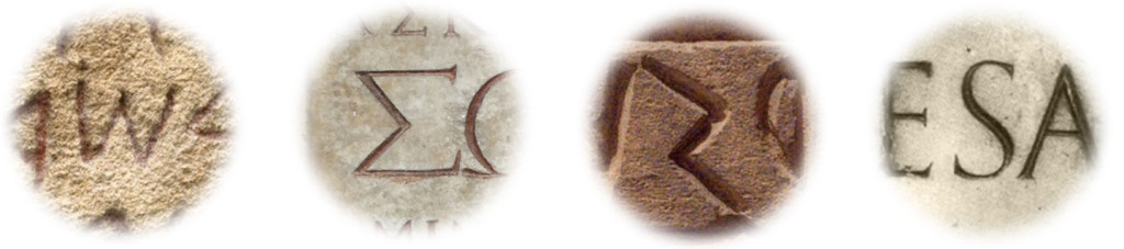
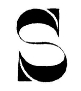
Inscriptions of Phoenician shin, Greek sigma, Archaic Etruscan s, and Latin uppercase s
The first lowercase letters appeared by the end of the 8th century in France with the Carolingian minuscule. Until the 19th century two different shapes of lowercase letter s were in use, the long s and the short s. The long s looked similar to the letter f without the right side of the crossbar.
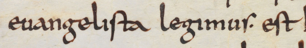
Carolingian minuscule long s in a text excerpt of Einsiedeln, Stiftsbibliothek, Codex 126(218), p. 115 – Hieronimus, Expositio in Evangelium Matthaei
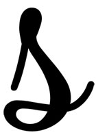
Since the appearance of cursive handwriting in the Renaissance, letter s also took a slanted shape. The joined sloping forms of the new style needed to adapt to the speed of writing. The structure of the letter s was simplified, the top curve was shortened and it, sometimes, included a loop for joining the stroke with the previous letter.
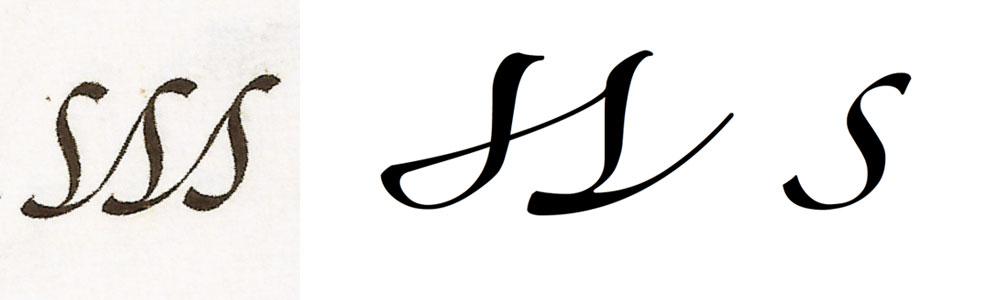
Three joined s’s in the calligraphy manual ‘Quarta parte del arte nueva de escrivir’ p. 50 (1626), and three alternative shapes in the design of Zapfino
The letter s is still a living shape. Searching in our own memory we can find some extraordinary designs of this character, both historical and contemporary models. Here are a few that have been selected by six members of Alphabettes.
 Spike Spondike: I love a good s. With a name like Spike Spondike, how could I not? There is even a small, much cherished collection of them in my studio. What is not to love? She is sturdy, soft, self-assured, sublime. Always smiling. The s in Blippo, in particular, is special to me. She is not like most others. This s is suave, smoooooth. Most of all, says what she has to say in a very simple shape.
 Nina Stössinger: The s is one of the characters I rush to check out in a new typeface, and Mallory’s is a recent favourite. Even — perhaps especially — in the really very heavy Ultra weight: this shape is as subtle as it is extreme, aptly balancing a compact, curvy core with reinforced, more rigid open ends; it feels fittingly solid, warm, and energetic with a dash of well-managed sharpness (mind that tail end!).
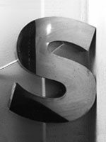 Shelley Gruendler: I love this s. I have a lot of vintage sign letters and this is absolutely my favorite one. I bought it at a jumble sale in England 15 years ago. There is something about the proportion of this s that I adore, the squatness in particular. The seemingly even strokes hold secrets for they actually swell and shrink upon closer inspection. It is strange that I love it so much because it feels Gill Sansy. But I don’t like Gill Sans. In writing this, I now see that it isn’t actually Gill Sans. Oh good! Now I love it even more.
 Zeynep Akay: I wasn’t always a fervent proponent of a top-heavy and slightly forward-leaning s. Typefaces like Excoffon’s Antique Olive, though, made me appreciate not only the unexpected, asymmetrical balance one can have, but also how harmoniously it can harbour contrasting features. Its beautiful serpentine curves make you think they will conclude in a tapered, perhaps rounded terminal — until abruptly they are cut, at an unforgivingly vertical angle, revealing a sharpness that surprises as well as it delights.
 Naïma Ben Ayed: s for special, s stands on the baseline with its extravagante spine, s for sneak… If you look at the lowercase s in fat faces the spine is about to explode. I love the unexpected delicateness of this engraved Italian Print alphabet, and the contrast going the other way around. I love the roller coasting curves and how the serifs stop them from falling over. I love the trickiness of this s, indomitable lowercase.
 Lila Symons:if I had to pick a letter that would most likely cause a rebellion in a script typeface, it would almost always be the lowercase s. It is often the character that we design a typeface around or modify to make it work with the rest of the letters. The s in Spumante begins with an impressively steep but graceful ascent. Its first loop is just the right size and doesn’t venture too far from the x-height. As it descends, it has just the right amount of swelling before making its final turn towards the next letter.
It is not the purpose of this article to delve into details in the history of lowercase s. This is rather an overview on its evolution, putting together some historical sources and showing a few design examples. Knowing more about a letterform will allow us to better understand its path, helping us to approach its design from a different perspective.
If you had to point out one particular design of lowercase s, which one would it be? Post a comment and share your opinion!
While preparing this article I made a long list of s’s that were special to me in some way. If I’d have to choose only one, that would be the lowercase ‘s’ of Iskra http://www.type-together.com/Iskra. So much flavour and beauty in that shape. It just feels right moving away from conventions.
Thank you María. Tom Grace did a super job with Iskra’s ‘s’ indeed!
Nice piece!
My favorite is the one in Legato; it shows what it looks like to take the white (arguably the under-valued feminine half of notan) truly seriously.
https://twitter.com/hhpapazian/status/691322802247315456
And yes, Iskra’s is awesome. The one in Satyr is also remarkable.
Nice article, Thank you. Wasn’t Gerry Leonidas who was explaining during MATD that American type foundries used to have a ‘S-test’ to hire new employees?!
Very much into Iskra as well, I could also direct your attention towards Shag Lounge by House Industries. This one is also a funny animal
An ‘S-test’!? Curious way to judge the skills of a type designer.
Nice one the ‘s’ in Shag Lounge, I didn’t know that one.
I guess the type designer job as we know it, didn’t exist back then… the employee was more likely hired to execute and draw the ideas of a type director.
Inspiring stuff María thanks!
Another favourite this week is Founder Grotesque italic from Klim. It’s strokes extend more than usual, and with the angle of their terminals it seems a bit wobbly but beautiful!
Hi María,
good article, thank you.
All four characters of your four photographs are integrated in Unicode:
U+10914 PHOENICIAN LETTER SHIN:
U+03A3 GREEK CAPITAL LETTER SIGMA: Σ
U+10314 OLD ITALIC LETTER ES:
and U+0053 LATIN CAPITAL LETTER S, of course.
But there are even more, like:
U+05E9 HEBREW LETTER SHIN: ש
U+10854 IMPERIAL ARAMAIC LETTER SHIN
U+10A66 OLD SOUTH ARABIAN LETTER SHIN
etc.
In Arabic, there is U+0633 ARABIC LETTER SEEN: س
All these are glyphs of teeth, in the end 🙂
If you don’t have a font for some obscure characters,
just search for »Shin« at decodeunicode.org
All the best,
Johannes
Thank you Johannes!
I have used the pictures on purpose, I thought it was interesting to show how those characters looked when they were born.
Awesome! I really liked Shelley Gruendler’s choice. So smooth and sexy.
I would really love if this turns into a whole series!