
In the middle of nowhere – an encounter First published in 2008 at SLANTED
I’m now on my way to Roquefort, after a halfway sleepless thundery night in a tent on the French Atlantic coast. I couldn’t tell if this is the place where the famous French cheese by the same name originates, but I do know that it is the place, central in the southwest of France where I will soon meet the man whose works I have studied, and come to appreciate, for some time now: his name is Jack Usine.
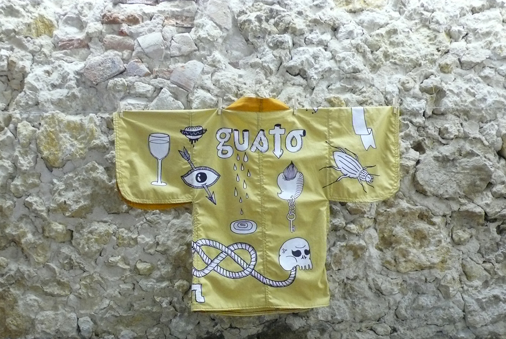
I arranged the meeting by email a week ago and there is a certain amount of anxiety in me, about how it will work out. We arrive at an old factory site, which has been transformed into a kind of cultural factory by a certain handful of artists. Here, there will be an event in Roquefort on this weekend, at which he and Fanny Garcia, with whom he is co-working under the name of Gusto, will be taking part. It is hot. Matias Matta an artist from the Canaries is busy putting on the finishing touches of graffiti on the outer wall, which he has been working on for more than a week, as we leave to look for Jack and Fanny. And just as I am about to ask for them, they are already standing in front of me. I am quite surprised. I hadn’t imagined them being so young, judging by the sheer volume of work that I have seen from both of them. We wander around the site. In one room there is an exhibition portraying graphical works, and I notice the poster series of the great poster exhibition in Chaumont on which both of them were involved in 2007. They are installing the music set in the main hall. In the evening they will have a band playing late in to the night. Outside in the garden at the site there are some artists and designers busy working on the pre fabricated kimono models of designer Natascha Sansoz. It is 4 pm and it is quite peaceful on the site. We look for a place in the shade to make conversation and Fanny brings us some seats. We sit down.
I would like to know more about them both and their work. The moment has come when I tear my notes out of my pocket. My French undergoes a strenuous testing. At first I had decided to perhaps record the interview, but then suddenly we were already in the middle of the conversation and I needed to listen carefully, so that I will not miss any crucial information. Furthermore it would seem out of place to pull out the recording device right now, which would interrupt the flow of speech as well. But I manage to take some notes which have borne this small review.
Naturally I ask Jack first, what probably everyone would first ask: I would like to know if his name, Jack Usine, is a pseudonym or not. Because in my opinion he could have not come up with a better name. USINE is French and means FACTORY. The volume of work which this 26 year-old designer (remark: in 2008) shows for is amazing and it would seem that he does several shifts a day to have accomplished this workload. As I look at him in front of me and perceive his wholeheartedness, I begin to think the name says it all. He explains that his name originates at his birthplace in Lorraine in the vicinity of Metz. Even though his family moved to Bordeaux when he was six, he still has a close relationship to this area, which is influenced by heavy industry. He worked several months in an iron works during the summer holidays. At the age of 10, having been caught on by his five years older brother, he starts to spray paint graffiti. Jack’s real name is Tristan and I find this suits him, for in all the extroversion of his work there is something extreme introverted and quiet in his speech. He feels at home at least in two worlds.
When one comes across his website www.smeltery.net, one will find many links to other sites which are filled with life. And what is more surprising, is the number of projects from which his personality comes out. I am fascinated by his motivation for it all. I ask both of them what lies behind www.sainte-machine.com and www.levilain.org and many other sites. Both Fanny Garcia as well as Jack studied at Ecole des Beaux Arts in Bordeaux and graduated from there in 2005. Fanny tells me that these projects in co-operation with other designers are mainly projects with a social aspect, to benefit the society at large. They want to make a difference and look for niches to make their cause known. They organize exhibitions, initiate action on the public scene to draw attention to flaws in society. They draft declarations with the residents to make the area urbanely attractive. In Sainte-Foy-La Grande in Fanny’s birthplace near Bordeaux they involve residents in their cause, by gathering experiences in interviews and publishing these (www.levilain.org). They also have a request to shake the town of Bordeaux awake. The slogan for this is “Bouger Bordel”, which roughly translated means “Bordeaux for change”. The French definition for “Bordel” purposely uses both meanings to create irony.
The work of Fanny and Jack well over from a pattern and colour wealth and an incredible vitality. I can detect no hint of “coolness” in the work and they remind me, even though they are of course different, of the well-known French collective “Grapus”. They radiate a certain familiarity, something I pretend to be familiar with; however, on a closer inspection they prove to be original. In 2006 I began working on a thesis for a lecture which states that the future of graphics design is moving in four distinct directions. One of them I called “romanticization”. I spoke about the return of Fraktur and Antiqua-Types and the excessive global emerging of new Scripts including the re-edition of the font Helvetica and the New Sobriety. The romanticization seems to especially be a counter movement to create a visible refuge in countering the rapidly increasing instability and vagueness in political and social relationships – a miniature better world. I ask both of them if they believe to be partly motivated by this. Fanny thinks for a moment, and then answers that she would applaud to make the world a better place for herself and others. Jacks reply is on the front of his poster, which could be viewed in Chaumont, that reads: “Ensemble tout devient possible” (“together, everything becomes possible”). Both of them have social romanticism as their clear motive and they still have the boldness to carry the flag with passion despite the contradictions it surfaces! I ask Jack about his ideals. He hesitates a minute – then names Jonathan Barnbrook, Emigre and Pierre di Sciullo who lectures at the Ecole des Beaux Arts in Bordeaux. It is noticeable in Jack’s work that years of practicing typography have perfected his skills. Patterns and proportions flow stylishly on the paper. Paul Rand says in the book “Conversations with students“ the following sentence: „It is important to use your hands, this is what distinguishes you from a cow or a computer operator.“ Jack and Fanny are so-called living proof of these instructions.
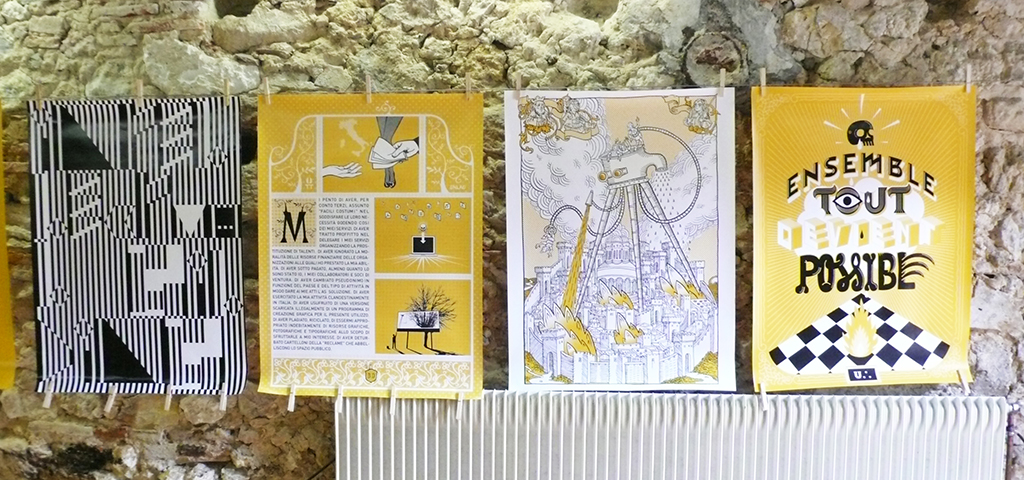
The font “Soupirs” (English for “sigh”) is an example for their work. Fanny and Jack systematically walked down all the streets of Bordeaux and counted 1489 basement windows (French for “soupiraux”) made out of iron and photographed them. Each one has its unique pattern. 310 of them were made into vector symbols. From these they created a poster, which has gained world renown. This individual diversity fascinated me. It’s not just about some kind of collector mania; it is also a piece of cultural heritage which is portrayed by these designers. Here are individual signs that otherwise would go unnoticed and they reflect the cultural wealth in their uniqueness and magnify the visual historical memory of the city.
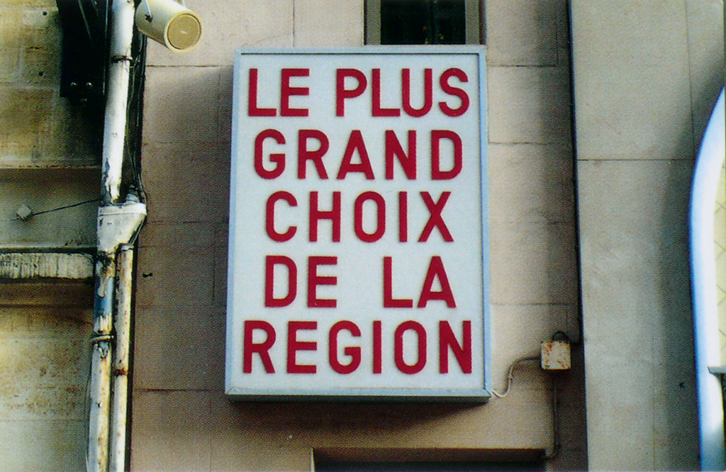
The title „Le plus grand choix de la region“ on the front side of a business card, which has all the internet addresses listed on the back side on which both of them play with their creativity. The title depicts a photography of an old signpost on the front of a house. Whatever took place there is history. Now it is part of their self-image, humor and irony that both cherish inside. (Please click here www.vernacular.fr for more wonderful old signposts and fonts preserved and published by Jack Usine). In 2007 the Old Town of Bordeaux was recognized a UN World cultural Heritage, and in this year Bordeaux applied for the status of Cultural Capital for 2013, amongst Lyon, Toulouse and Marseille. We just have to hope that those responsibles in Bordeaux become aware of the existing treasures of their city and begin to cherish and look after them. People like Jack and Fanny and many of their colleagues are a part of those. It would be a great setback for the cultural development of this city if one day they would leave the town for Paris or Berlin.
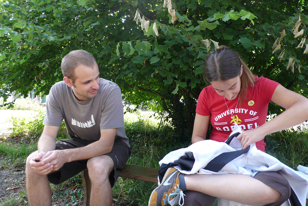
We wander a bit longer around the site talking to Natacha about her projects, while Jack and Fanny are contemplating the future of their blank kimono in the shade. As we are looking for the two to say good-bye, Fanny has begun to cross stitch a ladybird on one of the kimonos. The ladybird – also called “God’s little cow” – is a symbol of luck and untiring diligence. May their creative passion and vitality never depart from them. Merci et à bientot!