
This is the transcript of my talk at Typographics last June about the making of my (now-released) typeface, Gautreaux, edited for clarity in this medium. You can watch me in all my nervous glory here, but I wanted to make the written version available for anyone who’d find that useful. Enjoy!
Hi! I’m Victoria and I’m a type designer. I have a learning story for you about a script typeface. I happen to really like hearing people tell their learning-to-do-things stories, which is convenient for me because mainly the only stories I have so far are learning-to-do-things stories, so I guess I’m just interesting like that. I came to fonts via script lettering, and so I’m really into coming up with projects that help me to understand their distinctions and overlap. This one is about exploring what it takes to make some lettering into a font, the things that work and the things that break, and whether you want to make a font that obscures the clues that it is in fact a font, or as I ended up doing, tackle hug those issues into a chokehold. I’m going to talk to you about this one script font, right here, I’m sure you guessed. I’m going to tell you how I started, what I set out to do, and then about all the details I’ve screwed up and then fixed. Okay, here we go.
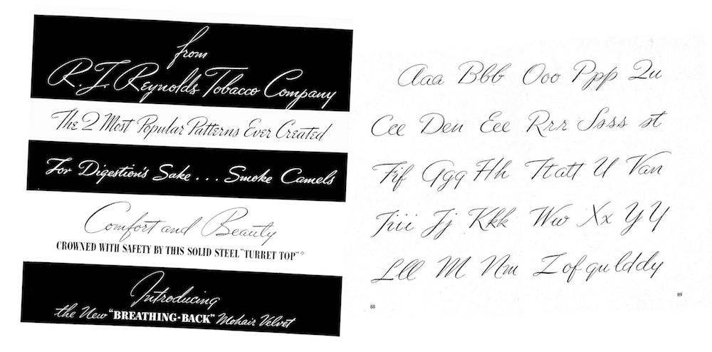
Quick exposition ’bout me just because I can: Probably not unlike a decent chunk of the youngish people, who are into type and lettering, what it took to draw me in was this brand of swirly, saccharine, script-y lettering. I discovered it in college at just the right point of hating my major and having no other plausible alternatives. There I had been training for three years to be an illustrator, which is to say, draw images that accompany or illuminate a message, but turns out you can draw things – words – that are the message, which was the coolest thing ever to me.
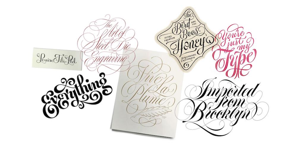
Lettering by Jessica Hische, Louise Fili, Doyald Young, James Edmondson, Tony Di Spigna & Ken Barber
I was doing that kind of swirly script-y lettering all the time, shoehorning it into assignments where it didn’t even make sense, which I’m not going to show you now because I don’t have to. And that was my gateway into wanting to draw all kinds of letters. After college, with the extreme benevolence of the folks at Font Bureau under whose wings I like to say I forcibly lodged myself, I had the great privilege to be taken on and be trained to make fonts by Dyana Weissman and Cyrus Highsmith.
My job was and is: 1) Production: Filling out character sets in other people’s fonts for retail, 2) Helping out if needed with custom fonts for clients, and 3) Conceiving of and executing my own designs for retail. So the whole time I’m doing this job, I’m also doing lettering just for fun. It’s the kind of script-y swirly stuff that I originally fell in love with making, and I’m doing it much less badly so that’s why I’m showing you it here. Around then I also started spending a lot of time with someone really special who also makes script-y fonts and lettering, who had a much keener eye and vaster historical knowledge for them than I did at the time, and having him around was really upping my script game. So the whole time I’ve been making fonts, I had this daunting task looming over me, that I knew I was going to address at some point: Victoria, you’re really gonna have to come up with an idea for a script typeface.
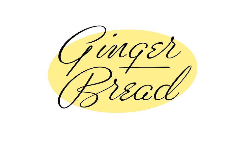
And that idea would start here, with these holiday cards I made in 2014 to send to art directors and friends. I try to make as much of my work about food and/or Christmas festivities as possible, the holidays are a wonderful time for me motivation-wise.
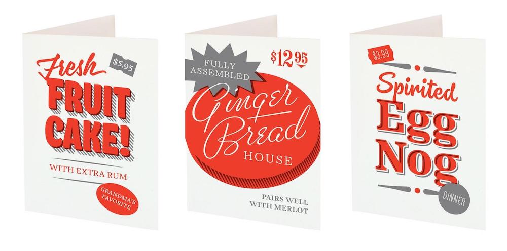
For that middle one, the lettering that says Ginger Bread, I referenced a style I got from a book called The Script Letter by Tommy Thompson. It’s what he refers to as Free Style lettering, so that’s how I, too, refer to it.
Tommy Thompson, The Script Letter
This book is so important that we have two copies of it in our house because, like, what if we both need it at the same time?
An aside: if you were thinking at some point you would see some charming sketches on paper now, they do not exist. This was drawn pretty much all digitally, paper slows me down, I’m not sorry. The way that I work is that, occasionally for lettering, I’ll do a quick pencil sketch for layout because that first 2% of the glacier of an idea can be exposed more easily by hand. But with typefaces, for the most part, I’m about drawing straight in a font editor. It’s just economical for me as it is for a lot of type designers – the faster I can get something in black and white vectors, the faster and easier I can see and fix its issues.
Anyway, this served the purpose it needed to on the cards, now I had this lettering chilling is a font file. And here’s the thing when you’re me and you have some lettering in a font file, and you have new things you need lettering for, you come up with lazy ways to get new lettering out of what you already have real quick. Once I have an idea like this satisfactorily digitized, I tend to build on it for little for-fun endeavors.
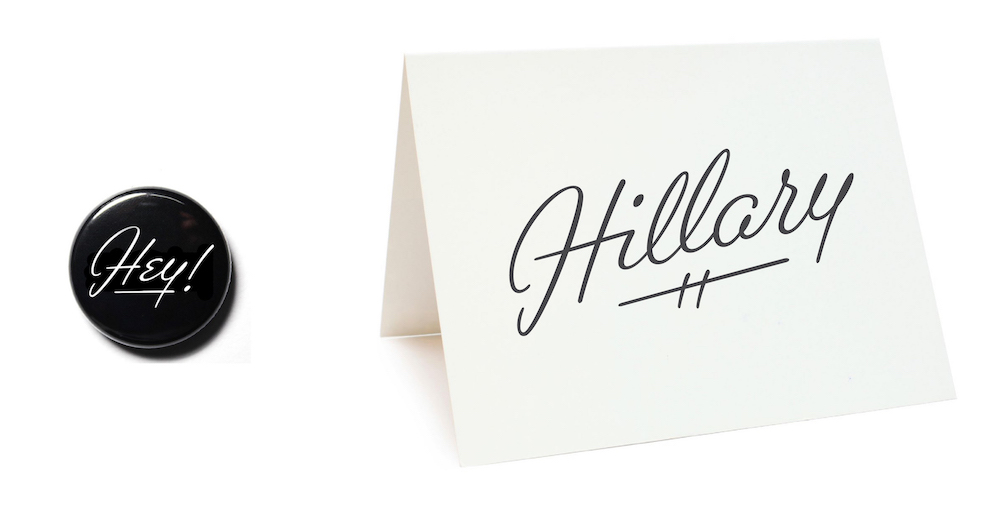
Like, I decided that I wanted to make some pins. Just gotta turn my lowercase g into a lowercase y, and make an H and exclamation point, boom new lettering. Then I have this in a font file.
Then I wanted a card for a friend, no problem just make some l’s. and we’re done. Then I have this in a font file.
Then, a whole alphabet just happened.
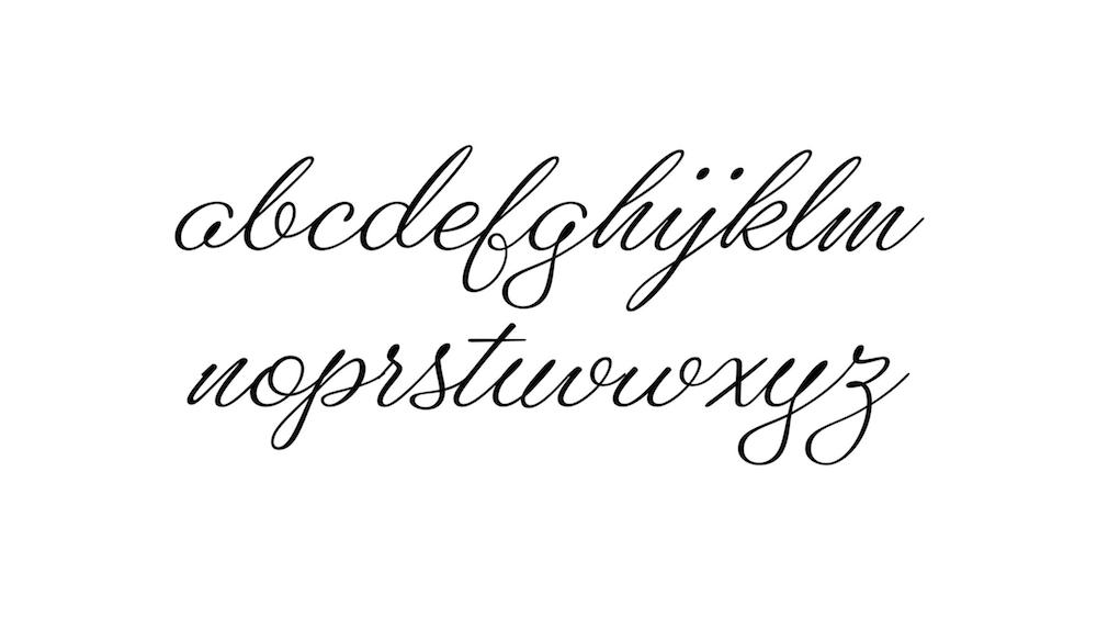
Obviously it’s messed up in places, but I love this alphabet, this looks super fun to me. And in script type design, fun apparently can only mean one thing: a forthcoming series of drastic compromises. For example, to make everything connect, already we’ve had to abandon that cute little cap e structure that looks like a backwards 3. That was hard enough to negotiate in lettering alone, so it was the first thing to go.
The charming wobbliness and slight variations in angle in that look so natural in lettering, as you can imagine, would look sloppy and unintentional in a font. So that got smoothed over, and a single angle was chosen.
And the lowercase e loop structure of freestyle lettering wasn’t going to work either. You know the way that cursive e’s are just straight-up, smooth loops? Apparently the reason you rarely ever see that is because it just does not work without making alternates. Speaking of alternates, we have an additional problem now.
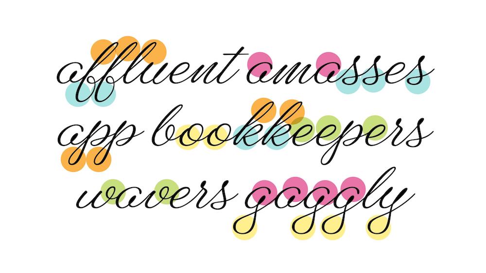
This type looks not so hot in some words. In my house we this call this the uncanny valley – where type is made to look like lettering, but its cover is busted when you see two of the same letter near each other. Yeah, it’s a pain.
Faced with this, I have two options.
Option 1: Make a font that has a bunch of alternate characters to mimic real lettering. Lots of typefaces do this really successfully – you know them, they’re great. they seem like a ton of work – it’s hard enough to design a single alphabet that works let alone two or three or six sets.
Or option 2: I have to tone it the heck down.
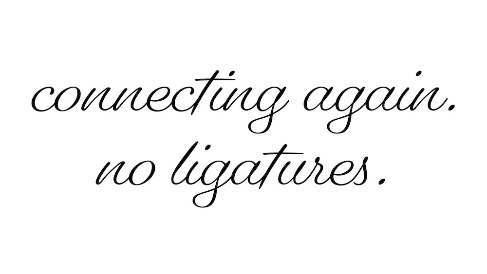
Pique by Nicole Dotin of Process Type Foundry
Right around then a font came out called Pique by Nicole Dotin, which I love. It looks SO good and has SO few ligatures. It still freaks me out – how well the outgoing strokes work on their own at the end of a word, but just happen to also work when overlapping with a following character.
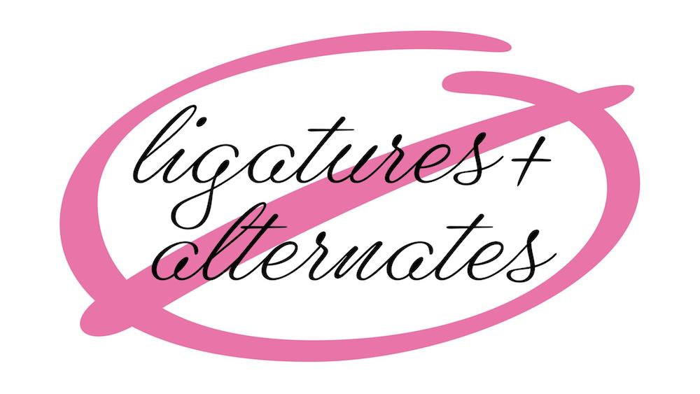
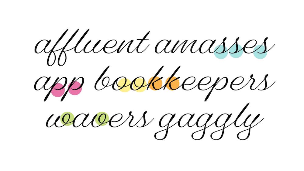
And that really cemented the goal of this project: I want to give myself the assignment to try to tame this thing and make it have as few ligatures and alternate characters as possible while still being as much itself as possible. So I’m no longer making a thing that looks like freestyle lettering, because it can’t. Instead, making something that’s informed by it. I wanted to see if I could pare it down to a system that has as few basic shapes repeating as possible. And yet – get this – they can’t repeat too much! In a typeface, you want parts of characters to be clearly related to each other, often exactly the same, but here’s it’s a problem. Like the top loops of the f and the l are identical, the descenders of the g and the l are identical. The bouncy baselines match each other. The entry stroke of the g and a are identical. I love all those parts of it, but they call so much attention to themselves. They’re all very casual, and it quickly became apparent that that casualness, when repeated, is what the uncanny valley comes from. All the things that make the lettering cool, are a charming disaster in a font.
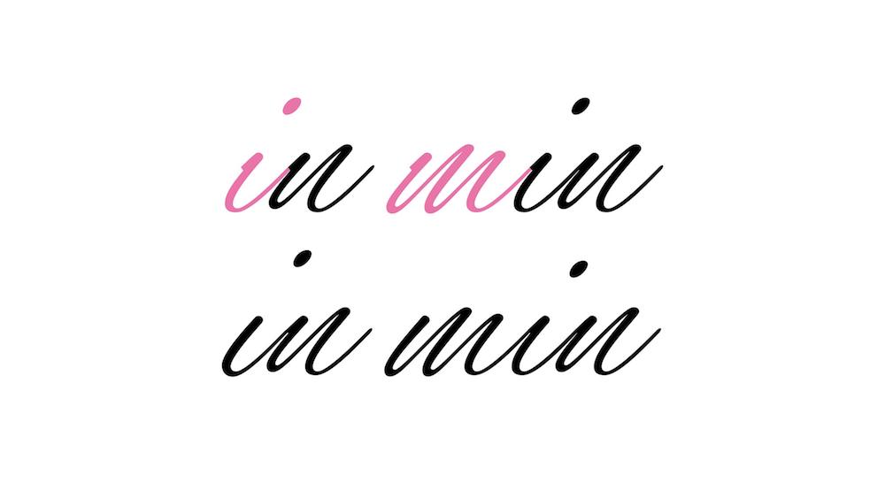
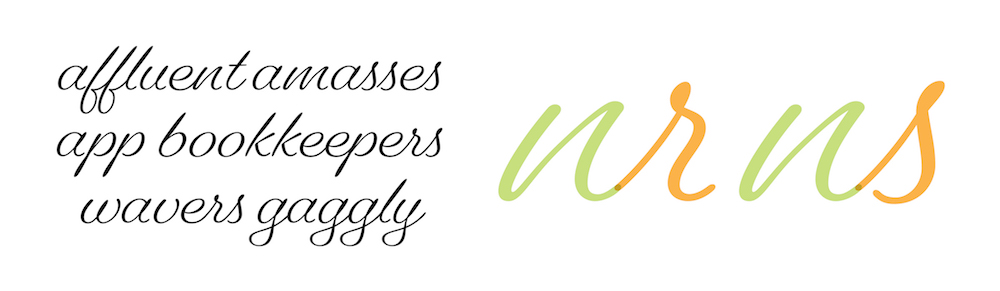
Another thing from that initial lettering and first draft that couldn’t stay was the way I had the connections of straight-sided characters set up – to have smooth connections between them, I needed an alternate in the middle of the word that was different from ones at the beginning. Like here you can see the default i and m, replaced below with an alternate i and m. So, that had to go. So we have to go more typographic, less loosey goosey. Time to bring it down a notch.
Okay so now this got… different. The open ascender and descender loops had to go, the open a and g had to go, the connections are now set up so that almost everything has an outgoing stroke that connects to a following character, and nothing needs an alternate or ligature to connect gracefully to anything else. This is technically doable. However.
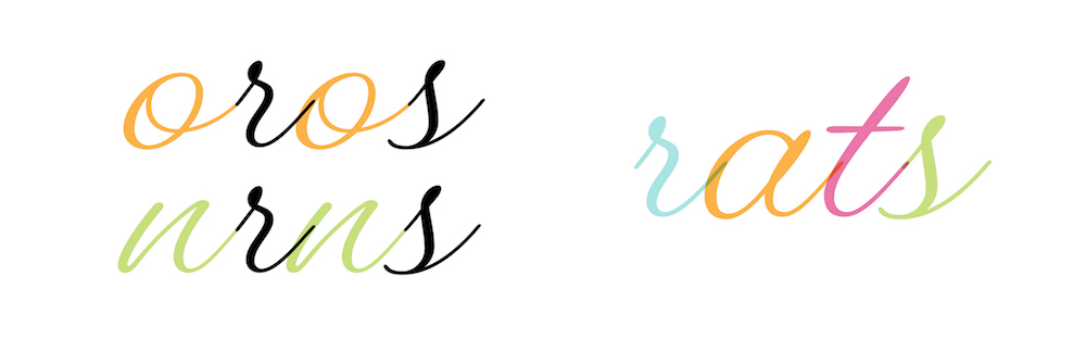
The real problem children for the no-alternates rule are the s and the r (and the x and the z but I don’t think anyone really uses those so who cares) because they have these ingoing strokes and outgoing strokes, where everything else in the lowercase only has outgoing strokes. And the ingoing strokes don’t like to play nice. Since the connections coming out of the o and the n come from different heights – the n comes up from the baseline and the o comes from the middle – you have these ones with stubby incoming strokes to make connections smooth in the middles of words but don’t look good at the beginnings of words. We need to come up another solution. No alternate characters. Live free or die.
I also was just not convinced that this was acceptably modulated and typographic yet, it’s still in awkward territory. In particular I’m not convinced by the outgoing o connection next to itself, and the connections coming out of the s and p were being a world of pain.
So I went and stared at the Tommy Thompson references for a while, to see what they would tell me. They said: Connections are hard, and the letters here connect, but… not always. Okay, what if, get this, what if it were a partially connecting script.
The main feature of this was the o no longer had an outgoing connection, because of how I said I didn’t like the o with an outgoing connection looked next to itself, and the o outstroke was that was most of what was being the most difficult to connect to the r and the s. I liked the way the sparse connections seemed randomly scattered, even though they were actually consistently emerging from the same six out of twenty six letters.
Two other things about it that worked: We were definitely now passing into the safe territory of “we’re sure this is a font and definitely not lettering.” And, the s and the r were carefully negotiated so that now, they could now play nicely with the everything that had to connect into them, and also look okay at the beginning of a word. This is making sense, she says to herself?
But comparing this to the Free Style lettering samples again, I thought, maybe I overdid it. The ratio seemed off – the disconnections probably shouldn’t outnumber the connections so much. It felt awkward when you saw a word that had no connections in it at all.
So time to re-draw some connections back in.
And this was looking pretty good to me. Still some issues to be worked out with the spacing to make the connections smoother and less stabby into the round characters, but getting there. This is where I could have stopped drawing, where I had done what I had set out to do: make a freestyle inspired script that didn’t need any alternates or ligatures to work. Just one problem.
That o that actually works? I couldn’t stand it. Or more specifically, I couldn’t stand the combination of an o right next to an r.
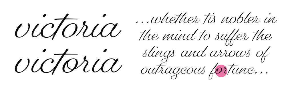
Which is a really important combination. If you can’t get your typeface to look good in your own name what are you even doing.
I considered bringing a ligature in here. I wasn’t convinced by it. The thing was, that then when you have any remotely substantial chunk of text, it doesn’t look great to see a bunch of normal o‘s and maybe just one or ligature stuck in there. It was just so obvious that there was an alternate at play here, so obvious that I cheated.
Also, maybe the o worked too well, and too typographic. It was sterile, just a perfect circle with no hint of stroke or direction like the rest of the alphabet had. In a last flailing effort to rectify that, I went back to the book and found this b. There was only one thing like that in all the samples, and I found it.
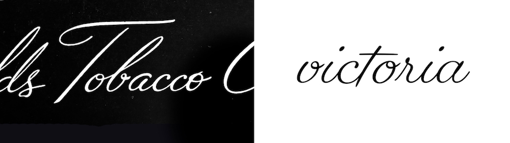
And I tried what we’re calling tweety bird o’s. It’s got lil eyelashes.
As I feared, this did not do well in focus groups and by focus groups I mean I showed it in a meeting and everyone was like, “uh, really?” I was frustrated! I pulled it directly from the source, this should work, so why didn’t it!
I was lamenting to my senior designer Cyrus one day about how I’d tried all these things to fix my or problem, tried to find a compromise that with that would satisfy both my no-alternates rule and my don’t-make-a-sad-looking-font rule. Several iterations in, working alone on this thing, I was really deep now in trying to meet this goal I’d set for myself. And sometimes apparently I need someone on the outside to be like “dude, why? just make a couple alternates.” I don’t think he actually said dude, he doesn’t say dude. But, that’s how drew another kind of o, with a closed loop, and, plot twist, compromised on my compromise. And I made a couple alternates!
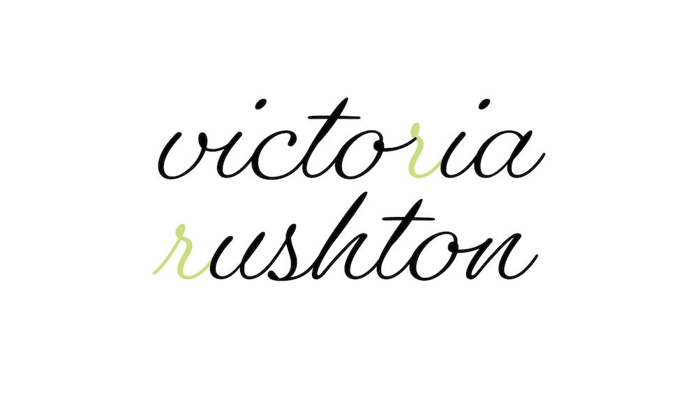
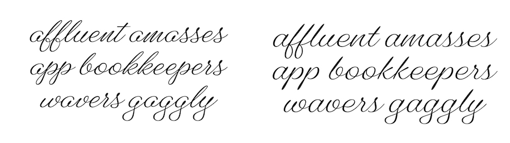
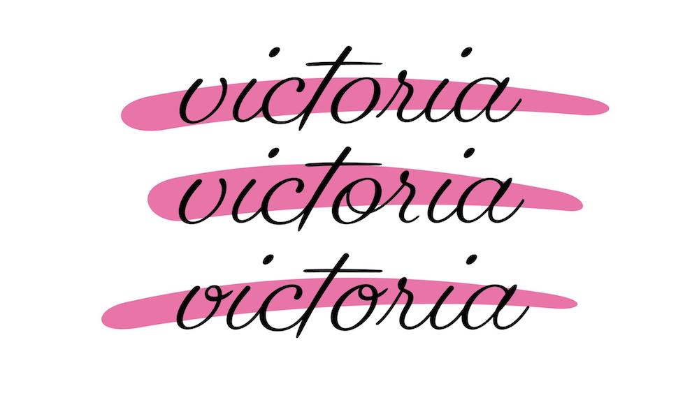
There are alternates for the r, s, x and z. Only four alternates. Deep breaths, Victoria.
The defaults have an entry stroke to go at the beginnings of words and following almost all letters (as you can see in “rushton”), and the alternates show up whenever they have to follow a b, o, w or v, like in “victoria,” the name my parents gave me.
Here are some words and how they evolved
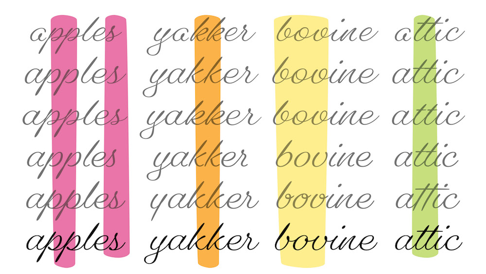
The outgoing strokes of the s and p usually at least tried to relate to each other. And the p didn’t look good next to itself for ages, it would tend to get clogged up really easily, and it took a long time for the loop on its baseline to look not uncanny valley but also convincingly script-y and not too mechanical.
The k looked terrible next to itself forever – the open loop was too loud, the closed loop roman construction was too narrow, the solution of kind of combining them came to me in a dream and I love it.
The b, o and v wanted to match each other, but were too loud with their big open loops, and looked weird with three (or more) consecutive disconnections, and then arrived at closed loops.
The t went through a phase where it thought it could be disconnected, which did look really good next to itself, my coworkers alll thought that that wasn’t a ligature for some reason. But when everything decided to go 100% connecting again, it took one for the team and returned to its old self.
And looking back at these versions, which obviously I’m very glad I kept, I can see how I would try something and it wouldn’t work. Then I would leave it for a bit, long enough to forget why that thing didn’t work, then tried that same bad idea again, and had to be like, oh right that’s why that didn’t work. Or else, I’d have an okay solution for a while, think I could do it better, and then months later change it back to the first way. And then usually repeat that process a couple times. I suppose the answer to that would be to make notes more consistently, but also it would seem that sometimes if I get drawing all of the bad versions of something out of the way, something good is bound to show up and just snap into place.
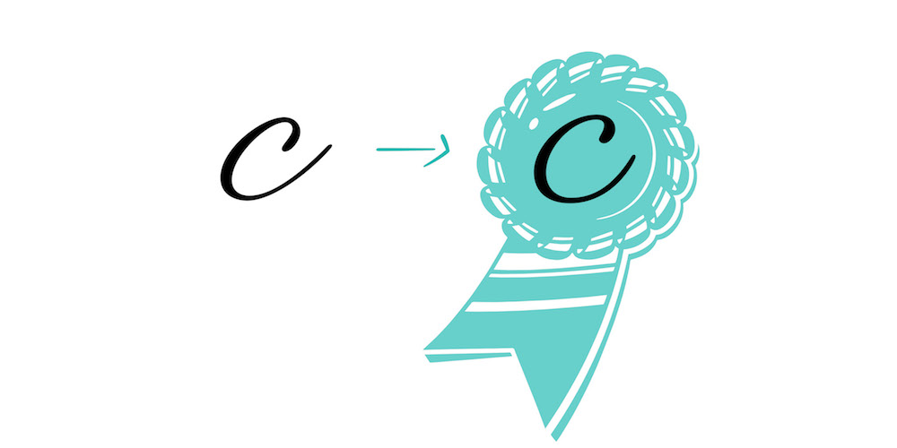
The award for least-changed letter goes to the c.
Also I made an uppercase. I like it. The capital V is the worst letter in the alphabet, which legally I’m allowed to say but no one else is.
And now it’s a font! This one weight is almost completely nailed down, and there will be a heavier weight and a lighter weight.
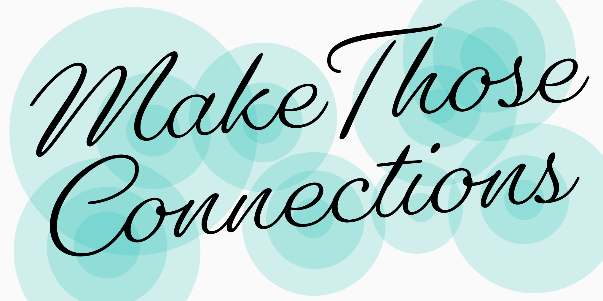
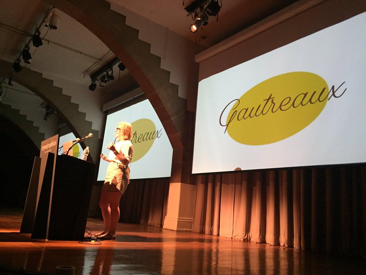
I’ve named the working file Gautreaux, because it’s my grandmother’s maiden name, because I thought that this font would be the thing that helps to finally explain to her what a font is. I think she’ll like it. But I haven’t gotten around to that yet, so if someone wants to take a picture of me and this slide so I can send it to her, she’ll be super thrilled and confused. And do not try to steal this font name. It is not a common name, if you try to steal this font name, I find you.
And that’s my tale! Taking something that by nature is free-form – lettering – and seeing to what extent you can pull and pry a consistent system out of it, as you saw, was a good challenge. It’s not like other projects I’ve done that go through a loading bar of progress draw characters, refine, clarify, draw the rest of the characters, refine, refine, refine, getting closer and closer, till it’s done. With this font it felt like it was hoving in place for ages, there’s lots of it drawn but instead of refining I’m cycling through different iterations, circling back to previous ones, and there’s always something just below the surface that’s irking me about it, that makes me uncomfortable seeing something that supposed to be random finagled into a pattern, till boom, figure it out then it’s done. Now that I’ve explored some of the challenges that casual script lettering poses to digitizing and making into a font, the next thing to try will be breaking down how a mechanical, formal script works. I think it’ll definitely be easier, but those are famous last words.