
From our mobile conference report correspondent:
Everybody should visit Moscow! I was lucky to recently spend 4,5 days in this fantastic city, and in fantastic company.
The occasion of my visit was Serebro Nabora, a typography conference organized by Gayaneh Bagdasaryan with the help of other local type people like Maria Doreuli or Ilya Ruderman. It was the third installment of the event, this year luckily not in freezing late November as the years before. And girl was the weather perfect! Bright 22–25 picture-book degree sunshine end of September — a time in late summer that apparently Russians as well as German denote as “old women’s summer” — бабье лето. More similarities in the two languages unfolded which I couldn’t make out in the stream of charming-sounding Russian around me before but then heard in every second sentence: the German word Schrift, a term that English is sadly missing, is also used in Russian (but with just one character for “sch”): шрифт.
Alas, I didn’t manage to master the Cyrillic alphabet during this short a stay but I learned many interesting snippets, e.g. about the differences between “pre Peter” and “post Peter” letterforms. Alexandra Korolkova gave an excellent talk on the topic of the changing design principles in Cyrillic typefaces, and what good readability is for Russian readers (more static, “Modern” forms). If you have the opportunity to see her speak about this or take one of her workshops, do it.
The conference offered a great mix of local and international speakers with half of the talks being in English and simultaneous translation for the Russian ones. I especially loved learning about contemporary Russian lettering from Yana Kutyina and Andrey Belonogov of studio otadoya, and the mechanics of book design with Innokentii Keleinikov. Speakers like Liza Enebeis, Christian Schwartz, Bänziger Hug and Jean-Francoise Porchez contributed the “Western-Latin” perspective and talked about their work, Ramiro Espinoza showed his Amsterdam Krul-Letters research, John Downer talked about sign painting traditions of the last century, and I about typography on the web.
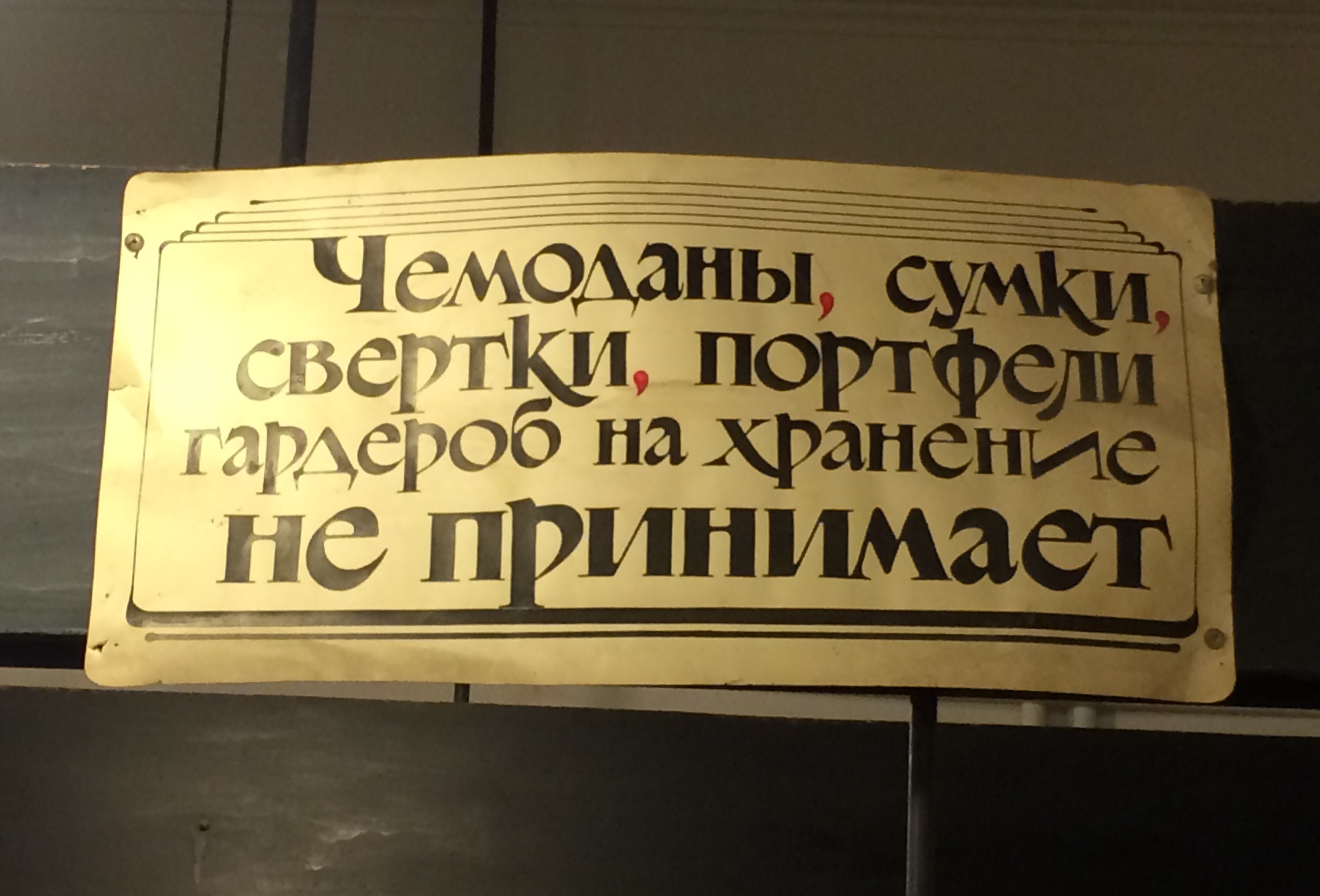
The venue was the house of architecture, an interesting building in a great location with several nice marble inscriptions — and all I photographed is this fun sign at the wardrobe?
It’s always especially interesting to learn new things about type, lettering, typography, and history not only at and via a conference but in the letter’s natural habitat so to say, being right there and occasionally also struggling with it. (A big advantage of interesting, foreign locations vs. the typical nondescript conference hotel!)

Surviving on your own in a Russian restaurant
Hence, the activities surrounding the conference were what made my stay in Moscow so enjoyable. Here are some travel tips in case you want to try it out yourself:
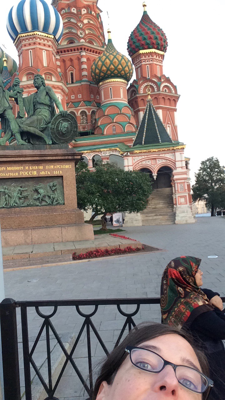
My visit commenced by strolling around the area of the cathedral with Maria Doreuli and seeing the cultural center Strelka institute with its design director Anna Kulachek on the island of the Moscow river. They have a wonderful sunny terrace restaurant/bar overlooking the river where you should totally go have food and drinks.

More photos on Flickr, like this one.
We (the conference foreigners) all stayed at Marco Polo hotel in a really nice part of town West of Тверская/Tverskaya street and North of Tverskoy Boulevard. This is apparently where the up and coming chic people live and dine and get their coffee. Cafe Nude is a fantastic place for food and drinks in the same street (best coffee I had in Moscow), and the fun little russian restaurant Mari Vanna, too.
I mostly walked everywhere to see as much as I could of the city, but public transportation is plenty and very cheap, though not always super straightforward for non-Cyrillic readers (knowing your way/direction or buying tickets). Getting around with taxis is also quite inexpensive and seems easy when you get the Yandex taxi app (they also make a very handy subway app and a maps app). An average taxi trip we took through town was about 300 rubles. Uber exists, too, as well as similar local services and may spare you the Russian conversation explaining where you want to go. Although younger people do speak English (I had luck with three random people I asked for the way), many don’t at all, neither in restaurants or shops, so be prepared for body language communication and have the address of your hotel handy for trips.
Oh and get a Russian SIM card for your phone! I had one from Beeline which only cost 200 rubles (ca. €3) and which was good for calls, SMS, and 6GB (!) of LTE internet.
The day before the conference, Irina Smirnova organized a tour with her cousin Alexej who knows a lot about the Moscow architecture and stories behind the buildings. Can recommend! The highlight was, again, on the island in the Moscow river, a huge luxury apartment building from the Stalinist era with an old church next to it. (The church kitchen sells the most delicious pirogi in a shed at the street.) The “Building on the Embankment” as it is called has a small museum, a super weird conglomerate of all kinds of old Soviet past ephemera cobbled together. We were not allowed to take photos but Veronique Porchez dared some fun ones.
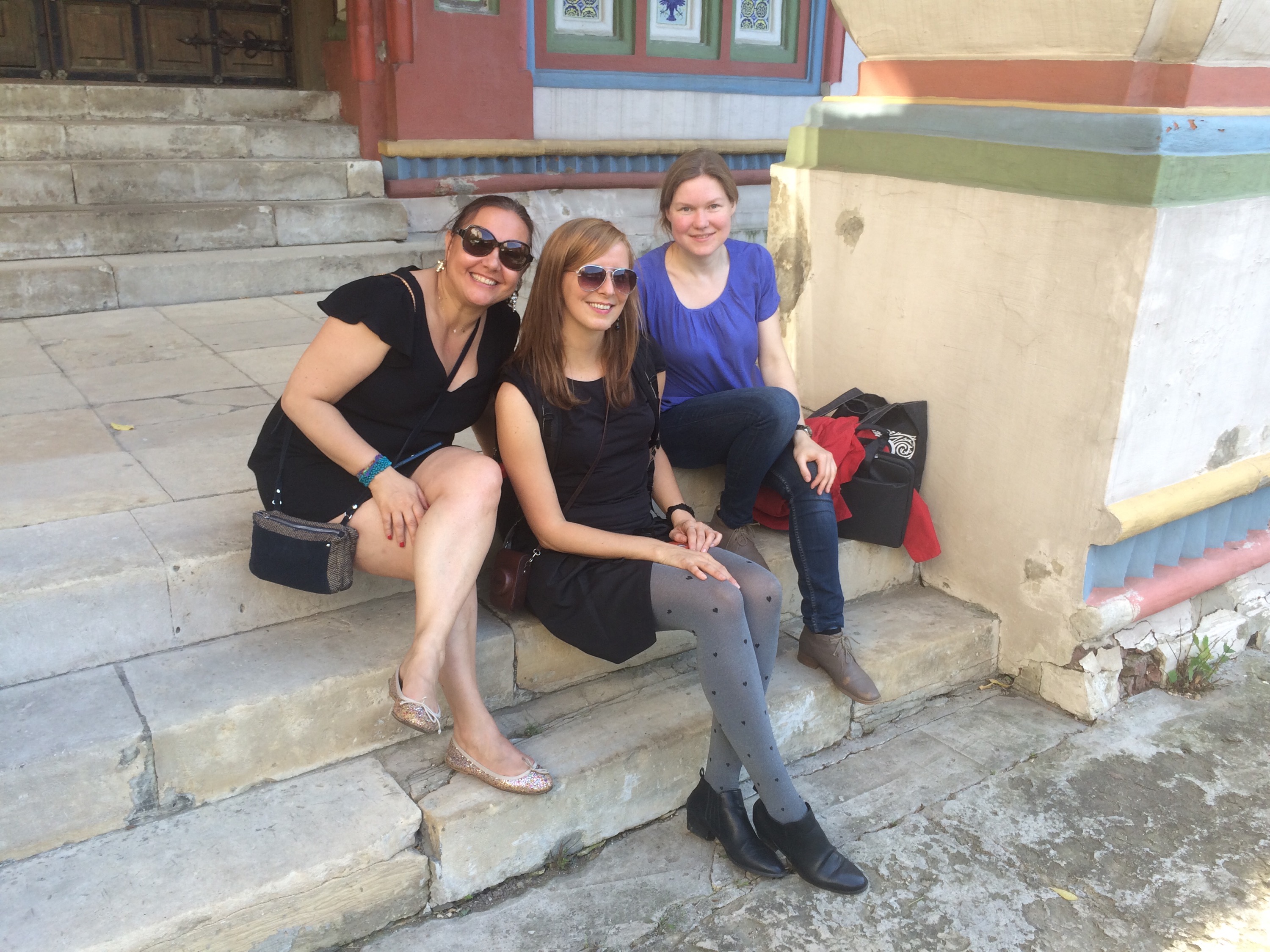
Veronique, Sol Matas and Irina Smirnova chilling at the church
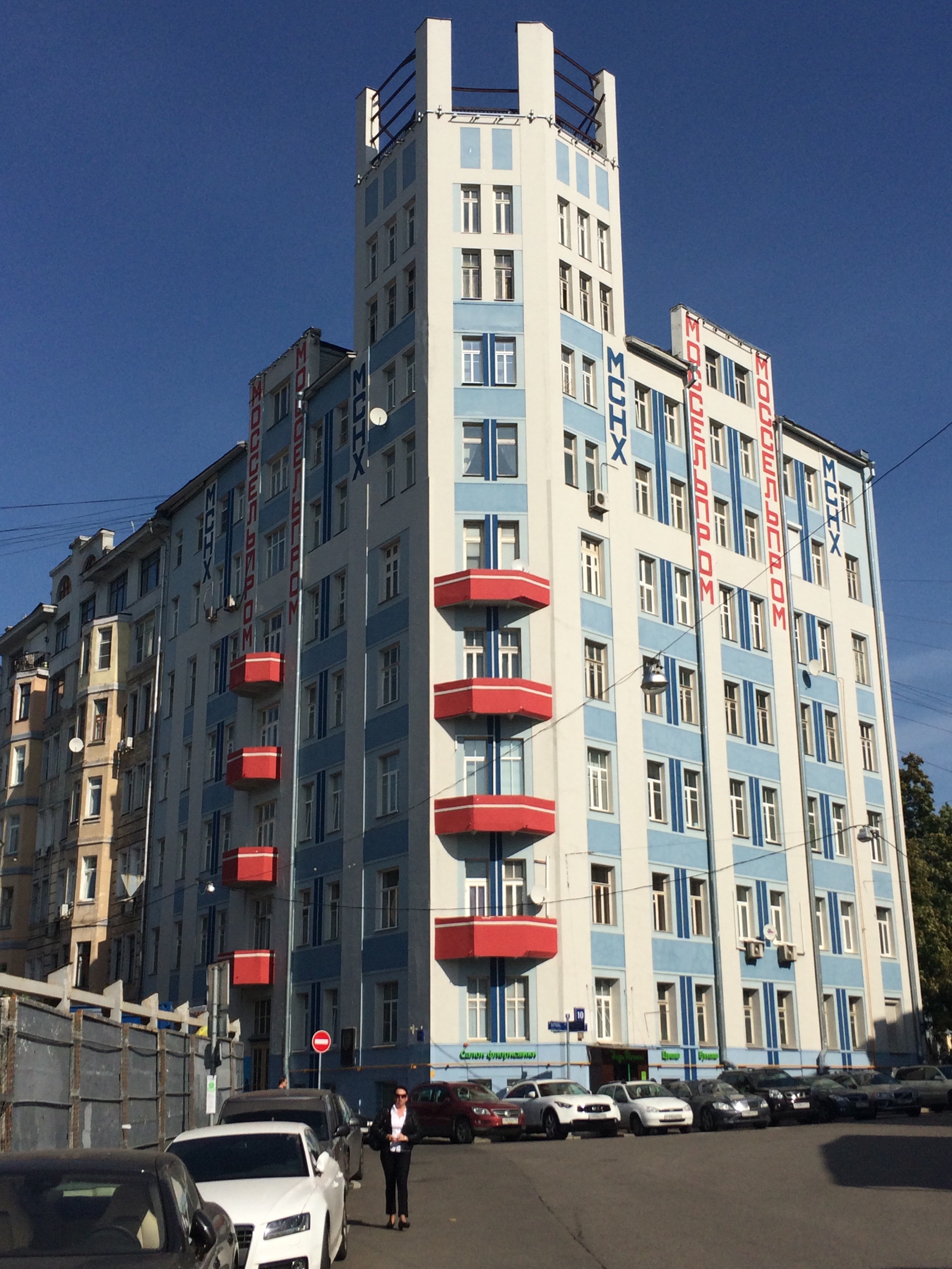
Constructivist building with great vertical lettering
Things learned on the way: Do not rely on the walk-times Google Maps or other apps give you for Moscow. If your way is along larger streets, it will definitely be 25% longer or more. It can take up to 8 minutes to cross a complex intersection and it is usually impossible to even cross a larger street. You will need to find an underpass which can be quite far from each other. Bi-directional main streets in Moscow have 10 lanes, one-way ones up to 7 lanes and not many stop lights. And the cars go fast! Also the escalators go fast(er). They have supervisors at the ends of escalators who can stop them in an emergency which may happen for instance when long winter coats get between the moving stairs.
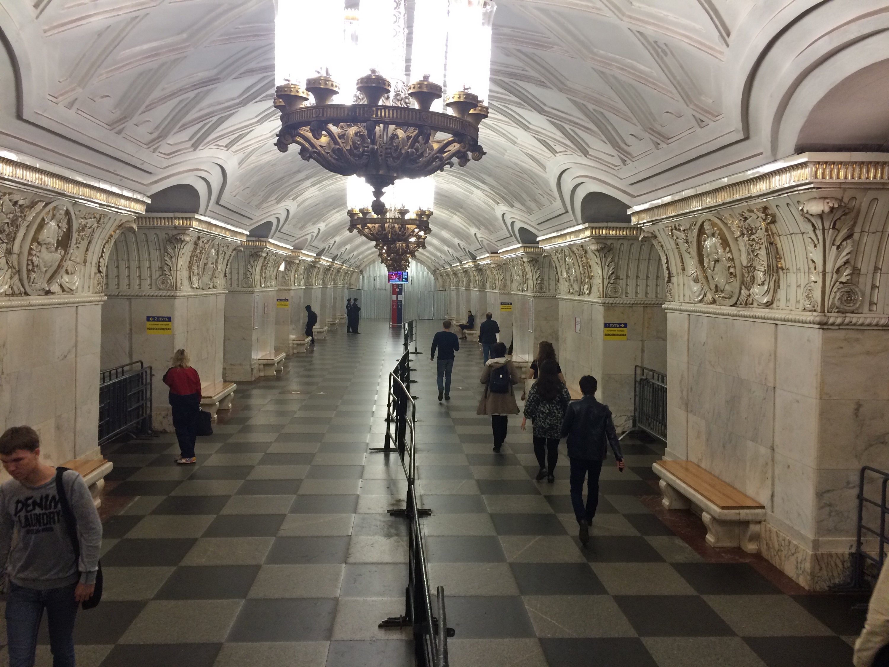
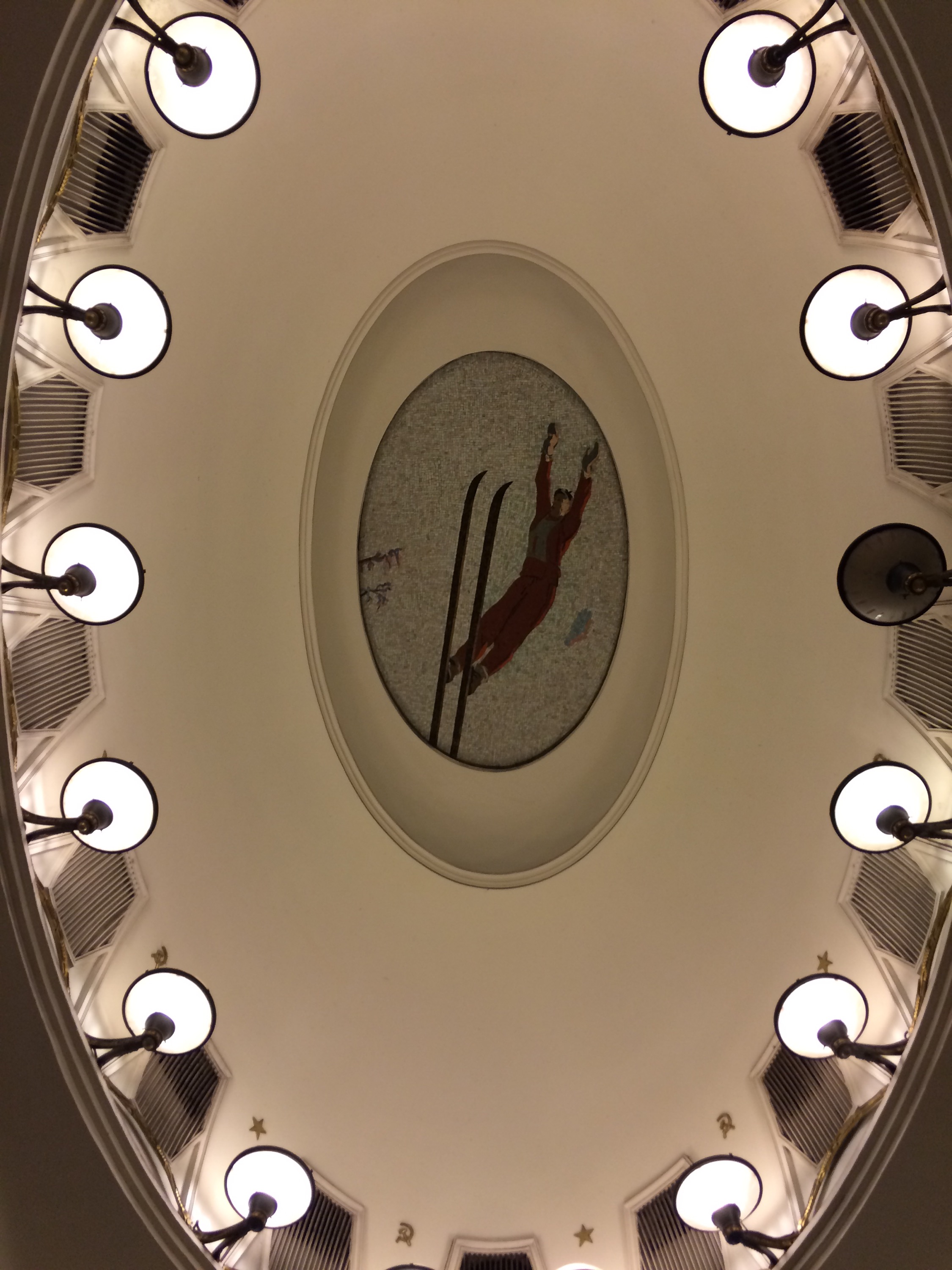
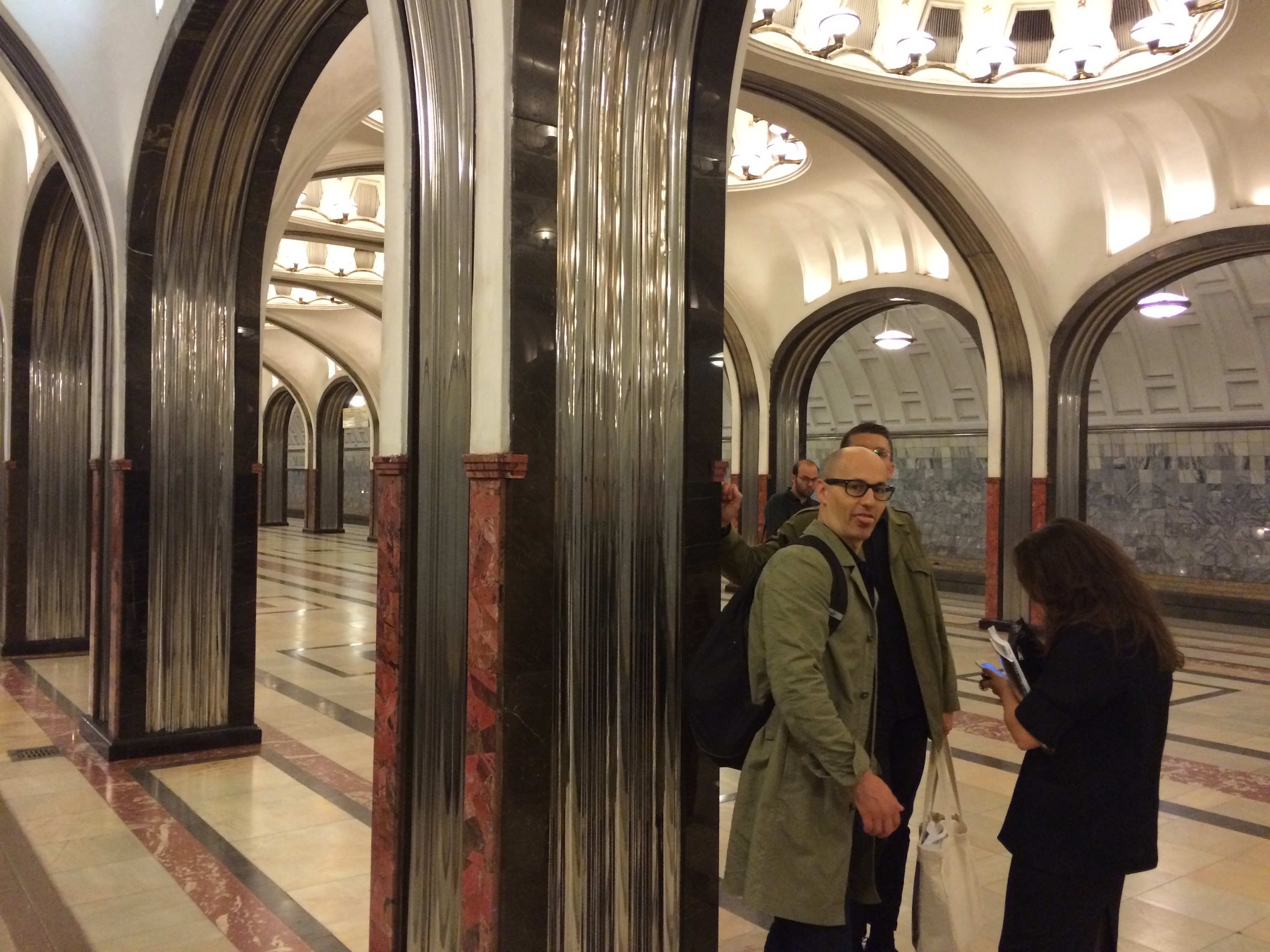
Speaking of the subway — oh the subway!! The subway is magnificent! It is cheap (50 rubles, ca. €0,70, for a single ride, 30 for the bus), and the historic stations are the most beautiful palaces of public transport you have ever seen! The ladies took us on a late night tour one evening which is especially recommended since the stations then are almost empty. (Speaking of ladies — the Russian type design scene is mostly female.)

Krista Radoeva, Maria Doreuli, Ramiro Espinoza, Gayaneh Bagdasaryan, Anna Kulachek, and Olivier Hug and Samuel Bänziger rocking the subway
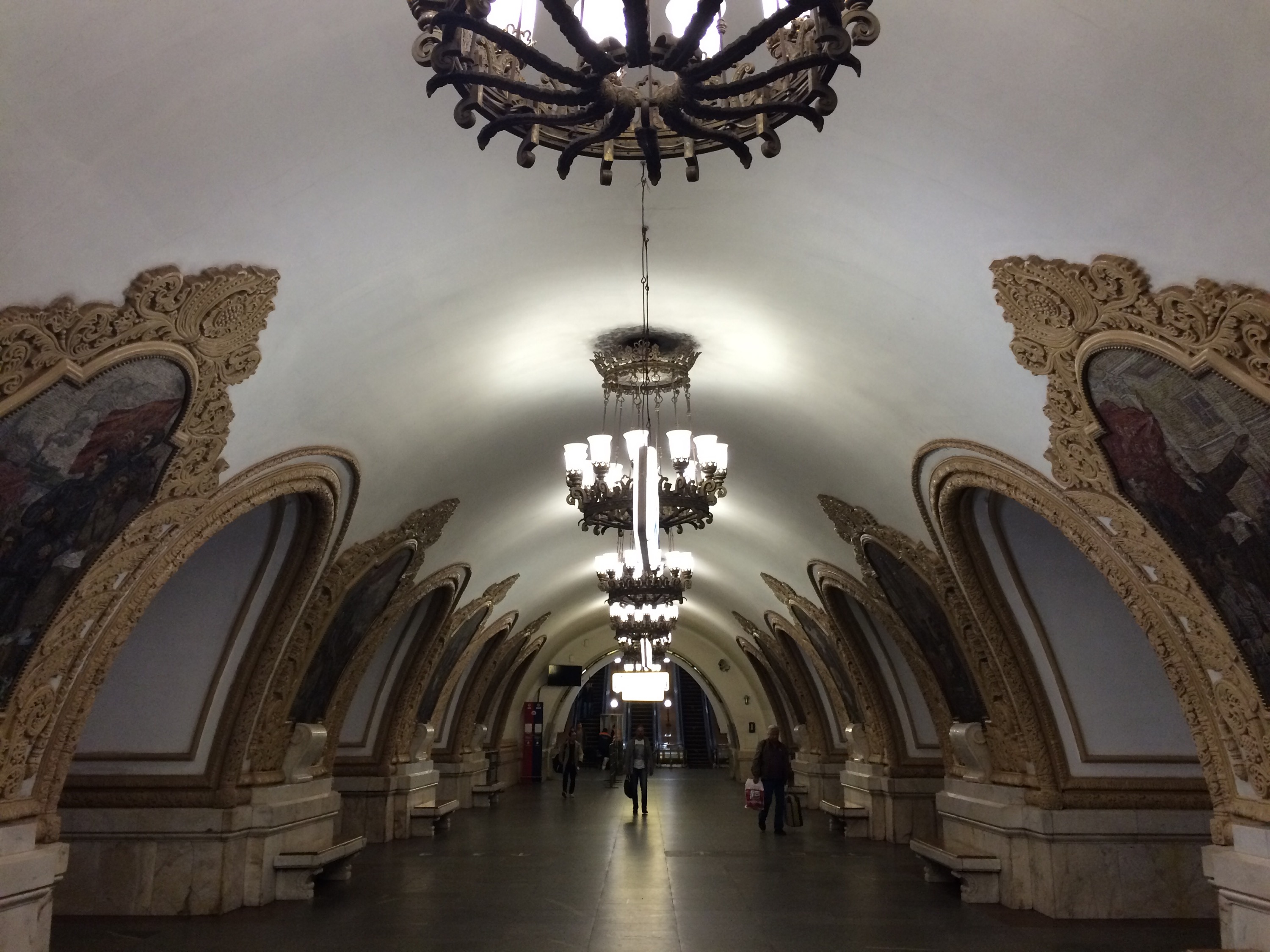
More subway photos here:
All in all, it was a most wonderful trip — city, people, weather, food, events, and Schrift wise. If it wasn’t so tedious to get a visa (oh I forgot to tell you about that one) I would be back in a heartbeat for an extended stay. You should all try to visit next year’s Serebro Nabora conference and check out the fantastic work these people do: Bownfox, Contrast Type Foundry, Paratype, CSTM Fonts and more. And now perhaps go here and look at the wonderful photos of Moscow letters Ramiro posted.
*
The title of this blog post was chosen for our German and Australian readers. It refers to the song of this name by the German Schlager band Dschinghis Khan which was released in 1980, the year of the Moscow Olympics. I had it stuck in my ears for the entire 4,5 days :/
I agree with Indra, Moscow is extraordinary and I would love to come back. I met very nice and interesting people at the Serebro Nabora Conference.
The main reason that led me to attend the conference was my interest in the Designing Cyrillic Workshop by Alexandra Korolkova and Gayaneh Bagdasaryan running after the event. So my stay was a full week traveling every day with the beautiful subway.
During the three days workshop I had the opportunity to learn a lot (really a lot) about the history, calligraphy (we practiced with point and broad nibs) and the forms of the Cyrillic letters. My work was greatly enriched by all the knowledge that these two type women gave to us. I was the only foreigner in the workshop so they gave a masterclass in Russian and English. I wish more Latin typeface designers are encouraged to attend this workshop, meet these two professional type designers and learn about designing Cyrillic in situ.
I agree with you both, I went to Moscow in 2006, together with my type ladies colleagues of Type and Media: Vera Evstafieva, Trine Rask and Circe Penning de Vries. And still, my memories are as fresh as if I have been there yesterday. Everything in Moscow is shocking and becomes an experience, and I’m not only talking about letters! The metro, the Kremlin churches, the river, uf I’d love to come back 🙂