Font licensing, webfonts and fair trade

A few weeks ago, I had to advise a design studio on licensing fonts. It is a common practice since different foundries and distributors handle licenses in many alternative ways. What may be complex for us, who work in the type industry, can become a nightmare for font users and design studios that acquire licenses for their clients. Some have made an effort in simplifying font licenses but webfonts is still a case worth discussing.

From all the types of use you can make of fonts, the web is probably the format where we find more differences, both in the licensing model and the pricing. Some articles offer information on the topic and compare the different licenses available. I was surprised to note there is little debate or discussion on this.

In terms of pricing, we can differentiate two main models for licensing webfonts, “pay as you go”—I call it a subscription to be less ambiguous— and “pay once”.

Before writing this article, I wanted to get a first impression of people’s positions so I did a quick poll. The question was simple and plain—with all the ethics implied in the word “unfair”—Do you think the annual subscription model for webfonts is unfair? I acknowledge I positioned myself when formulating the question, choosing the word “unfair” instead of “fair” and offering two affirmative options but only one for disagreement. The results of the voting are almost balanced, 41% think the subscription model for webfonts is fair—not “unfair”—and 59% agree this is an unfair model. A considerable percentage of people (32%) voted strongly on this, thinking the subscription model for webfonts is a scam. Needless to say, when I ask about “fairness”, I consider all the people involved in the trade (font distributor, font author, buyer, licensee and font user). It is impossible to think about fairness if not fair to everyone affected.

I will briefly describe the experience that made me especially reflect on this. A design studio wanted to license a webfont for a client. The budget for the project was limited, having a maximum amount for licensing fonts. They presented the proposal using trial fonts and calculated the license cost to fit the estimate. The project was approved. While buying the font licenses, they discovered the cost for the web was a recurring payment, tying the client to the distributor and exceeding the budget over time. They trusted the platform they often used for licensing fonts and they didn’t check in other places. While studying this case I could confirm the font was also available from other distributors and on the foundry site. If they were acquiring the web license in MyFonts, they had to commit to an annual payment (e.g. one font 37€). Meanwhile, the foundry site and other distributors offer the license as a one-payment purchase (e.g. one font 39$). The price is similar in both cases, which means the subscription model is never cheaper, not even in the unlikely case of using the font only for a few months. Would you consider this fair trade?

Many questions come to mind when reflecting on this. Why do licensees have to be dependent on a platform/company? What if the company goes bankrupt, is sold, or changes the subscription terms? Why make a periodic payment? Are the distributors guaranteeing and offering updates on the fonts or any extra services—besides hosting? If so, does the client need that? Also, some distributors include two options for webfonts licenses, “pay once” or “recurring payment”. In these cases, why is “one payment” so expensive compared to desktop fonts? I would be interested to know the math and reasoning behind this pricing model.

If you ask me, I would say webfont subscriptions are not fair, especially to the user. It makes them dependent on a particular company/platform and very often expend more money over time.
24 Hour Hangout for International Women’s Day 2023

Last year, we took a hiatus from our ridiculously complicated and sleep-depriving idea of a 24 Hour Hangout on International Women’s Day. The concept was first crafted in 2019, before endless video calls with friends around the world was as normal as shoving a medieval torture stick up your nose and wiggling it around for 15 seconds. This year, we’ve decided to once again (dis)organize our 24 Hour Hangout on Wednesday, March 8. And, we hope you’ll join us.

>>>Link to the live Hangout<<<<
Note: This year we’re using Jitsi.

Here’s how it works:

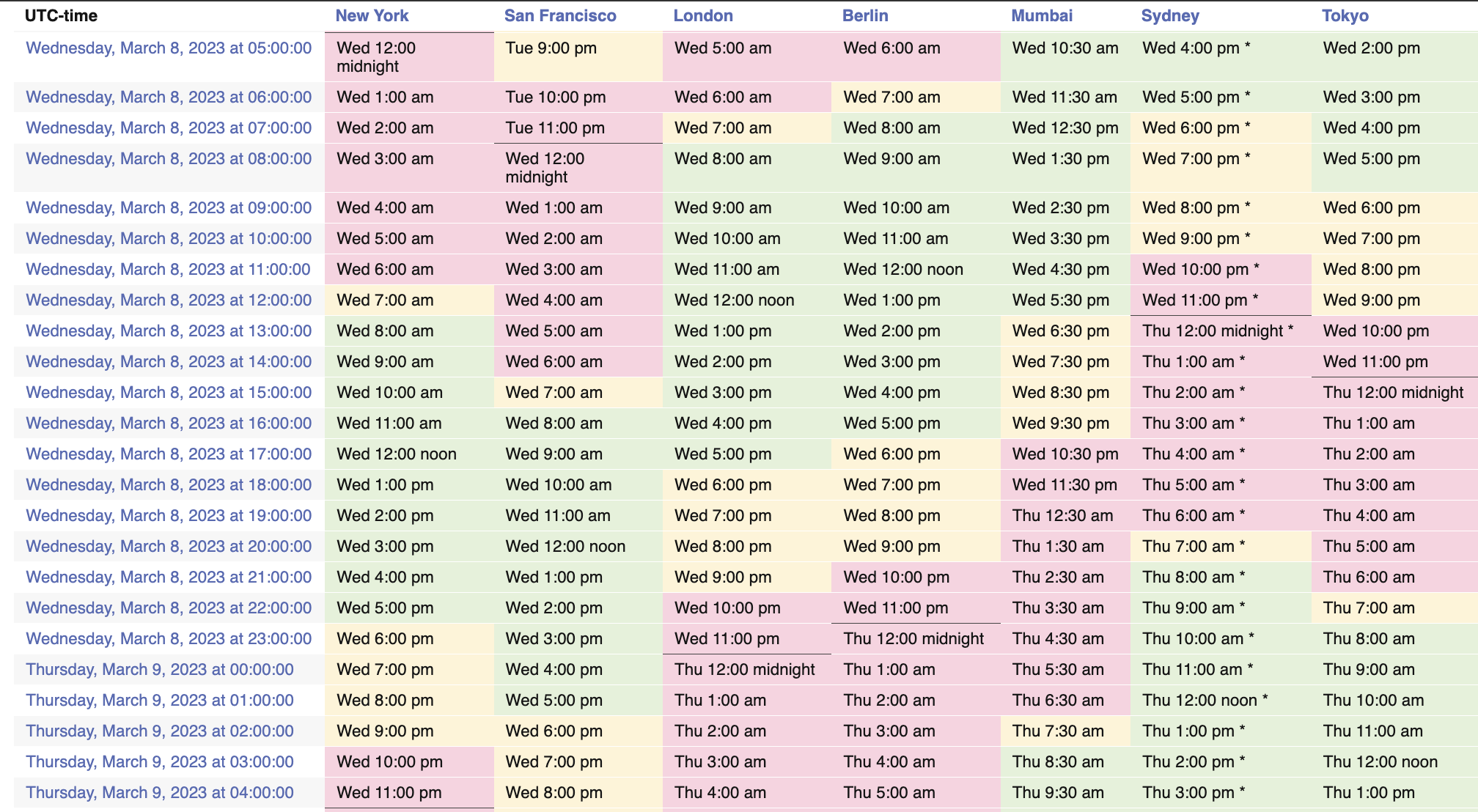
From March 8, 2023 at 12:00am ET / 05:00 UTC to 11:59pm ET / 04:59 UTC 3/9, stop by for conversations on type, design, the universe, what’s in that dreaded ‘desktop’ folder on our desktop, whatever! Everyone is welcome. Some times may be more spontaneous and chatty, other hours might be filled with activities and presentations.

Look! A Handy Timezone Chart!
timezone converter table

Some fun plans throughout the day (times in ET):
00:00: Amy kicks it off with a bedtime story
02:00: Liron and her daughter, a budding 7 year old lettering artist, talk about learning to write
03:00: Typewriter chat with María and friends
09:00: Boom shares what she’s up to in Bangkok and Luang Prabang, Laos this month
10:00: Ro and friends discuss the recent anticonferences and events they just organized
11:00: La Hora Spanish with Caro and friends
12:00: La Segunda Hora Spanish with Laura, María, Elena and amigas
14:00: Alanna and Sophia on live streaming type design
15:00: Ro and friends will make posters in preparation for the Women’s Day march
16:00: Bianca and Tânia show books and chat
17:00: Luisa’s Advice hour! Unqualified advice about life, typography and everything else.
18:00: Teresa hosts type conference social hour. Yes, there is a TypeCon this year.
21:00: Lisa on AI generators + letters + typography + low-res impressions of language

and more! Surprises! Fun! Chats!

Who can attend:

You! All are welcome* to stop by when you can and leave when you need. Video is possible but just audio is fine, too. Or, just help the chat stay aflame. Keep an eye on this post and the socials for any updates and help us spread the word! INTERNATIONAL WOMEN’S DAY = FUN.

* Participants must follow our code of conduct.

WOMEN = FUN

Ezhishin, Una Invitación A La Reflexión

To read this post in English, keep scrolling or go here.

El pasado 11-12 de noviembre el evento EZHISHIN, nos permitió descubrir los desafíos y triunfos que implican diseñar tipografía para lenguas indígenas, el proceso de revivir un idioma o incluso cuestionar el impacto del colonialismo en el diseño y la percepción que tenemos sobre nuestra realidad. Cada presentación es única y generará debates que invitarán a la reflexión, desafiando la sabiduría convencional e inspirando nuevas ideas. Desde el 1 de febrero y gracias al patrocinio de Google, los videos están disponibles para que todos los vean en línea. Te invito a que te prepares para ampliar tu comprensión del poder del diseño y el papel que desempeña en la configuración de nuestro mundo.

Continue reading

Not your average type conference: Typefobia, this weekend Feb 4–5

A few weeks ago, I found the most wonderful surprise in my in-box: a 15-page PDF outlining what appeared to be a kind of alternative typographic universe: an “anti-conference about the ‘culture’ of letter design”. It’s Typefobia, happening this weekend, February 4 and 5, online and in Puebla, México.

a blue sky with white puffy clouds with yellow text "Hiiii!" in Comic Sans

This is not your average type conference and Typefobia organizers, Romina and Karly, answered some questions about how this weekend intends to challenge industry / academic expectations and reimagine what a design conference can be.

Continue reading