
This is the last part of the series, “What does a feminist graphic design history in the United States look like? Read Part 3 here, Part 2 here and Part 1 here.
Because the assumption of universal and pseudo-neutral design is ultimately blind to nuances, visual alternatives emerged from countercultures. During the second wave feminism movement in particular, feminist design aimed to engage and connect in an experimental, interdisciplinary, participatory, non-hierarchical and non-authoritarian way, which broke the principles of the existing male value-constructs of “good” design. It is exciting to think of how design could be more egalitarian by discovering these alternative universes with those who were left out of design history.
Modern Typography
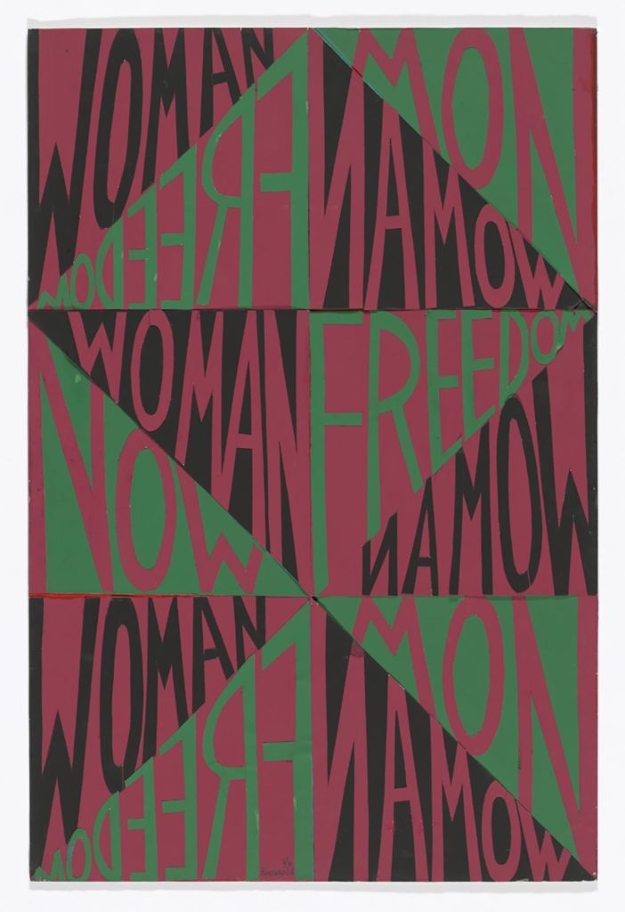
Faith Ringgold, Woman Freedom Now, 1971, Accessed March 21, 2020: https://www.moma.org/collection/works/202866
Although coming much later than the modernists, yet during corporate Modernism, this cut-and-pasted colored paper on board by Faith Ringgold explores and reinterprets key visual cues from that movement to serve feminism within the context of black activism in the USA. (1) Indeed, the color scheme signifies “solidarity with Black Power and text that salutes the women’s movement. The poster adopts the form of a Bakuba chevron derived from Kongo textile design. Its configuration is effected by the joining of a series of red, black and green paper triangles, within which its three words are etched forward, backward and in reverse.” (2) The triangular hand-lettered sans serif typography implies loud voices, reminding us of the iconic 1924 Aleksandr Rodchenko’s poster with Lilia Brik. The bowl of the R and low crossbars feel very similar to A. M. Cassandre’s art deco typography. The geometry and asymmetry of this piece brings a continuous dynamism, as if Woman Freedom Now was a shouted ad infinitum. That is, “Ringgold’s interpretation of op art is effective: it transfixes one’s gaze on its kaleidoscope of ever-changing planes. Its typographic nature on the other hand makes for a straightforward, readable, and literal billboard.”(3) Woman Freedom Now was one of a series of Faith Ringgold’s activists posters, a designed work “which writer and activist Amiri Baraka has christened a “modern classic” [for being] one of the first works of graphic design to endorse feminism” in Black culture. (4)
International Style
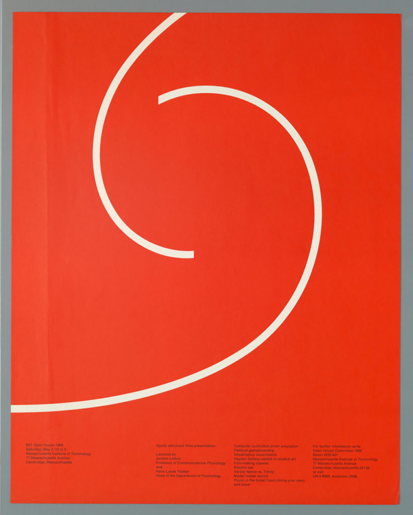
Jacqueline Casey, MIT Open House, 1969, Accessed March 21, 2020: https://www.cooperhewitt.org/2016/03/20/a-mystery-is-a-possibility/#_ftnref2
This poster, designed by Jacqueline Casey, advertises an open house on the campus of MIT following the International Style through grids and geometry. It is simple yet enigmatic and falsely neutral with its undeniable expressivity. As the designer admits: “my job is to stop anyone I can with an arresting or puzzling image, and entice the viewer to read the message in small type and above all to attend the exhibition.” (5) Her poster has a clear sense of rhythm and direction using contrast of scale and size with the white central curved lines breaking the multicolumn grid, adding even more movement. These lines are an object of mystery. According to Nomiyama, “there might be no right answer to the question about what the two white curved lines represent. One might think that the two lines are about to encounter one another and mingle, which alludes to the concept of an open campus event in general. Others might think that the image of the two curved lines is a close-up of a larger image, which can be read as a metaphor for the comprehensiveness of the event. The mystery becomes a possibility for imagination and interpretation, perhaps exactly the way Jacqueline Casey would have wanted.” (6) I personally see a 69, corresponding to the year when the MIT Open House occurred. The shape of this 69 adds an architectural quality to the poster. The minimal color palette—red, black and white—characteristic of the modernists and Swiss design, create dynamism. If anything, this poster is intellectually engaging and designed for an informed audience. Indeed, as Elizabeth Resnick frames it: “Casey’s work for its academic community engaged the intellect of her audience by its ability to identify and reveal the ‘essence’ of each subject in a profound yet human form.” (7) Plus, her witty contribution to Swiss style as a whole alters the un-inclusive design movement, notoriously a men-only movement.
Protest Design
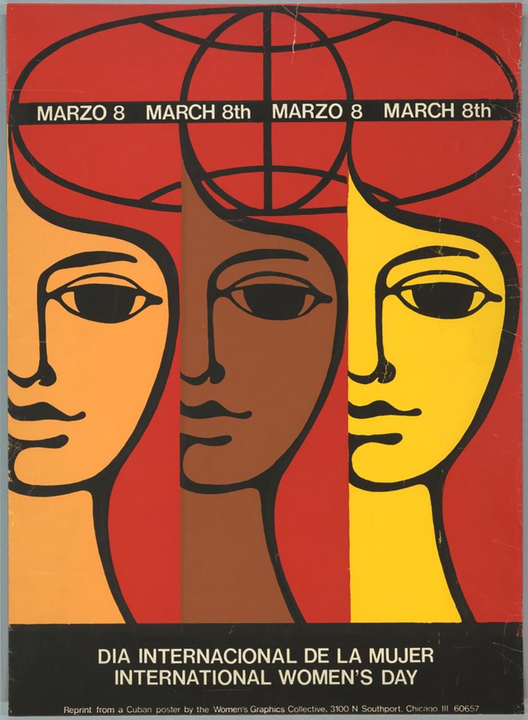
Women’s Graphics Collective, Dia Internacional de la Mujer, ca. 1980, Accessed March 21, 2020: https://www.cooperhewitt.org/2017/03/08/internationalwomensday/
The Chicago Women’s Graphics Collective, created in 1970 as “a creative group that brought together women designers and activists to produce art that advanced the goals of the women’s movement,” co-designed this multi-script screen-printed activist poster between members to celebrate International Women’s Day. (8) Both in Spanish and English, the 28 3/16 × 20 3/8 inches poster communicates aspects related to inclusivity and union as it aims to reach multiple audiences. In addition, “the elliptical form above the women resembles a global map, suggesting that each figure might belong to a different region of the world.” (9) The wavy women, themselves, printed with three different hues of earth tones, act as a simplified and symbolic reference of the multiplicity of identities in the United States. Indeed, the poster is a metaphor of diversity rather than an accurate representation of diversity.
Graphically, the women’s illustration has a psychedelic, naive quality that resembles Cuban protest posters. The poster credits the Collective’s borrowed aesthetic from Cuban design at the very bottom. “Since members were already printing collective images, they were open to printing designs that originated elsewhere, [promoting a feminist democratic design], using the profits from sales to support their operational costs and to showcase the wide range of the women’s movement and feminist design.” (10) The limited color palette and geometry add a modernist flavor of simplicity. The use of (what seems to be) Helvetica works as a common choice of that time as well, communicating information with the intention to be done in a clear, straightforward and effective way. Like Barbara Kruger and her use of Futura, these typefaces had a widespread popularity in the United States despite their controversial oppressive overuse in various contexts. Ellen Lupton refers to Savan’s belief that Helvetica had a “social role in cleaning up corporate images;” however, I believe the typeface is another product of capitalism. (11) I personally think using Helvetica is a strategic mistake from a typographical point of view, as it decreases the power of this work in truly communicating diversity, yet I salute the collective process of this feminist effort for the International Women’s Day in Chicago.
What will be your contribution in completing a more inclusive history of design?
(1) MoMa; “Faith Ringgold. Woman Freedom Now,” The Museum of Modern Art. https://www.moma.org/collection/works/202866
(2) Morley, Madeleine. “How Feminist Movements Co-opt Graphic Design to Express Themselves. Plus: when we archive political posters, do they lose their impact, or gain historical importance?” Eye on Design. September 19, 2017. https://eyeondesign.aiga.org/how-feminist-movements-co-opt-graphic-design-to-express-themselves/
(3) Morley, Madeleine. “How Feminist Movements Co-opt Graphic Design to Express Themselves. Plus: when we archive political posters, do they lose their impact, or gain historical importance?”
(4) Ibid.
(5) Nomiyama, Sakura, “A Mystery is a Possibility,” The Cooper Hewitt Museum. March 20, 2016, https://www.cooperhewitt.org/2016/03/20/a-mystery-is-a-possibility/#_ftnref2
(6) Nomiyama, Sakura, “A Mystery is a Possibility.”
(7) Ibid.
(8) Pastor, Julie, “International Women’s Day,” The Cooper Hewitt Museum. March 8, 2017. https://www.cooperhewitt.org/2017/03/08/internationalwomensday/
(9) Pastor, Julie, “International Women’s Day.”
(10) Ibid
(11) Lupton, Ellen, “Documentary “Helvetica” Traces The History of Typography,” Metropolis. June 1, 2007. https://www.metropolismag.com/design/documentary-helvetica-traces-history-typography/