Lost and found
(and lost again)

Exploring the first multi-style Hebrew typeface family

Lost
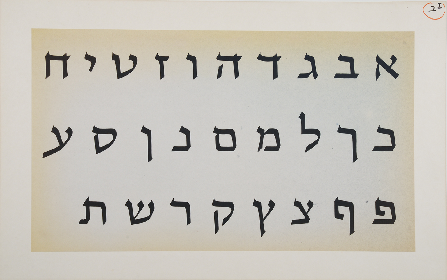
Hebrew was the language of the Israelite and Judean people for over 1,300 years when around 200 BCE, it died as an everyday language and was confined to religious use.1 This affected the Hebrew script heavily, since it only developed those attributes that were necessary to present specific religious texts. Therefore, Hebrew is lacking the typographic tools that would have evolved and developed from an ongoing secular use. Moreover, the Hebrew script was considered sacred. The scribes that were permitted to write manuscripts were concerned with preserving the letterform appearance, even at the expense of the ease and speed in which they could be read.2
Hebrew was reintroduced as a spoken language in the 1880s. Since then, it experienced an accelerated process of revival. The shift from the written form to movable type was a hastened and interrupted one and did not allow for refinement and distillation of the letterforms.

Setting type in the Hebrew script was and still is a frustrating experience. Not only there is a shortage in typefaces which sufficiently address specific Hebrew script issues, but the few that are available mostly consist of a single regular style, accompanied by a small number of weight variations. So, what is a Hebrew typesetter to do when trying to create differentiation within a text? I remember how pleased I was when I found a book published in 1905 in Minsk. In it I spotted one spread that seemed tailor-made to answer my question. The typesetter used different typefaces, different sizes, increased letter spacing and underlining. These were amongst the popular typographic solutions throughout the 20th century.


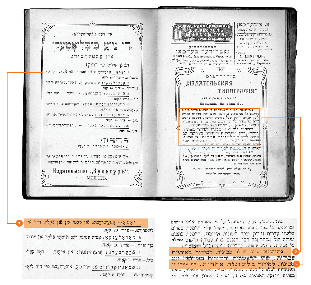
A spread from the book printed in 1905 in Minsk showing the various ways to handle word differentiation and emphasis without a typeface family: 1. Underlining a word. 2. A different typeface, in a different size. 3. Increased letter spacing.

Continue reading

Greetings from Haifa

How is it possible that it’s August again??? This summer, we wanted you to travel with us (for free!) around the world and enjoy some typographic curiosities we have around us (check out this map by Indra). Those posts will be scattered throughout the month, marked with a passport stamp on the first image for quicker spotting. This is a perfect excuse for a tomato juice! Here we go:

Scripts don’t live in a void. They live together, interlaced, in Israel’s urban environment: Hebrew, Arabic and English. Each script is affected by surrounding scripts, which in turn influences them back, a symbiotic relationship. Examining trilingual signage in Haifa provides an opportunity to discover meaning among the different alphabets; an additional benefit is that it is a good excuse to show some of what surrounds me in my hometown.

haifa10

Continue reading

My 2¢: Two Typefaces, Vanished

I do promise there is more than one influential Hebrew type designer, but after a long research process, my mind is filled with stories that were covered in boxes until now.
I am referring to Henri Friedlaender. Last time, I wrote about his design process, and today I wanted to share two typefaces that were simultaneously designed by him for the Bank of Israel in the 70’s: One serif style to be used for banknotes and one (semi-) sans, for coins. Those two were supposed to act as a family, and indeed, Friedlaender based them both on similar skeletal forms.

the banknotes typeface

the banknotes typeface

Continue reading

Liron Loves Henri’s Type Strips

Henri Friedlaender designed the legendary Hadassah Hebrew typeface. While doing extensive research for an exhibition that included his work, I was lucky to get a glimpse of his design process. Until the revealing of his personal archive (donated to the Israel Museum), his design process was only known through an article he wrote with few rather “clean” images of sketches. In the museum’s basement, wearing cotton gloves, we were taking out item by item from large drawers. The Hadassah material was intriguing. So much was said about this typeface, so much guessing on the design process was done. And here we are, seeing traces of Friedlaender’s own way of designing.

hadassah3

From Friedlaener’s archive. Photo by Eli Pozner, the Israel Museum. This refers for all images in this post

Continue reading