Dyana Loves Garbage

Finding the divine in the details—what others overlook—is not so much an amusing pastime, but a constant state of being. When out on a hike, I often stop to question a seemingly meaningless feature. What species of moss is this? Why does this look like a witch’s hat? Who lives in this hole? The answers can be fascinating.

Living in a city, one might find charming little doodads in the gutter and under hedges as well. The metal numbers and letters on telephone polls—what’s the deal with those? In the same week, I found two that had liberated themselves somehow. For years, I’ve been accumulating these letters, or odd bits that look like letters. Some as possible solutions for future typeface projects, others just for the sake of the collection.

Continue reading

Elena Loves Pigeons

Declaring my love for pigeons is not an easy task. It was not easy to accept it in the first place. But one day I looked back I realised that my friends were right, I have a thing for pigeons. And this thing has a name: Peristerophilia. (With the exception of labeorphilia – love of beer bottle labels, I believe this loveletter-philia to be unique in having a name, whether that is something good or not, well, I really can’t say).

Was this love for pigeons triggered by my grandfather’s love for pigeon keeping? Back in the 60s my grandfather, Bibiano, used to breed pigeons in the attic and participate in competitions that consisted in, basically, many good looking male pigeons (at least if you are a female-pigeon) trying to conquer the female pigeon in dispute, and of course, bring her back. Cachorro, my grandfather’s palomo, was a winner, irresistible for all pigeon-ladies and Bibiano’s reason to be proud.

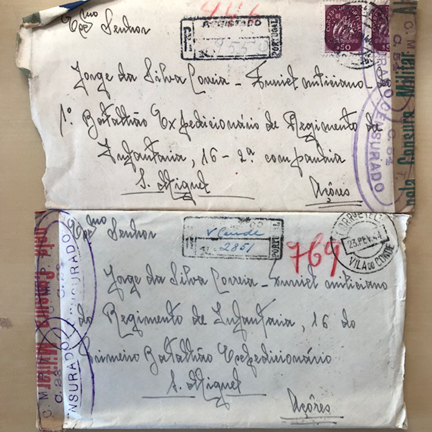
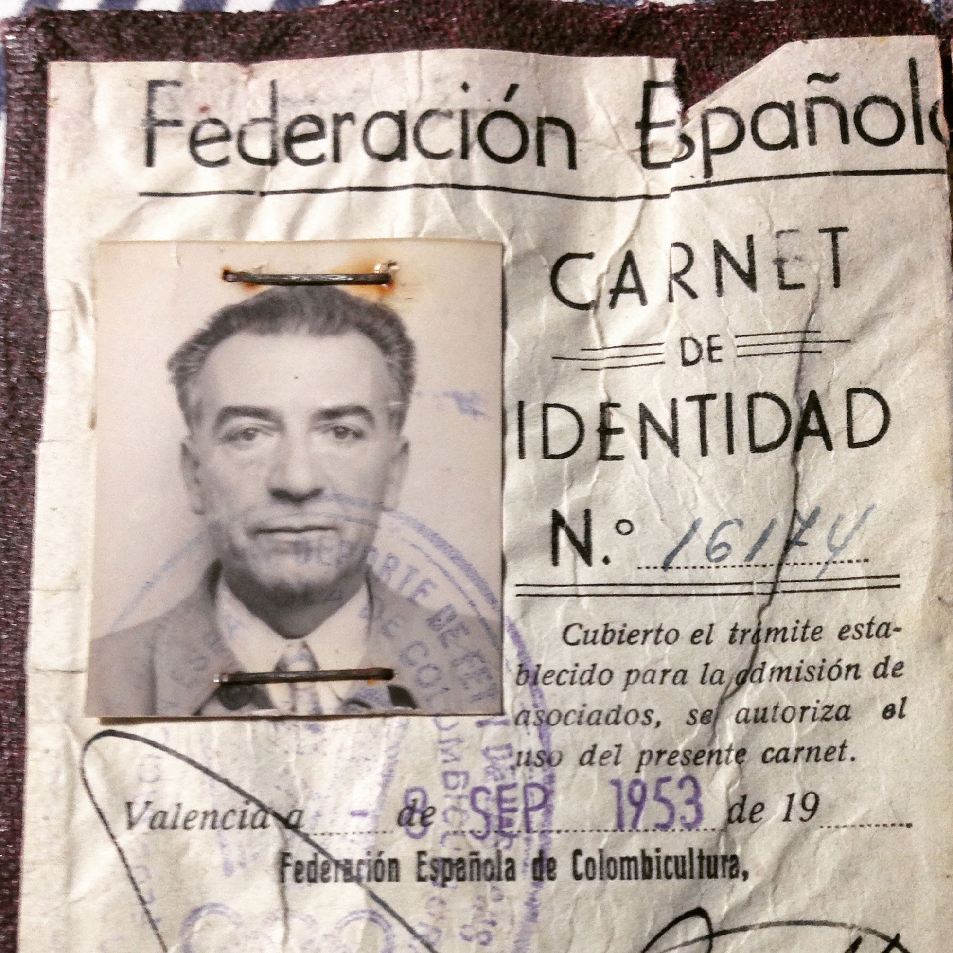
In my mother’s family archive, an old box full of old pictures, ephemera and other artefacts, there is still a copy of Bibiano’s membership card of the Spanish federation of pigeon keeping (Federación Española de Colombicultura).*

Bibiano

Continue reading

Luisa Loves (Erm… Kind Of) Rio’s Old Acrylic Signs

A hardware store in Copacabana.

A hardware store in Copacabana.

Love is a strong word, but I’ll admit I have a fondness for them. In truth, I grew up in Rio and I can’t say I ever paid much attention to this kind of acrylic signs. Now, having lived in London for almost a decade, whenever I visit I stay with family in an upper-class neighbourhood where they hardly exist. A few days ago I went to the grittier neighbourhood of Copacabana and had an almost Proustian experience as I found myself surrounded by these old signs; with their cheap plastic appearance and soft edges, they formed the typographic landscape of my childhood. Although I can’t say they are exactly beautiful, I suddenly found them oddly charming. They were the letterforms of local popular commerce in 1980s Rio, the letterforms of hardware stores, florists, barbers and fishmongers, cheap-looking and anonymous, often considered ugly and vulgar. Today they are slowly disappearing, and the city doesn’t mourn the loss.

I decided to write my love letter to them, in spite of all the mixed feelings about their aesthetic value, and tried to find out more. I daydreamed about finding an old factory with stacks of old acrylic letters in different styles, dusty and forgotten…

Continue reading

Lynne Loves Vintage Tins

As the renowned Louise Fili has said, “everything looks better on a tin”. Amongst all the little advertising items I collect, little tins are probably one of my favorites. It seems that nearly everything was packaged in these sturdy little boxes at one point, from laxatives to typewriter ribbons.

Advertising Tins

From the left: laxative, moth-deterrent, and two typewriter ribbons

Continue reading

Liron Loves Henri’s Type Strips

Henri Friedlaender designed the legendary Hadassah Hebrew typeface. While doing extensive research for an exhibition that included his work, I was lucky to get a glimpse of his design process. Until the revealing of his personal archive (donated to the Israel Museum), his design process was only known through an article he wrote with few rather “clean” images of sketches. In the museum’s basement, wearing cotton gloves, we were taking out item by item from large drawers. The Hadassah material was intriguing. So much was said about this typeface, so much guessing on the design process was done. And here we are, seeing traces of Friedlaender’s own way of designing.

hadassah3

From Friedlaener’s archive. Photo by Eli Pozner, the Israel Museum. This refers for all images in this post

Continue reading