Book Review: Natural Enemies of Books: A Messy History of Women in Printing and Typography

I pre-ordered Natural Enemies of Books: A Messy History of Women in Printing and Typography immediately when I stumbled upon on the ‘forthcoming titles’ page of publisher Occasional Papers’s website. I knew the the title was a reference to an essay in a book designed and printed by a number of women in 1937—Bookmaking on the Distaff Side. I had recently learned about it in my own research and had only just succeeded in getting my hands on a copy from the edition of 100 after many dead ends. Thank you, interlibrary loan, and thank you, UC Berkeley!

Bookmaking on the Distaff Side was a unique piece of collective work in which women printers were invited by a committee to submit signatures they’d printed to be bound into an edition, which contributor, Kathleen Walkup, refers to as a pot-luck format. This means each submission is printed on unique paper, with varied colors, type, and illustration styles. It’s diminutive size and deckled edges with unique papers (and colors) make it such a treat to hold and leaf through. Content focuses generally on printing and typography, whether it be type theory, history of women and printing, or humorous piss-takes about the famous typographic men of that era. Perhaps my own greatest surprise in reading the book was the shade thrown at male printers and typographers. Though it is often tempered with some clarifying diplomatic statement, it’s clear the women who put this volume together had opinions and knew humor was a clever way to couch their critical opinions.
Continue reading

Multiscriptual Typesetting

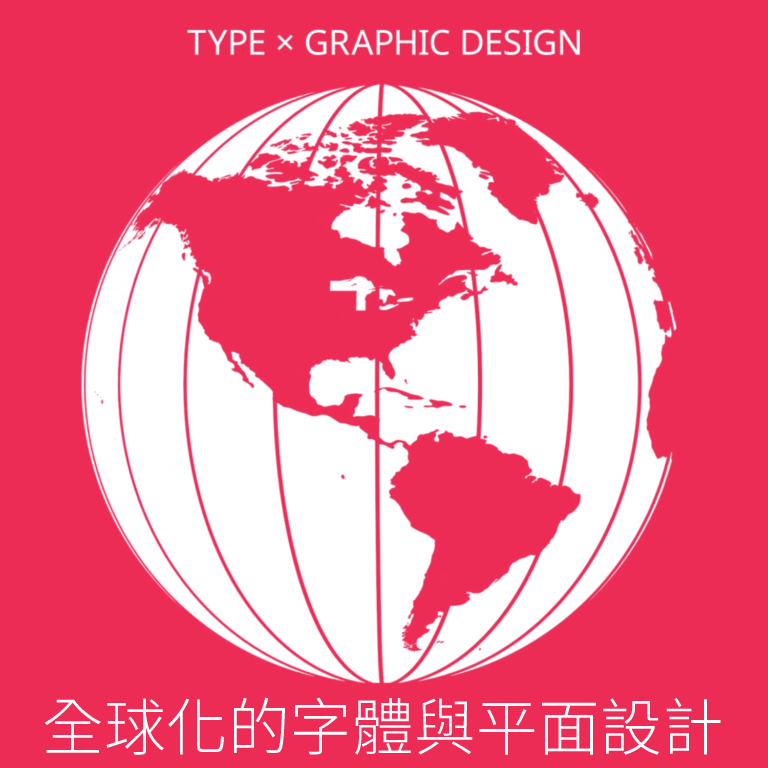
image of globe showing north and south america


Last month I had the honor of creating the graphics for Designing without Borders, a three-part lecture series hosted by AIGA NY and the TDC. The design process was a collaboration between myself and the event organizers; Caspar Lam, Juan Villanueva, and Lynne Yun, which led to an ambitious undertaking of designing with a dozen languages. This experience was equally rewarding as it was challenging. It inspired me to continue pushing my understanding of typography by going beyond what is linguistically familiar. 

Continue reading

Remember December: Reflections on Arabic literature, calligraphy and type

I have always had a fascination for Arabic literature; I say this not as a native speaker but as a Lebanese francophone who studied in an American university. The multilingual education system in Lebanon gave us the privilege of reading literature classics in three different languages. But Arabic has always had its unique aura, enchanting me with its subtle grammar and with how the interplay of short and long vowels, along with other rhetorical elements, can overhaul its semantics and enrich its rhythm.

This literary enchantment has indirectly played a significant role in my life by drawing me into calligraphy when I was a design student. I used to keep a notebook in which I collected quotes that piqued my interest. The words I had once noted down started taking different shapes in my calligraphy copybook. The desire to bring these eloquent words to life, through beautifully entangled strokes, fueled my discipline and commitment towards doing–and sometimes overdoing—my homework. Only then was the euphoria of reading matched, if not surpassed, by that of writing.

Continue reading