Yesterday was a good day for type releases designed or co-designed by women, so here’s a quick double showcase to commemorate the event.
Project: Corsair
Designer: Ksenya Samarskaya
Foundry: Rosetta Type
Team Members: Azamat Kodzoev, Micha Strukov, James Todd (Drawing); Mathieu Réguer (Post-production)
Published: 2018
Link: Corsair
Project: Conductor
Designers: Tobias Frere-Jones and Nina Stössinger
Foundry: Frere-Jones Type
Team Members: Fred Shallcrass
Published: 2018
Link: Conductor
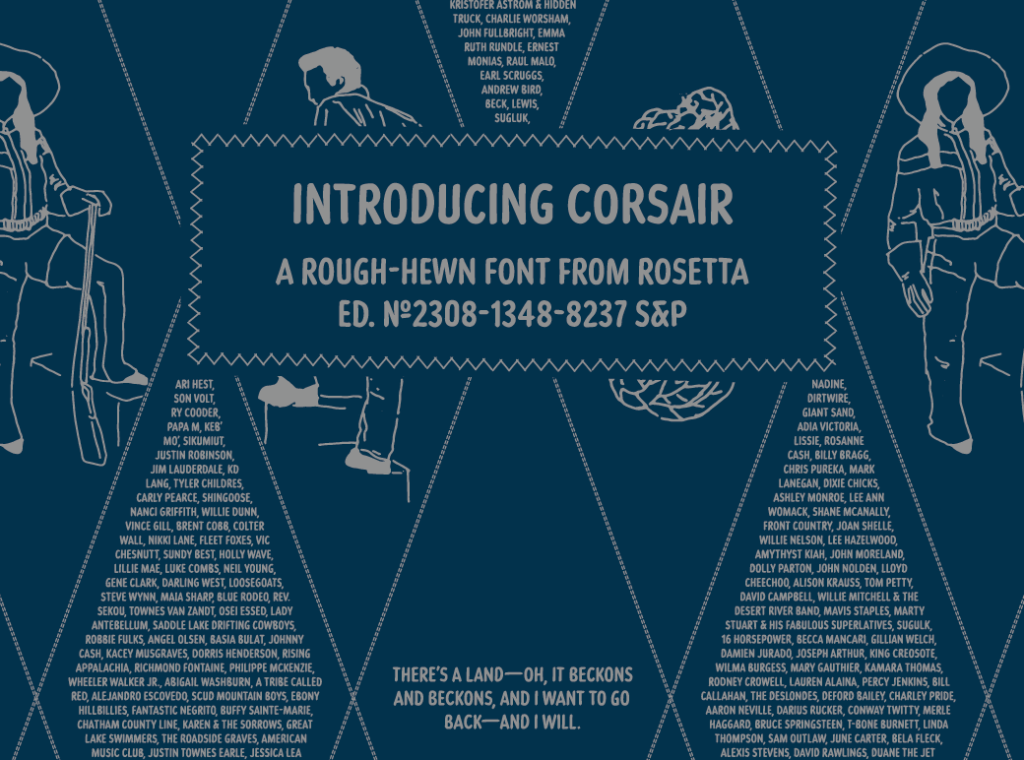
Corsair, designed by Ksenya Samarskaya and released by Rosetta Type, is a condensed all-caps sans-serif in handwritten style, as if written with a sharpie. The original commission came from Best Made Co., and the letterforms are inspired by the lettering on a collection of leaflets intended to help discern WWII fighter aircraft. Available in Latin, Cyrillic and Greek, it has a great texture in short paragraphs, with warm irregularity in the letterforms and really satisfying uniform texture — like looking at the notes of that one friend you have with mesmerizing handwriting*.
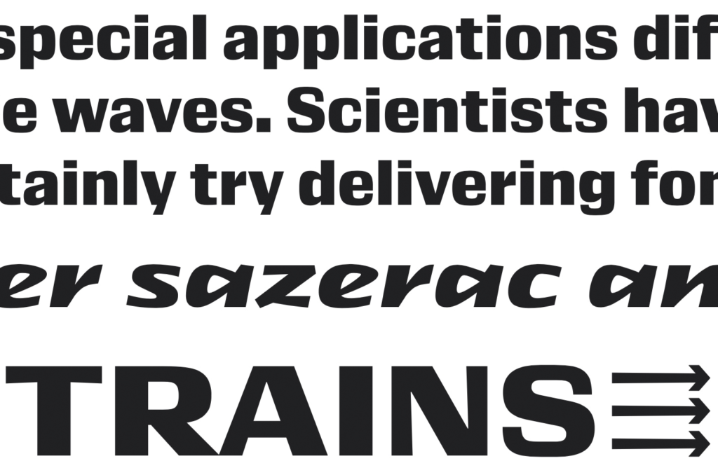
The other release we saw yesterday is Conductor, designed by Tobias Frere-Jones and Nina Stössinger, with contributions by Fred Shallcrass, and released by Frere-Jones. It’s a display family where the romans have a distinctive retro feel, while the italics look really fresh and dynamic — I have a soft spot for lowercase zs, and this italic z looks so great I want a poster of it for my wall. The roman shapes were based on Bulgarian lottery tickets, which only seems random until you take a quick look at the ephemera eye-candy shown in this article by Helen Rosner on the Frere-Jones blog. The article also includes fascinating insights into the design of the italics and their relationship to the roman counterparts.
I really look forward to seeing these two releases in use!
*As a random side comment, for me that was Spike Spondike, who designed Blenny — I used to love looking at her notes when we worked together.

