Evolved from the Brahmi script, Devanagari is used to write Marathi, Hindi, Sanskrit, and Nepali, and remains an important Indic script used in South Asia and beyond. Its technological advances have been slow, and design advances are just starting to pick up. South Asia, and specifically India, has a multilingual cultural landscape, and it is not uncommon for street signs, periodicals, newspapers, and other printed ephemera to typically use two to three languages—English and a regional language or two, or two to three regional languages together. While Indian street signs have long featured beautifully painted, built, or set Devanagari signs, often integrating Latin numbers or words seamlessly, translating this to digital typesetting has not been an equally easy task, owing to the differences in setting the two scripts, the difference in anatomy and reading of the scripts, and the limited availability of Devanagari fonts as compared to Latin. There are also knowledge gaps in multilingual typesetting where a script is often forced to follow Latin typesetting principles. This write-up aims to develop a guide for effectively setting Devanagari alongside Latin type, while honoring the nuances of both scripts.
Continue readingProcess behind Dukat: shaping letters and ideas side by side
First ideas for the project emerged in the autumn of 2024. At the time, I was doing an internship at a French type design studio. Surrounded by the rich beauty of Paris and looking at typefaces every day, I felt an increasing urge to start working on a new typeface.
Typeface brief can take shape through different processes. In my case, I knew from the beginning that I wanted to work on something experimental, a project that would create a dialogue between historical letterforms and contemporary approaches.
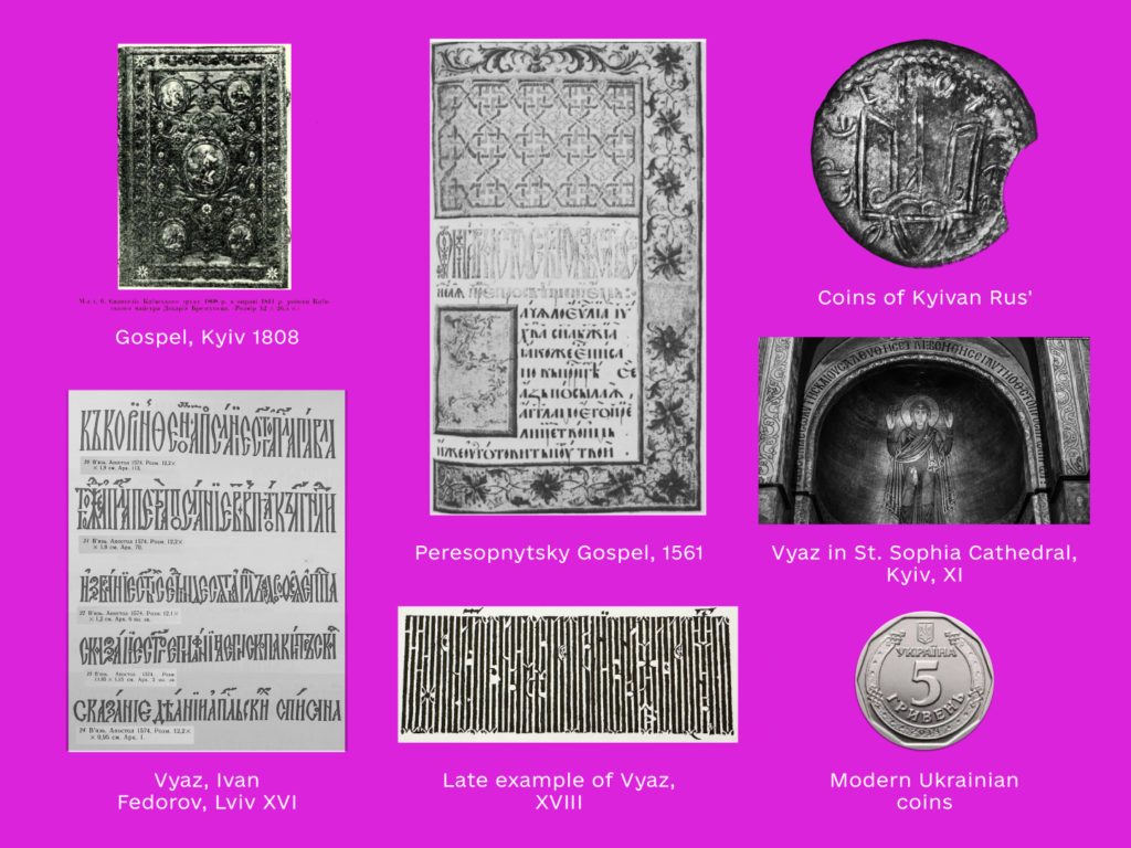
More specifically, I wanted to explore Vyaz, an ornamental writing style derived from Byzantine culture that played a significant role in the history of Ukrainian writing. In terms of character, I was drawn to something sharp, carved, chiseled.
24-Hour Hang *In*: March 8, 2026
Since 2019, Alphabettes has spent nearly every International Women’s Day doing what it does best: hastily dis-organizing a 24-hour online hangout across timezones and continents with a loose schedule that anyone on the internet was welcome to join. We’d take a virtual type walk around Mumbai with Tanya. We’d join Romina and friends in Mexico City for an 8M March with handlettered signs from her community poster-making workshops. We’d hear cool conference stories from Theresa in San Francisco. We’d chit chat in Spanish for an hour with Laura and Dafne and Caro. We’d say hi to pets and babies and make breakfast, lunch, and dinner together, all at once. In 2026? Instead of hanging out, some of us decided we’re hanging in. Or maybe, hanging on. We’re still here, but for now, it’s ok to hang up the internet for the day or hang out in other ways.
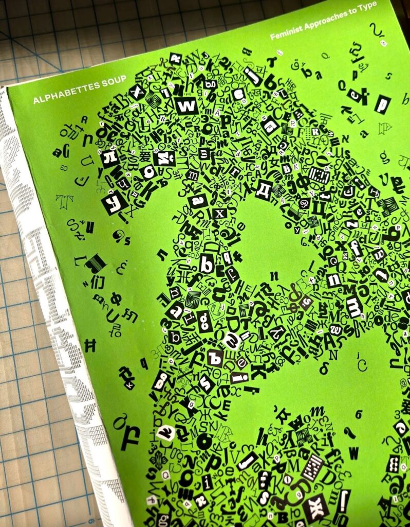
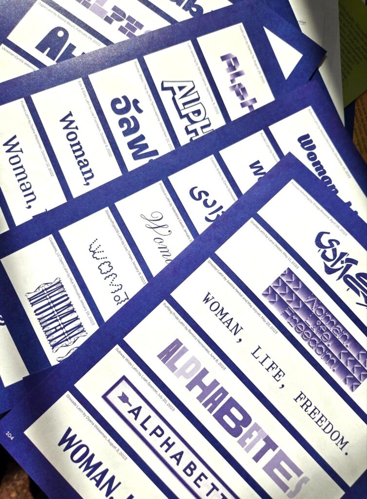
This International Women’s Day, I’ll be helping to bring a very hot soup to simmer. After two years of non-stop planning, writing, editing, organizing, emailing, type pairing, proofreading, and spreadsheeting, Alphabettes Soup: Feminist Approaches to Type, heads off to the printer very (very!) soon, after every tiny error has been uncovered in these 400 beautiful pages (🤞). Hang tight!

Tiny Grotesk: bridging 500 years of type design
Tiny Grotesk is a tiny superfamily. In a market where sans-serif families quickly grow to contain dozens of styles, sometimes over a hundred, Tiny Grotesk is an antidote, a proposal to do more with less. It covers as much ground as possible, across only twenty-four carefully selected styles.
Tiny Grotesk is in its regular width a clean, friendly neogrotesk with relaxed capitals and a round, even-keeled lowercase. The two accompanying widths, Narrow and Wide, expand it into a complex typographic toolkit. The Narrow styles, space-saving and optimised for small use, are ideal for footnotes, asides and UI elements. The Wide styles, imposing and optimised for large use, demand space, and will take that space no matter what. This pairing makes the family versatile and broadly usable while remaining as compact as possible.
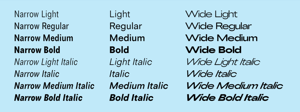
Tiny Grotesk has been in development since 2019, slowly but steadily expanding in scope but not really in size. It has been used in a few print projects, on some vinyl records, and for a complex digital catalogue before its release in 2024 and expansion in 2026.
Bridging some 500 years of typographic ideas
The initial idea for the family started in a perhaps weird place: 1500s italic calligraphy and movable typefaces based on it. In these early days, the lowercase was a cursive italic. The capitals, however, were upright forms. Since the capital letters in these texts occurred relatively rarely – an average of something like once every forty characters – their presence clearly wasn’t disruptive to readers. Not disruptive enough to feel the need to draw italic capitals, which would require a whole new set of sorts to be drawn, cut and cast. I can’t blame them for wanting to be efficient.
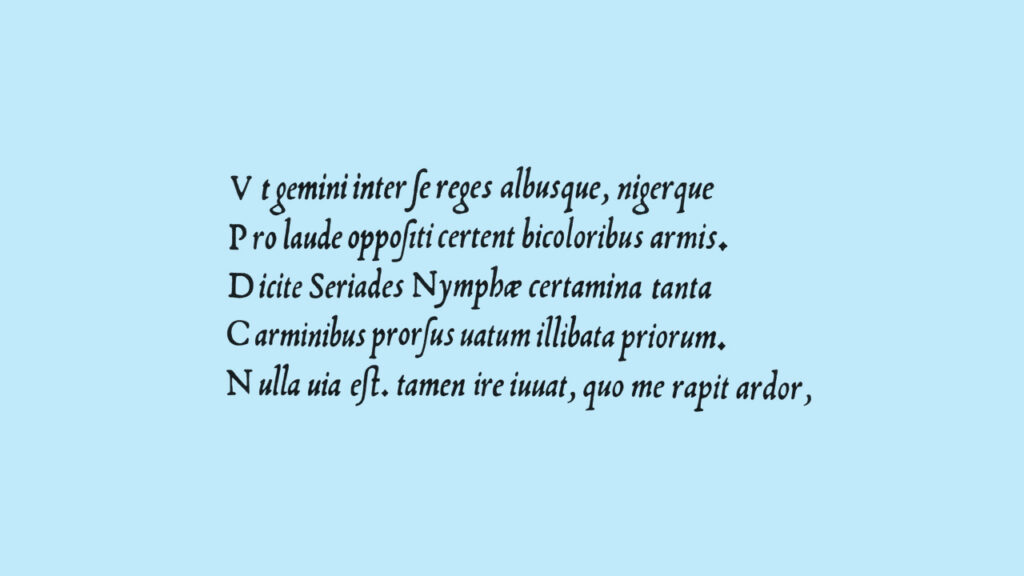
The italics by Ludovico Arrighi were the original inspiration for Tiny Grotesk, in a direct but not entirely obvious way. The proportions were taken from his second italic, and I wanted to explore them in depth. Would the typographic rhythm work in a sans-serif jacket, even with the strange width relationship between these capitals and lowercase letters?
Continue reading