I am a fan of Oh, the Places You’ll Go! by Dr. Seuss. It is a children’s book laden with metaphors for adults and one that comes to my mind every time I finish something. Or start something, since when we finish, we also begin. This year, I started working at Morisawa’s first U.S.-based design office, which Cyrus Highsmith aptly named the Providence Drawing Office. (We are in Providence, Rhode Island, and we draw.) And again, I thought of Dr. Seuss.
You have brains in your head.
You have feet in your shoes.
You can steer yourself
any direction you choose.
You’re on your own. And you know what you know.
And YOU are the [girl] who’ll decide where to go.
I decided to go to Typeland with my brains and feet. And type has definitely taken me places this year. Lots of places.
NEW CITIES
In June, I returned to my favorite city, NYC, for Typographics again. But this year, type has flown me abroad, too—a short flight to Montréal for ATypI, and a long one across our biggest ocean to Japan and Taiwan, for work.
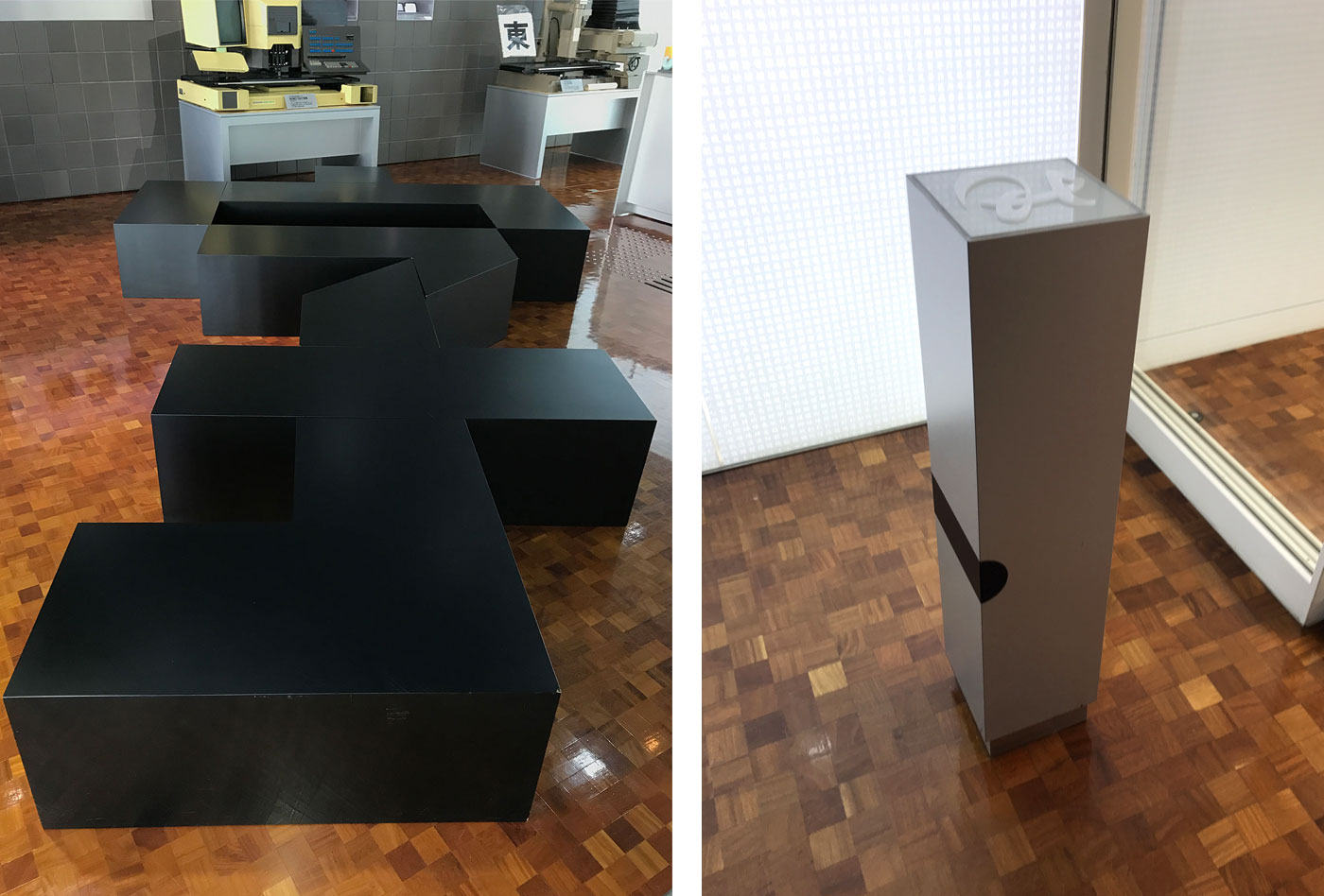
A bench in the shape of the Chinese character “zi,” which means “character/letter” (left), and the employee ID card scanner in the shape of a piece of metal type (right). Morisawa’s Osaka Headquarters.
Continue reading