As 2017 closes out, I, and I think many others, are reflecting on the weight of everything that has happened in the previous twelve months. It was a year raging with political and climate-inflicted disasters throughout; filled with frustration and feelings of hopelessness. Despite this (or perhaps because of this, as a means of avoidance or way to channel positive energy) it was also personally an incredibly productive year.
Professionally, I started leading a new team in Germany, taking on the responsibility for guiding the design direction for some of the best icon designers around. That, in addition to the brand team I was already leading, would have been enough to call this a good year. But outside of work, teaching Typography 1 at California College of the Arts was the most rewarding endeavor.
When the chair of the Graphic Design program, Rachel Berger, approached me in the spring of this year to teach in the fall, she encouraged talking to the other level one faculty to understand common themes and principles that would be taught alongside my class. These were important, of course, but “Above all,” she stressed, “is that the students should begin to fall in love with type.”
I taught a few years ago in the graphic design program, but the class was a Tools class, and while important, not nearly as close to my heart as Typography. I was excited about it for a number of reasons: getting to revisit the basic principles again, getting to have at a minimum of six dedicated hours to just talking about type each week, and having a place to share my love for type.
I don’t remember exactly when I fell in love with type, can’t point to a time in my first Typography class, or a specific book or exhibition that was the “Aha!” moment. There are experiences I look back on though, like happily sorting the random-bucket of loose lead type for 8 hours at a time at SF Center for the Book in 2004, where it is clear to me that my love for type was established.
I didn’t know of any good way to get students to fall in love with type, besides introducing them to fundamental ideas and sharing my own interests and knowledge along the way.
The class started by using broad-nib and pointed pen calligraphic tools to learn letterforms through stroke and rhythm, and understand the difference between expansion and translation types of contrast. It was important to me that the students understand how much our hands influenced early letterforms. Some students really enjoyed this process, while others found it incredibly challenging, not having good dexterity with a pen.
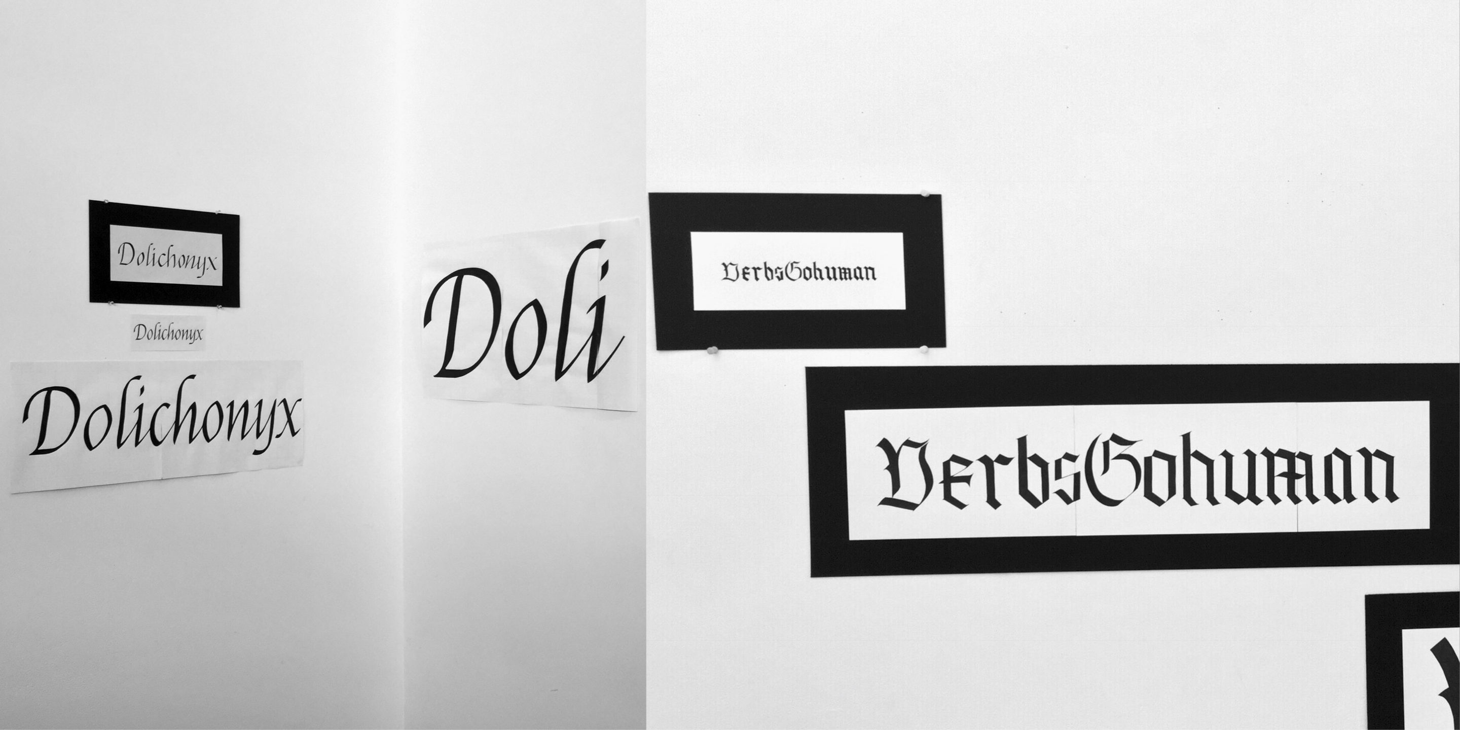
Project work by Jennifer Lam (left), and Alice Yufan Niu
From the focus on the stroke, we then moved on to looking at one or two characters and using them abstractly in compositions to express design principles like symmetry/asymmetry, rhythm, and scale. This exercise was to be completed using a xerox machine, and to my surprise when introducing the project, only one student had ever used a copy machine before.
It was interesting to see the challenges the students wrestled with. The unfamiliarity with the xerox proved to be a large hurdle for many. Encouraging students to look beyond the letterform was another challenge, pushing them to separate the letter from showing a word that might blatantly express the design principle, and look for a more sophisticated way to use the letterform. I also sensed that many were unhappy to be continuing to work with their hands, when their expectation of Typography was that it should be done on the computer.
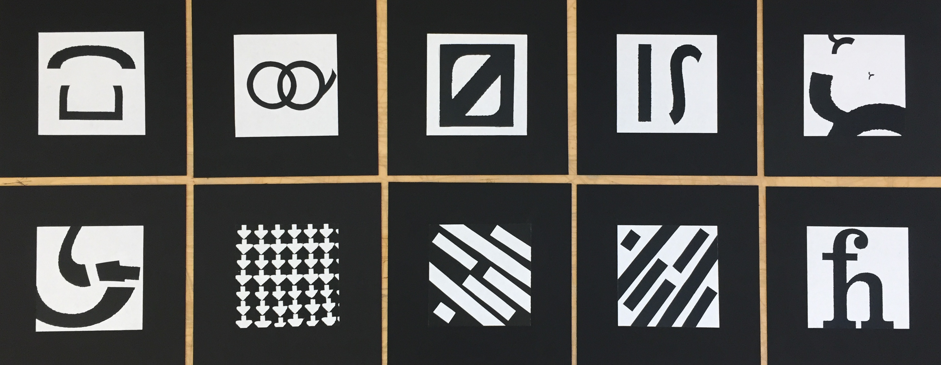
Project 2 work by Yenne McClellan
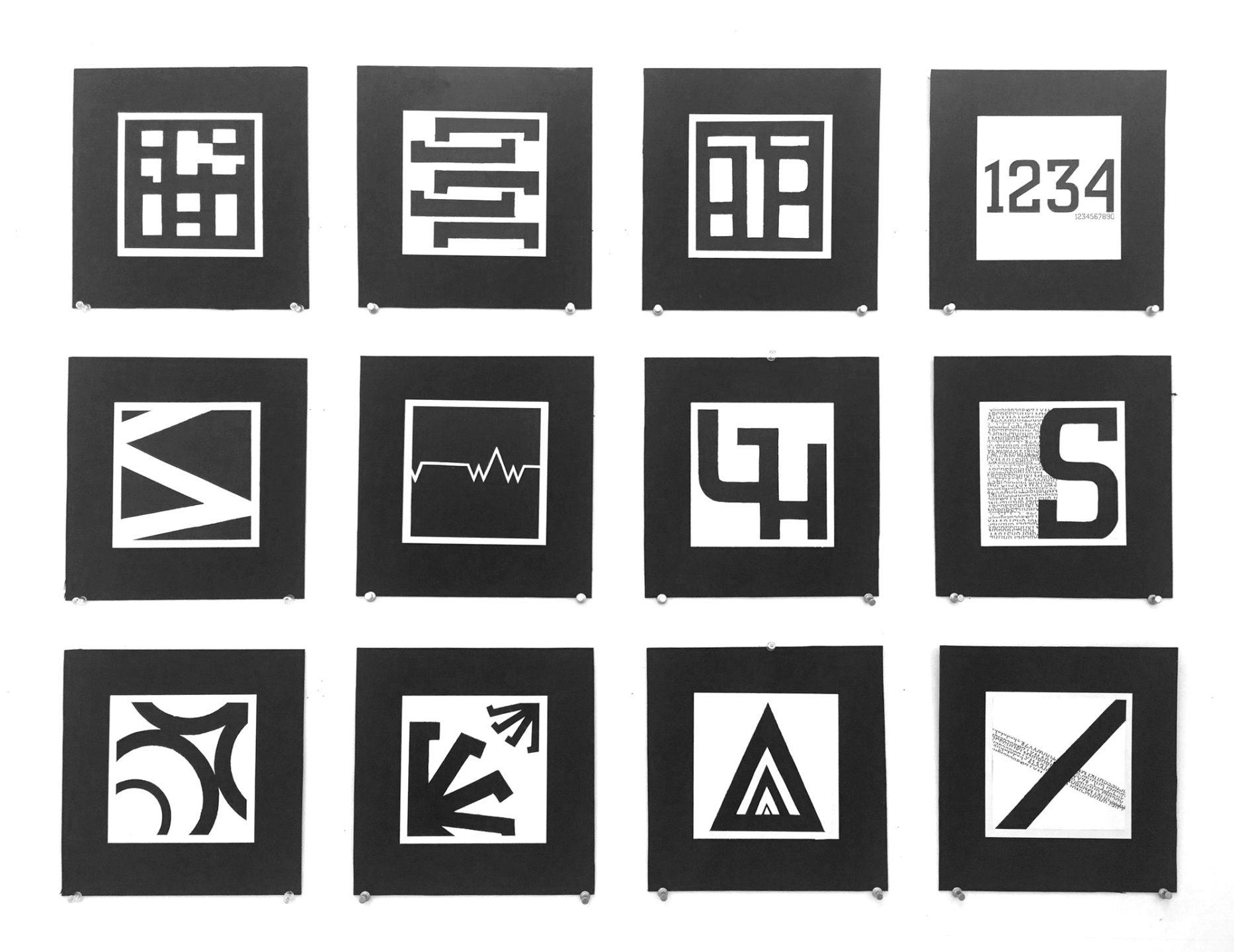
Project 2 work by Alice Yufan Niu
At this point in the semester all the classes have fully ramped up, and students are starting to show up to class bleary-eyed from lack of sleep and a little frantic that they are only half-way through the semester.
The third project in the semester turned out to be my favorite. From focusing on individual letters we zoomed out to look at words, and using them expressively in an image-like way. For this project, the students could choose one of five essays on graphic design to work with. Some of the essays were “Macrame of Resistance” by Lorraine Wild, “The Crystal Goblet,” by Beatrice Warde, and “The Underground Mainstream,” by Steven Heller was another.
They needed to read and understand the author’s meaning behind the essay, and then express their own understanding of it through a short phrase. This phrase needed to be constructed in a three-dimensional form or placed in an environment and photographed. This photograph would be their final poster with minimal photoshopping allowed.
I saw the students energy increase during this project. Although they were still being forced to work with their hands, I think the additional challenge of understanding the content, and be expressive with the image, invigorated the students. I pushed them to really synthesize their ideas down to a phrase and consider whether the typographic treatment was supporting that; it was exciting to see their investment in the project and the work evolve over the weeks.
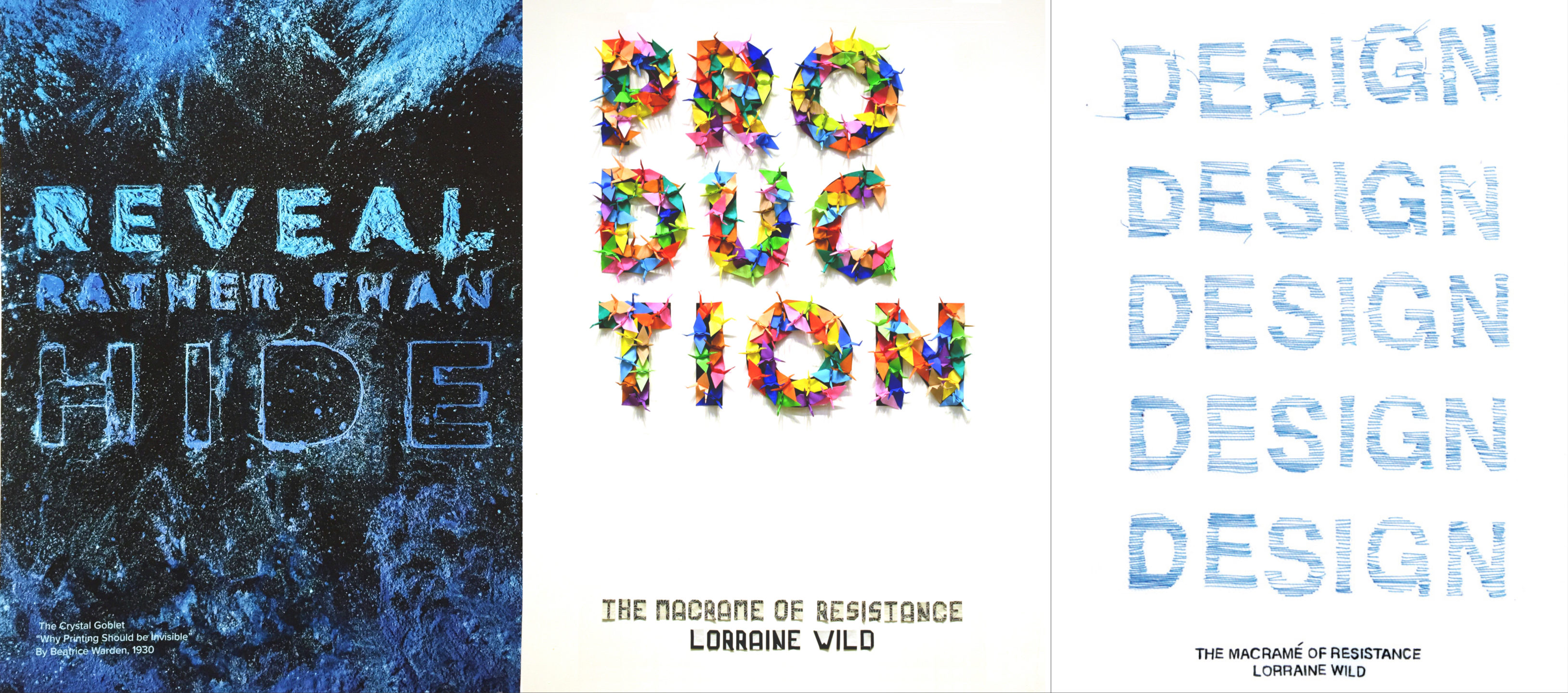
Project 3 work by Ileana Garry (left), Jennifer Lam (center), & Yenne McClellan (right)
For a change of pace, the last project was entirely digitally created. For this project, the students were required to typeset long-form text into a book format, and then translate this into the browser using similar styles across the two mediums. This was a whirlwind project taking us to the end of the year. While the students seemed relieved to be working in InDesign more, there was general apprehension about using html and css since not many students had experience editing code. Each connection made between forms was a small win, and it was great to see students becoming more uncomfortable with the unfamiliar.
No matter how much time it seems there is at during the firsts weeks, the semester always goes by in a whirlwind as both I and the students embark on a journey of learning and trying new things together. Design history is taught, some lessons work better than others, and I learn to explain principles in different ways. What is consistent throughout is encouragement for the students to try harder and iterate more, to look deeper and the typographic forms in front of them, and to find their own personal connection with type.