
An interview with Azucena del Carmen Cabezas León from the Carga Máxima studio at ATypI São Paulo, October 2015
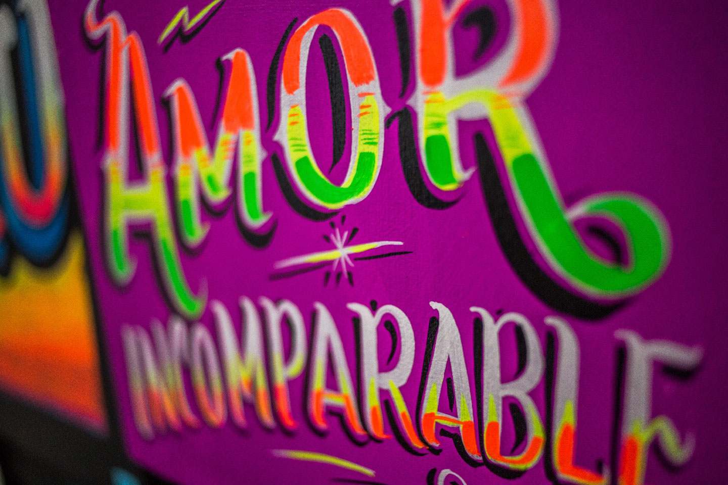
We interviewed Azucena León during the ATypI conference in São Paulo in October 2015, when the Alphabettes blog was barely in its first weeks of life. Azucena and her partner, Alinder Espada, had a stall in the conference market place, where she was composing and selling lettering posters. What immediately caught our attention was the bold, fluorescent and immediate hand lettering, with strong messages distilled from the Peruvian version of Cumbia, the popular music of Colombia. The messages combined references to music, ‘la novela’ (soap opera), but mostly, a sense of pure drama: tu castigo será verme feliz [your punishment will be seeing me happy], el buen amante nunca se enamora [the good lover never falls in love], no se gana pero se goza [you can’t win, but enjoy it anyway], está prohibido estar triste [sadness is not allowed], se sufre pero se aprende [you suffer but you learn] and so on. It was not easy to find a free slot during her busy day, as every ATypI attendee wanted one of her posters.
We chatted informally. Her speech is fast and vivid, a pure reflection of her work. Her Peruvian accent was so sweet to my Spanish ears, that sometimes I found myself mesmerised and lost in her accent and her local terms. Azucena also gesticulates unstoppably. Her hands follow and shape her speech, with sound and gestures becoming one. She explains letterforms with her hands which has been so hard to capture here in this interview text. The more we talked the more emotional she became about her work, as if she felt she alone was responsible for spreading the vernacular lettering tradition of Peru. We talked type, women, lettering, materials and, of course, ‘chicha’.
¡Hola! Can you introduce yourself?
My name is Azucena del Carmen Cabezas León, I am a designer and a signpainter, and I am from Lima, Perú.
Who is behind Carga Máxima?
Carga Máxima was founded by Alinder Espada — my boyfriend — and myself. He is a Fine Arts graduate, and I’m a graphic designer.
Where does the name Carga Máxima come from?
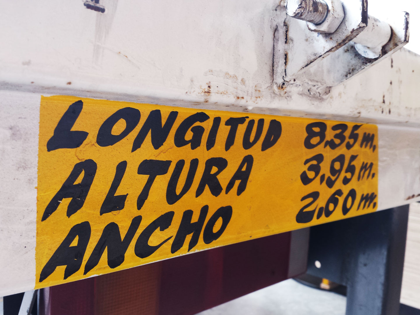
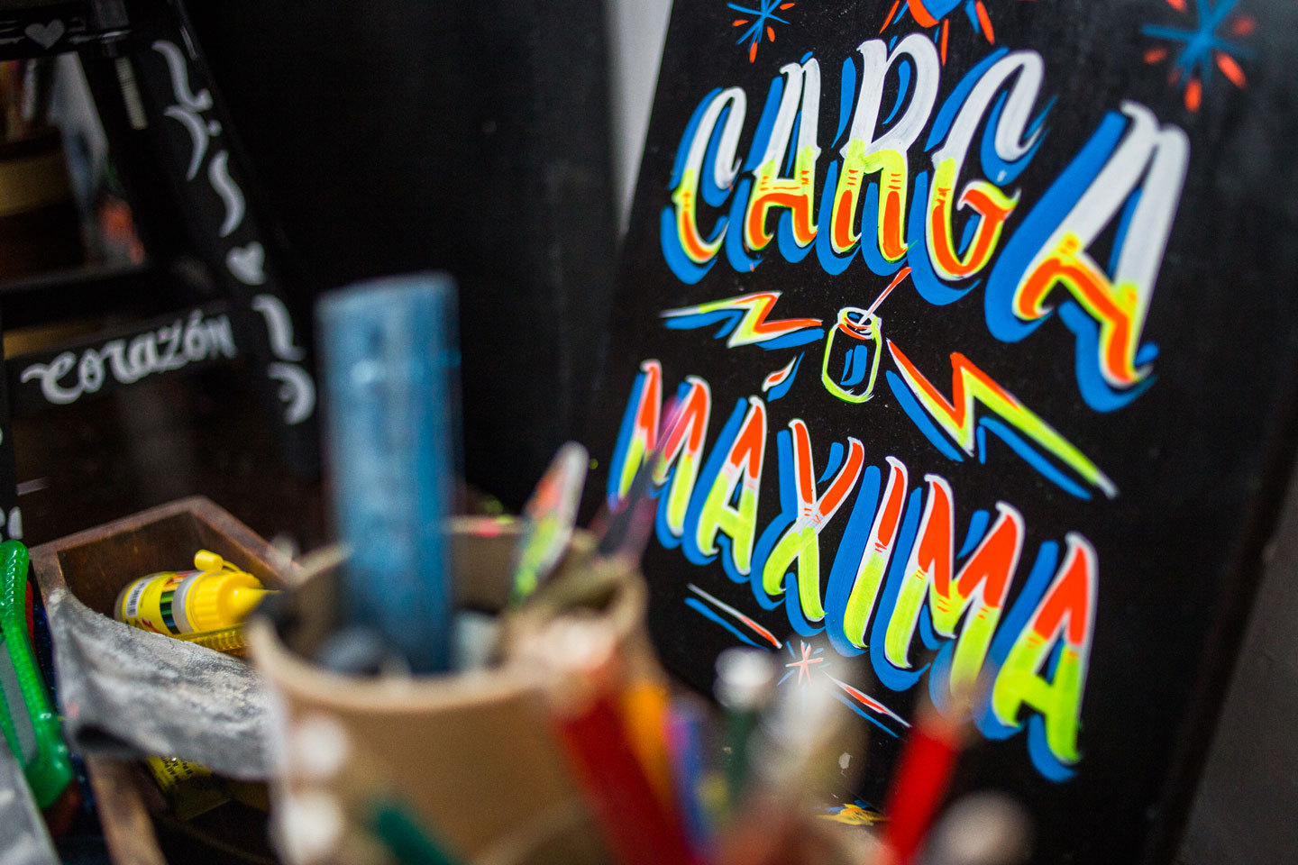
Carga Máxima (literally ‘maximum load’) is the name of the style of lettering from Perú seen in traditional hand-painted signs on the back of trucks. Carga Máxima can refer to the process of forming letters with a heavily loaded paintbrush. And Carga Máxima references transport, which, in a way, is the medium where our local graphic style is born. The truck signifies the immigration of people from the Andes (in my country) to the now very mixed capital city, which for a time was very important. Carga Máxima is also a workshop. It’s a studio located in Lima and the first of its genre because it’s a studio with permanent activity in lettering and local graphic styles.
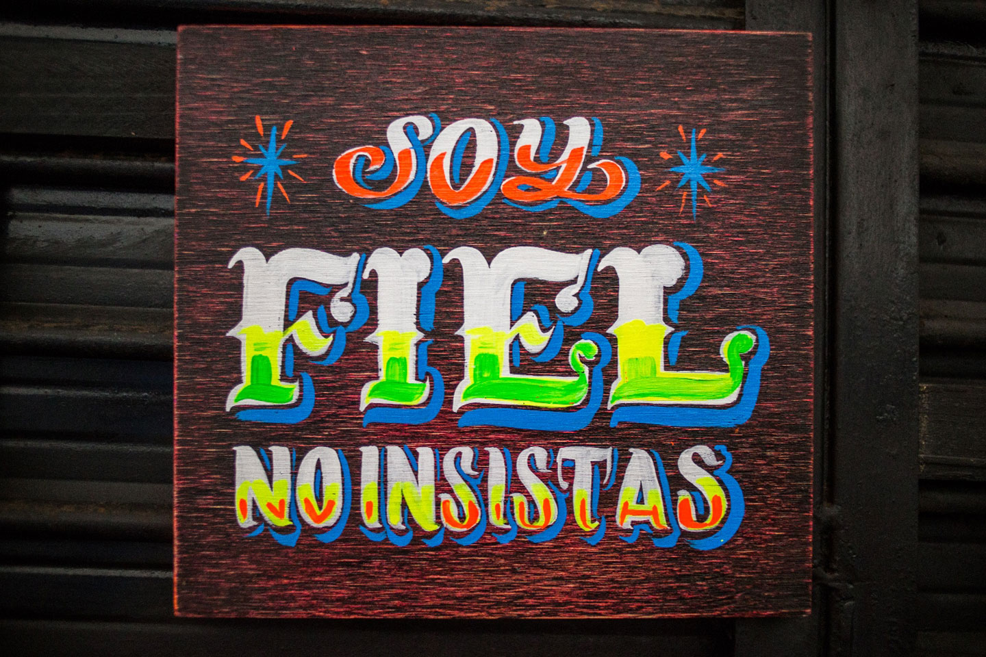
Carga Máxima’s work owes a profound debt to the vernacular styles of Lima and Peru, informally called ‘chicha’. This is a term associated with local music and food, and which, in some cases, can have a negative connotation. To change that and to empower the value of this popular art the work of Carga Máxima rescues the use of ‘chicha’ and the use of other vernacular forms that belong to the collective imagination.
‘Chicha’ means many things for Peruvians. ‘Chicha’ is a style of music, a Peruvian beverage, and the graphics for advertising musical events. More importantly, the term ‘chicha’ also has a lot of historical meaning: in the 90s, during the dictatorship of president Alberto Fujimori the information in the media was manipulated and falsified, a strategy used to distract the public from the extreme corruption of the government. This is when the ‘chicha’ newspapers, the ‘chicha’ parliaments, the ‘chicha’ transport were born, all as a reflection of the informality and delinquency of the time. From then on, the term represented everything that was ‘badly done’. ‘Chicha’ is also how the vernacular style is known in other countries, but Peruvians don’t like it. The term ‘chicha’ is a vulgar term. It’s as if you are saying our aesthetics are vulgar, as if what I do is criminal. My goal was to change that. That’s why I refer to our graphic style as being ‘urban vernacular graphics from Lima’, because there are other rural vernacular graphics from different parts of Peru – the Andes, rural Amazonia, urban Amazonia and other areas – which all have different styles. The problem is that people who come from a different context don’t realise this. They call everything ‘chicha’ and that is simply not true. The graphic artists that I have met and I have interviewed for my job do not think of themselves as ‘chicha artists’. They say ‘fluor colours’ but not ‘chicha colours’, and they name their letterforms and content with very personal, sometimes very general, names: carga máxima [maximum load], huesito [bones], partidas [broken], a golpe de pincel [brush stroke], rabo de pez [fish tail], zapatito [little shoe], letras trenzadas [knotted letters], decoradas [ornamented], monas [cute], manuscritas [handwritten], and many other names. I think it is too easy and unfair to call or impose a trendy term when the same authors don’t identify with that concept.
The main interest of Carga Máxima is to promote knowledge and research, so that in the future we will be able to study the diversity of street lettering in Lima: the letter as image, techniques, styles and colour. So I work spreading the culture of ‘chillante’ and ‘chicha’ style.
This means there is also an educational aspect to the Carga Máxima project.
Yes, teaching is what I love best. I teach classes because I want people in Lima, in my country, to feel good about what we’re doing. Our main goal is to teach and promote awareness of the importance of developing new graphic concepts, and to research to better understand our graphic history.
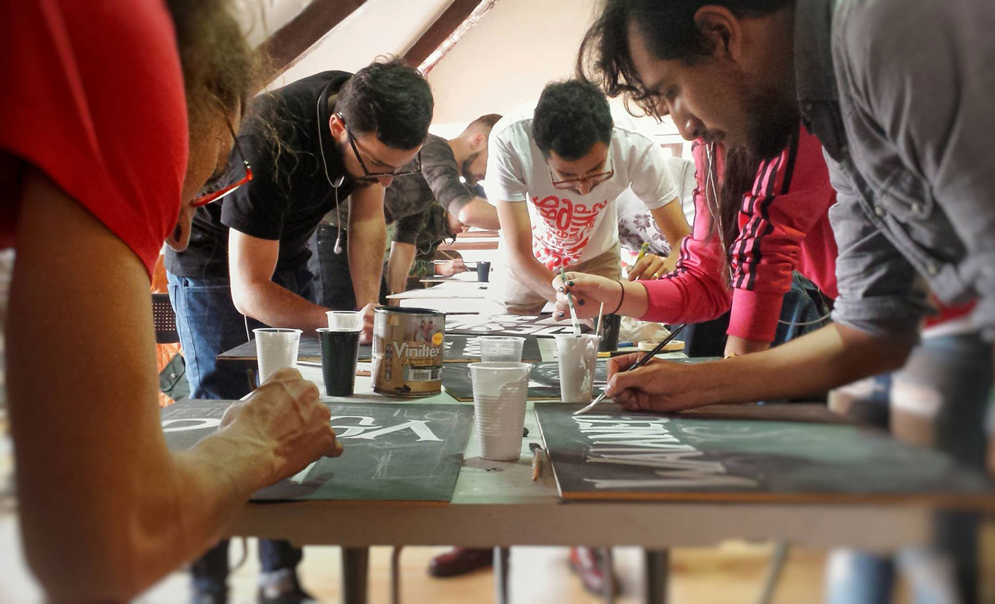
Workshop in Colombia
In your work you make a constant reference to the ‘estilo chillante’ — ‘chillón’ in Spanish means loud, garish, strident or even flashy – manifest in the flat colours used by Carga Máxima. Could you explain a bit further what ‘estilo chillante’ means in your work?
When we work we always focus on colour. The colour is what first grabs your attention, that’s why we call it ‘estilo chillante’: neon yellow, electric blue and neon orange. The fluorescent style is what we call the ‘chillón’ style. ‘Chillón’ means, according to the Real Academia Española [Royal Spanish Academy of the Spanish language], full of life, full of colour, therefore ‘estilo chillante’ (flashy style). We don’t work exclusively with fluorescents, but it’s what we are known best for. It’s how we have been building our path in Lima. Young people now want to start similar projects, but when we began our workshop in 2012 most people didn’t think much of it because they saw it as vulgar, as ‘chicha’.
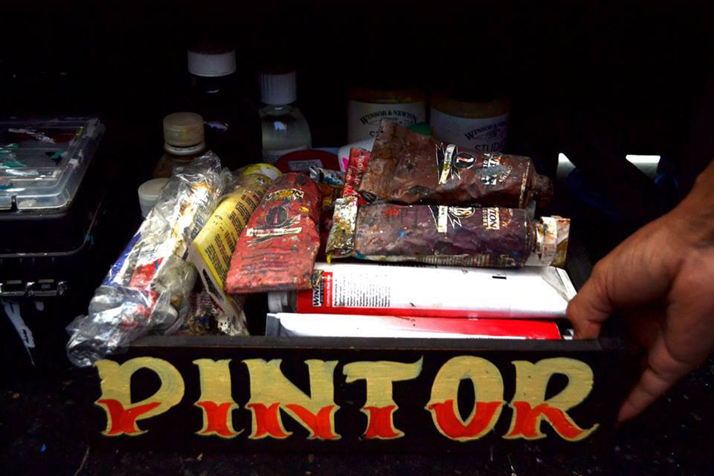
In your daily work the brushes become a basic tool, what sort of brushes do you use?
The brushes that we use are the same as the brushes used by traditional street painters, hand-made brushes made of animal hair. Although now it is possible to buy brushes to make letters, it’s better to work with vernacular materials. Also, experimentation is more interesting. We work on different kind of supports: murals or walls, digital, web, wooden posters and more recently on canvas.
Inks and tools
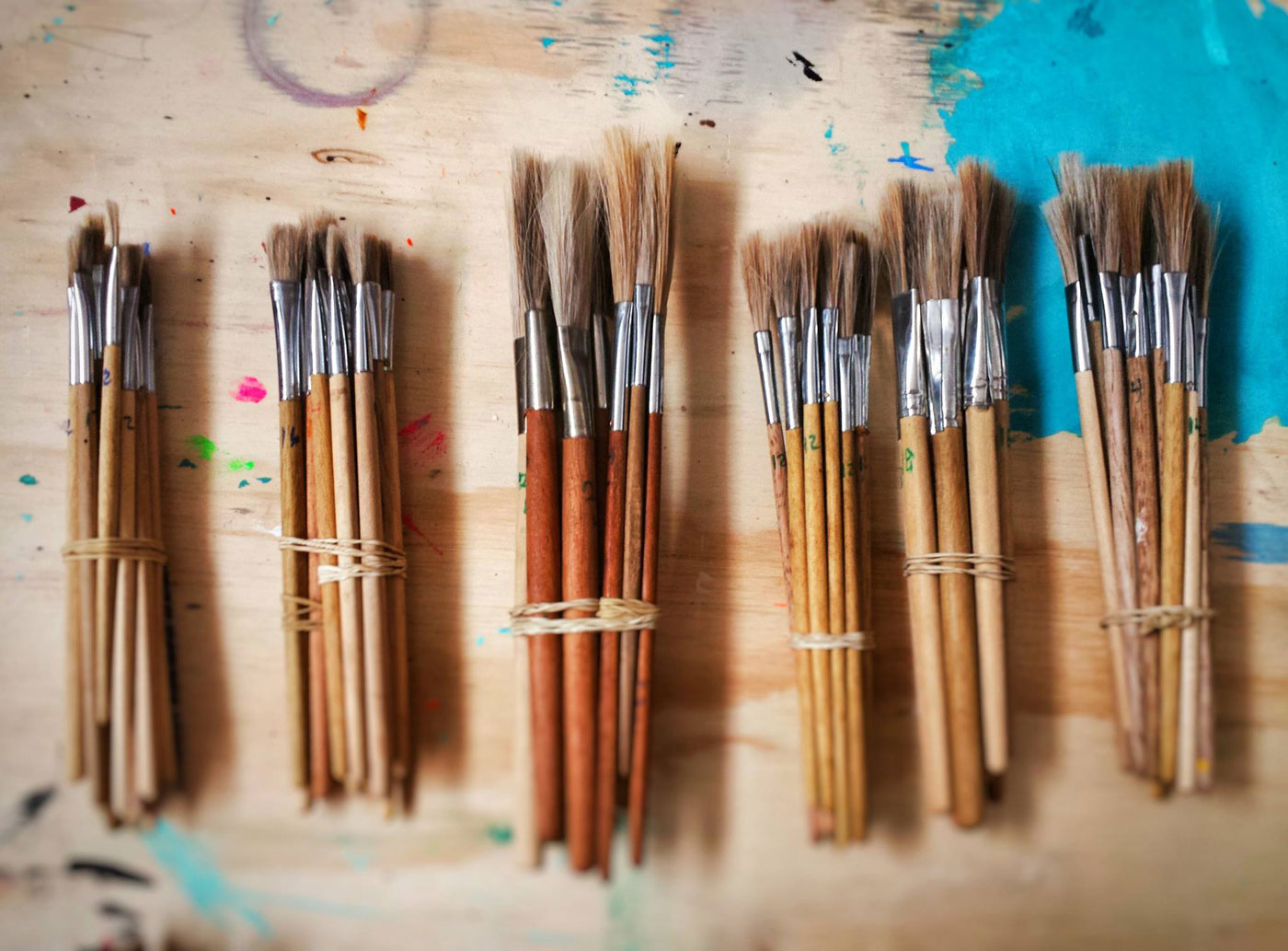
Brushes by Carga Máxima
How do you start working on a mural or canvas?
We charge by letter. The number of letters determines the price. That somehow sets a limit for the client, so they won’t give us a very long text. It makes them think. For them a sentence is everything, but if you make them think only of a simple phrase, with as few letters as possible, then we can work on ligatures and flourishes, that could not be done with a long text.
Do you make sketches first?
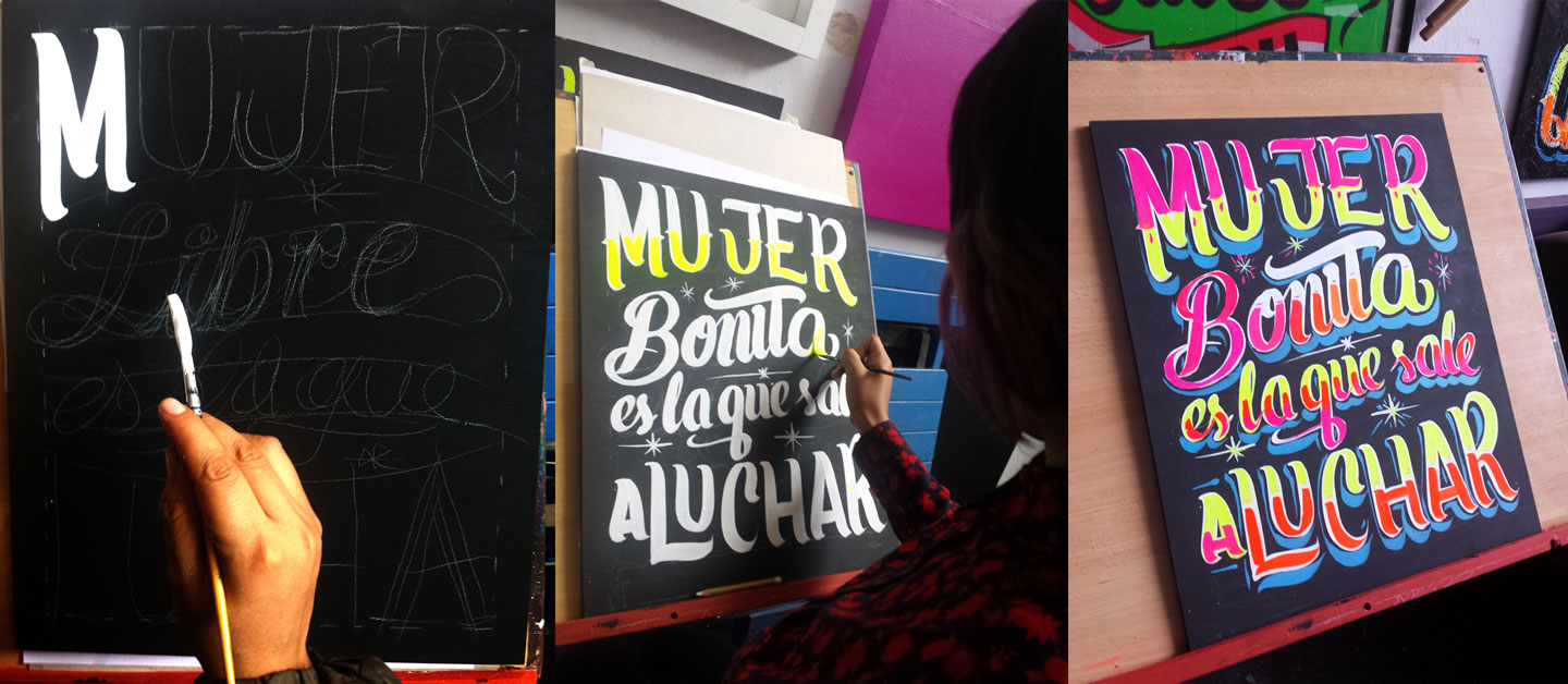
No, we work directly in the space. We don’t work with sketches because most of the work is decided at the last moment. We draw it first with a pencil if it’s on wood. We work with chalk when the wall is made of concrete and then we take measurements using our fingers. Americans use a stick, but we never use sticks, we paint directly. What we do ask the client is for good lighting.
We always draw the structure with a pencil and get the client to see it, because sometimes there is something to correct, an accent, an ‘e’, an ‘n’, or often you end up missing a letter.
We make the drawing, and once it has been approved we take a picture. We paint from left to right and from top to bottom, like writing, the more natural, the better. If you are up high painting, it looks different, than if you are looking from afar; so, you should always backup and see the sign from a distance, because that’s how others will see it. You could make some small mistakes, but no one would see them. We paint the letters in white first, because the neon pops on top of the white, and it doesn’t react so directly on the concrete.
You said that you use three main styles of letterforms: a grotesque called Carga Máxima, a bolder style Cachito, and Huesito (bones), which is a sort of Tuscan, with each of these adapted in different widths and proportions. Can you explain how they are used?
We use the grotesque style, Carga Máxima, the formal one, for hardware stores or cinemas. Names such as Yulisa, María, Vanesa, for instance, can go with the style called Cachito, which is like Carga Máxima’s bold. When something is very theatrical or very local, we use Huesito, that has strokes in the shapes of bones. If a place wants to be down-to-earth but fancy, we use Carga Máxima Condensada, but if it’s a bit more down-to-earth and there is a large space, the bolder Cachitos. These work well with smaller texts. So, for example, the three words: el–buen–sabor [and she gesticulates the three words, the–good–flavour.]
You’ve mentioned that you also work on digital lettering. How does that differ for you from signpainting?
In some cases we work with a lettering style called ‘populachero’ — popular. We paint it and later on we digitise it. We use Adobe Photoshop, because people usually request that the final piece has a ‘painted texture’. In some cases we draw with vectors and it’s a bit crazy, because we end up creating letters that are not necessarily in the Carga Máxima style.
But are these pieces that you’ve also drawn?
Yes, but we use a lettering style influenced by posters and silkscreen and not so much from our sign painting traditions. When we vectorise these letters we do so stroke by stroke, building them up as if with a paintbrush.
So you mean, you vectorise the strokes instead of the whole letterforms.
Exactly, it’s like a digital painting. And that’s our lettering. We work with a screen printing style that gives a 3D effect. All the digital lettering — different from Carga Máxima’s 2D work and neon style — is worked in this 3D way, meaning that it is a stroke, a fill colour and a drop shadow on the right hand side. I can do a sign and vectorise it, but it’s not really vernacular. Rather I am making a piece that is influenced by the vernacular but is 100% digital and pretty, pretty, pretty.
Changing the topic completely and given that this interview is for Alphabettes, can you tell us about the situation of women in lettering in your country? Are there women besides you who focus on type and lettering?
Yes, but in Perú, as women, we are very few in many things. We are certainly very few women working in calligraphy or lettering. What’s interesting though, is that in most of the workshops that we have organised, a third of the attendees are women. We, women, are learning together. We are establishing a small school with a stronger female presence. If we were to talk about the art world – with my partner at Carga Máxima we work mostly at art galleries – the art world is really chauvinist. And it’s much harder to be taken seriously when you are young, male or female.
Are there any differences in how a client treats you compared to your male partner?
Sometimes when we both go to a meeting, I speak about pricing and clients say ‘Oh yeah, Azucena, but relax’ as if everything was a joke to them, like they don’t take that part seriously. For example, amongst men they will often settle these things over a beer at the bar. But I am not a part of that but because I still take business seriously, they don’t like it.
To wrap things up, there have been painters that have been dedicated to popular art in Lima and Peru for a long time. How do they react when they see what you are proposing; aiming to renew and refresh what they are doing?
We found out the history of the style Carga Máxima from a master sign painter called Rodolfo Ponce, ‘El Caribeño’. At 73 years of age, he is the one of the real veteran painters of Lima. He gave us his blessing to continue with our project and the new generation of ‘gráfica chillante’. We respect his work, as we do the work of the many other sign painters who represent the popular street artists. Their story is quite different from ours. Maybe because they weren’t looking to do this for a living, it just happened for them. By contrast, the new generation, that Carga Máxima represents, chose to work on this. I studied design, Alinder academic painting, and we chose to work in graphics. Popular graphics doesn’t have to be from the streets. The academic doesn’t have to be academic. It can be mixed. Everyone is free to work in popular graphics. We don’t share in the provincial story of someone who started at the bottom, someone who didn’t study, but who is self-taught. No, that’s not the story we want to tell. It’s about evolution, feeling good, modern. Wanting to move on and find our own voice. This is why it is important to us to say that we are working with popular graphics out of choice. Because we like it. And we enjoy it.
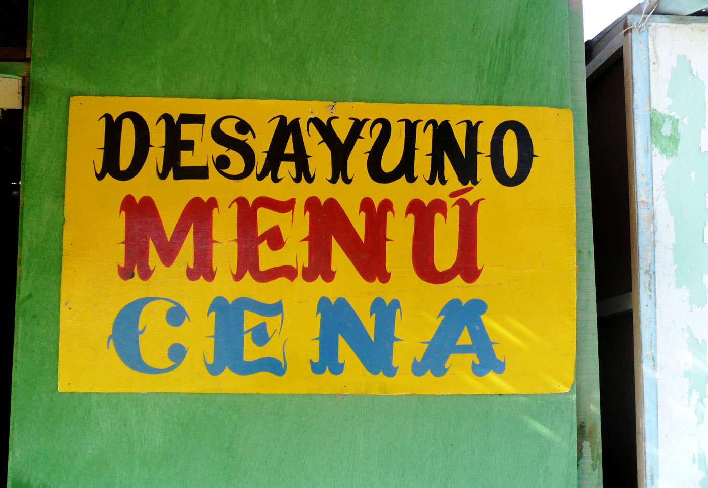
Public lettering from Puira, Perú. Photograph by Azucena León, for her personal project Maestros del Pincel.
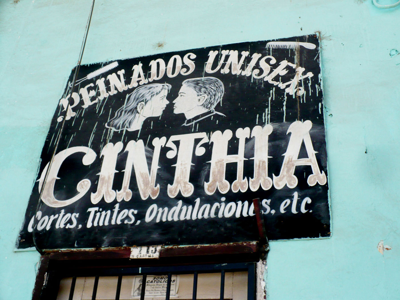
Public lettering from Puira, Perú. Photograph by Azucena León, for her personal project Maestros del Pincel.
This interview was conducted and edited by Elena Veguillas, with invaluable help in editing and translating from Luisa Baeta, Isabel Urbina Peña, Thalia Echevarria and Catherine Dixon. If you want to contact Carga Máxima, hire them, attend one of their workshops, or just browse their work follow these links: Facebook, Tumblr, Instagram, Behance, or watch this video.
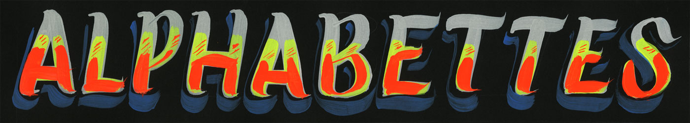
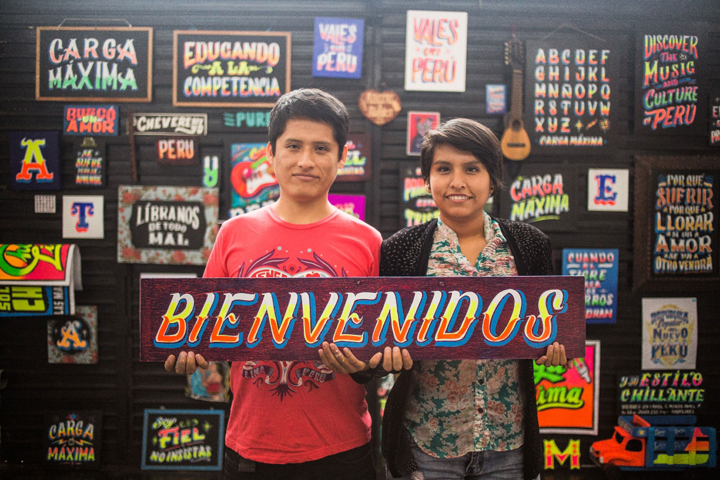
Alphabettes header by Azucena
Carga Máxima
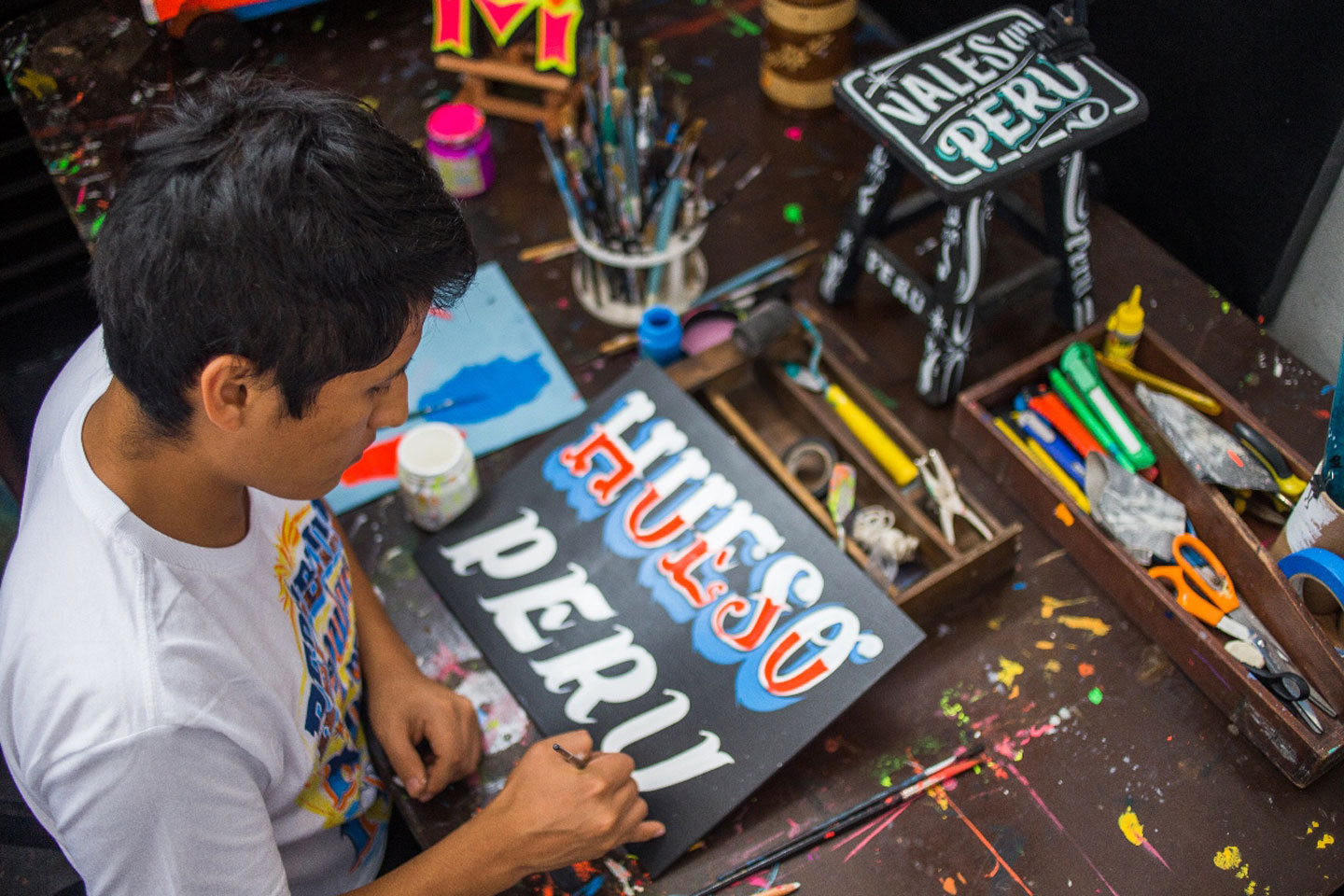
Hueso letterforms
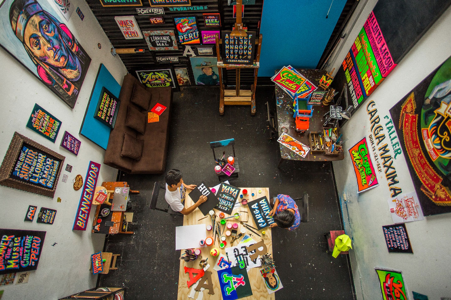
Carga Máxima studio
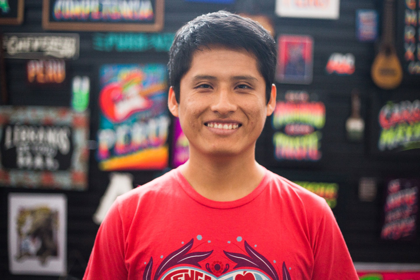
Alinder Espada
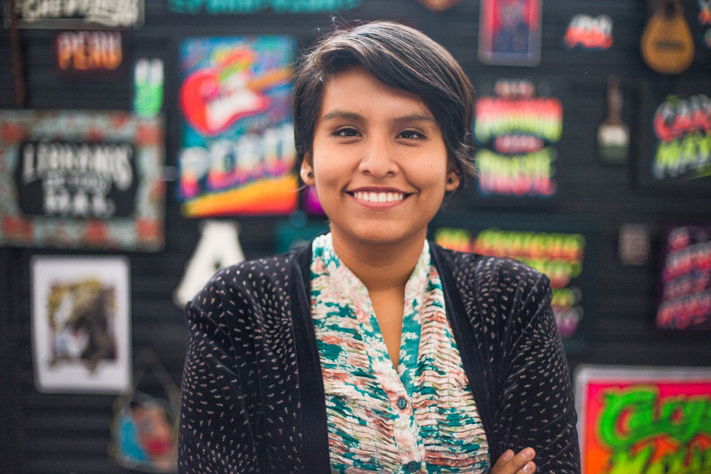
Azucena León
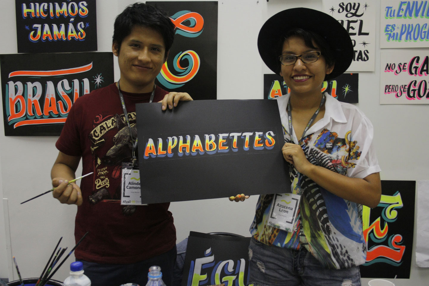
Alinder and Azucena holding the Alphabettes header
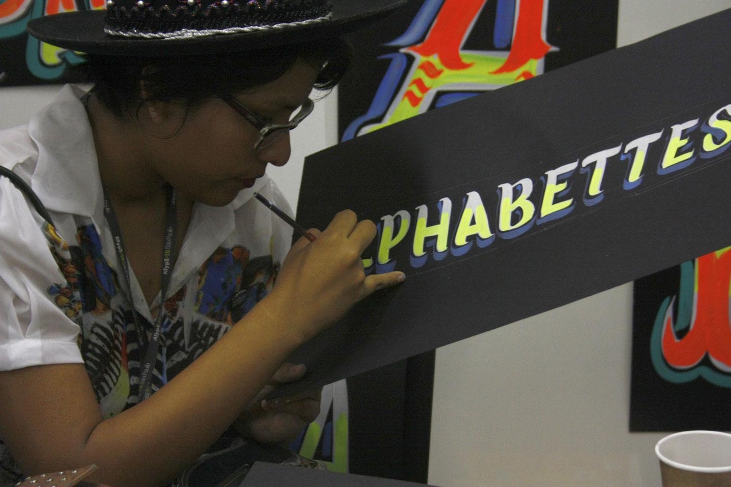
Azucena drawing the Alphabettes header
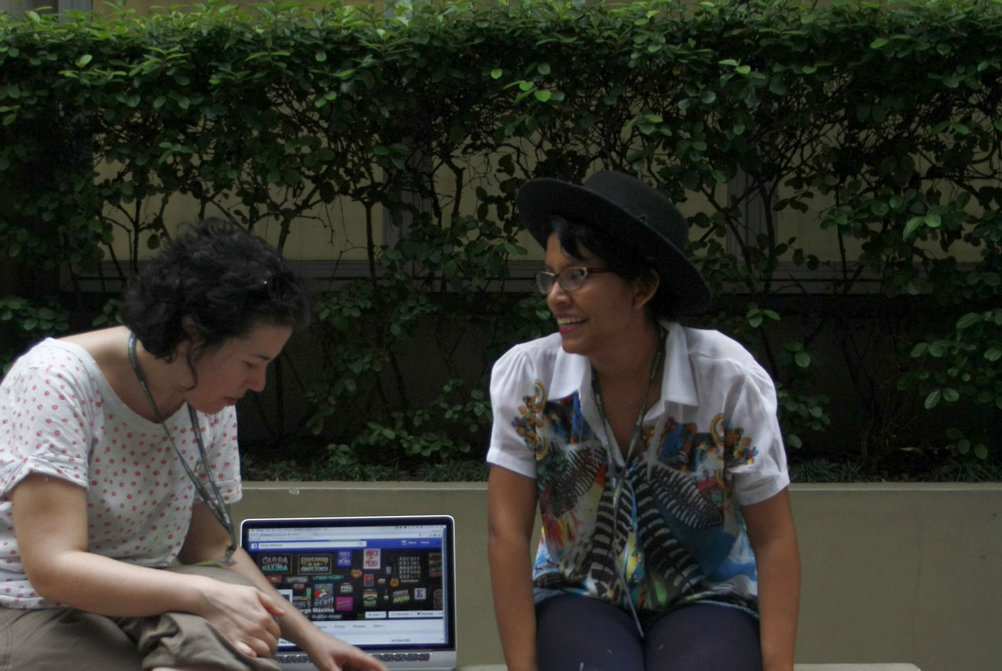
Elena and Azucena during the interview. Photo by Luisa Baeta