Too often, we face the challenge of explaining font licences to students, customers, colleagues, or friends; it proves difficult every time. Back in 2023, we asked ourselves what could we do to improve our understanding of the topic and explain it better? We began collecting information from foundries, tons of data that is not only valuable for us but also for other type users, font makers, and educators. This article is a short introduction to the project and the information available in our website. We also post updates, from time to time, on social media.
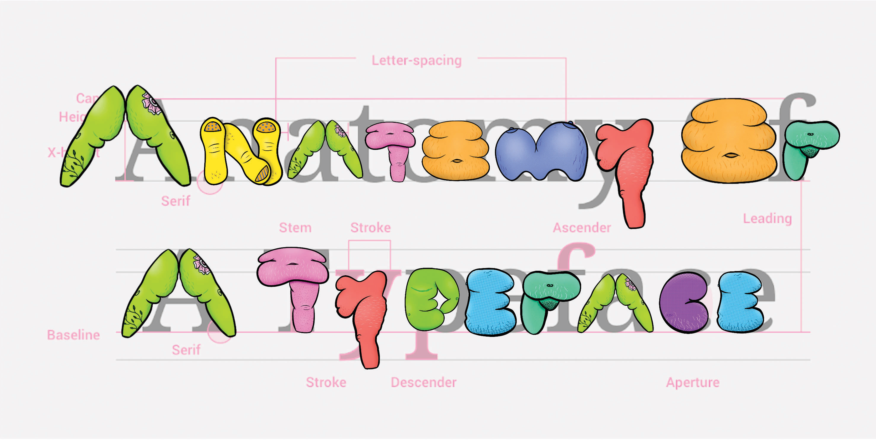
Above: Brooke Hull. “Overlay of Fat Letterform Illustrations on Type Anatomy Guide.” 2023. Type Anatomy guide image via Material Design. “Understanding typography.” nd. https://m2.material.io/design/typography/understanding-typography.html#type-properties
How can we disrupt design canons & fight fatphobia intersectionally through embodied typography?
This research began as I discovered and accepted my own fat, nonbinary body for the first time at the age of 23-24. I was in graduate school having to not only expand my knowledge about the systems within the world around me but having to understand how those systems impacted my own body. As a person who has been fat my whole life, I never accepted this reality until I learned about the system of oppression known as fatphobia.
Fatphobia, as defined by Dina Amlund, is “the name of the structure and the social hierarchy that place people of size, or fat people, beneath slender people” (2017).
Fat people face proven discrimination at work, in relationships, in healthcare, and in the media (Cooper Stoll 2019). Fatphobia, like all other systems of oppression, is intersectional (Crenshaw 1989), further harming folks who embody multiple systems of oppression, like race, gender, sexuality, and disability. While learning about these intersecting systems of oppression, I wanted to use design to relate these systems to my own body and bodies like mine. This is where the idea of fat typography began.
To read this post in English, keep scrolling or go here.
El pasado 11-12 de noviembre el evento EZHISHIN, nos permitió descubrir los desafíos y triunfos que implican diseñar tipografía para lenguas indígenas, el proceso de revivir un idioma o incluso cuestionar el impacto del colonialismo en el diseño y la percepción que tenemos sobre nuestra realidad. Cada presentación es única y generará debates que invitarán a la reflexión, desafiando la sabiduría convencional e inspirando nuevas ideas. Desde el 1 de febrero y gracias al patrocinio de Google, los videos están disponibles para que todos los vean en línea. Te invito a que te prepares para ampliar tu comprensión del poder del diseño y el papel que desempeña en la configuración de nuestro mundo.
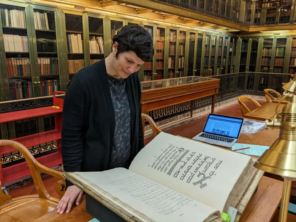
This profile is part of a series of interviews chronicling the experiences of researchers who use The New York Public Library’s collections for the development of their work.
The interview was conducted by Dr. Lyudmila Sholokhova, Curator of the Dorot Jewish Division. It was originally posted on the NYPL blog, July 5, 2022.
The visitor’s book of The Jewish Palestine Pavilion at the 1939 New York World’s Fair.
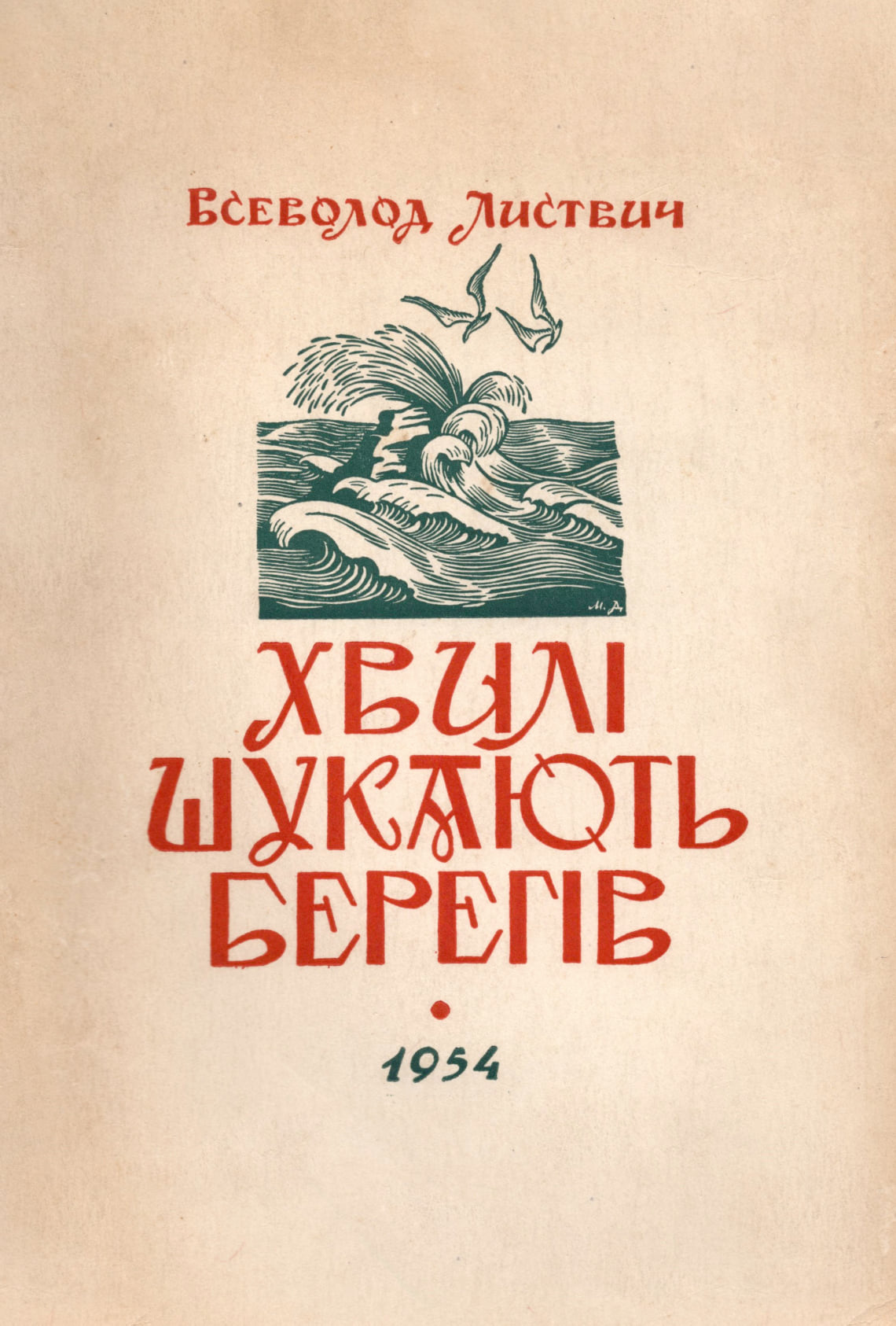
We have a strong type tradition in Ukraine. Over the past few years, Ukrainian type design has been growing rapidly. I believe that now, during the war, when Russian invaders are destroying not only our nation but also our cultural heritage, it is even more important to highlight Ukraine’s graphic and type tradition.
I enjoy creating letters that are inspired by Ukrainian architecture (for example, my Misto font), works by Ukrainian graphic artists of the last century and vernacular typography. The lettering I did for Alphabettes was inspired by the 1954 book cover created by Mykhailo Dmytrenko. I like to take historical samples as a basis and rethink them more or less in a modern context. In this way, you can build a bridge between the past and the present. Visual communication becomes stronger and makes sense.
Nota: Este artículo es parte de una compilación de textos realizada por Mariana Pittaluga en el libro «Visiones sobre el rol social del diseño», Buenos Aires, Argentina, Octubre 2020. Wolkowicz Editores. En esta versión digital se han modificado y agregado imágenes mas el contenido es el mismo.
La invitación a participar en este libro me transportó al momento en el que oí por primera vez hablar sobre la dimensión social del diseño; me refiero a la ponencia de Gérard Paris Clavel en la conferencia organizada por la revista Tipográfica en 1996. El caballero se paró en el escenario y sin dar muchas vueltas dijo alto y claro: «el diseño cobra sentido realmente si persigue un objetivo social», y continuó:
…frente al poder mundial de los medios masivos de comunicación podemos proponer un medio «internacional de la proximidad». Compartir en todo el mundo las singularidades locales, nuestras propias referencias culturales, en lugar de dar paso a una «sopa mundializada» servida por las autopistas de la comunicación mercantil. [2]
Malayalam language, spoken predominantly in the south Indian state of Kerala has an alphasyllabary writing system. Like other Brahmic scripts, the consonant-vowel sequences is written as a single unit- the consonant letter being the base and the vowel notation secondary. The u and uː vowel signs of Malayalam modifies the shape of the associated base consonants (or consonant clusters, called conjuncts). This article discusses various ways in which the shape of consonants get modified when followed by the vowel signs, u and uː.
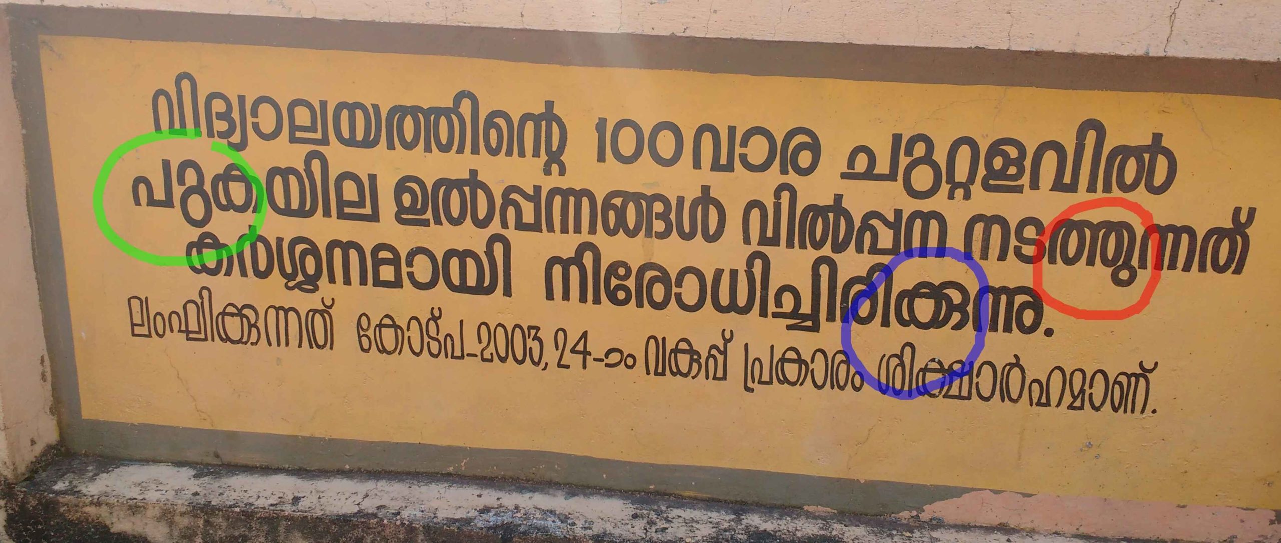
The orthographic script style of Malayalam was reformed or simplified in the year 1971 by this government order. A detailed analysis of its reasons and its impact on popular culture is available here. The reformed orthography is what is taught in schools. The textbook content is also in the reformed style. The prevailing academic situation does not facilitate the students to learn the exhaustive and rich orthographic set of Malayalam script. At the same time they observe a lot of wall writings, graffiti, billboards and handwritings that follow the exhaustive orthographic set.
The sign marks for the vowels ഉ and ഊ (u and uː) have many diverse forms in the exhaustive orthographic set when joined with different consonants. But in the reformed style, they are always detached from the base consonant with a unique form as ു and ൂ respectively for the vowel sounds u and uː. Many native Malayalam speakers learn to read both of these orthographic variants either from school or from everyday observations. But while writing the styles, they often get mixed up as seen below.
‘Do you have at hand a list of women type designers?’ ‘can you give me a list of typefaces designed by women?’ ‘Is there a bibliography about works related to women in type?’ We all have received this kind of questions at one point or another, but here in Alphabettes we didn’t have a page or a blog entry listing this kind of material. This is an un-organised list of resources all related to women in type that anyone can use. Continue reading →
This is the beginning of a bibliography of women in type. It was initially based in two main works, Julian Moncada’s and Laura Webber’s respective MA theses, but it has grown since then.
The first question when making a bibliography is what is this for? who is it going to help? This list might be useful for anyone researching the history and the roles of women in printing, design and type design. It could also be helpful to understand the contemporary situation of women in type. But also, for anyone who wants to research a particular type design. The list has been organised in three main categories, design, print and type. Continue reading →