This is Part 3 of the series, “What does a feminist graphic design history in the United States look like? Read Part 2 here and Part 1 here.
Early moderns from design reform to new typography created and followed rigid guidelines to define “good” design. When researching women in typography, I found that Elizabeth Friedlander is considered one of the first women to design a typeface, Elizabeth Roman and Italic, commissioned by the Bauer Type Foundry in multiple weights in 1927. In addition, she produced multiple geometric patterned prints and covers for Penguin Books inspired from nature. Just like Friedlander, more women have had their work obscured to put forward those who followed the sacred words of Tschichold.
Proto-modernism

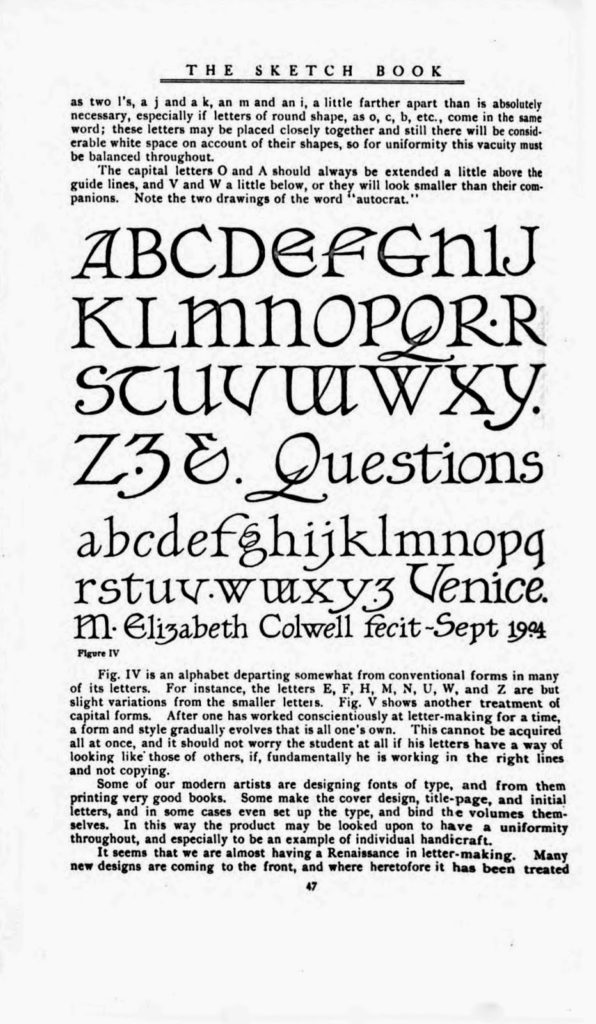
Elizabeth Colwell, Notes on Hand-lettering, September 1904, Accessed March 14, 2020: http://alphabettenthletter.blogspot.com/2016/03/creator-elizabeth-colwell.html
Elizabeth Colwell was a designer and typographer during the proto-modernist movement. This latter developed specific aesthetics based on their philosophy of design, leading to geometrical representation of the world, mainly inspired from nature. Thomson recognizes Colwell as the first and only woman to be featured in Graphic Arts in 1913, after it was created in 1911 to “profile leading printers, designers, and advertising artists.” (1) Colwell was a Chicago designer. She “did publicity for Marshall Fields and for Cowan Company. She designed bookplates and was known for her lettering and her work as a book designer.” (2) Later the author cites the editor, Henry Lewis Johnson expressing that “it has been an axiom among designers, although just why it is hard to say, that women cannot do good lettering. Miss Colwell with many other women designers, offers direct proof to the contrary.” (3)
I chose to show this 1904 Roman alphabet by Colwell, taken from the forty-seventh page of The Sketch Book, when she was a student at the School of the Art Institute of Chicago, for multiple reasons. (4) First of all, it presents and preserves her work as a young typographer as she conceived the alphabet within the context of the early moderns. In her own words, this “is an alphabet departing somewhat from conventional forms in many of its letters” as an effort to maintain uniformity. From her text, I assume it was a way to fit in with the philosophy of the modern type designers. Second, I thought it was revealing that she uses the male pronoun, not imagining that a type student could be other than a man, even if she was not a man herself. Indeed, as she describes the arduous journey of a letterer and typographer, she mentions that it “should not worry the student at all if his letters have a way of looking like those of others, if, fundamentally he is working in the right lines and not copying.” To me, it resonates directly with the normalized and internalized thought that only men can do “good design.” Finally, I chose this alphabet instead of her complex and ornamental designs, simply to celebrate her work as a female type designer, being a notorious men’s club, up until today.
(1) Thomson, Ellen Mazur. “Alms for Oblivion: The History of Women in Early American Graphic Design.” Design Issues 10, no. 2 (1994): 27-48. doi:10.2307/1511627
(2) Thomson, Ellen Mazur. “Alms for Oblivion: The History of Women in Early American Graphic Design.”
(3) Ibid
(4) Tenth Letter of the Alphabet (blog); “Creator: Elizabeth Colwell,” posted Monday March 14, 2016, http://alphabettenthletter.blogspot.com/2016/03/creator-elizabeth-colwell.html
Modernism

Elaine Lustig Cohen, The Book of Jazz, 1958, Accessed March 14, 2020: https://collection.cooperhewitt.org/objects/18645217/
This cover designed by Elaine Lustig for Meridian Books is a lithograph on paper. (5) She “is recognized for her body of design work integrating European avant-garde and modernist influences into a distinctly American, mid-century manner of typographic communication.” (6) Ironically, she worked for her husband until he died, but he never included her as a designer in his own projects. Her task, as she recalls, was to do the “dirty-work” as an “office slave,” and was revealed as a designer when she had to run the business herself. (7) Indeed, she “began in her husband’s shadow, yet emerged among her male counterparts as an exemplar of contemporary graphic design and typography.” (8) It is undeniable that she was influenced by her time and her husband’s work but, as a modernist, she was not an ideological one—“she [just] favored clarity and simplicity, and used functional typography with asymmetry as a guiding principle. She preferred pure geometry.” (9) I find her work fantastic and eclectic. In this particular book cover, the type has so much rhythm and playfulness. The letterform “J”, mimicking the saxophone, is multiplied, layered and assembled like a puzzle to become a geometrical pattern with vivid analogous colors, extending to the fourth cover. I particularly love her attention to detail, where shapes end and meet to form a fluid composition. The sans serif typeface, asymmetrical elements, sense of contrast, and limited color palette refer to modernism, and yet her interpretation of it is refreshing, as if she is reinventing it to feel more expressive.
(5) The Cooper Hewitt Smithsonian Design Museum; “Book Cover, The Book of Jazz, 1958.” Cooper Hewitt, http://cprhw.tt/o/2Dyzg/
(6) Heller, Steven, “Elaine Lustig Cohen,” AIGA, 2011, https://www.aiga.org/medalist-elainelustigcohen/
(7) Heller, Steven, “Elaine Lustig Cohen.”
(8) Ibid
(9) Ibid
Avant-garde

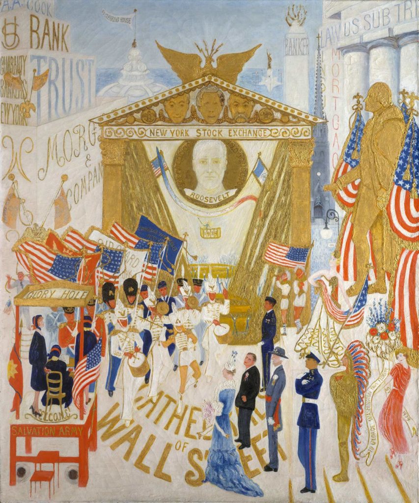
Florine Stettheimer, The Cathedrals of Wall Street, 1939, Accessed March 14, 2020: https://www.metmuseum.org/art/collection/search/488733
Florine Stettheimer is an American dadaist “ahead of her time” according to the New York Times. (10) This is definitely not the kind of imagery I assumed to find in a dadaist’s work. Hence, I chose this particular artwork, part of a series of four fantastical 60×50” paintings, because it went against the conventions of the modernist rules of the time, which is unquestionably part of the Dada thought process. It “unites various public figures with the major financial establishments of the day, suggesting the close relationship between politics and big business in New York. The reimagined facade of the New York Stock Exchange pays homage to President Franklin D. Roosevelt and the financial leaders Bernard Baruch, John D. Rockefeller, and J. P. Morgan.” (11) Stettheimer adds Salvation Army workers in her composition “perhaps as a warning against the temptations of earthly riches and power”—not an uncommon mindset after World War I and the Great Depression in the US. (12) The artist also depicts herself offering flowers to the sculpture of George Washington. (13) Overall, her work reminds me of Maira Kalman’s in her way of incorporating typography and portraying whimsical characters. In the Cathedrals of Wall Street, she illustrates sans serif type almost everywhere but Morgan and Trust, which can be thought of as recognition of the modernist typography. Finding typography in a painting is quite refreshing to me, making this a designed piece as much as a painting.
(10) Cotter, Holland. “Dada’s Women, Ahead of Their Time”. The New York Times. July 6, 2006, https://www.nytimes.com/2006/07/06/arts/design/06dada.html
(11) The Metropolitan Museum of Art; “The Cathedrals of Wall Street,” The Met Museum. https://www.metmuseum.org/art/collection/search/488733
(12) The Metropolitan Museum of Art; “The Cathedrals of Wall Street.”
(13) Ibid