
This is Part 2 of the series, “What does a feminist graphic design history in the United States look like?” Read Part 1 here.
In the 19th and early 20th centuries, technological advancements helped information spread fast and far. The industrial revolution led to the creation of mass media as well as romantic and revolutionary outcomes. The mechanization of print culture facilitated the geographical spread of belief systems and information as well as offered the possibility to critique, question and reject established models of society to serve women’s rights.
Information Design
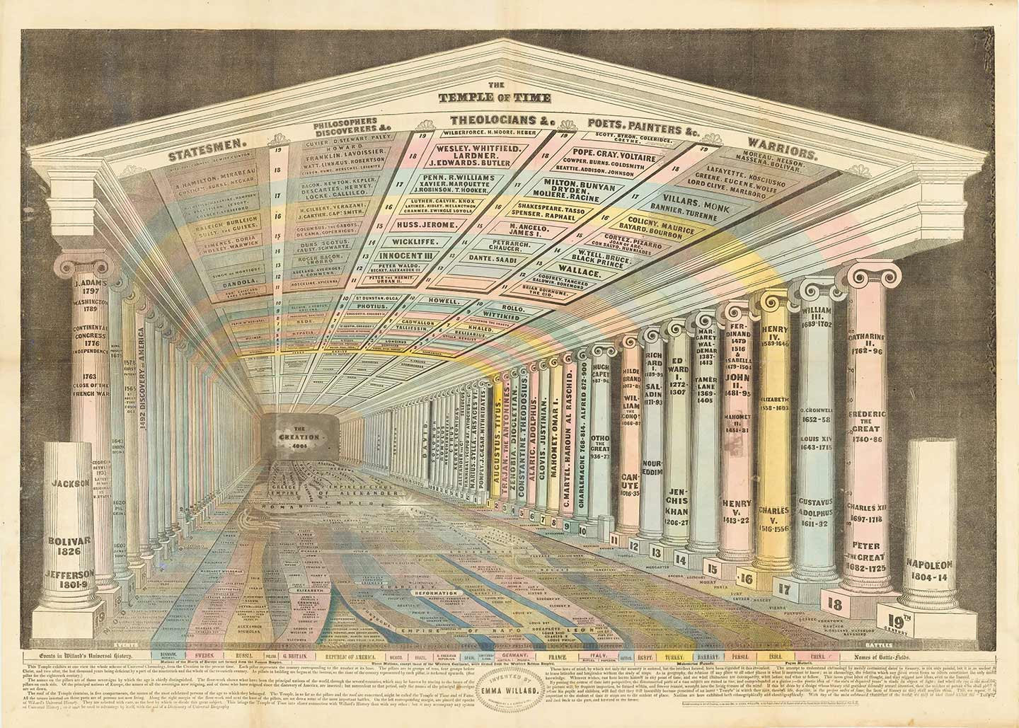
Emma Willard, Temple of Time, 1846. Accessed March 8, 2020: https://bostonraremaps.com/inventory/emma-willard-temple-of-time-1846
Isolated facts are useless unless connected within a bigger system to paint a meaningful picture. Emma Willard was ahead of her time. Temple of Time, published in Willard’s Atlas to Accompany a System of Universal Geography, is a brilliant demonstration of early data visualization expressing that an element can only be fully understood in relation to other elements. She believed that “information presented spatially and visually would facilitate memory by attaching images to the mind through the eyes.”(1) That is, in the body copy, she writes:
“The attempt to understand chronology by merely committing dates to memory, is not only painful, but it is as useless as to learn latitudes and longitudes, without the study of maps. As in geography, the relation of any place to all other places is what is important to know; so in chronology, the relation which any given event bears to others constitutes the only useful knowledge … By putting the course of time into perspective, the disconnected parts of a vast subject are united into one, and comprehended at a glance.”(2)
Willard’s map represents the complex dynamic of rising and falling empires. Indeed, “it adorns the floor of a pagan temple, which has been repurposed as a timeline with the present represented by the foreground and history “receding,” as it were, to the Creation at the very back of the structure. The flow of time is demarcated and regularized by 59 pairs of Ionic columns each representing a century. The flow diagram bears the names of kings, queens and emperors and is flanked by the major battles and other events of each period; each column bears the names of “those sovereigns by which the age is chiefly distinguished;” and the ceiling lists the eminent statesmen, thinkers, theologians, artists and military figures of each age.”(3)
Graphically, Willard uses asymmetry, perspective, a limited color palette and subtle typographical contrast in terms of pairing a serif and sans serif as well as using scale to create hierarchy. This piece could have easily existed during Herbert Bayer’s time where information design condensed complex data into effective and factual forms.
Public Sphere
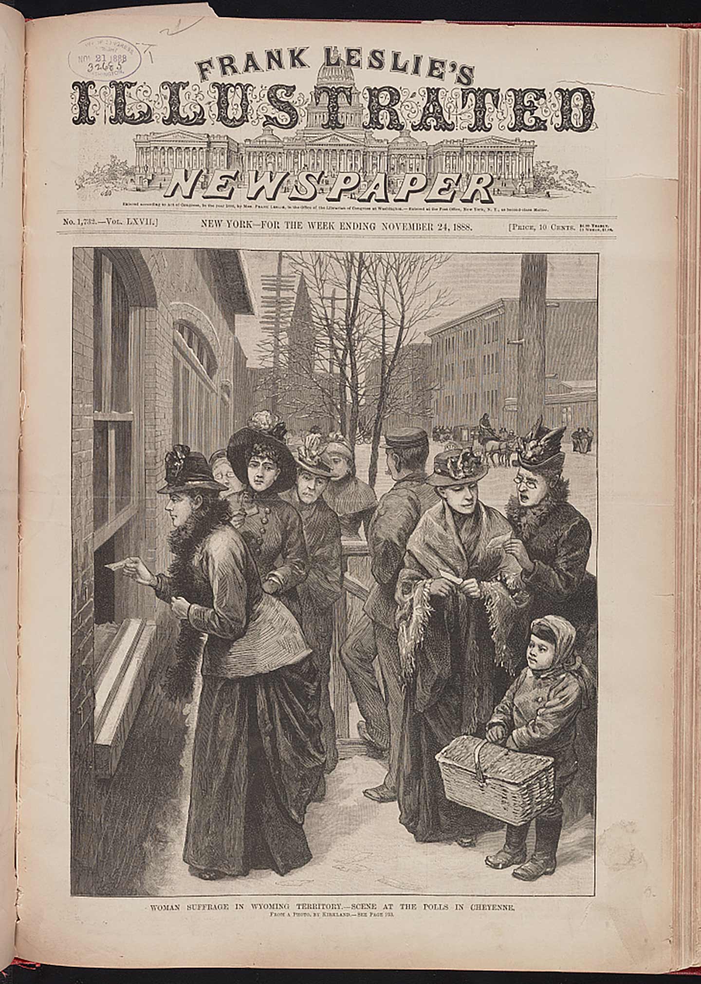
Frank Leslie, Women Suffrage in Wyoming Territory, 1888-11-24. Accessed March 8, 2020: https://www.loc.gov/pictures/resource/ds.13020/
“Known for its somewhat lurid stories and images, Frank Leslie’s Illustrated Newspaper was the country’s first newspaper to include illustrations and it had a circulation of more than 200,000 during the Civil War.”(4) Frank Leslie married Miriam Florence Follin, who saved the publication twice, and later, in 1880, after Frank’s death, Follin changed her name to her husband’s and took full control of the newspaper, becoming a vehicle of women’s rights.(5)
In this weekly, printed on November 24th, 1888 in New York, we see women at the polls voting in Wyoming Territory—a right that was only granted in New York in 1919.(6) From their elaborate clothes and hats, they look like they are coming from the middle to upper class. A child accompanies them, probably as a symbol of the future carrying the best practice. My guess is that this image served as an example portraying a revolutionary, yet basic right to other states in the US where women could not vote, as if the general population needed to be exposed to this scene to normalize it. I think what makes this illustration even more powerful is that this scene happens during winter, and regardless of the cold, women are still going out to vote. By the direction of the strokes, the main illustration appears to be an end grain wood engraving, combining the relief printing technique of woodblock with the detailed linework of copperplate. The Tuscan letterforms with swooshes in addition to the hand-lettered display titles seem to be using a woodblock, layered on top of what seems to be another copper plate background illustration of the capitol. The smaller serif type, used in subtitles, seems to be incorporating metal movable-type. Aesthetically, this cover is complex considering the timely concept of the newspaper.
Mechanization
Carter Medicine Company, Carter’s Iron Pills, 19th century. Accessed March 8, 2020: https://library.artstor.org/public/SS35230_35230_15668966
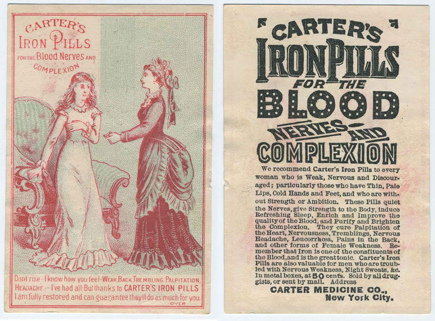
“The ideal female in America was expected to be gentle and refined, sensitive and loving. She was the guardian of religion and spokeswoman for morality. […] The American girl was taught at home, at school, and in the literature of the period, that aggression, independence, self-assertion and curiosity were male traits, inappropriate for the weaker sex and her limited sphere.”(7) As a result, showing any of these traits were signs of hysteria—the female disease of the 19th century.(8) As much as there are a ton of sexist advertisements on women, Carter’s pills excelled in that realm. In these 19th century chromolithograph and black-inked lithograph we see, on one hand, a woman handing a Carter’s pill to a supposedly sick woman and, on the other hand, a label describing the pill, one that cures any “forms of female weakness.”(9) “Don’t rise”, says the ad in the subtitle. (10) How explicit! Women rising to the level of men and beyond is so threatening that they needed pills. The hyphenated forced justification in both visuals reinforces the tension of the content. The display hand-lettered typography, on the right lithography, seems rather festive—like a neon sign, adding even more to the irony. After an entire litany of all the female sicknesses, the label ends by stating that these pills could also be valuable for men “troubled with nervous weakness [and] night sweats.”(11) This mention was probably added as an afterthought for financial reasons to expand their market.
Map Design
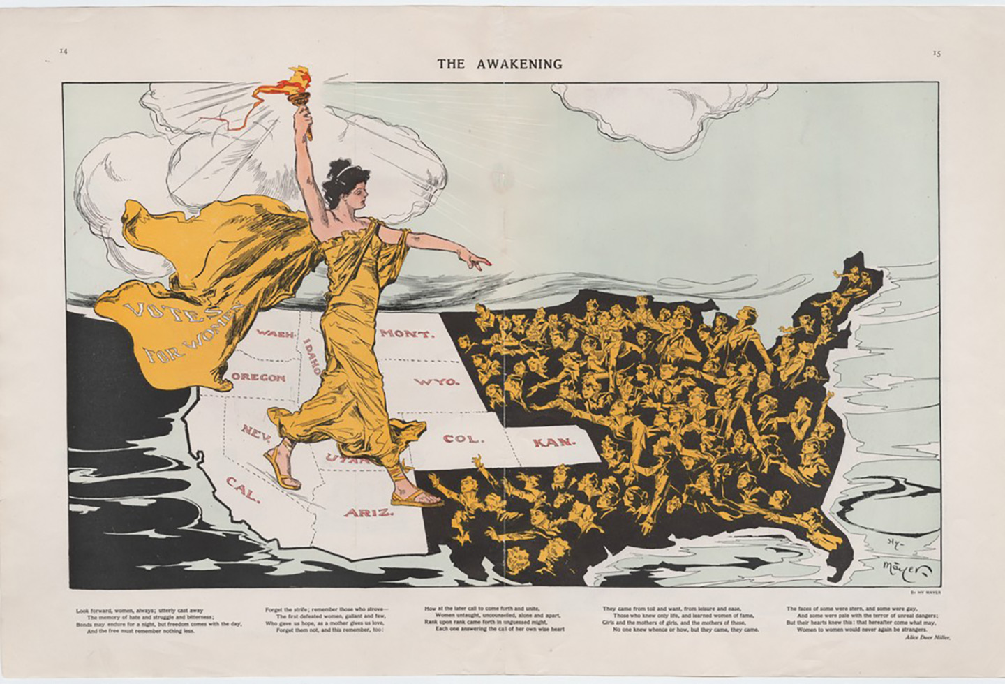
Mayer Henry, The Awakening, 1915. Accessed March 8, 2020: https://library.artstor.org/publicSS36044_36044_23459844
This map is considered “the most striking of the “suffrage maps,” which played a major role in the successful fight for women’s suffrage in the U.S.”(12) It was published in Puck magazine during the Empire State Campaign on a suffrage amendment to the New York State constitution. The progressive illustrator, Henry “Hy” Mayer was Puck’s chief cartoonist at the time. In it, we can see a white Lady Liberty wearing a cape in which the words “votes for women” appear written on it. With her torch, she enlightens women from the states that have not yet adopted suffrage. She gives them the platform to voice their power. These women are, in return, reaching out for her hand—hoping to get out of darkness. This particular visual detail reminds me of Plato’s cave allegory. “Many [of these women] have fashionably short hair and hats, reflecting the middle and upper class core of the suffrage movement.”(13) Below the map is a typeset poem by Alice Duer Miller who was an active feminist producing a large volume of provoking suffrage poetry.(14) This image is revealing to me because one of the most iconic symbols of this country (and the world) is actually a woman—one that empowers other women in this map. In addition, the fact that she is painted white opens up a deeper and darker issue in America about race as well as feminist issues seen solely from a white perspective. Finally, another insightful point concerns the illustrator who is not a woman. Even if I wished that a woman had created this piece, having feminist men by our side is a necessary step to keep moving forward. The map, if anything, historically proved this point. We need all genders from all backgrounds to be feminist for a society to stop inequality.
(1) Boston Rare Maps, “Emma Willard’s Temple of Time”. Accessed November 4, 2019, https://bostonraremaps.com/inventory/emma-willard-temple-of-time-1846/
(2) Boston Rare Maps, “Emma Willard’s Temple of Time”.
(3) Ibid
(4) International Center of Photography. Frank Leslie’s Illustrated Newspaper. Updated 2011. https://www.icp.org/browse/archive/objects/frank-leslies-illustrated-newspaper
(5) Google Arts and Culture. “Women’s Suffrage Memorabilia” entry. https://g.co/arts/AutFwgmuLfGCiUHr7
(6) NPS. “New York and the 19th Amendment.” Updated August 9, 2019 https://www.nps.gov/articles/new-yorkand-the-19th-amendment.htm
(7) Smith-Rosenberg, Carroll: Hysterical Woman: Sex Roles and Role Conflict in 19th-Century America. Social Research 39 (December 15, 1972): p. 652–78. https://login.lp.hscl.ufl.edu/login?url=https://search.proquest.com/docview/1297248946?accountid=10920
(8) Smith-Rosenberg, Carroll: Hysterical Woman: Sex Roles and Role Conflict in 19th-Century America.
(9) Artstor, Artstor “Carter’s Iron Pills” entry. https://library.artstor.org/asset/SS35230_35230_15668966
(10) Artstor, Artstor “Carter’s Iron Pills” entry.
(11) Ibid
(12) Artstor, Artstor’s “The Awakening” entry. https://library.artstor.org/asset/SS36044_36044_23459844
(13) Artstor; Artstor’s “The Awakening” entry.
(14) Ibid