Part 2: What does a feminist graphic design history in the United States look like?

This is Part 2 of the series, “What does a feminist graphic design history in the United States look like?” Read Part 1 here.

In the 19th and early 20th centuries, technological advancements helped information spread fast and far. The industrial revolution led to the creation of mass media as well as romantic and revolutionary outcomes. The mechanization of print culture facilitated the geographical spread of belief systems and information as well as offered the possibility to critique, question and reject established models of society to serve women’s rights.

Information Design

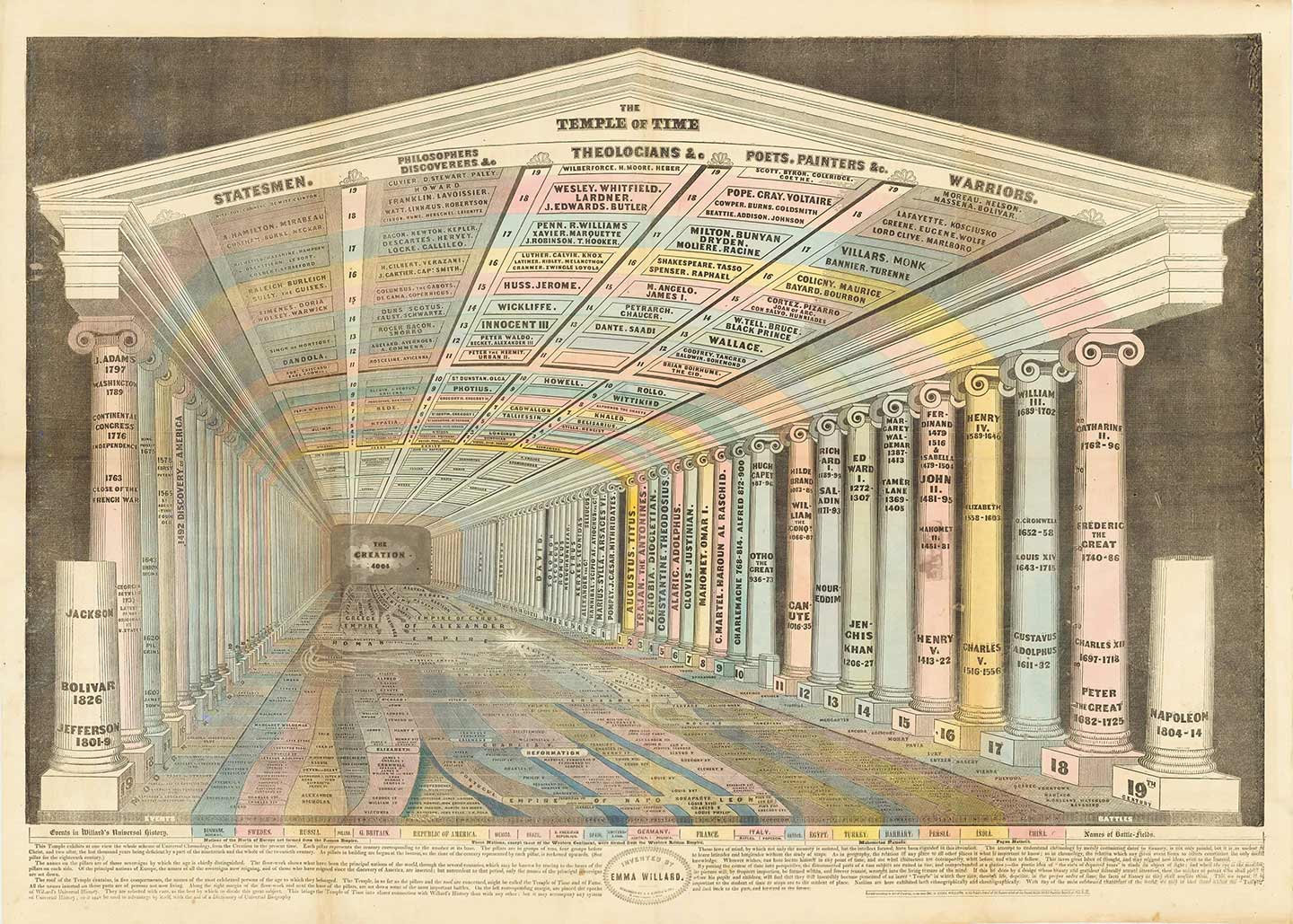
Emma Willard’s Map Temple of Time

Emma Willard, Temple of Time, 1846. Accessed March 8, 2020: https://bostonraremaps.com/inventory/emma-willard-temple-of-time-1846

Continue reading

What does a feminist graphic design history in the United States look like?

Why are women’s contributions to society systematically overlooked and obscured? Design is no exception to the rule. There is a disturbing lack of literature on women’s impact in the history of graphic design. During this year’s Women’s History Month, I will share a curated collection of twelve artifacts, from the fifteenth century through the twentieth century, that offer, from a feminist perspective, a counter visual story to the traditional white male and widely received narrative in graphic design history. Before diving into contextualizing this work, I want to briefly explain my position and how I came to focus my research on illuminating female narratives.

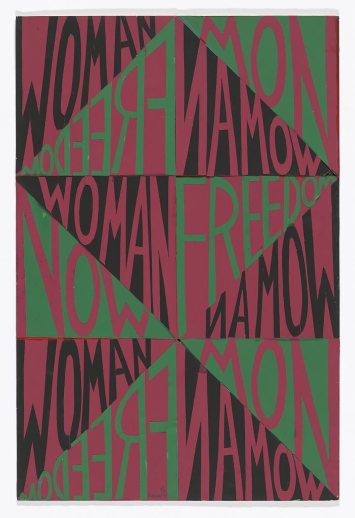
As individuals, we are all irradiating complex systems defined by society along with our nuanced multilayered identities. When I walk into a room, at the most superficial level, one can read that I am a woman. I am light skinned. I have tattoos. When I start talking, my French accent suggests that I am from another country than the United States. I am indeed from Morocco and I am Arab. Living in Morocco was violent in many ways. My gender was enough to be constantly harassed since I was a teen, judged on every single thing I did and ultimately made me feel like an outsider every day. I came across the word feminism in high school. It made me feel somewhat normal that my mindset was not unique. But I did not understand the divide within feminism at that time until very recently. I just knew I did not want to be subject to anything or anyone. Freedom (from patriarchy) has always been a fight to be my own person and fulfill my own purpose. As a result, my work will always have a feminist point of view. 
Continue reading

The Feminist Possibilities of Print: Jane Grabhorn’s Jumbo Press

In 1937, occupied with “proof-reading, folding printed sheets, hounding delinquent clients, [and] writing letters and even introductions to books” in her husband and brother-in-law’s Grabhorn Press, Jane Bissell Grabhorn “suddenly revolted and decided to do some printing of her own and by herself” (Grabhorn “Mea Culpa”). The act of revolt on Grabhorn’s part would become just one instance of many in which she would defy expectations through her printing enterprise, the Jumbo Press, which she operated single-handedly from 1937 until her death in 1973. Employing typography and print to express feminist thought processes in her hand-press productions of satire, wit, and ephemera, Grabhorn exclusively utilized letterpress printing as a place of rebellion. As Grabhorn notes in her 1937 A Typografic Discourse, a piece originally published as part of the volume, Bookmaking on the Distaff Side, her press realizes the ways in which women’s work might reimagine the male-dominated sphere of printing and its influences: “Jumbo stripped the mask from typography’s Medicine-Men and their disciples have seen them as they are: —pompous, tottering pretenders, mouthing conceits and sweating decadence” (8). Grabhorn’s perspectives on the art of printing itself would prove to continually subvert expectations of women’s roles—and more importantly, the increasing relevance of the female printer’s place in printing history.

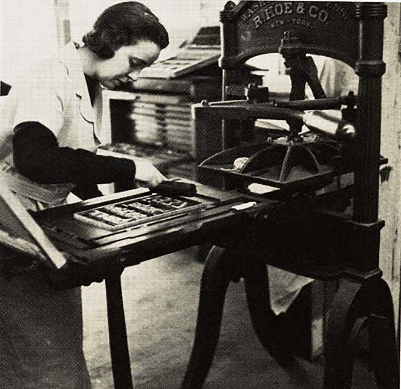
Jane Grabhorn printing on the Washington hand press, ca. 1945 (Princeton University Libraries)

Jane Grabhorn printing on the Washington hand press, ca. 1945 (Princeton University Libraries)

Continue reading

Counterspace: Classroom Space as a Pedagogic Tool

I proposed to investigate the potential of space as a pedagogic tool, especially in the graphic design classroom. Within this context, ‘space’ should be understood not only as the physical space of the classroom but instead as a broad and overarching concept: the space within typography, the space one occupies, the space of the institution, or the social and political spaces that emerge through daily interaction.

The research — Counterspace: Classroom Space as a Pedagogic Tool to Share Authority and to Empower (Design) Students — took place between September 2016 and December 2018. The practical part was conducted in my Graphic Design classes with the first year students at the Royal Academy of Arts, The Hague (KABK). The project was part of the Master Education in Arts at the Piet Zwart Institute in Rotterdam.

Scholten, J. (2017), Students taking over the corridors. Part of the section: Pedagogic practices and strategies, ENLARGE THE CLASSROOM: Take over the corridors.
We do this to perceive and use space differently and extend the borders of the classroom, to facilitate random encounters.

Continue reading

List of resources on designing diacritics

Aleksandra Samuļenkova shared this list of ‘sources concerning diacritics and special characters of the Latin script’ which is just too good to be buried on Twitter.
It would be great if we could all add more tips in the comments!

• An essay by Victor Gaultney on Problems of diacritic design for Latin script text faces

• An article by David Březina On Diacritics

• A great book about Central European diacritics: The Insects Project

Continue reading

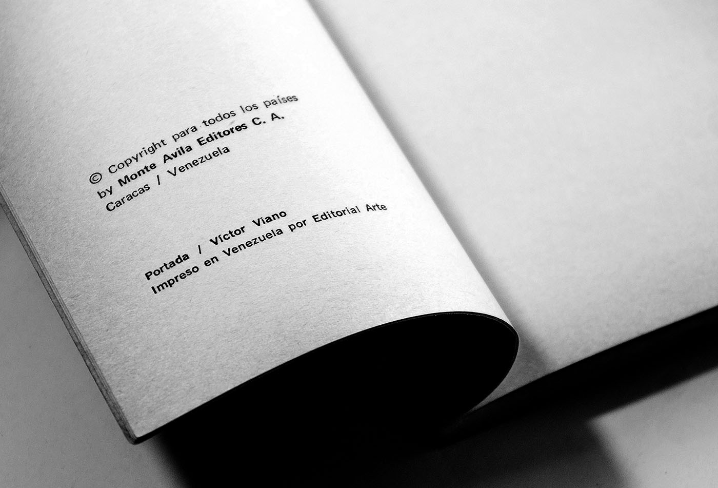
Cover design: Víctor Viano

When man resolved to imitate walking,
he invented the wheel, which does not look like a leg.
 Apollinaire

Victor Viano

A couple of years ago, I had the honor of presenting a lecture at Columbia University regarding my research on Venezuelan editorial design and a draft of research on its book history. It is no coincidence that I live in New York now since Venezuela’s editorial design began here, where Francisco de Miranda, one of Venezuela’s founding figures, managed to get a press assembled and took it to Venezuela in the early 1800s.

Continue reading

Branding and the Psychology of Handwriting: The new NIVEA Care Type

At Juliasys Studio we’ve been working for some time now on a digital handwriting style for the “NIVEA” brand of Beiersdorf AG. “NIVEA Care Type”, as we are calling the new OpenType font, is understood to be the imaginary handwriting of the NIVEA brand persona, the “NIVEA Woman”. Care Type on product packaging and in marketing material has the function to subtly present the NIVEA Woman personality in the look and feel of the brand. Care Type is to be used prominently but at the same time sparingly, “with caution”.

Figure 1: A century of typographical metamorphosis on the legendary NIVEA tin

Continue reading

Granada: The Spanish language as type design criteria

Halfway through 2016, as I was finishing my undergrad Graphic Design studies, I became very interested in the idea of researching the relationship between language and type. Fortunately, I stumbled upon Bianca’s dissertation, which helped me greatly as I could build upon her thoughts, draw my own conclusions and hopefully design a typeface based on language as criteria.

Continue reading

First/early female typeface designers

Every other month the question about who was the first female typeface designer comes up. From my armchair research, for up to the 1950s, so far we know of

  • Hildegard Henning, Belladonna, Julius Klinkhardt, 1912
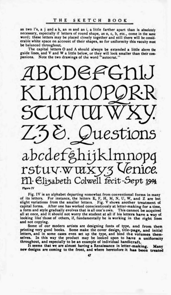
  • Elizabeth Colwell, Colwell Handletter, ATF, 1916
  • Maria Ballé, Ballé Initials, Bauersche Gießerei, date unknown, 1920s?
  • Elizabeth Friedländer*, Elizabeth, Bauer, ±1937
  • Ilse Schüle, Rhapsodie, Ludwig & Mayer, 1951
  • Gudrun Zapf von Hesse, Diotima, Stempel AG, 1952–54 (Ariadne ’53, Smaragd ’54 …)
  • Anna Maria Schildbach, Montan, Stempel AG, 1954
  • (That is women credited with a typeface’s design. Many have worked in drawing offices and type production but remained unknown. And post-metal type design is another blog post.)

    I have been talking a lot about this with Dan Reynolds, who is researching 19th century type making in Germany for his Phd (this is such a brief generalization of his topic that he will probably kill me). After the war, West German type foundries published a couple of typefaces designed by women, but of pre-war typefaces Dan could so far not find more than the two mentioned above — Belladonna and the Elizabeth types. (It’s debatable whether the Ballé initials count since they were “not actually cast as foundry type, but rather electrotypes mounted on metal”, as some sources state.) While the idea that Anna Simons might have designed some of the Bremer Presse types is intriguing, it seems that this was just a 1980s American speculation, not actually a fact.

    Last weekend, Dan visited the printing museum im Leipzig and writes:
    “I finally made it to the exhibition from Jerusalem, which exhibited work from Moshe Spitzer, Franziska Baruch, and Henri Friedlaender. That exhibition included Stam, a Hebrew typeface designed by Franziska Baruch for Berthold in the 1920s. Baruch left Germany for Palestine and died in Israel in 1989. She had a career as a designer in Germany in the 1920s and ’30s, and then in Palestine and Israel after that. Much of her graphic design for the State of Israel and for her Israeli clients was significant; however, she never wrote about her work.

    While it was not mentioned in the exhibition, I suspect that Baruch was commissioned to design Stam by Oscar Jolles, who was Berthold’s director in the 1920s. Jolles was a prominent figure in the Berlin Jewish community, and Berthold’s publication of Hebrew type specimen took place during his tenure. Jolles died in 1929, but like Baruch’s mother and sister, his wife and daughter were all murdered in 1943, albeit in different death camps.”

    I believe Liron worked on this exhibition and its original catalog? Does any of you type history or Hebrew researchers have more info on Franziska Baruch and her typeface Stam? I had never heard of her. Glad we can add another name to our Olden Type list.

    * There is a documentary about Elizabeth Friedlander that just came out and will be shown in London on October 20. If you are in the area, this is worth watching.
    Continue reading

    Facing Our Fears:
    Teaching Type on the Web

    This article is based on the presentation, “Web typography is just typography, sort of,” part of the Type@Cooper West Lecture Series at the San Francisco Public Library, on July 18, 2017. Watch a video of the talk or keep reading.

    web design and typography exist in parallel

    In many design programs, web design and typography courses exist in parallel universes. If 95% of the web is typography, then why aren’t we teaching this?

    Continue reading