
Every other month the question about who was the first female typeface designer comes up. From my armchair research, for up to the 1950s, so far we know of
(That is women credited with a typeface’s design. Many have worked in drawing offices and type production but remained unknown. And post-metal type design is another blog post.)
I have been talking a lot about this with Dan Reynolds, who is researching 19th century type making in Germany for his Phd (this is such a brief generalization of his topic that he will probably kill me). After the war, West German type foundries published a couple of typefaces designed by women, but of pre-war typefaces Dan could so far not find more than the two mentioned above — Belladonna and the Elizabeth types. (It’s debatable whether the Ballé initials count since they were “not actually cast as foundry type, but rather electrotypes mounted on metal”, as some sources state.) While the idea that Anna Simons might have designed some of the Bremer Presse types is intriguing, it seems that this was just a 1980s American speculation, not actually a fact.
Last weekend, Dan visited the printing museum im Leipzig and writes:
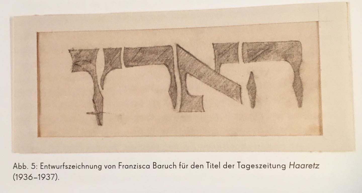
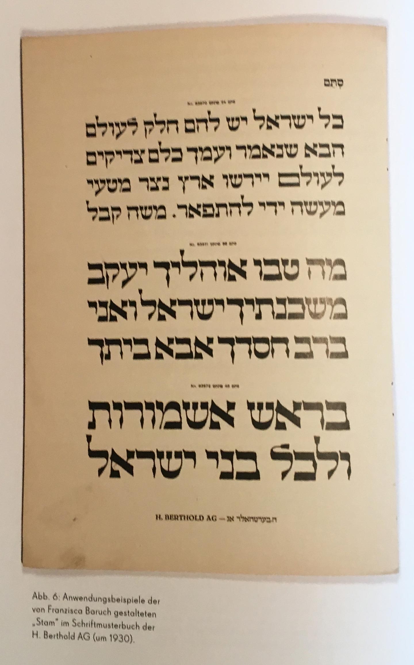
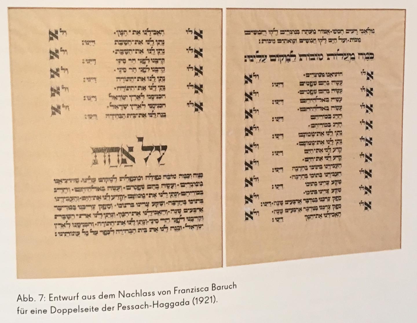
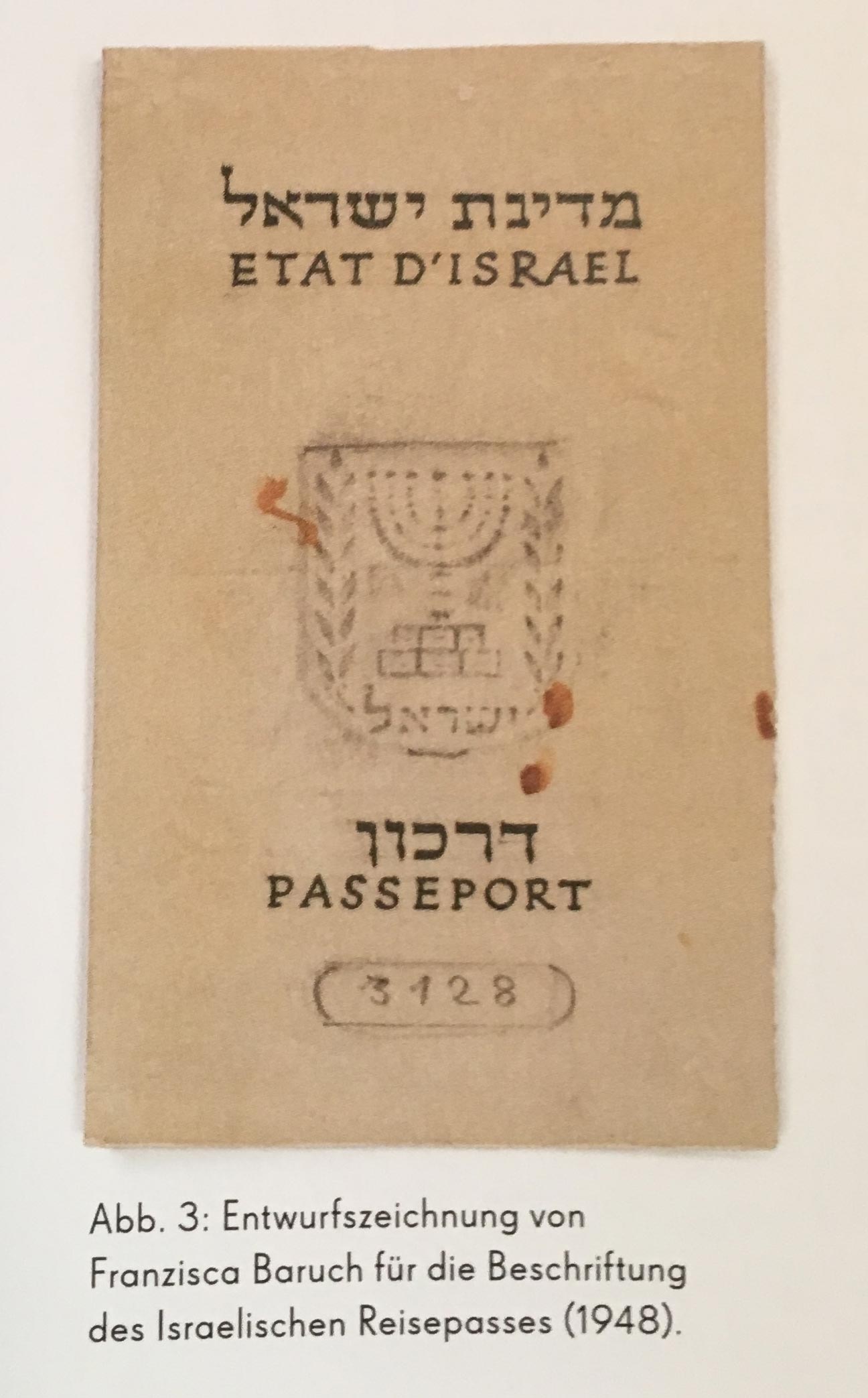
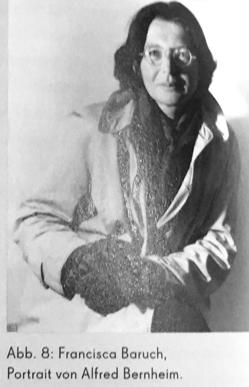
“I finally made it to the exhibition from Jerusalem, which exhibited work from Moshe Spitzer, Franziska Baruch, and Henri Friedlaender. That exhibition included Stam, a Hebrew typeface designed by Franziska Baruch for Berthold in the 1920s. Baruch left Germany for Palestine and died in Israel in 1989. She had a career as a designer in Germany in the 1920s and ’30s, and then in Palestine and Israel after that. Much of her graphic design for the State of Israel and for her Israeli clients was significant; however, she never wrote about her work.
While it was not mentioned in the exhibition, I suspect that Baruch was commissioned to design Stam by Oscar Jolles, who was Berthold’s director in the 1920s. Jolles was a prominent figure in the Berlin Jewish community, and Berthold’s publication of Hebrew type specimen took place during his tenure. Jolles died in 1929, but like Baruch’s mother and sister, his wife and daughter were all murdered in 1943, albeit in different death camps.”
I believe Liron worked on this exhibition and its original catalog? Does any of you type history or Hebrew researchers have more info on Franziska Baruch and her typeface Stam? I had never heard of her. Glad we can add another name to our Olden Type list.
* There is a documentary about Elizabeth Friedlander that just came out and will be shown in London on October 20. If you are in the area, this is worth watching.
Some shaky snapshots from the show:
I’d love to see this list growing.
For anyone interested, there is a digital version of Elizabeth typeface designed by Andreu Balius http://bauertypes.com/tipografia/elizabeth-nd/
Elizabeth/Elisabeth was commissioned by Georg Hartmann of the Bauer Foundry in 1927 or 1928. Friedlander had been a pupil of E.R.Weiss in Berlin, and was a staff calligrapher on Die Dame, creating their titles. Production of the face was held up by the depression after the Stock Market crash, and by the time Hartmann was ready, the Nazis were in power, thus the type was issued, at his suggestion, as Elisabeth rather than the intended Friedlander (a recognisably jewish name). See New Borders, the working life of Elizabeth Friedlander, by Pauline Paucker.
Graham also shared two images of Elizabeth’s typefaces, the roman and italic as released by Bauer, and a set of caps that was never issued:
https://twitter.com/GrahamMoss9/status/910920556240887808
https://twitter.com/GrahamMoss9/status/910916256429199360
Thanks!
Here a few pictures and text included in the type specimen of Montan by Anna Maria Schildbach http://peter-glaab.de/2012/05/montan-eine-verschollene-auszeichnungsschrift/
I’d like to suggest adding Friedel Thomas (1895–1956) to this list. She is credited with the design of Thomas-Schrift and the accompanying Thomas-Versalien, released posthumously by VEB Typoart in 1958. Some more info: https://fontsinuse.com/typefaces/38804/thomas-schrift
I’d like to suggest another name for this list: Friedel Thomas was a German designer who lived from 1895 to 1956. She is credited with the design of a typeface that was released by VEB Typoart posthumously in 1958. [Klingspor-Museum] The series includes Thomas-Schrift (8–12pt) and the caps-only Thomas-Versalien (16–24pt). [Typoart specimen, c. 1960s]
“In 1917, Friedel Thomas was one of the first participants in the lettering course of Anna Simons at the Handwerkerschule in Halle […] and in 1921/22 an assistant in the Munich studio of Anna Simons […] In 1922 she was named director of the the newly established printing workshop at Burg Giebichenstein […] In 1950 she returned to Burg Giebichenstein and taught typeface design as well as graphic design from 1954. // Dolgner 1993 // Schneider 1992” — Gerda Breuer, Julia Meer (ed.): Women in Graphic Design 1890–2012. Berlin: Jovis, 2012
Hi Florian! Very grateful for your comment! I am a graduate student at UVic, doing my MA research on early women type designers. Friedel Thomas is new to my list!
I have sent in an Interlibrary Loan Request for Breuer and Meer’s book, as I would like to read the information on Thomas. It’s odd that the designers of the digital version of the typeface refer to Thomas with the pronoun “he” in their specimen sheet: https://www.urwtype.com/graphic/family-pdf/fontforumthomasschrift.pdf
Hi Lauren! That’s odd indeed. A textbook example of bias. To be fair, the (nowadays uncommon) name Friedel is a bit ambiguous – one might assume it’s a diminutive of a male name like Friedrich. I wish they would have dug a little deeper when embarking on a typeface revival.
Wonderful article and I loved seeing photo of Ms. Baruch. In my book on type designer Carol Twomby I included a fairly comprehensive introductory chapter about women in early type design. Hope all of the work we are doing to shine a light on early women type designers gets them into the mainstream type history cannons.
A small comparison of original Elizabeth and Andreu Balius
https://designtraveler.wordpress.com/2014/01/09/andreu-balius-a-visit-to-catalonia-and-the-typerepublic/#jp-carousel-2765
Another one for the list. According to Friedrich Bauer’s 1928 chronicle on the history of German type foundries, Lina Burger was responsible for the several ornamental fonts – like borders, etc. – at Schelter & Giesecke around the year 1900. These included products called:
1. Edellinien
2. Patriz-Huber-Ornamente
Burger was born Lina Schroeder in 1856. She had been a pupil of the painter Anton Klamroth at the Unterrichtsanstalt des Kunstgewerbemuseums Berlin. I am not sure in what years she was enrolled there, but I assume it was before she worked with Schelter & Giesecke. This is quite interesting, because women were generally not permitted to enrol Prussian Kunstgewerbeschulen (arts and crafts schools) until 1906. Burger later exhibited her work in the women’s pavilion (Haus der Frau) at the Internationale Ausstellung für Buchgewerbe und Graphik at Leipzig in 1914. There are some photos of that exhibition, but I have no found any of her work. Anna Simons was probably the most renowned artist whose work was exhibited in that pavilion, and Burger’s work may have been in the same room.
Eleisha Pechey was born on December 24, 1831 in Bury St. Edmonds/Suffolk and died in London in March, 1902. She completed an apprenticeship in printing and bookbinding and began working for Stephenson, Blake & Co. in 1863.
Designed Windsor, released posthumously in c.1905.
I have since discovered that Elisha Pechey was a man.
Great article, would be amazing to know more about women presence in east typography too, if anyone knows about it.