
The year is 1915 and the typeface is Ella Cursief. While the name might imply that it is intended for the ladies that can’t be true because women do not even have the right to vote yet. Honestly, this is a typeface that simply cannot be pinned down by something so mundane and banal as a stereotype.
Is it a killer dame or a wisenheimer gentleman? All show and no tell? All gussied up and on the make? Available in light and airy or dark and brooding it could be used equally well on the sheet music for the Elsa Maxwell song “Please Keep Me Out of Your Dreams” you might hear on the Victor Talking Machine; or on the advertisements for the fashion-set, armed with their copies of Les Modes, crowding into the studios of their personal vendeuse on rue de la Paix or Place Vendôme or painted large on a billboard, all posh and pressed for the latest Ziegfeld Follies at the New Amsterdam Theatre; or splashed across the building telling the viewer about the latest Model T Champion race car. Ella Cursief truly could be all of these things.
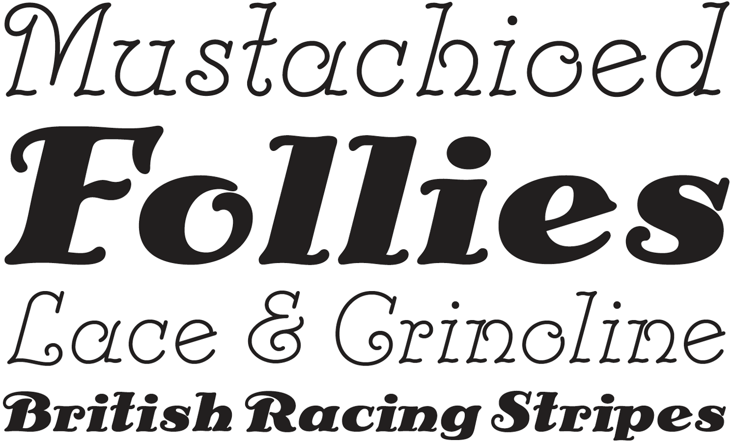
The truth is, this typeface could be used in a multiplicity of directions simply because its style transcends cliché. After all, in the hands of a skilled typographer, Ella Cursief can be elegant, charming, sophisticated, dapper, glamorous, or handsome at any moment’s notice.