
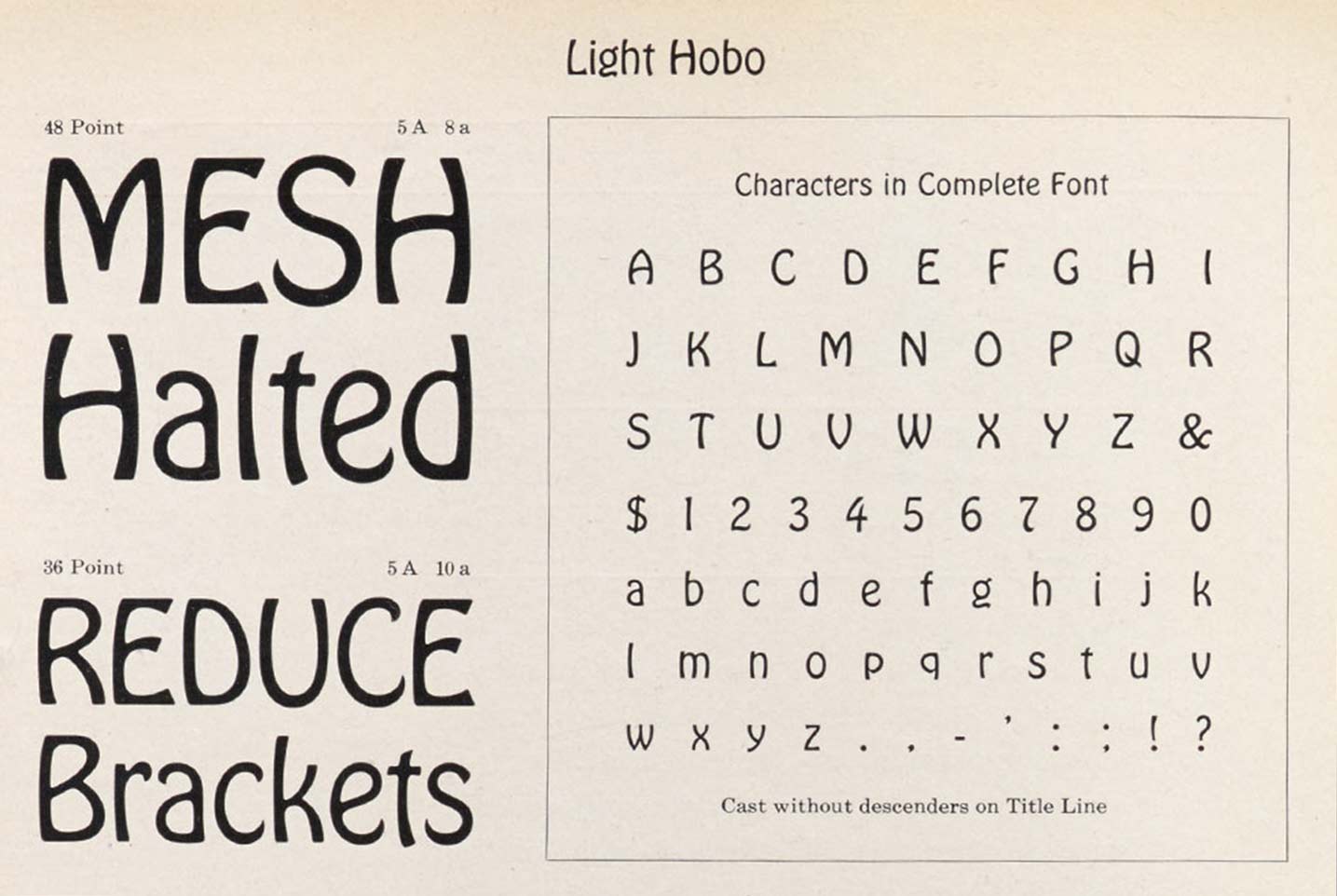
The first styles of Hobo were released by ATF in 1910. There are different theories about why Hobo is called Hobo, one being that it was left behind in the drawers of designer Morris Fuller Benton for so long that the typeface was known as “the old Hobo”. Other people think it was inspired by a Russian cigarette poster where the word ново (new) can be seen at the top. But it appears, the inspiration for Hobo’s letterforms came from a different word on the poster — Чудно. (Read the full story here.)

Hobo’s shapes are clearly influenced by the Art Nouveau style and its preference for organic forms even though it was published more towards the end of that movement — remember, it was in Fuller Benton’s drawer for some years before release. The typeface enjoys great popularity as a display face, which is sometimes hard to understand why. A sans serif typeface with almost no straight lines (there is one straight line in the lowercase a), no descenders and in an old-fashioned style … one would think this is the recipe for a big flop. But that was not the case. So much so that ATF now added a light weight to the series.
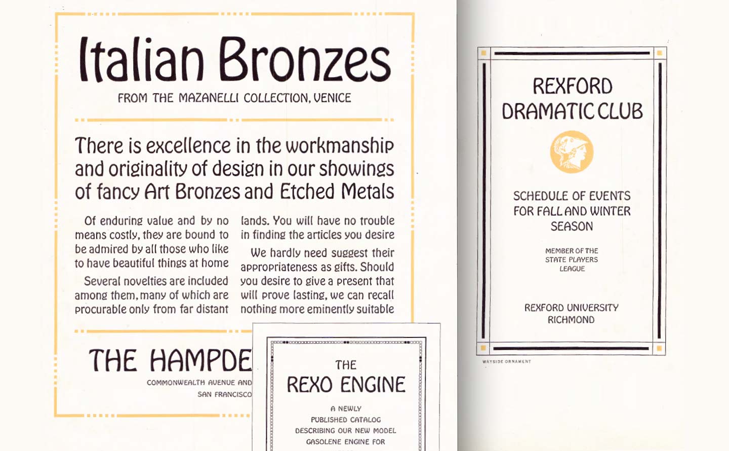
And the success just continues. You can find things set in Hobo everywhere, e.g. here, here and here, but like with everything that is popular also the other extreme.
I personally always found Hobo as a typeface hard to use, sometimes rolling my eyes when spotting it on the street. Fortunately James Edmondson made us look at Hobo differently. It is always amazing when people are so passionate about something that it rubs off on you, too, and I started to look at Hobo with new eyes. It is growing on me. I no longer think “Hobo! You are drunk, go home!” every time I see it in use.