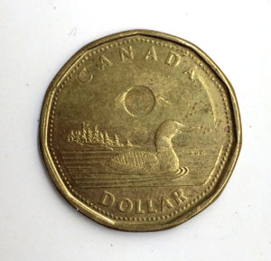
The Canadian dollar coin, introduced in 1987 with a loon featured on the back, is affectionately referred to as a ‘Loonie’. When the two dollar coin was introduced 9 years later, they had a public vote on whether to call it the ‘Twoonie’ or the ‘Doubloon’. They picked the former, which is a shame because if you have an opportunity to name your your money something pirate-themed, then you should totally do it. However, this essay is not about the mundane design of Canadian currency, but rather this particular Loonie, saved from during my recent decade Canada.
Environmental issues are a large part of Canadian life, the most notable being the Vancouver-founded Greenpeace. Most groups adhere to the typical methods methods of raising awareness, creating predictable banners, graffiti, and flyers.
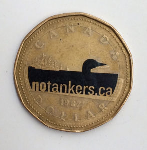
My Loonie features a clear sticker, just short of the circumference of the coin itself, featuring a black oil-covered loon swimming in a slick that announces the website. This directs the user to more information and a petition regarding tanker and pipeline expansion in British Columbia.
I think it’s brilliant. Physical currency is all pervasive (although perhaps it’s declining in these days of digital banking?) and I rarely look at the coins in my hand, usually going by weight or feel of them instead. But this coin caught my eye — an unexpected blob of black on a normally faded gold space. It communicates so much, quickly and simply.
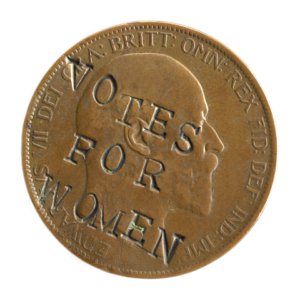
This isn’t the first time someone has done this, as a century-old equally subversive coin promoting women’s suffrage demonstrates. One can see the wobbly individual letters stamped into the surface that creates a more personal, or perhaps even urgent, tone to the campaign.
So every once in a while, look into your handful of coins and perhaps you will discover an equally intriguing message waiting to be rescued.
This post is part of My 2¢, a short series on money-related type and lettering examples, stories and thoughts. You can read the series here.


