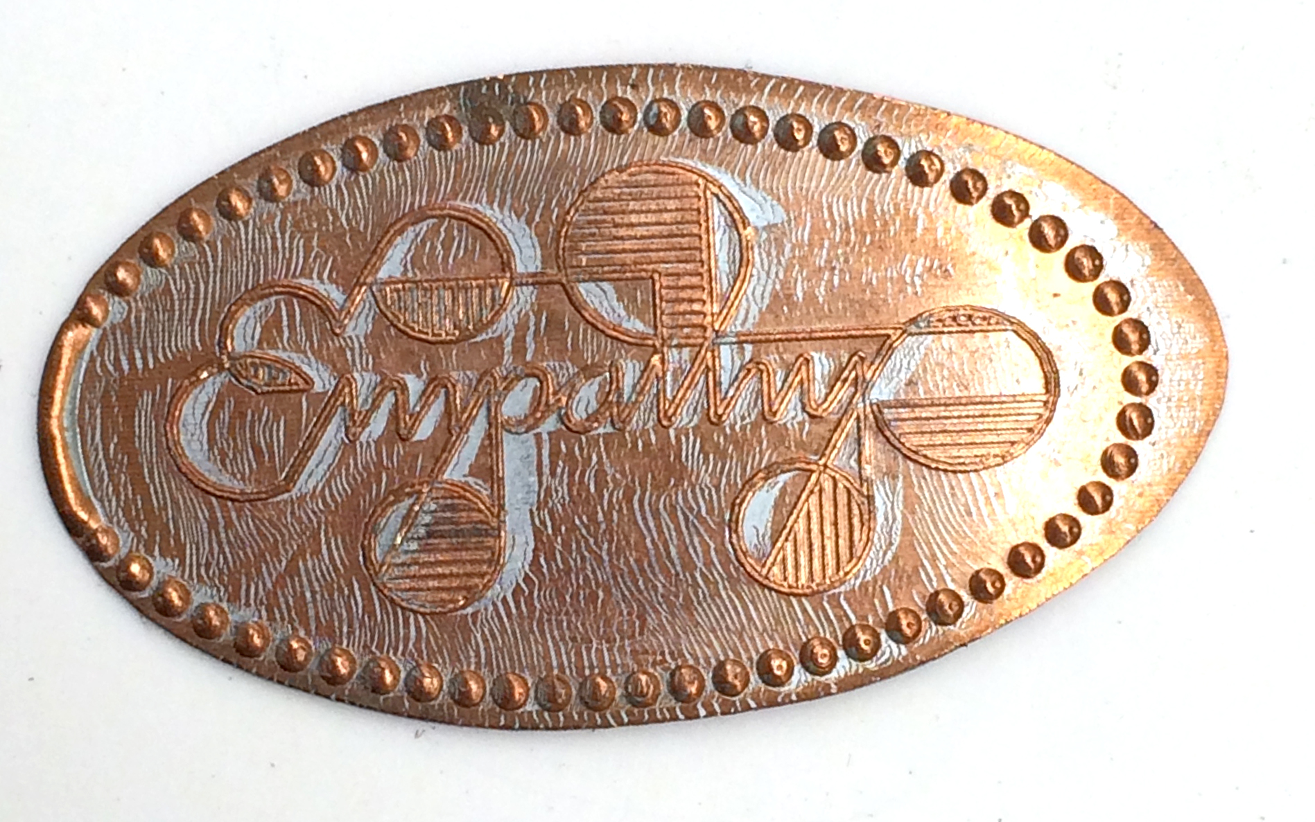
I have a penny that is worth far more than its currency, as it was designed by Marian Bantjes.
Several years ago, I taught a Type Camp at the Design Exchange, the Design Museum of Canada in central Toronto. In the lobby is a machine that imprints designs of several artists, one of which is Bantjes, onto pennies. (The irony here is that Canada has ceased production of the penny and is removing them from circulation. Therefore, trying to locate a penny to use in the machine is becoming a bit difficult.)
The penny, once pressed, becomes an oval, with a dotted periphery, and the word ‘Empathy’ in typical Bantjes style, slightly legible and extremely stylized. It moves between a script and a geometric typeface with integrated ornamentation in the ascenders and descenders. As with the majority of her creations, it requires work by the reader and provides a payoff at the end.
Of course, I was excited to find her work ‘out in the wild’ and promptly purchased and pressed one. I didn’t think about it much at the time and it soon disappeared amongst the detritus from that trip.
Just last week, I came across it again, after 2 moves, a change of country, a change of career, and a change of life. I am a different person now, perhaps more like myself or perhaps a different one altogether.
As I discovered the long-forgotten penny, my experience was nearly visceral. It no longer represented just her work, but now my connection to her, a close friend, whom I haven’t seen since I moved away.
I immediately thought about the empathy that has been bestowed upon me, or not, as well as the empathy that I feel and have felt for others. It also it demonstrated to me that a tiny token of an emotion, even in the smallest denomination and especially regarding empathy, can have an impact when one least expects it.
This post is part of My 2¢, a short series on money-related type and lettering examples, stories and thoughts. You can read the series here.
