
Typeface designers frequently seem to assume the more OT features their fonts have the better. Typeface users, on the other side, don’t always share this delight. They are often stressed by the complexity, don’t get any sense out of them or just ignore the features. Since I am both a designer and a user of typefaces I tend to sway from one position to the other.
In my work, where I am involved with script typeface design, OpenType features and coding play a very big role. I would say that a natural looking contemporary script typeface is not imaginable without an extended OT feature code.
Here are some reasons:
In order to avoid glyph repetitions and to let glyphs connect in a plausible way, alternate forms have to be made. At the beginnings and ends of words glyphs tend to look different from those in the middle, so for them too, “init” and “fina” alternates should be designed. To keep texts from looking monotonous and to add personality characteristic ligatures can be inserted. But they should “pop up” only once in a while — otherwise texts would get an artificial feel.
For these things we need the feature code. — To let a ligature pop up only once in a while; to let “init” alternates appear at the beginning of words, and only there; to ensure that a “righthigh” glyph (like o, v, w) is followed by a “lefthigh” and not a “leftmedium” or “leftlow” alternate.
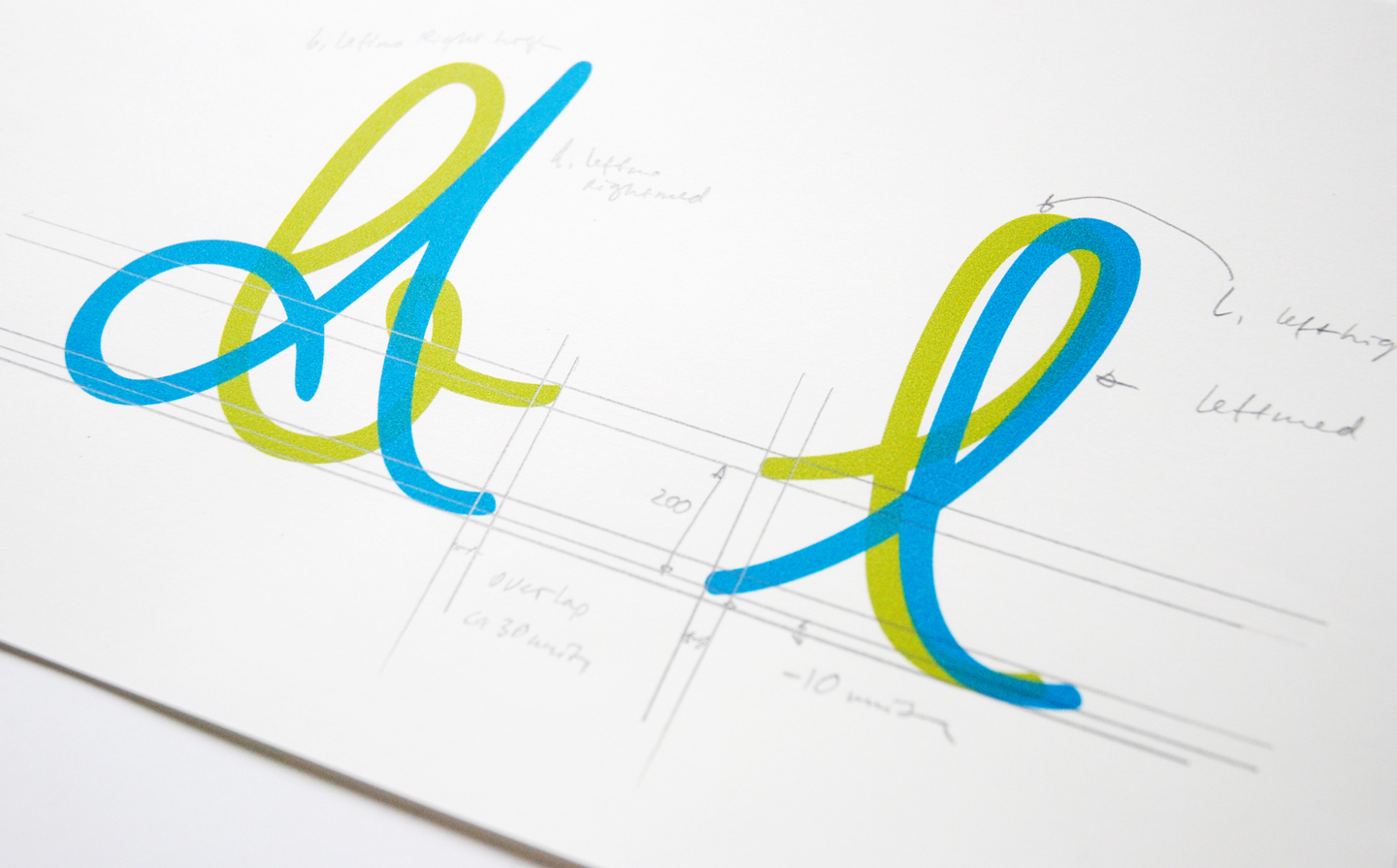
In my fonts FF Mister K and Josef K Paneuropean the results of some of this coding can be seen. The feature code defines in which surroundings different alternates (there can be a few thousand) substitute the basic set of glyphs. The code, which is usually placed in the “calt” and “liga” features (contextual alternates, standard ligatures), can be long and complicated. Luckily for the users, these features are turned on by default in most application programs, and everything happens automatically. So hardly anyone would think of disputing their usefulness.
Disagreements about OpenType features begin when users may/must activate them by themselves. Some consider them as superfluous frills and others as delicacies. In my type workshops I noticed that students and also professional designers find “discretionary ligatures”, “stylistic sets”, “stylistic alternates”, “titling alternates”, etc. often cumbersome and frequently just ignore them. Additionally, in many cases it is not easy to see their effect. An example: A popular typeface we all know has 14 stylistic sets, with each set affecting only a few characters. It’s quite a job to figure out what they are all good for. — In my view, this is overfeeding users with OT features, and we should try to avoid that. Among others I have these two possibilities in mind:
I. Let important effects happen automatically.
II. Let alternates in style be independent from OpenType.
About I: Key features for this are “liga” and “calt” since they are active by default. Here an example from FF Mister K: Besides the basic set of capitals (which are very “kafkaesque”-looking) there is another set with simplified, clearer shapes. For acronyms and other all-caps contexts these are preferable. Users can activate them manually by selecting “stylistic set 01” or “stylistic alternates”. But also in “liga” there is a code which substitutes the basic capitals by the simplified ones when caps are typed directly one after another. So unless someone purposely turns the “liga” feature off this will happen automatically, and “stylistic set 01” does not have to be activated.
About II: After experiencing how frustrating it can be to figure out the effects of different “stylistic sets” I figured out that it is often more user-friendly to create extra font styles. Users can select them easily from the character window and instantly see the changes in a text. Like this, they get a quick and easy overview of all the possibilities a font offers. For a typeface designer there is also an advantage: A large number of styles in a family is usually more highly appreciated by customers than only few styles with large amounts of glyphs plus stylistic sets.
There are, of course, also OT features which are — depending on the type of texts to be set — simply essential. If we forget script and display for a moment and talk about texts with somewhat demanding or even scientific content the following seem indispensable to me. Concerning numerals: proportional lining, tabular lining, proportional oldstyle, tabular oldstyle, superscript, subscript, numerator, denominator, fractions.
For text and punctuation: small caps, capital spacing, case sensitive forms and ordinals.
I think all of them should be available — and many text font families have them. But if you look into details there are quite big differences.
Take as an example “superiors”:
In many typefaces only the numerals 0 to 9 exist as superiors.
With them, you can set annual figures as shown here:

But you could not set a page reference like here:

And you could not set this very basic chemical equation:

Or if we take “fractions”:
In many typefaces the “fractions” feature works only for the most common fractions and shows them like this:

Only seldom is the feature “alternative fractions” available showing stacked fractions — which are in many cases much clearer:
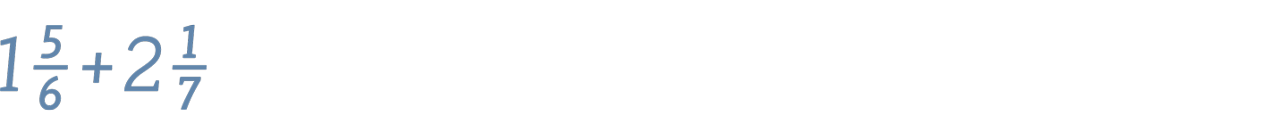
The examples are shown in my typeface Mir.
Fine, these were some “serious” OT feature applications. Now let’s look at cases where they are just fun to use and part of the game.
Very popular these days are layered fonts, mainly because users can multi-color them. Often the feature code for this is placed in “stylistic sets / stylistic alternates”. I too went this way when I made my symbol font FF Mister K Dingbats. Here the procedure of its use: First, set a background form; second, set a frame; third set the icon. Then apply different colors and finally activate “stylistic set 01” to let them slide over each other:

FF Mister K Dingbats
For the Swashes of my font family Emily In White (based on poet Emily Dickinson’s handwriting) I left away the stylistic set and put the layering code in “liga”. As shown in the illustration: first type a letter (example “y”) — and an ornament appears as an outline. If that’s what you want, color it and finished. If instead you want the filling, don’t type “y” but “y1”, again color it and finished. Finally, if you want the outline and the filling, type “y1”, then “y” and color them; finally type “2” to let them slide over each other.
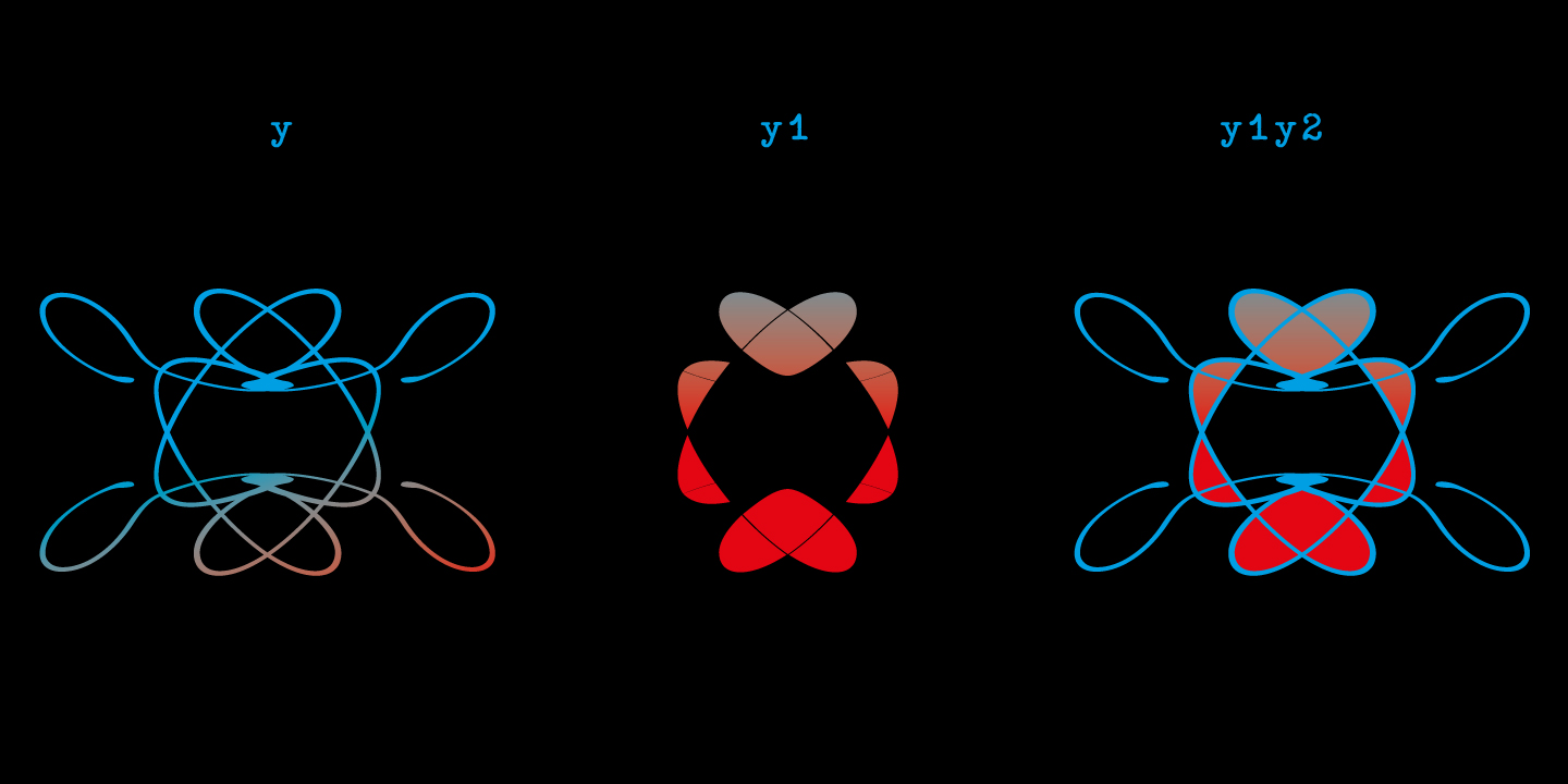
Emily In White Swashes
With my latest font family COLORADO I decided to skip OpenType for the layering altogether — and it works beautifully in a very conventional way: First, write some words in COLORADO X. Then successively copy, paste in place, change color and style …

Colorado X

Colorado X, Colorado IOO

Colorado X, Colorado IOO, Colorado OIO

Colorado X, Colorado IOO, Colorado OIO, Colorado OOI
Although COLORADO is my last release and I minimised OpenType coding there (it has only 6 features), I am surely not moving away from OpenType features in principle. For me they are just not ends in themselves.
On this note, a last example — a possibly completely senseless font. When it is finished it will be another one of my “K-Fonts” — Josef K correcting typewriter texts. The font contains two character sets: one is in typewriter style, the other in Josef K style. OpenType code in “dlig” (discretionary ligatures) allows users to cross out parts of the typewriter text and put Josef K’s correction remarks over it. Here is what a text looks like (“dlig” activated):
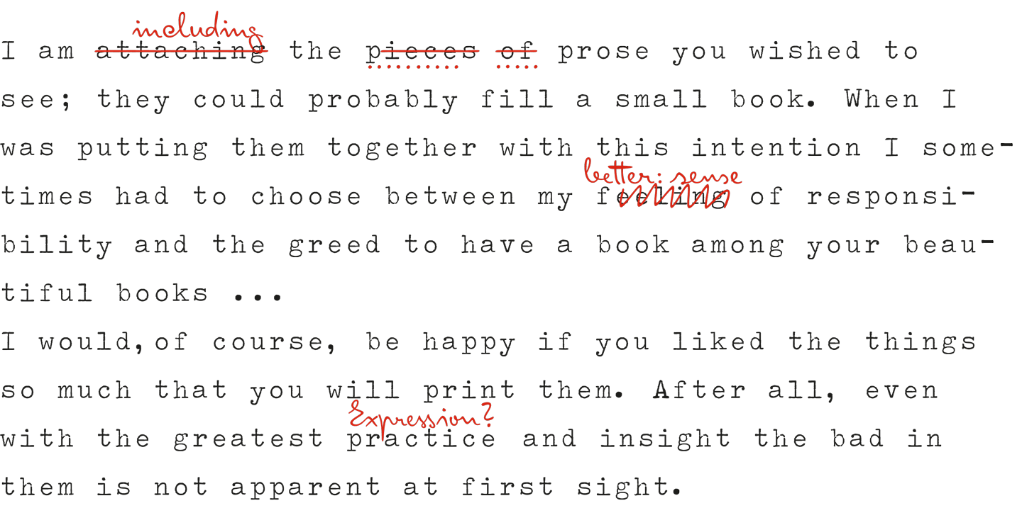
And this is what you type before activating “dlig” (second last line of the text):

I hadn’t expected it, but when a friend of mine, who is a language teacher, saw this she got the idea to use the font to correct her students’ exercises. So who knows, maybe Josef K Typewriter will some time or other even be used for serious work.