
As a type designer, every so often, one is confronted with the question “Do we need more typefaces?”. As somebody who makes a living out of creating typefaces, the obvious answer is yes; however, here are other less subjective reasons in favour of new type designs.
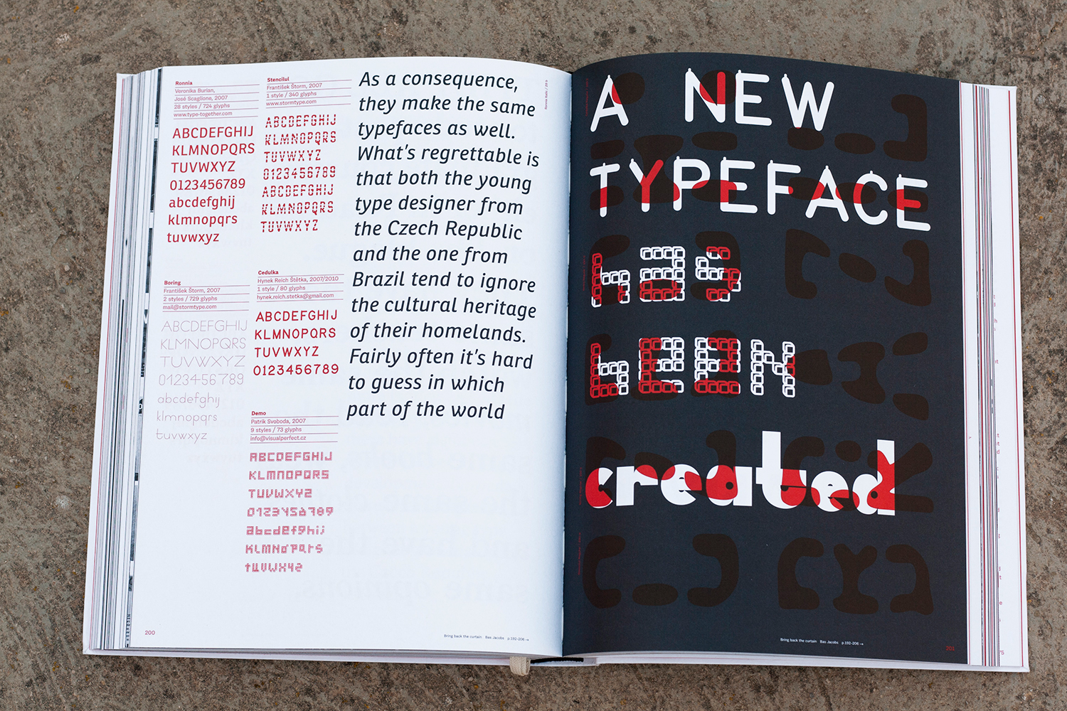
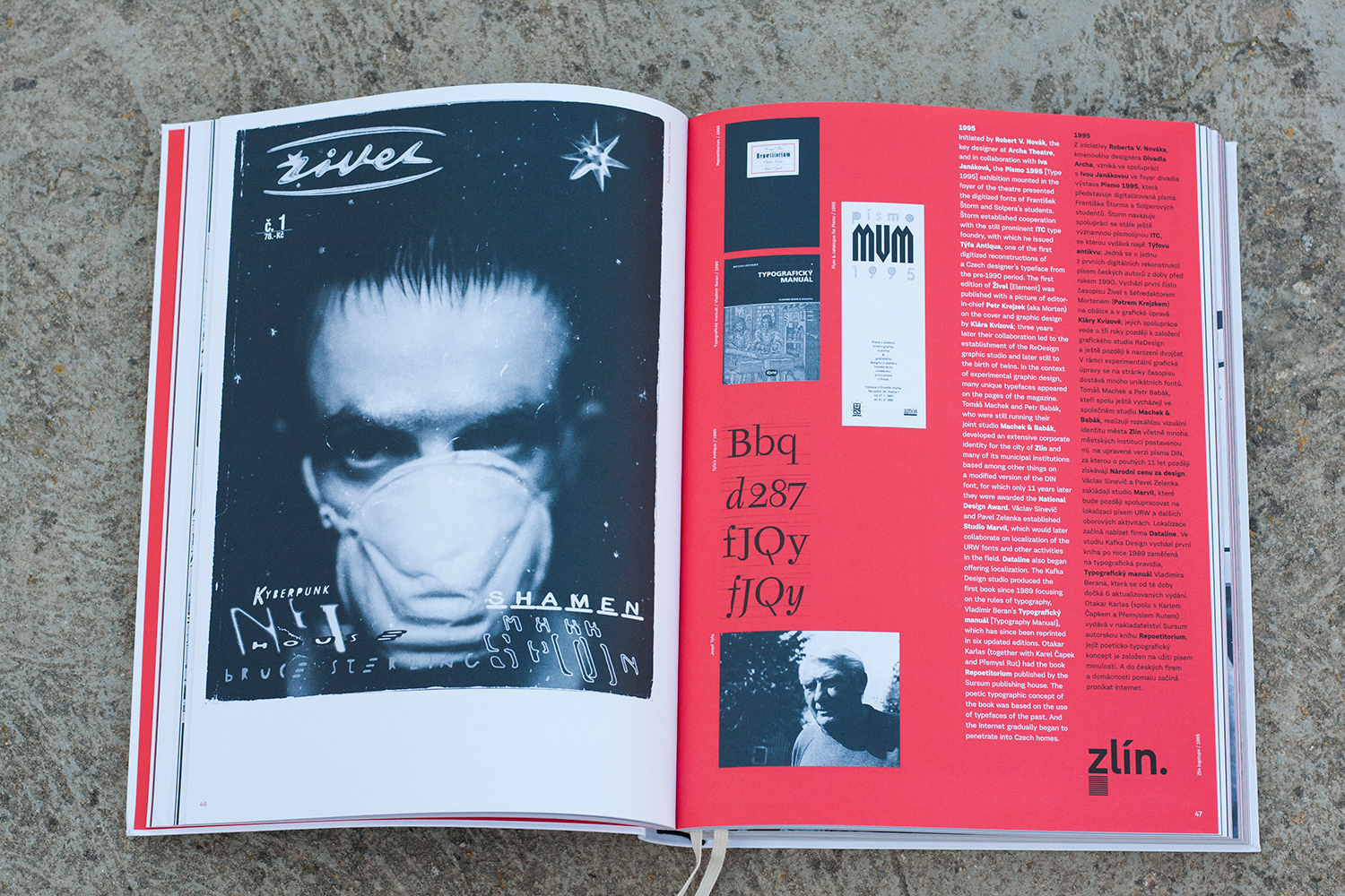
A spread from the book Typo 9010, Czech Digitised Typefaces 1990–2010
An effective way of weakening this question usually asked by lay persons is to pose another question, such as “do we have enough music, or clothes, or art?” In the same spirit, I agree with Cyrus Highsmith’s reply “You know, I heard the same thing about people!”
Type design is a carrier of our culture and is subject to developments and trends, even more so in this world of constant movement and change. Type matters more than ever, with increasing self-expression and communication channels, different media and mobile devices that rely heavily on typography for information and coherence of visual identity. The digital fonts and desktop publishing era has irreversibly changed the process of designing typefaces. The internet and the growing necessity of multilingual, and often multi-script, information pieces have significantly increased the complexity of the type design profession. At the same time, design tools have become faster and easier to use, allowing for a massive flood of digital typefaces in the market. A significant amount of them are novel, short-living bursts of creativity though, often technically and aesthetically flawed. I see no harm in them. They don’t waste resources or energy other than the author’s own and they are part of our digital online culture, manifested in free, open-source tools and the accompanying enthusiasm of users and creators alike. There is a large gap between the occasional amateur who would create a typeface with limited knowledge and the professional type designer who is providing a very specialised service. These are two extremes that should be differentiated. Font piracy is an obvious issue here, but that goes beyond this essay.
Typography is ubiquitous and often taken for granted. Most people don’t think about it as it is just there in their everyday lives to fulfil the many roles type can have. I believe that this existence in the “background” is one of the reasons why the “Do we need more typefaces?” question comes up so often; although it is indoubtably a valid question from the reader’s point of view. The biggest factor in graphic design is communication and typography is the main contributor. So when a graphic designer begins to wonder about the importance of typography, then they really question the essence of their profession and therefore might want to think again. One has to be prepared to move out of an established comfort zone with prescribed recipes and instead explore new ideas and concepts. Using new typefaces is part of this.
Nevertheless, a type designer should, at least to some extent, think about the driving forces behind creating new fonts. Perhaps one of the most obvious reasons is a personal interest in letterforms and the desire to experiment with them. Taking the letterforms to the extreme and back and seeking new shapes can even become an obsession. This kind of drive already flourished in the Czech Republic after 1918, when the country became independent and new opportunities became available. New publications, book designs, and graphic arts boomed under the umbrella of nationalism and the quest for Czech visual expression. Increasing confidence and the search for national identity enhanced the evolution of the Czech book craft along with type design. A small group of artists endeavoured to address the present deficiencies and to establish a sovereign Czech style. Names like Vojtěch Preissig, Karel Svolinský, Karel Dyrynk, Jaroslva Benda and later Oldřich Menhart come to mind. They recognised the demand for typefaces to be able to highlight the intrinsic peculiarities of Czech handwriting. A large part of their endeavour was to create balanced diacritics, so crucial for the Czech language.
A similar motivation can be ascribed to the wave of typefaces created after 1990 in the “new” Czech Republic. Not only was there a need to express the freshly gained freedom from the political regime and its visual uniformity, but it also provided tools for the digital era, after photo composition had quickly become obsolete. The majority of the fonts from this era are no longer used. This is irrelevant as they influenced the visual environment and helped to create a distinctly different visual culture from the previous years.
New technologies, such as the introduction of personal computing, and the resulting radical change of graphic design and type-making, are good reasons to develop new typefaces. In the case of Eastern Europe, language specific requirements also came into play. In the early 1990’s barely any digital typefaces included well-crafted accents. Global markets and necessary language support, together with technological developments, are now more than ever a driving force behind the creation of new fonts. We have high-resolution screens, tablets, e-book readers and many other forms of mobile devices that pose new demands on typefaces. Publications tend to exist in both printed and digital format simultaneously with portable devices demanding flexible layouts and brand coherence. Here the typeface has to perform well on all of the different rendering devices without difficulty or adjustment. The best way to ensure this is to create a bespoke typeface. It is, along with the company’s logotype and colours, a crucial component of the corporate identity. The typeface communicates with the customer on a subtle but important level conveying the company’s core message and enhancing its recognisability.
There are several reasons for the growing demand of tailor-made typefaces: they share the same language as the rest of the visual program of a company, guarantee the process of exchanging information both internally and externally, and allow for the company’s expansion with no extra licensing charges. In global markets with their broad diversifications of media, having a distinct typeface can be valuable. This practice, so common in places like the United States and the United Kingdom has found its footing in the Czech Republic as well, albeit with some delay and a greater need to convince potential clients. There are good examples in the Czech Republic though and the creativity of Czech designers and students is still growing and flourishing. Indeed, the growth of independent foundries globally and the mid-sized firms growing as well is a good indicator for the increased appreciation as well as the need for good typography.
For a small foundry, it is important to establish its own unique portfolio of typefaces, ideally with a particular focus, e.g. text typography, scripts, historical revivals, etc. Commercial decisions can lead to the development of new typefaces and as a small business one needs to respond to and, in the best case scenario, inspire trends within the industry. Quality control and an aim to contribute original solutions rather than plagiaries should be the pillars of new designs. Some of the best solutions are mixtures of personal exploration with an understanding of historical contexts and abstract concepts.
Private interests, technical developments, bespoke client requirements and commercial decisions, are all reasons for creating new typefaces. The last item on this list is preservation and improvement of historical typefaces, which are still relevant today or serve as a direct source for inspiration. There are many grades of authenticity in revivals and it is worth questioning how true one should stay to the original. Typefaces from the 20th century, during hot-metal times, were restricted by technical requirements of production. For example, italic and bold styles for Linotype machines had to sit on the same widths as the regular style. This lead to “unnatural” shapes, which were a necessary compromise. These concessions can be rectified by reinterpreting the analog designs and adapt them digitally. From my point of view, revivals have their place and reason, but it is more interesting to develop contemporary ideas.
We can conclude that the five-typeface-credo is a mindset of designers from the 1950s/60s that was rooted in technical limitations as much as ideological ones. It has no place today, and I encourage people to contact type designers and foundries to ask for advice, get additional information, and generally involve them at an early stage of the project. Their expertise can help all designers to move away from the ordinary and towards originality.
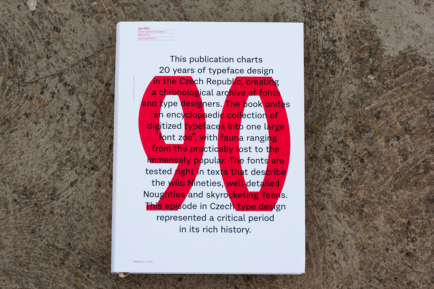
This article was originally written in 2012 for the book TYPO9010, that shows all the digital typefaces produced by Czech designers during a very significant 20-year period, 1990–2010.
Pingback: 365typo: Why do we need more typefaces?