
Sometimes, parts of what you write for a specific article gets left on the editing room floor. Those bits might be the most interesting parts, that simply don’t necessarily fit perfectly into the story. Sometimes it’s the predefined word count which is forcing one to leave it out. But the interest stays, and the will to dive deeper into the thoughts and process behind one typeface does not leave. This is the story of Sandrine Nugue’s Infini, a typeface she designed after winning a commission from CNAP (National Center of Visual Arts) in France, and is available for free, to everyone.
I followed up with Sandrine and asked more questions, based on her original replies. This typeface is so nicely explained, with the process shared and great images, that I encourage every reader to take a quick journey into a typeface that is both here and there, present and past, serious and lively.
Infini was designed by Sandrine in 2014 and is considered a public commission, published in 2015. One of its goals was to raise awareness of type design and typography. “It was an important moment for the French scene of design because it was the first time we focus on Type Design in this way.” Sandrine shares. “Véronique Marrier has really supported it at CNAP. We are pretty lucky in France to have this institution, it is a kind of guardian.”
© Richard Pelletier
“I graduated one year before and I was working for other type designers when the commission was revealed. It was an evidence for me to participate. Three designers were selected to make a proposition to the jury. The request was to design a typeface family (regular, bold, italic) which is linked with a pedagogical project. Its goal was to explain to everybody –not only designers– what is typography. In Infini, I have totally focused on my interest in writing and typography. I have tried to make a sincere and clear proposition. It was very stimulating to expand this story.”
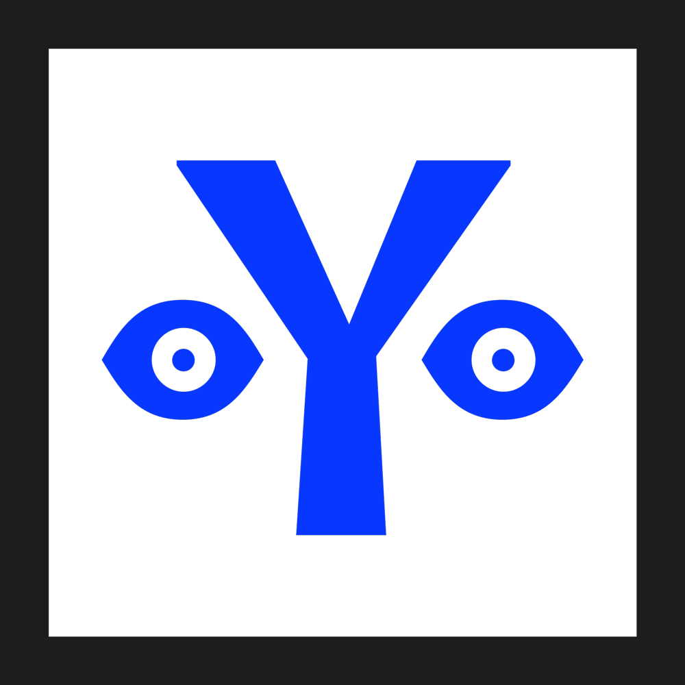
“Pictogram was the origin of letters so I thought it could be interesting to make a chronological history of all the steps and begin with ancient writing.” She was designing the pictograms and the alphabetical glyphs simultaneously. “I am fascinated by this human invention of this slow development and what it implies, all social and political changes. I like to search for important moments in history that express the relationship between politics and writing since they are so connected from the beginning.”
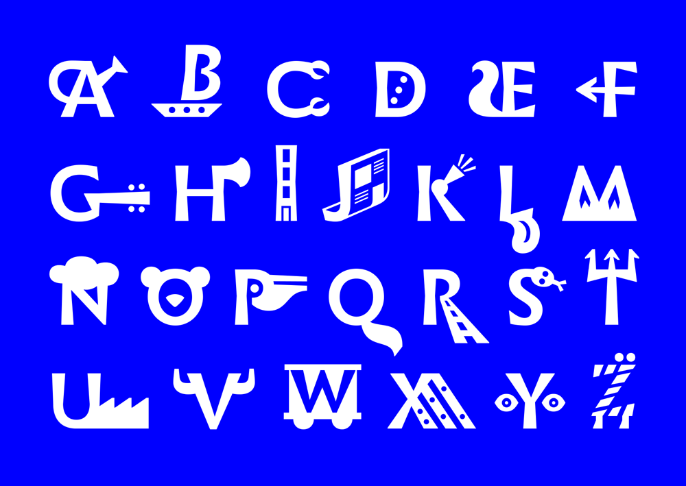
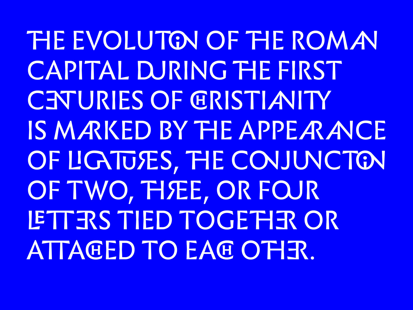
“If we talk about the origin of writing, we automatically think of pictograms. With the first pictograms, we learned about our world, ancient way of life, daily practices. Ancient pictograms were necessary to share information. They were synthetic, so synthetic that they became letters, only keeping the first sound of a word.” Though emojis are often seen as contemporary pictograms, she explains how the role of the pictograms in Infini was different. “The typeface has to be readable and not disturb the reader, I have wanted to add to this vision and modify our usual perception of letters. Suddenly, letters become mysterious images, catching our attention.”
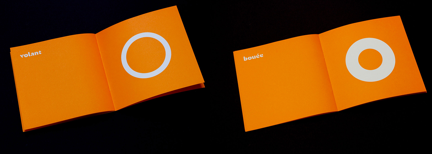
Sandrine continued her deep interest with pictograms to a more recent project, a series of mini self-publications called Figures, published last month by Le Signe (the national center of Graphic Design, based in Chaumont). “The publications contain only geometric shapes and allows the reader to interpret them. How can a round shape have many different stories? It all comes to the same principle, both writing and pictograms are conventions, and it is exciting to play with our knowledge of signs and symbols.”

Going back to Infini and its design process, Sandrine was initially thinking about monumental Roman capitals as her source of inspiration but quickly decided to go back even further in time and look at Greek writing. “The challenge was to make it contemporary. I have only kept few features, particularly the flared shapes,” She was also trying to stabilise the written form and make it more typographic.
As we are often not designing in a void, I thought it is relevant to look back at Sandrine’s background. “I have studied in different art schools in Lyon, Paris and Strasbourg where I have graduated in graphic design. After my graphic design Master degree, I came to ESAD Amiens, a postgraduate course where I have learned type design. Sébastien Morlighem –who had written the texts of Infini specimen– was one of my teachers.”
“This diploma was a great moment to be concentrated on drawing, reading, writing, designing and testing with passionate teachers. There, I have decided to focus my diploma on a Latin family with optical sizes. I have designed Ganeau after discovering François Ganeau’s Vendôme.” And indeed, as the story unfolds, Ganeau was previously mentioned as the precursor to Infini. “What I tested with Ganeau, I used it and accomplished it with Infini. Particularly with the Ganeau caption. Very direct shapes, no space for sophistication because it is small it needs to be efficient.” When continuing to enquire about the process of moving on from Ganeau, it became clear that our designs style are so engraved in our heads and hands, as Sandrine elaborates: “When I was designing Infini, I did not think about my last typeface Ganeau. It was a new drawing and Ganeau wasn’t my source. Thoughtlessly, I suppose its matrix was in my mind because I was a young practitioner and the commission was hurried I needed to make quick choices. Without much intention, the structure of Ganeau was present. Sometimes, I regret that I have not released it, but I suppose it keeps its spirit in a way.”

This is the perfect time to publish this interview, since Faune, CNAP’s new commissioned typeface, by the renowned typeface designer and researcher Dr. Alice Savoie was published a few weeks ago. Sandrine tells me that “Because the first commission was well received, CNAP decided to make a second one. This time, the collaborated with Imprimerie Nationale. The process was the same, an open contest and a selection by three people. I was part of the jury and saw very nice proposals. At the end, we have chosen Alice because her proposal offered a wide perspective too.” More on Faune, very soon.

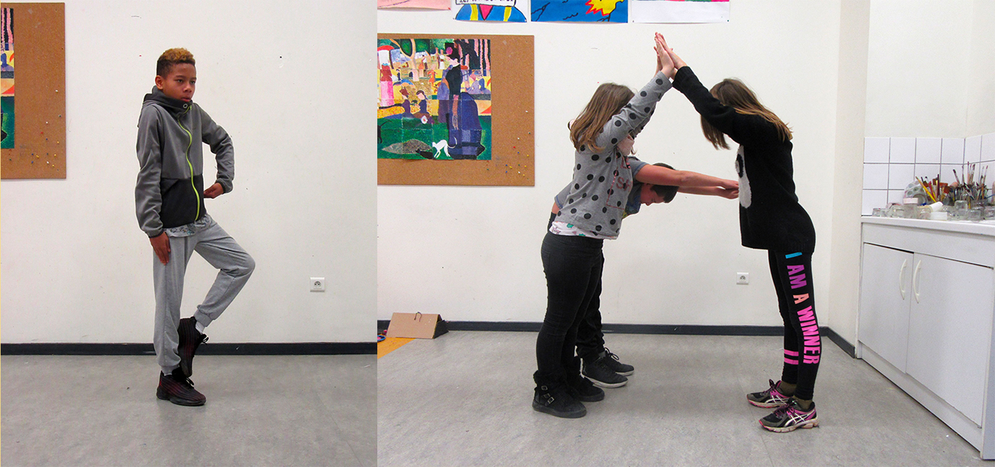
These days, Sandrine is working on various projects. She teaches in art schools, encouraging children to draw letters with their bodies. This unique exercise of using the hands and arms instead of pencils and paper engages children who don’t usually participate in class.
“More and more I like to involve the body,” she shares. “Gestures are another language which I focus on. I am working on my first dance performance with two dancers who will walk on a partition I will paint on a floor. That will be in the Piazza of Pompidou Center to open a festival in April.”
In addition, her type design work is not neglected: “I am developing Orientation. The typeface has been designed for a student habitation signage two years ago, used by the graphic designer Thanh Phong Lê. Now I am extending it to a full family which will be released with a foundry.” In January, she received the Grand Prix de la Création de la Ville de Paris award for a young designer. This was the first time that a type designer received the award which helps grow awareness to this profession.

©Thanh Phong Lê
Starting with the recommendation to open another browser tab (I have dozens open while you are reading this) and dig into the Infini mini site I might as well repeat it. Surely, us type lovers are not the only ones browsing through it. This typeface is widely used and downloaded. How does it feel? “I really enjoy to see it freely used by anyone,” Sandrine replies. “Because I do not control it and who will use it, it is still a surprise. Almost every week, I discover new ways of using the typeface. I see them by accident or people send it to me and I am very grateful about that. Because it is free, now Infini is widely spread. I didn’t expect it so much. I see it used by a lot of graphic designers and students in very different ways, for running text in book or as display text for signage, logos and posters.”
©Design & Photo Mirko Borsche
©Design & Photo Mirko Borsche

©Design & Photo Dépli Design Studio
Sandrine shares an important note regarding free typefaces around the web. “I insist on the fragile economic aspect of typography. I used to explain that CNAP pays me properly to allow users to download it for free. The aim of this commission was to explain what typography is today and the economy is an important aspect of it.” This is a great line to end with, I believe. Respecting the designers and educating the public on type and our trade is the base that we all hope to lean on.