Workspacing, part 1

An inspiring workspace isn’t easy to create. And yet, after we get our act together and design a space that is right for us, we know that our work will be better. We will be more motivated, our mind will be clearer. This workspace will allow new ideas to flow and focus time to be cultivated.

When thinking of a type designer’s desk, we may have a few images in mind: the messy, crazy-artist desk with ink all over and paper flying around. But at the same time, we may imagine the ultra-organised designer where every file is cataloged in a neatly labeled folder, a huge monitor and the newest tech gadgets.

Out of pure curiosity and an unmet wish to be a fly on some Alphabette’s walls, I’ve set out to explore some of our workspaces.

Feel free to reach out to any of them, ask questions and share what you thought.

Let’s begin!
Continue reading
Challenging myself

Mental clutter: Heaps of articles I want to read, podcasts I want to listen to, photos and thoughts I crave to share. Organising my digital assets (aka mess) became a feel-good activity. With so many things unclear and uncertain in 2020, the thought of having a clean inbox, an organised closet, or a quarterly plan gave me peace of mind. Continue reading

Graphic memory & transferable drawers — Talking with Elena Veguillas

After a long break, we are returning with the interview series. I am well aware that life is busy and that you probably feel like there is much to do in all areas in life. It’s rare to see someone focusing only on one thing, and structuring the days with a single repeating activity. It is the combination of different activities that make our lives unique and interesting, and so very often, we clearly see how one action in our days affects the other in a big pile of, well, life.

Elena’s name pops up whenever someone mentions writing, research, design, and publishing. She is a woman of many traits that made me fascinated by how in reality this works for her.

Continue reading

Soundtracks & comfort zones — Talking with Luisa Baeta

It has been about 20 months since the last interview in this series was published. Since then, many things have happened & a lot has changed. Returning to this format is incredibly comforting to me. The familiar structure, the visual glimpse into one woman’s life, the personal questions that get such honest replies.

Luisa is a person you want to both hear and read. You don’t want to miss a word, since they are all clear and make you think. Walking with her on the streets of Thessaloniki some years ago, I was lucky to find a friend so soon after meeting in person for the first time. The ease and sincerity of her thoughts are very much apparent in this interview. I urge you to find few quiet moments to read, drink something relaxing (hot chocolate? something stronger perhaps?) and let it sink in slowly, along with this interview.

Continue reading

Expanding on Infini, with Sandrine Nugue

Sometimes, parts of what you write for a specific article gets left on the editing room floor. Those bits might be the most interesting parts, that simply don’t necessarily fit perfectly into the story. Sometimes it’s the predefined word count which is forcing one to leave it out. But the interest stays, and the will to dive deeper into the thoughts and process behind one typeface does not leave. This is the story of Sandrine Nugue’s Infini, a typeface she designed after winning a commission from CNAP (National Center of Visual Arts) in France, and is available for free, to everyone.

I followed up with Sandrine and asked more questions, based on her original replies. This typeface is so nicely explained, with the process shared and great images, that I encourage every reader to take a quick journey into a typeface that is both here and there, present and past, serious and lively.

Continue reading

Letters in Letters
A chat with Carolyn Porter

If you have been following my interview series here on the blog, you might already know that there is a well-defined structure for those conversations. Today, I want to share an interview done in a different way. It will be quicker, a bit more friendly and not any less personal. Carolyn recently published a typeface and a book, and those two were good enough reasons to sit down and enjoy a virtual conversation about the process.

Continue reading

Rush & Flow — Talking with Marina Chaccur

Nina, continuing the Den Haag theme (well, not anymore!) chose Marina to be our next interviewee. Honestly, one of the emails with five chosen questions I sent to Marina started with (quote:) “I want to be your friend!” I didn’t even care what she will think of me, proposing friendship out of the blue. In case you are wondering why I am sharing this with you, just read on and you will probably tell her this as well.

She is full of energy. This energy is present in every line Marina wrote, makes it feel like she is talking to us, telling some of the “behind the scenes” stories. She was so engaged in writing the most whole answers, no ego or vanity involved.
Now, I am not sure what I should advise you to drink while reading the interview. As you will see few lines down, Marina offers some flavorful choices. Either way, I know you will enjoy what she has to say.

Continue reading

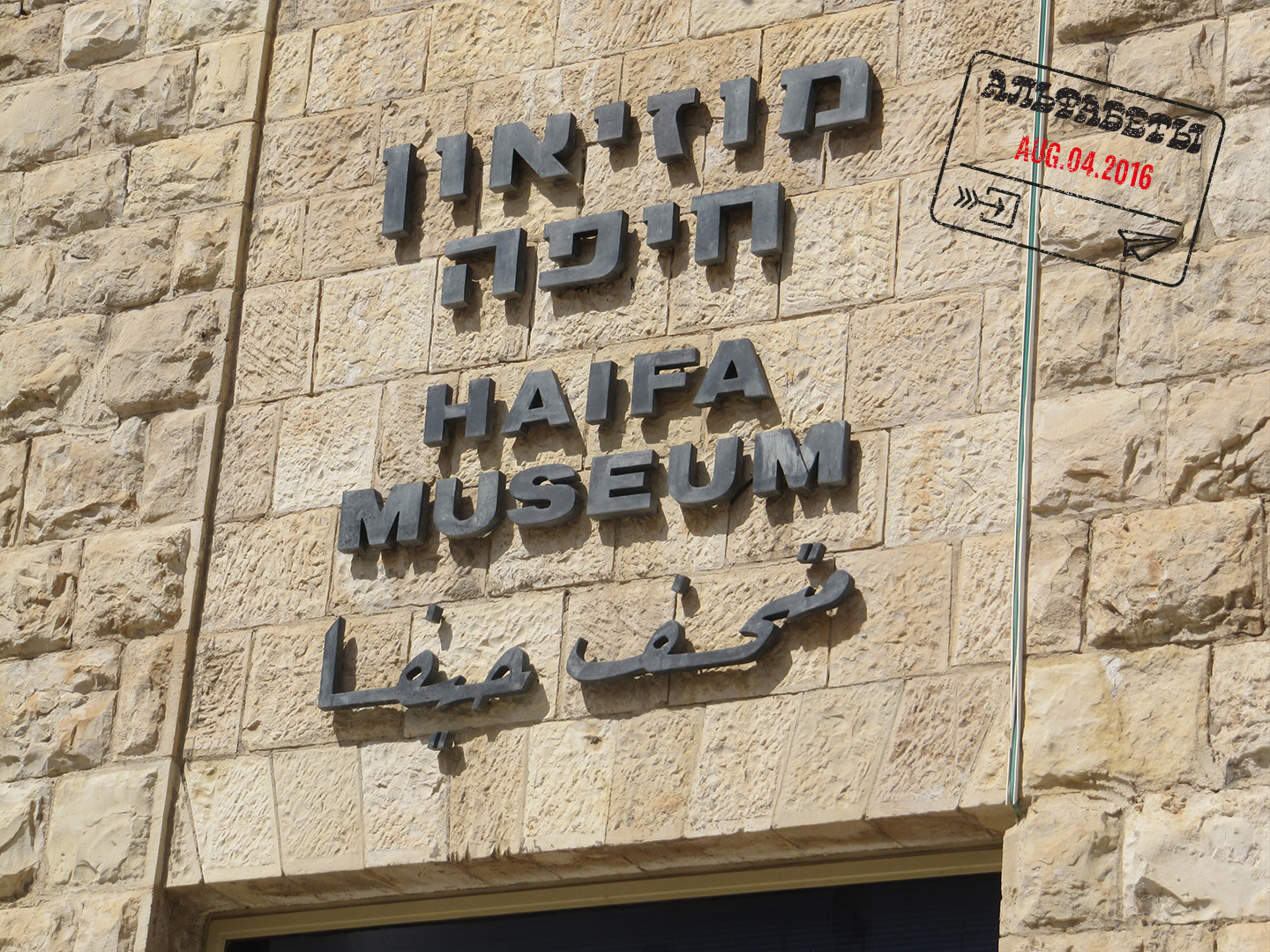
Greetings from Haifa

How is it possible that it’s August again??? This summer, we wanted you to travel with us (for free!) around the world and enjoy some typographic curiosities we have around us (check out this map by Indra). Those posts will be scattered throughout the month, marked with a passport stamp on the first image for quicker spotting. This is a perfect excuse for a tomato juice! Here we go:

Scripts don’t live in a void. They live together, interlaced, in Israel’s urban environment: Hebrew, Arabic and English. Each script is affected by surrounding scripts, which in turn influences them back, a symbiotic relationship. Examining trilingual signage in Haifa provides an opportunity to discover meaning among the different alphabets; an additional benefit is that it is a good excuse to show some of what surrounds me in my hometown.

haifa10

Continue reading

My 2¢: Two Typefaces, Vanished

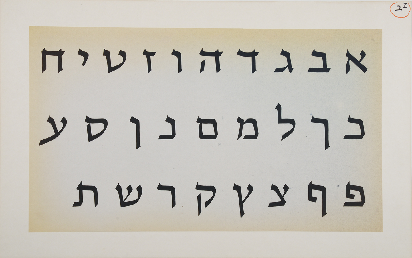
I do promise there is more than one influential Hebrew type designer, but after a long research process, my mind is filled with stories that were covered in boxes until now.
I am referring to Henri Friedlaender. Last time, I wrote about his design process, and today I wanted to share two typefaces that were simultaneously designed by him for the Bank of Israel in the 70’s: One serif style to be used for banknotes and one (semi-) sans, for coins. Those two were supposed to act as a family, and indeed, Friedlaender based them both on similar skeletal forms.

the banknotes typeface

the banknotes typeface

Continue reading