In our last interview, Sol chose Nina Stössinger to be the next interviewee. The research and work that is done in the background for this series is truly joyful. But, it’s impossible to compress everything I have learned about each interviewee into five questions. I am trying to show a glimpse of the many things each inspiring lady is doing and thinking, and in Nina’s case it was a huge challenge.
The timing of publishing this works perfectly with the week’s events, and Nina herself fits well into conference discussions and talks. When I first met Nina, it was a one-way meeting. I was watching her give a talk at Ampersand conference, and despite the disappointing gender ratio of speakers, I was thrilled to hear another great female speaker. I had much to ask, and her precise answers will surely leave you wanting to read more. So get yourself a sweet or savory treat, preferably of a kind that you can refill your bowl with, and read on:
The warmup
Write three sentences about you
– I grew up in Switzerland, but not in the mountains.
– I make type and I use type and I love type a lot.
– I rarely don’t work.
What is your soundtrack while working?
There are a few things (like writing and programming) that I can do best in total silence. Most of the time though I am listening to music. I enjoy exploring music widely, though over time I always seem to gravitate back to electronic music — which feels closest to me, and also seems most helpful / least distracting in the way it opens up spaces for my mind to exist in, rather than grabbing my attention to tell a story. Lately I’ve been on an Autechre kick, especially rediscovering the Incunabula album, which I used to love many years ago and then somehow forgot. While kerning or drawing I sometimes listen to podcasts too; TypeRadio is of course a favorite, and I’ve also been enjoying The World in Words and Lexicon Valley lately.
Name three locations: a current location, a location you love, and a fantasy location
– A ridiculously cute, tiny house close to the (rainy) Dutch beach in Scheveningen/Den Haag, The Netherlands.
– The place I know that maybe contrasts most strongly with where I live: crazy, wonderful New York! (Part of me is still amazed that it exists outside of movies.)
– Space. I dream of venturing off this planet. Even on airplanes I get a kick out of seeing the curvature of the horizon and the Earth’s blue glow from a bit more of a remove.
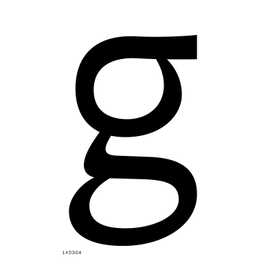
Your favourite glyph to design and the most challenging one?
– This may be boring, but I do like making the ‘n’. It encapsulates much of the DNA of a typeface, so a lot of the work molding the overall character of the design is done — and shown — in this one glyph.
– I have a special kind of loathing for the X/x. I find it frustratingly hard to make these things look right, and then they’re also pretty boring shapes. The only thing I like about them is that the counters can look like two arrows. Which is kind of neat.
What is something you did that you are proud of?
Actually finished the first “serious” typeface I started, to the point where it’s been released and seen professional use. I was a bit shocked at the time what an unbelievable shit-ton of work that was. I’m about to do it again, hoping for many more.
The visual
A photo of your favourite beverage, and something to eat with it
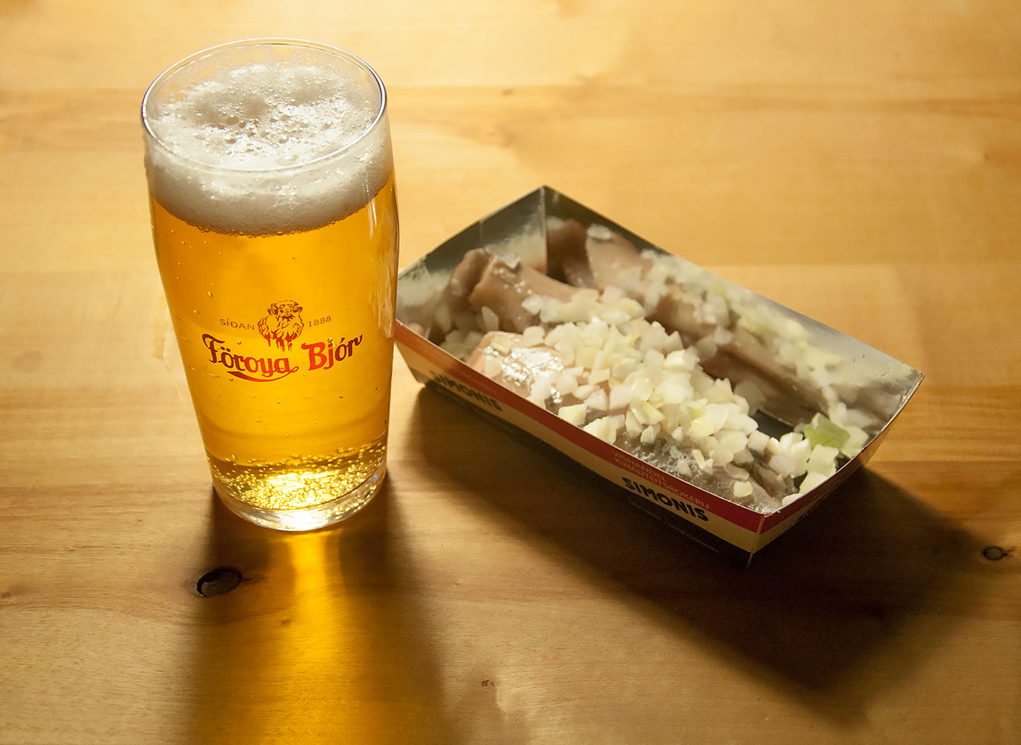
Since we’ve had coffee and chocolate, I figured I’d go the savory route: Beer and herring! Dutch herring, eaten raw, is my favorite culinary discovery here. Especially in the early summer when the fish is young and fresh, it’s unbelievably tender, yet flavorful. The beer is usually not Dutch – I prefer stronger/richer flavors, with a special liking for ales. This is a Belgian blond, in my favorite beer glass that I brought back from a trip to the Faroe Islands.
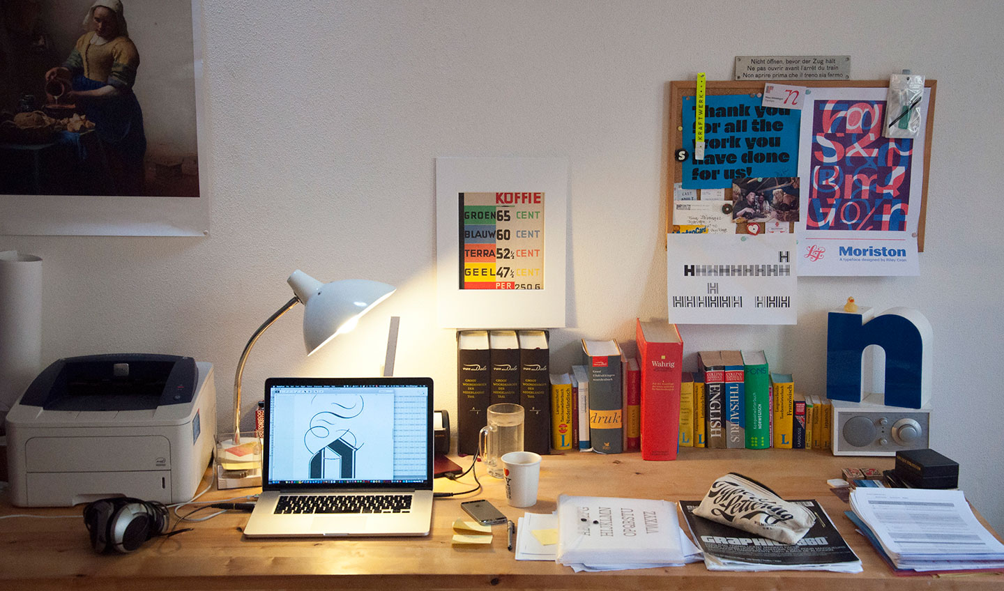
A photo of your type drawing process
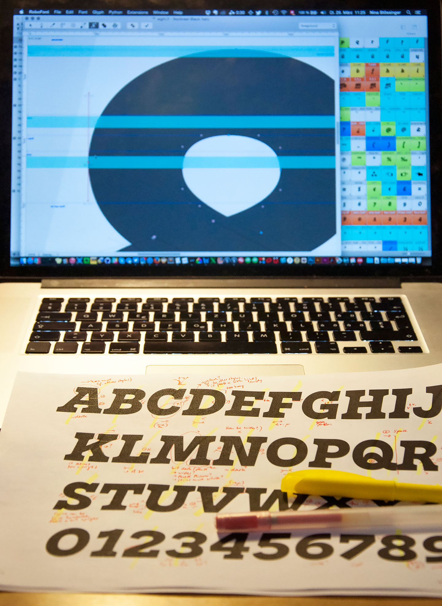
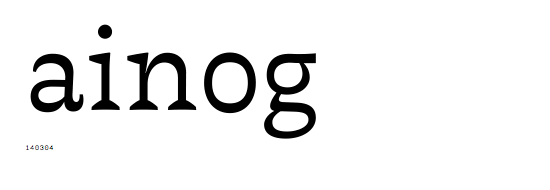
 gifs are from my current typeface
A photo of your desk, working space
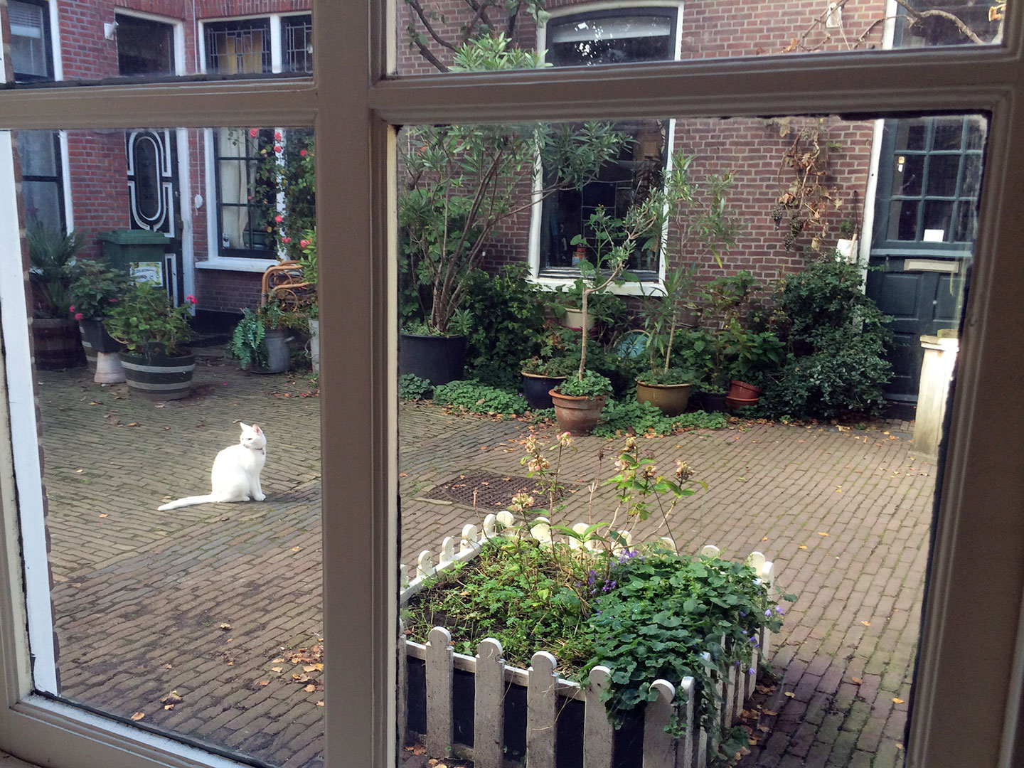
What do you see from your window?
A pile of books, both professional and others
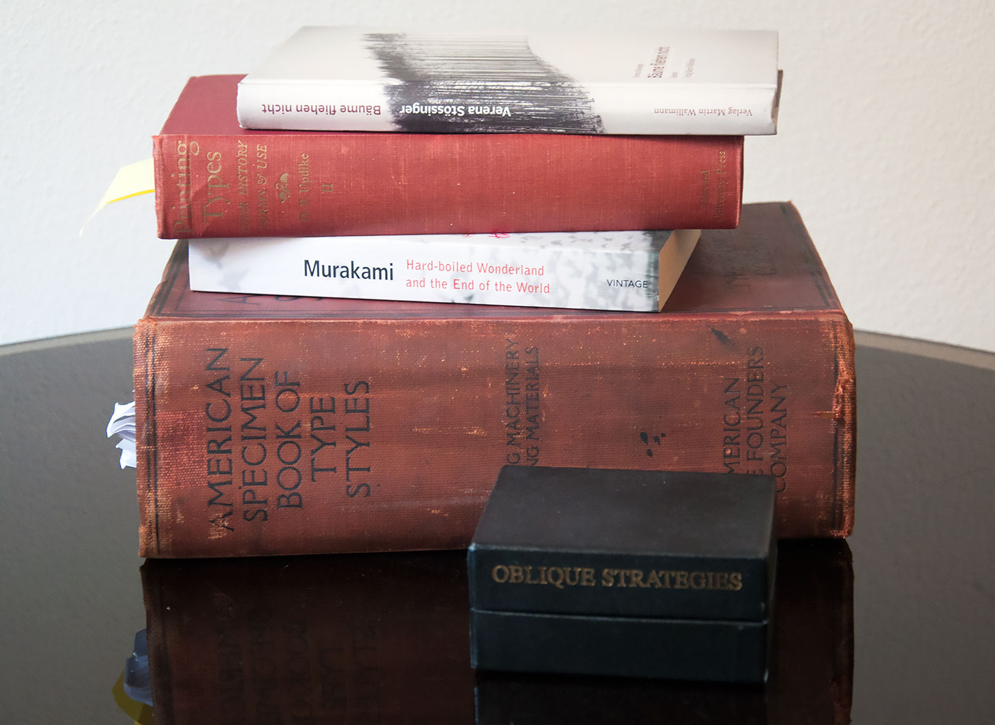
– I got the big 1912 ATF book just recently, along with a few other specimen books. I used to have a weird guilt problem buying books that are not for reading; but I’ve finally convinced myself that specimen books are not just eye candy but workthings and tools and reference that is needed, and it’s true — I reach for one almost every day. And they fill me with both ideas and much joy.
– Murakami’s “Hard-boiled Wonderland and the End of the World” is one of my very favorite works of fiction, maybe because it’s so meticulously precise and mysteriously weird at the same time.
– Updike’s “Printing Types” makes me both happy (because it’s so comprehensive and useful) and angry (because it’s so opinionated and dismissive of many things), but there’s just definitely no way around this thing.
– “Bäume fliehen nicht” is a novel by Verena Stössinger — my mother — which is based on my father’s wartime childhood memories. By a lucky twist of fate I got to design and typeset it, and work on the typeface used within as well. It’s very dear to me, certainly my favorite among the books I have designed.
– “Oblique Strategies” by Brian Eno and Peter Schmidt is technically not a book, but I like it so much that I decided to declare it one for the purposes of this selection. It’s a collection of cards that pose good questions and thoughts for getting (creative) processes unstuck and inspiring all sorts of weird ideas.
The longer bits
The first question is from Sol:
What aspects of the design of Ernestine would be different if you were to design it today, after your time in Type and Media? And more broadly, what are your thoughts on your work before t]m, in light of your experience there?
Well, there are problems of execution that I can see better now, curves I could draw better… I made Ernestine to the best of my ability five years ago, so I’d be worried if I didn’t see anything now that I’d like to fix.
Also I might push the design more, search for its limits. TypeMedia encourages you to find the extremes before you decide on parameters: Once you know the available design space (how bold could this be, how light, how wide, how narrow etc.), it gets easier to define the desirable scope within that. With Ernestine I just incrementally increased things like stroke weight until it felt like “probably enough”, and I wonder now if there could (should) have been a Black, or a Thin. Although such extreme weights would also have been quite hard for me to draw well back then.
Perhaps the biggest change I would make isn’t directly visible, because it’s in the process. Making Ernestine was inefficient, inflexible, and slow; I did not know much Python, and sometimes struggled with making FontLab do what I wanted to. I got so frustrated trying to fit interpolation into my workflow that I gave up and drew all four weights individually, which now just makes me go, oh girl.
I’m happy that I made Ernestine, I still think the concept checks out pretty ok, and it makes me happy to see it used or hear that someone likes it. But it’s nice to move on and keep growing, and I’m looking forward to having another major release out the door (soon!).
You are very open about your design process, and bravely show images of “wrong” design that you did. Those are not things that should be taken for granted. Could you elaborate on what makes you do this and how do you see the important of ‘in process”?
It can be embarrassing and humbling, but as part of a story with a successful result I’m not sure it’s all that scary. Personally, whenever I’ve seen designers I look up to discuss their process and the journey to making something that is actually satisfying, I’ve found it highly instructive — and also reassuring. Oh look, their first sketches are obvious and/or awkward too. Oh look, not everything they make is instantly done. Because don’t we all question ourselves and secretly suspect that everybody else just casually poops gold? Only ever showing polished results reinforces that image. They’re great to show to clients or put in portfolios, but if we’re honest they only tell a small part of the story; among colleagues and peers I think it’s not only permissible, but maybe also fair and helpful to look a bit more human.
You are very active on Twitter, and overall online. How would you describe your online presence? Are you using it as a professional tool or drawn to the interactions with peers and others that it brings?
Online platforms have been my lifelines to the industry as I’m working alone from home (another part is going to more type conferences than I should realistically afford). I like how they present an ongoing opportunity (but rarely immediate pressure) to communicate and learn. And it’s also nice to actually have an audience for nerdy observations and jokes that nobody physically around me would probably find funny.
Twitter especially has been central to my development and learning, for keeping up with type news and being part of the community, forging and maintaining connections, and getting my own work and voice out into the world. Before that, when I first started learning about type design, Typophile was a great source of learning, and a nice playground for building a critical stance. After its (hopefully temporary) demise, I am now a moderator at Typedrawers. Though I am currently most excited about the advent of Alphabettes — which I am happy to have been a small part of since the beginning, and which has quickly grown into so much more than I would have imagined back then.
Conference speakers are one of the issues Alphabettes are thinking a lot about, so I will allow myself to ask you (and risk sounding corny or enforcing this status): You are one of the very few female type designers that are speaking at conferences. How do you feel about it? What are your thoughts on your own public speaking experience?
I actually love public speaking. In a way, talking to others about things I deeply care about feels like a natural extension of caring about them in the first place. I also much enjoy teaching, but they are very different modes, like Alice mentioned.
There’s a lot of quiet, diligent work involved in preparing a talk, but I also enjoy the performative aspect of it. Public speaking is a strange ritual: You get up on stage, and everybody else is happy to shut up and listen. That is actually amazingly empowering, and all you need is something to say, having prepared how to say it, and the courage to grab that moment and use it.
I may have inherited a bit of a stage gene from my father (who is an actor). But oh, I get scared too. Before every talk there’s a moment when my brain contains no words and spins into vague panic. But once I have stumbled my way through the first few thoughts and gotten used to the bright lights, I usually remember what story I was going to tell, and that the people in the audience are not out to eat me alive but are already supportive and curious; and then I know I’m going to be ok. In the best moments it feels like surfing a wave, riding the current and the logic of the narrative while being totally present in the moment. Other times it’s a bit more of a struggle to get from A to B. But it does get easier, and if I can risk a glance at the audience and see that there’s a connection, that I may have put a new thought into somebody’s head or a smile on their face, that is just the best thing.
You originally come from web design, and code is not out of your comfort zone. How does type design (and your daily work specifically) integrate with those? And from the other side — could you tell us a bit about the stone cutting you are doing, and how that analog craft integrates with your type design?
The combination of these two perspectives — one more creative and design-oriented, the other more about logic, technology, engineering — is one of the main things that attracts me to type design (and indeed also fascinated me in making websites, which was my original entry point to the world of design).
I’ve called Python coding a useful superpower in type design. It can do so much to speed up processes, smarten up testing and QA, or prettify specimens, to name only a few things. What I love most about learning to code is that it makes the workflows accessible, malleable, designable: Frustrations about missing buttons or cumbersome workflows can be instantly transformed into little side projects, and fixed. So I often write bits of code to assist my processes, and have customized my workflows with a number of my own tools.
I don’t do much stone cutting at the moment, sadly. It’s a bit of a challenge to integrate it into my life, since I don’t have a workshop or garden, and the noise and stone dust make carving at home not really an option. I’d like to get back into it — it’s nice to get away from the screens I am glued to most of my time and experience (letter-)forms and materials in a profoundly different way. I have a fondness for stone; and while carving may appear to have the gestural quality of calligraphy (which I get impressed by but am terrible at), it’s slowed down and fragmented into incremental iterations that make up compound “movements” — to the point that it feels more like drawing: slow, iterative, stable.
You use many metaphors in your writing and speaking, which are almost poetic (designing type is like walking in a jungle of details, “Like a good actor, good type, selected and set well, does not pretend”). I find it very vivid and colourful. What is the idea behind those? How do you come up with those and are they a part of your daily life?
I think metaphors, similes, comparisons, parallels are very much part of my thinking. I have a very active imagination and often “translate” impressions between different fields, like for instance comparing typefaces to people. So to a certain degree, it comes naturally. But it’s also a device I use consciously when speaking, writing, or teaching; things like type or code can seem rather abstract, but if you can find a good parallel that people can relate to from their lives, I think it can do a lot to open up those subjects and make them appear in a new light. And sometimes it’s funny too, although maybe sometimes I’m the only person who thinks so.
You can see Nina’s work here.
Next interviewee …
Nina is nominating the next lady to be interviewed:
For the next interview I would like to nominate Marina Chaccur, amazing power lady from Brazil who is now also living in The Hague. I’m quite a fan of her imaginative and diverse lettering work, and would love it if she could tell a bit about what inspires her — I wonder if the rich diversity of her work is perhaps also connected to having these different geographical and cultural backgrounds and perspectives.
On a personal note:
I was reading Nina’s interview over and over, and was impressed with her carefully chosen words. The sentence that stuck with me while reading her answer to Sol, is that she would be worried if she hadn’t seen anything she would feel that needs improving in Ernestine. This proves, once again, the importance of continuing to educate ourselves, and striving for development. No designer would be whole without this, a type designer is not any different.
Nina’s sharing of process, being transparent with uncertainties and dilemmas and great knowledge is what makes her so convincing, and as genuine as a person can be. I hope that every reader could find some inspiration from this lady (for speaking, stone cutting, Python or thick specimen books). I know I did.