
Henri Friedlaender designed the legendary Hadassah Hebrew typeface. While doing extensive research for an exhibition that included his work, I was lucky to get a glimpse of his design process. Until the revealing of his personal archive (donated to the Israel Museum), his design process was only known through an article he wrote with few rather “clean” images of sketches. In the museum’s basement, wearing cotton gloves, we were taking out item by item from large drawers. The Hadassah material was intriguing. So much was said about this typeface, so much guessing on the design process was done. And here we are, seeing traces of Friedlaender’s own way of designing.
From Friedlaener’s archive. Photo by Eli Pozner, the Israel Museum. This refers for all images in this post
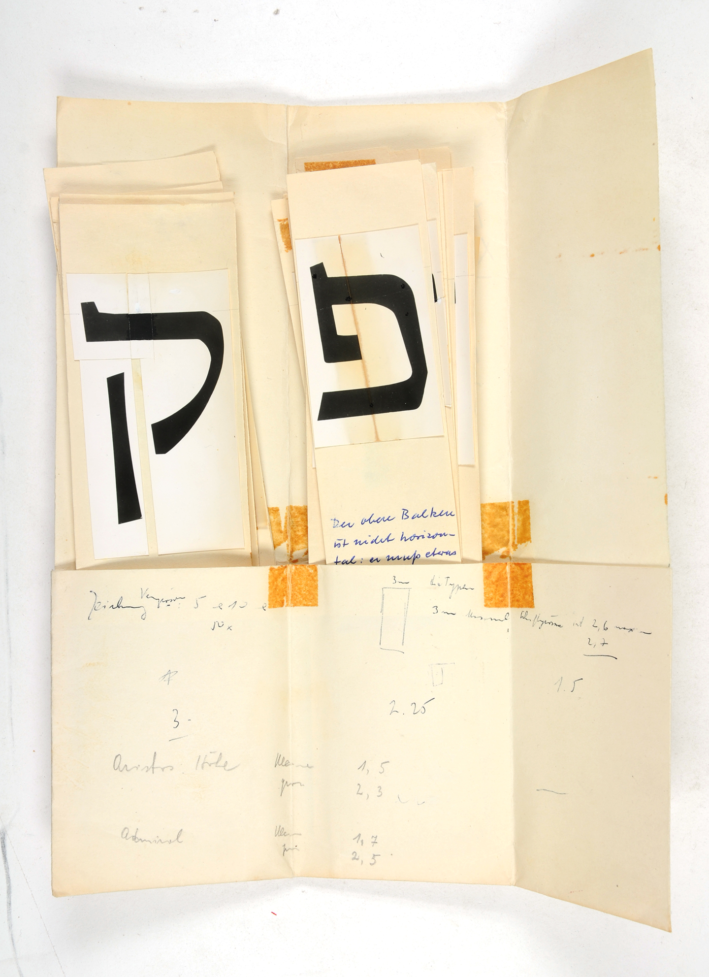
The design process of the typeface took around three decades (!), and since the first sketches it is clear that he followed the same approach. One of the goals for this innovative typeface was to act as a family with few weights, both upright and italics (this was one of the very few Hebrew typefaces that aimed for having more than a single weight and italics, even rare at the time of its publishing in 1958). Friedlaender was consistent in his way of designing the regular weight, the italic style and the bold weight in parallel.
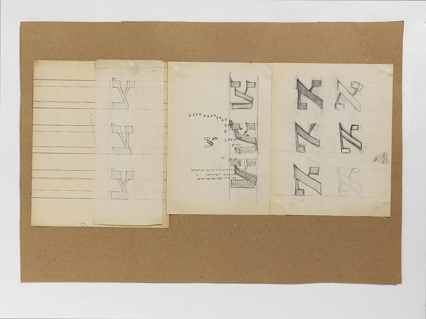
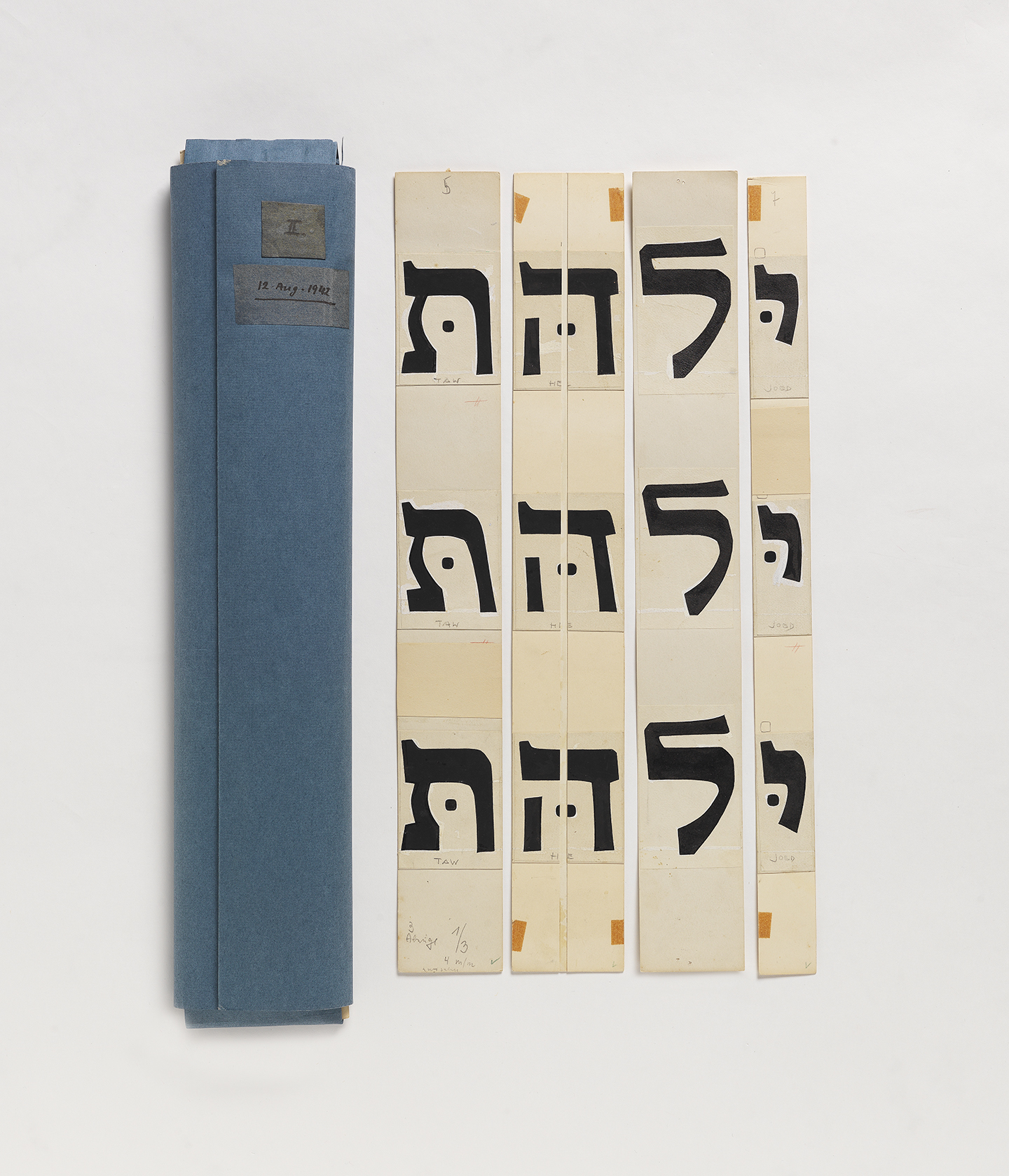
He used narrow strips of paper or cardboard, and placed on each piece a single letter in the three weights, one on top of the other. This gave him two benefits, I believe: First, he was able to see the differences and similarities of each letter across the weights. Second, he was also able to move the cardboard strips around, assembling words and seeing how the letters behave one next to the other. This helped him constantly check his design and ensured that the type works each time, in every combination.

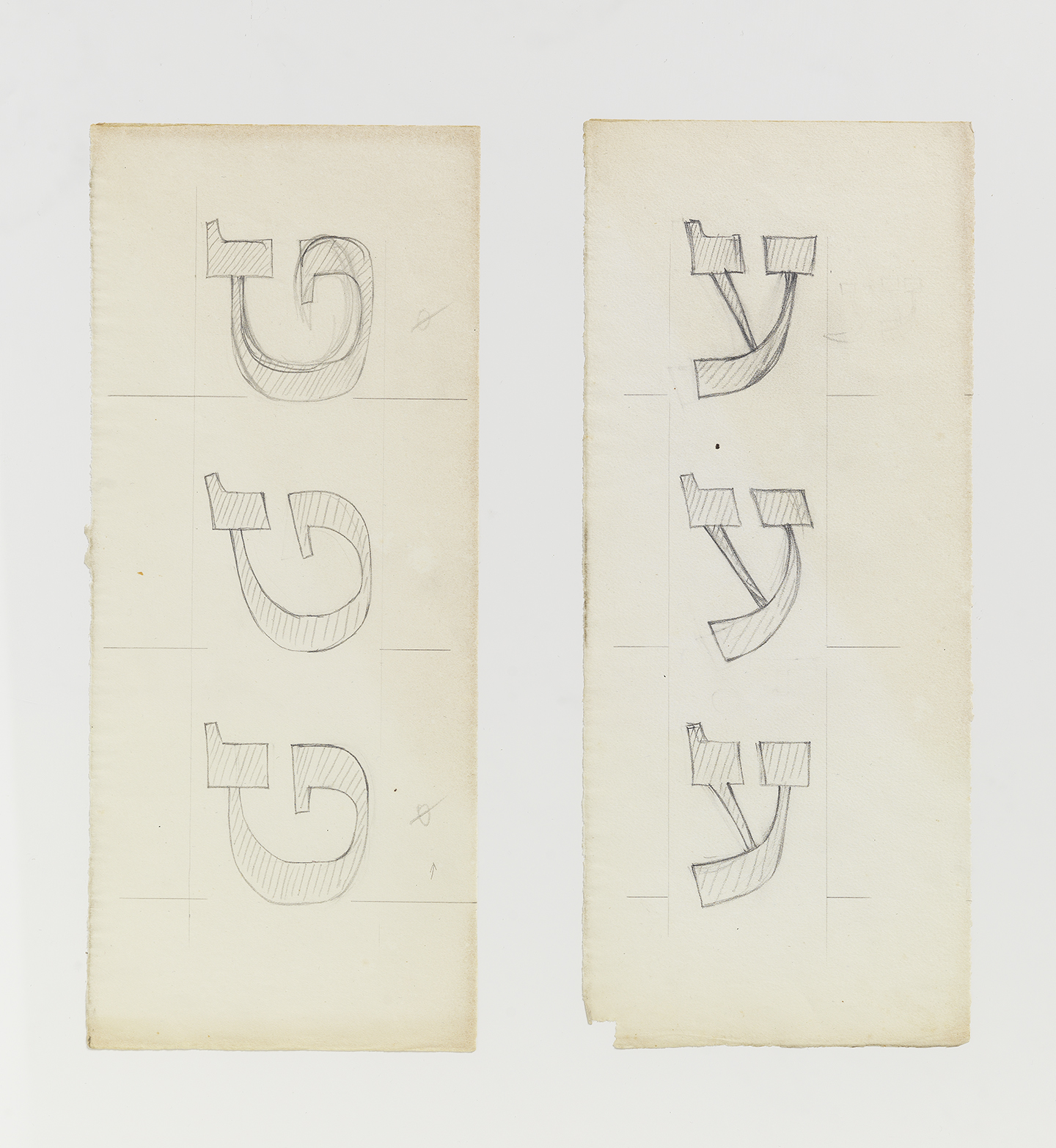
Note the design of the Tet (most right on this image and third from the right on the image below) during two points in time.
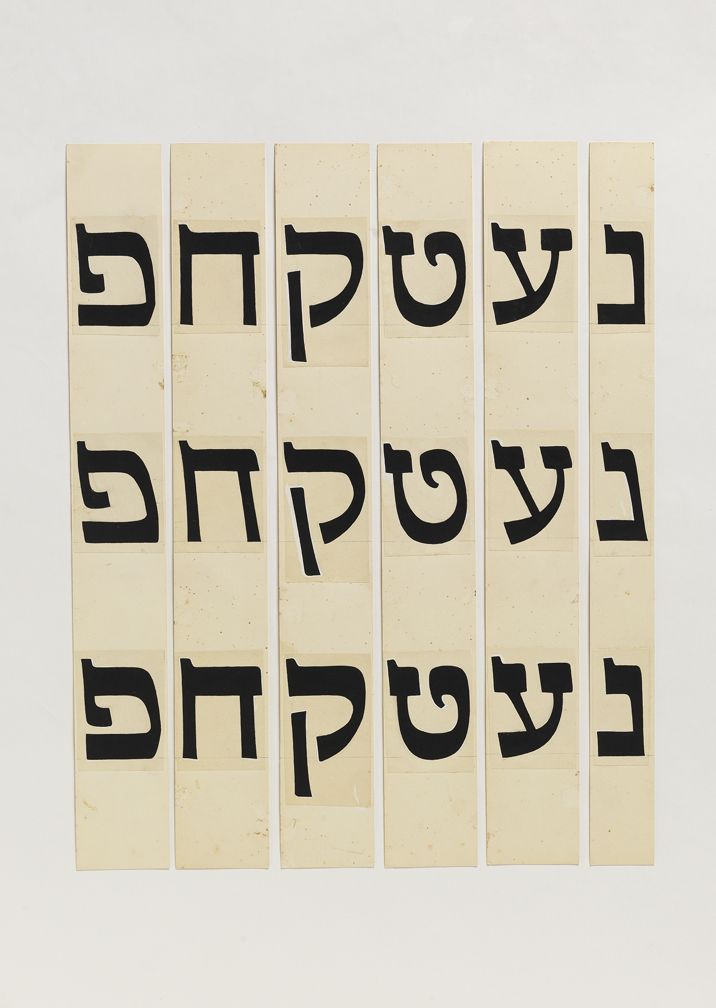
This “strip method” allowed a clear measurement to be kept between any letter in different weights. It is not unlikely that Friedlaender, was also thinking further in terms of production — we know that in 1931 he wrote to Beatrice Warde in the hope to publish his new typeface with Monotype. Even while working on a condensed style as a suggestion for newspaper usage, years later, he kept on working with the strips. This time only with the option to compare letters side by side for one weight.
suggested condensed weight, not produced as far as I know
The unfortunate case is that despite the design of the italic style, it was ultimately not published as part of the typeface by Lettergieterij Amsterdam that cut it. Even without the italic (which I’ll admit, I feel indecisive about) this was and still is one of the most beautiful, well designed and original typefaces ever produced in Hebrew.
Those glimpses into the past of great masters allow me to think how easy it is for us to just type a string of glyphs and see how they work, and how perhaps it’s too easy and quick these days. In contrast, one typeface in almost thirty years… that’s quite some time.
Hadassah’s wood letters for larger sizes
Assuming the majority of our readers are not fluent in Hebrew, an English version of the exhibition’s catalogue with many interesting research bits should be out in the next few months. Stay in touch for details.
All photos in this post taken by Eli Pozner, the Israel Museum
Share your love for letters with us on Instagram or tweet at us @alphabettes_org with the hashtag #letterlove.
Pingback: Hadassah Friedlaender – Stockholms Typografiska Gille