Script, print, and letterforms in global contexts: the visual and the material

At the end of June, I was lucky to attend the new Centre for Printing History and Culture (CPHC) conference ‘Script, print, and letterforms in global contexts: the visual and the material’. Organised at the Birmingham City University in the UK by the talented Sahar Afshar, Vaibhav Singh, and Darryl Lim, the conference set out to explore the ‘plurality of engagements with, and interpretations of the printed and written word in various writing systems and artefacts’.

Maybe it was the anticipation of attending a conference’s first edition, or the large range of fascinating topics on the conference schedule. Or perhaps it was the idea of visiting the ‘Brummies’ in Birmingham, with its beautiful industrial terracotta buildings. Whatever the origin, I was already excited about this conference long before it even started. And I can confirm that it totally lived up to my expectations.
It’s the smallest conference I’ve ever attended, and probably the most eclectic. With a crowd of roughly 50 attendees and speakers, its ambition was no less than that of a larger conference. Bringing together scholars and practitioners from various disciplines such as book history, printing, publishing, type design, typography, and print culture, the conference aimed to start conversations from different points of view on print ‘in the diverse linguistic contexts of the world’.

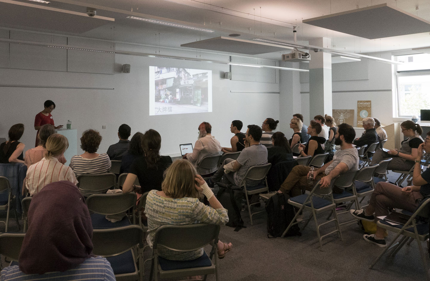
Script, print, and letterforms in global contexts: the visual and the material. Vivien Chan takes the stage.

Continue reading

Remember December: Tipoteca with Legacy of Letters 2017

The typographic highlight of my year was a July workshop at Tipoteca in Cornuda, Italy. The workshop was the culmination of the 2017 Legacy of Letters tour lead by design historian, writer and educator Paul Shaw and publishing consultant and translator Alta Price. Anyone lucky enough to visit Tipoteca Italiana Fondazione is rewarded with a vibrant and immersive connection to the history of printing and type. For lovers of type, Tipoteca is a bucket list must, for lovers of type and lovers of Italy, Tipoteca, and the Legacy of Letters tours, can become a bit of an addiction.
Continue reading

Lost and found
(and lost again)

Exploring the first multi-style Hebrew typeface family

Lost
Hebrew was the language of the Israelite and Judean people for over 1,300 years when around 200 BCE, it died as an everyday language and was confined to religious use.1 This affected the Hebrew script heavily, since it only developed those attributes that were necessary to present specific religious texts. Therefore, Hebrew is lacking the typographic tools that would have evolved and developed from an ongoing secular use. Moreover, the Hebrew script was considered sacred. The scribes that were permitted to write manuscripts were concerned with preserving the letterform appearance, even at the expense of the ease and speed in which they could be read.2
Hebrew was reintroduced as a spoken language in the 1880s. Since then, it experienced an accelerated process of revival. The shift from the written form to movable type was a hastened and interrupted one and did not allow for refinement and distillation of the letterforms.

Setting type in the Hebrew script was and still is a frustrating experience. Not only there is a shortage in typefaces which sufficiently address specific Hebrew script issues, but the few that are available mostly consist of a single regular style, accompanied by a small number of weight variations. So, what is a Hebrew typesetter to do when trying to create differentiation within a text? I remember how pleased I was when I found a book published in 1905 in Minsk. In it I spotted one spread that seemed tailor-made to answer my question. The typesetter used different typefaces, different sizes, increased letter spacing and underlining. These were amongst the popular typographic solutions throughout the 20th century.


A spread from the book printed in 1905 in Minsk showing the various ways to handle word differentiation and emphasis without a typeface family: 1. Underlining a word. 2. A different typeface, in a different size. 3. Increased letter spacing.

Continue reading

Japanese typography & Motogi

In the context of writing a master dissertation about Japanese culture at the Inalco (Paris), I dived into the history of Japanese typography, focusing on the figure of Motogi Shōzō. As there are only few sources in English about the development of Japanese typography, I want to share here some of the elements I discovered. (This article was first published on the blog of Émilie’s type foundry, www.aisforapple.fr)

In Europe, we learn at school that printing has been invented by Gutenberg, in Germany, in 1460. Johannes Gutenberg, thanks to his strong will and by dint of mysterious research, is believed to have invented from scratch the way of making books on a large scale, and to be at the origin of the democratization of knowledge in Europe. Whereas the city of Mainz keeps the printing technique a secret, it is ransacked in 1462 and printers spread out all over Europe. This is how other printing centers are created, starting with Rome (1465), Venice (1468) and Paris (about 1470). 1
When we say “printing”, it is a shortcut that means in reality “typographic printing”, that is to say printing pages of text using metal letters. This technique is divided in different successive steps : engraving one sample of each letter in metal, reproducing identically these samples dozens of time, setting text using these signs made of metal, et then finally printing the typographic composition on paper.

In 1460 in Germany, the technique of engraving metal was already in use for the making of medals, and the printing press was well known : images were engraved in wood and printed using a press. Gutenberg, pictured in history textbooks as a brilliant inventor, based his invention on existing techniques. His creation has been to bring these techniques together and to finalize the production of metal letters thanks to a specific mould. Furthermore, he did not work alone, but had business partners. 2

In the same way that we turned Gutenberg into a symbol, Japan considers that the “father of Japanese typography” is Motogi Shōzō (本木昌造, 1824-1875). Magata Shigeri 3 paid tribute to this man in a short biography in English, published 18 years after Motogi’s death : “After years of toil and experiment, [Motogi] invented types for Japanese characters and for the first time made printing a business. We owe, indeed, to him alone the success and prosperity of Japanese typography in modern times. He is therefore most deserving of our esteem, as the Father of Japanese Typography.” 4
This idea then spread out.

Continue reading

Elena Loves Pigeons

Declaring my love for pigeons is not an easy task. It was not easy to accept it in the first place. But one day I looked back I realised that my friends were right, I have a thing for pigeons. And this thing has a name: Peristerophilia. (With the exception of labeorphilia – love of beer bottle labels, I believe this loveletter-philia to be unique in having a name, whether that is something good or not, well, I really can’t say).

Was this love for pigeons triggered by my grandfather’s love for pigeon keeping? Back in the 60s my grandfather, Bibiano, used to breed pigeons in the attic and participate in competitions that consisted in, basically, many good looking male pigeons (at least if you are a female-pigeon) trying to conquer the female pigeon in dispute, and of course, bring her back. Cachorro, my grandfather’s palomo, was a winner, irresistible for all pigeon-ladies and Bibiano’s reason to be proud.

In my mother’s family archive, an old box full of old pictures, ephemera and other artefacts, there is still a copy of Bibiano’s membership card of the Spanish federation of pigeon keeping (Federación Española de Colombicultura).*

Bibiano

Continue reading

Liron Loves Henri’s Type Strips

Henri Friedlaender designed the legendary Hadassah Hebrew typeface. While doing extensive research for an exhibition that included his work, I was lucky to get a glimpse of his design process. Until the revealing of his personal archive (donated to the Israel Museum), his design process was only known through an article he wrote with few rather “clean” images of sketches. In the museum’s basement, wearing cotton gloves, we were taking out item by item from large drawers. The Hadassah material was intriguing. So much was said about this typeface, so much guessing on the design process was done. And here we are, seeing traces of Friedlaender’s own way of designing.

hadassah3

From Friedlaener’s archive. Photo by Eli Pozner, the Israel Museum. This refers for all images in this post

Continue reading

The Story of Perpetua

This essay relates the origins of the typeface Perpetua and Felicity italic which were designed by Eric Gill and produced by The Monotype Corporation. Although the type and the collaborators are well known, the story has had to be pieced together from a variety of sources—Gill’s and Morison’s own writings and biographical accounts. There are accounts similar to this, but none could be found that either takes this point of view, or goes into as great detail.

PDF (1.3 MB): The Story of Perpetua

This was originally submitted by Tiffany in partial fulfillment of the requirements for the Master of Arts in Theory and History of Typography and Graphic Communication, at the University of Reading in 2000.