Declaring my love for pigeons is not an easy task. It was not easy to accept it in the first place. But one day I looked back I realised that my friends were right, I have a thing for pigeons. And this thing has a name: Peristerophilia. (With the exception of labeorphilia – love of beer bottle labels, I believe this loveletter-philia to be unique in having a name, whether that is something good or not, well, I really can’t say).
Was this love for pigeons triggered by my grandfather’s love for pigeon keeping? Back in the 60s my grandfather, Bibiano, used to breed pigeons in the attic and participate in competitions that consisted in, basically, many good looking male pigeons (at least if you are a female-pigeon) trying to conquer the female pigeon in dispute, and of course, bring her back. Cachorro, my grandfather’s palomo, was a winner, irresistible for all pigeon-ladies and Bibiano’s reason to be proud.
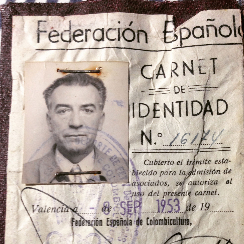
In my mother’s family archive, an old box full of old pictures, ephemera and other artefacts, there is still a copy of Bibiano’s membership card of the Spanish federation of pigeon keeping (Federación Española de Colombicultura).*
In addition to a charming picture of my grandfather we can see the ubiquitous typeface Electra (yes, same name as William Addison Dwiggins’s 1935 Electra). It was one of Carl Winkow’s (1882–1952) designs for the Fundición Tipográfica Nacional that was based in Madrid, and where he lived most of his life. Electra was designed and released after the Spanish civil war (sometime around 1940) and was a sort of geometric sans serif late ArtDeco-ish (everything in Spain is/was late), with some particular features, such as the cross bar in ‘A’, ‘F’, ‘E’, the one-storey ‘a’, and particularly the bolder weights and that distinguishable diamond in letters such as ‘r’, the triangle instead of the crossbar as in the letter ‘A’. These bolder styles are very easy to spot in Spain, they are everywhere. In the digital era a condensed version of Electra was released in 1990 by Font Bureau, named Romeo.
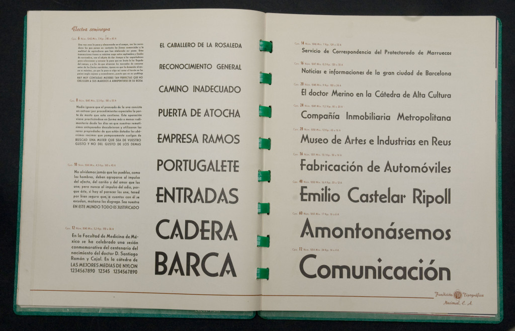
Type Specimen of Fundición Tipográfica Nacional, featuring Carlos Winkows’s Electra, image courtesy of Jose Patau
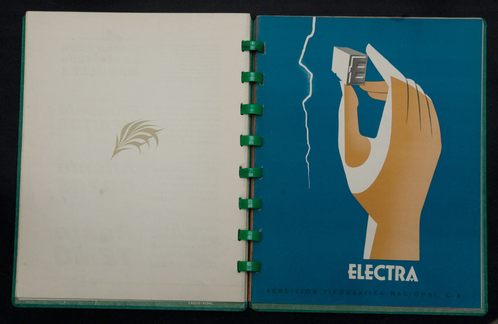
Type Specimen of Fundición Tipográfica Nacional, featuring Carlos Winkows’s Electra, image courtesy of Jose Patau
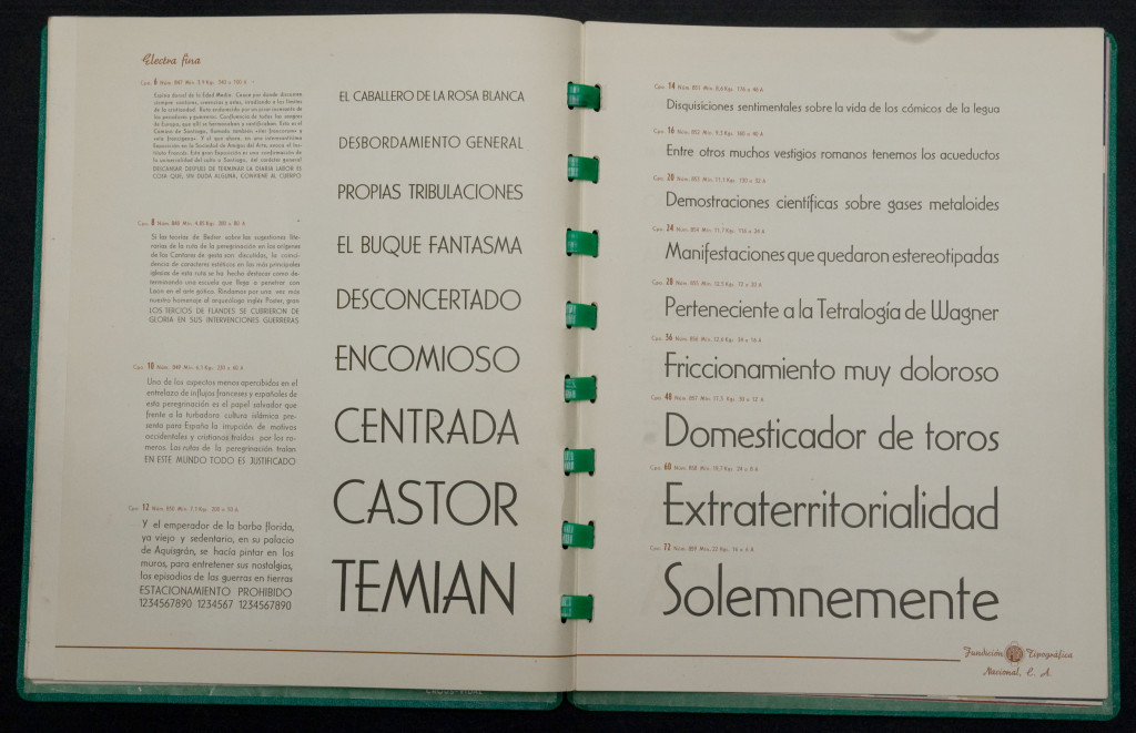
Type Specimen of Fundición Tipográfica Nacional, featuring Carlos Winkows’s Electra, image courtesy of Jose Patau
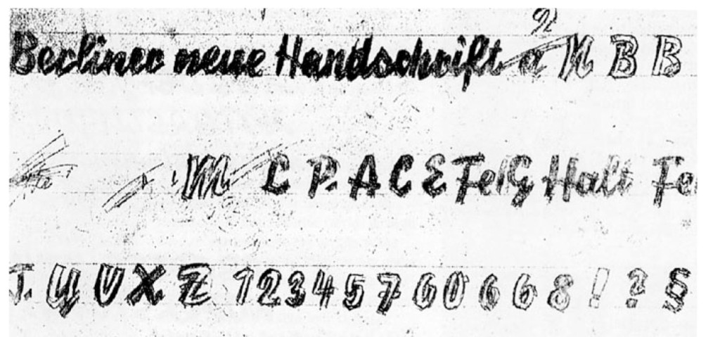
Carlos Winkow —in Spain he would be known as Carlos— worked for the leading Spanish type foundries of the 20th century, FT Richard Gans and FT Nacional, and very briefly for Nebiolo in Turin. For a short period of time, during the Spanish civil war (1936–1939) he moved to Berlin and worked for Johannes Wagner at the Norddeutschen Schriftgießerei. In Berlin he designed what is probably his best type, Reporter (1938), a vivid script that simulates a dry-brush. The digital version of Reporter, included in many lists of the 100 best typefaces ever, is a simplified and mutilated version that lacks the lively character of Winkow’s design.
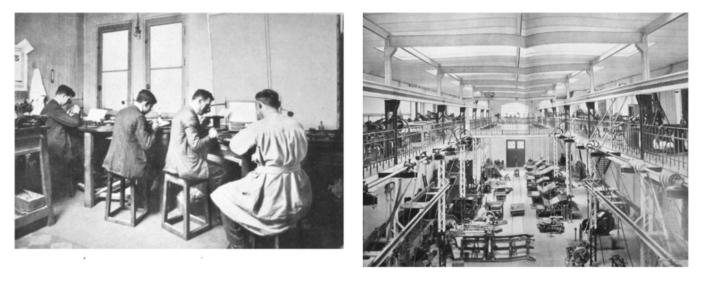
Images of Richard Gans typefoundry, probably before 1930. Courtesy of Unos Tipos Duros, see footnote for further information.
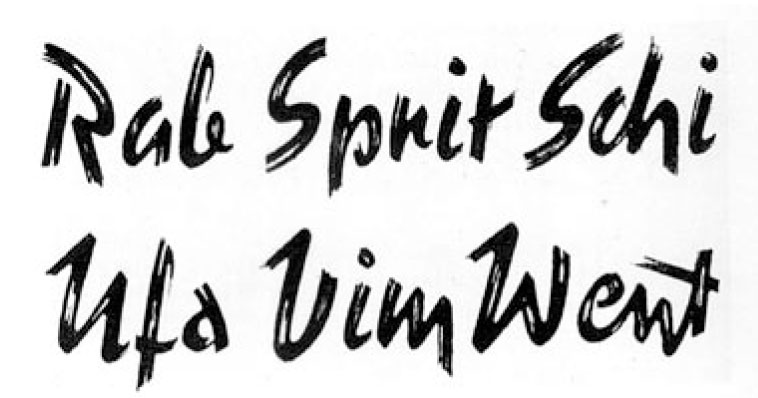
Almost finished version of Reporter. Courtesy of Unos Tipos Duros, see footnote for further information.
Going back to the pigeons, and back to the present time, one thing took to another, and before I even noticed there were some pigeon-videos, [link and link], pigeon-pictures [link], an Instagram hashtag [link] and of course, pigeon items. The first pigeon-related item worth mentioning is the little book Enjoy your pigeons, a late 60s quirky introduction to do’s and don’ts on pigeon caring. Don’t feed street pigeons from your mouth being the best possible advice.
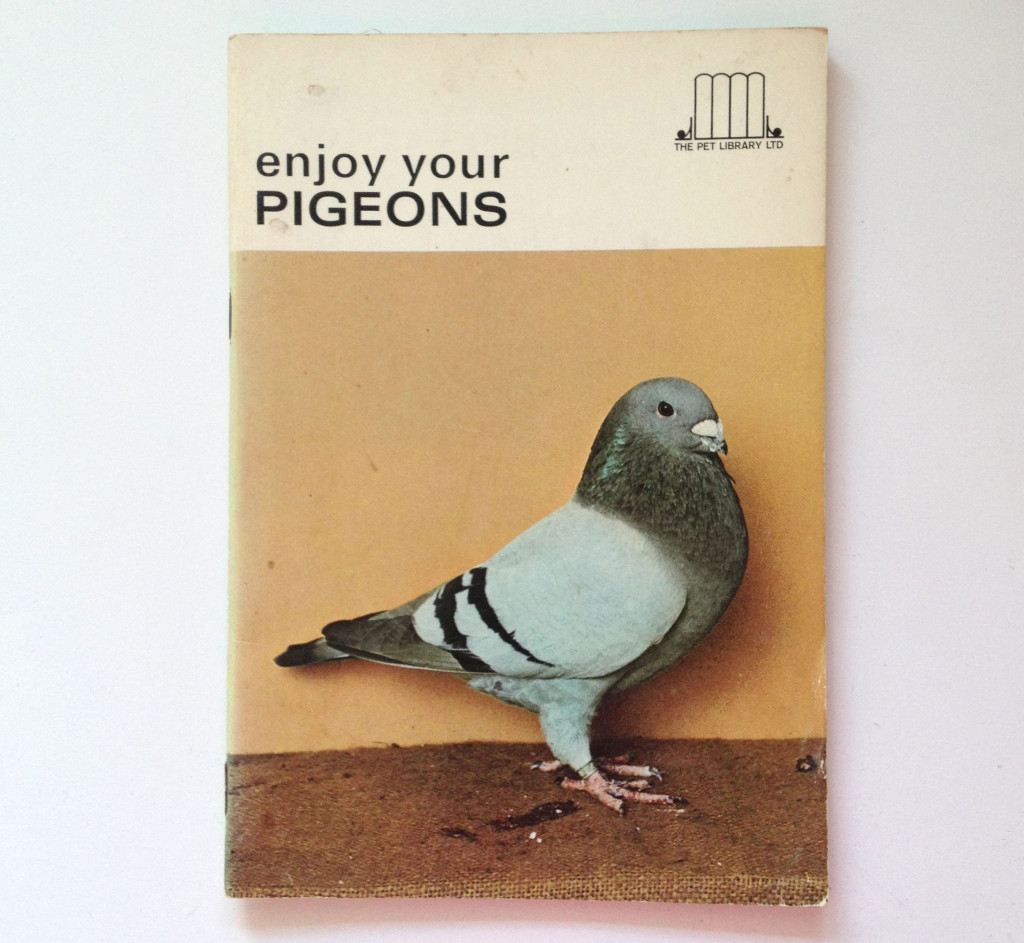
Enjoy your pigeons.
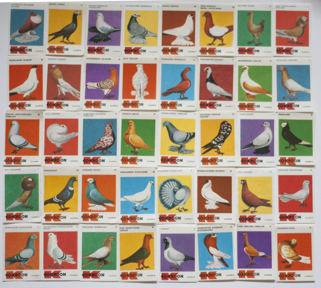
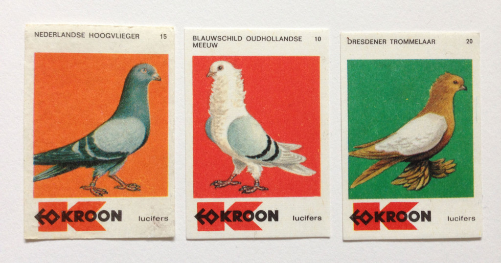
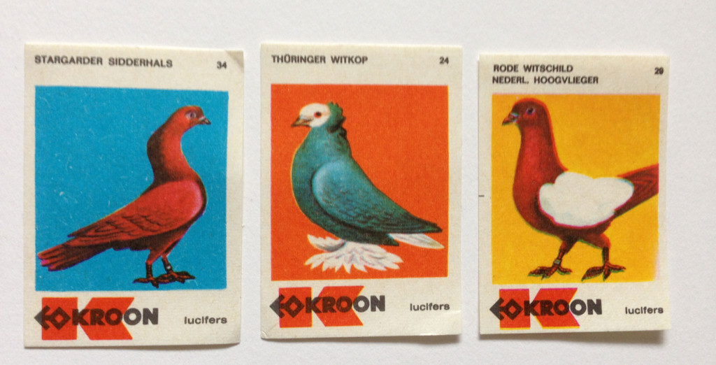
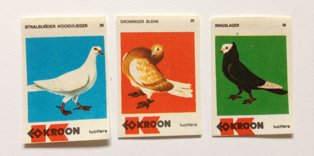
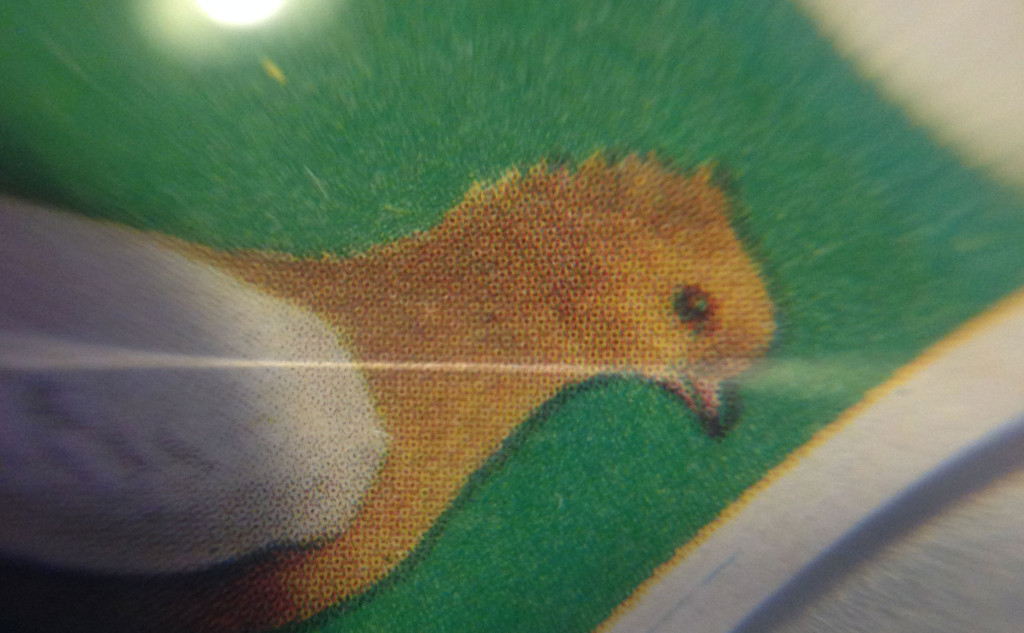
But I guess the best object so far couldn’t have arrived in a better moment, just after telling my flatmate ‘I am definitely over pigeons’. It was her Christmas present: a complete collection of 40 Dutch matchbox labels printed in 1968-69 featuring all sort of pigeon species. Typographically they don’t stand out, but it’s the bright colours, the carefully drawn pigeons, and the not so perfect printing technique, what made of these pigeons a charming collection.
I am definitely not over pigeons. Not yet.
A few links to follow up:
For those interested in Carlos Winkow, FT Richard Gans and FT Nacional, the best place to start is this paper by Unos Tipos Duros, in Congreso Internacional de Tipografía de Valencia 2006 [in Spanish I am afraid]. The images from the Richard Gans foundry and the drafts of Reporter belong to this pdf, and have been reproduced here with permission of Unos Tipos Duros founder’s Ramón Penela; The Klingspor-Museum in Offenbach (Museum for Modern International Book Art, Typography and Calligraphy) has scanned Carlos’ fonts from te Jasper, Berry and Jonshon’s Encyclopaedia; Spanish type designer Josep Patau’s Flickr has more images of Electra (and many other specimens); If you want to see the new versions here are Romeo/Electra and Reporter; For matchbox labels, I’ve found some information in this website; If you want to enjoy your pets The Pet Library, NY, published a series of enjoyable pets, in the 1960s and 1970s.
And if you are into pigeons, well, Google is your friend.
* Colombofilia or colombicultura in Spanish — from the Latin columba or pigeon, and the Greek φιλία or philia.

Pingback: MUJERES EN TIPOGRAFÍA: ELENA VEGUILLAS | Rayitas Azules | Diseño Editorial y Tipografía