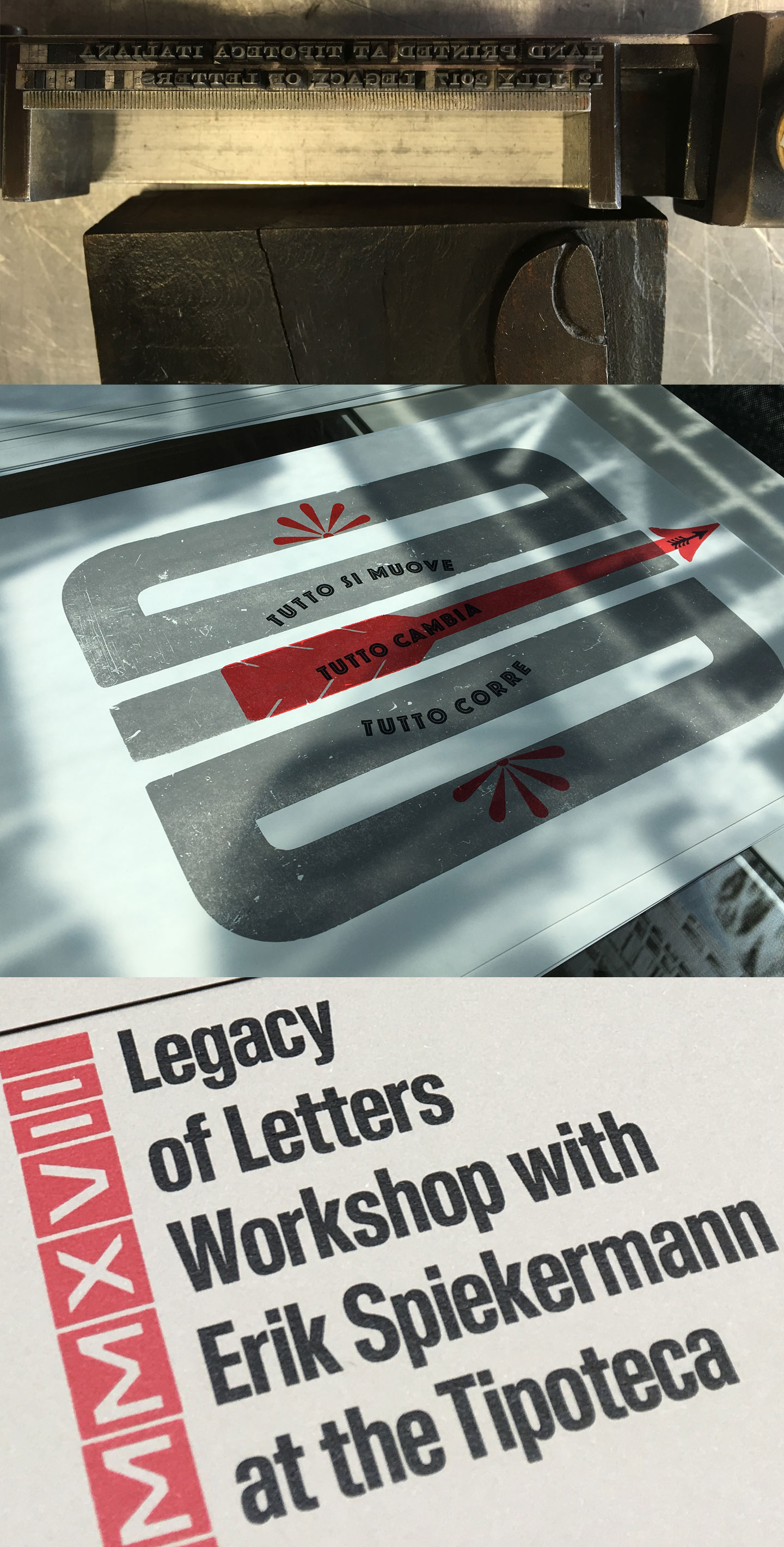
The typographic highlight of my year was a July workshop at Tipoteca in Cornuda, Italy. The workshop was the culmination of the 2017 Legacy of Letters tour lead by design historian, writer and educator Paul Shaw and publishing consultant and translator Alta Price. Anyone lucky enough to visit Tipoteca Italiana Fondazione is rewarded with a vibrant and immersive connection to the history of printing and type. For lovers of type, Tipoteca is a bucket list must, for lovers of type and lovers of Italy, Tipoteca, and the Legacy of Letters tours, can become a bit of an addiction.
This was my second visit to Tipoteca, and my second Legacy of Letters workshop. The first was in 2015 with Legacy of Letters & Alan Kitching. A colorful, memorable, instructional, fun and food filled week, which left me wanting more.
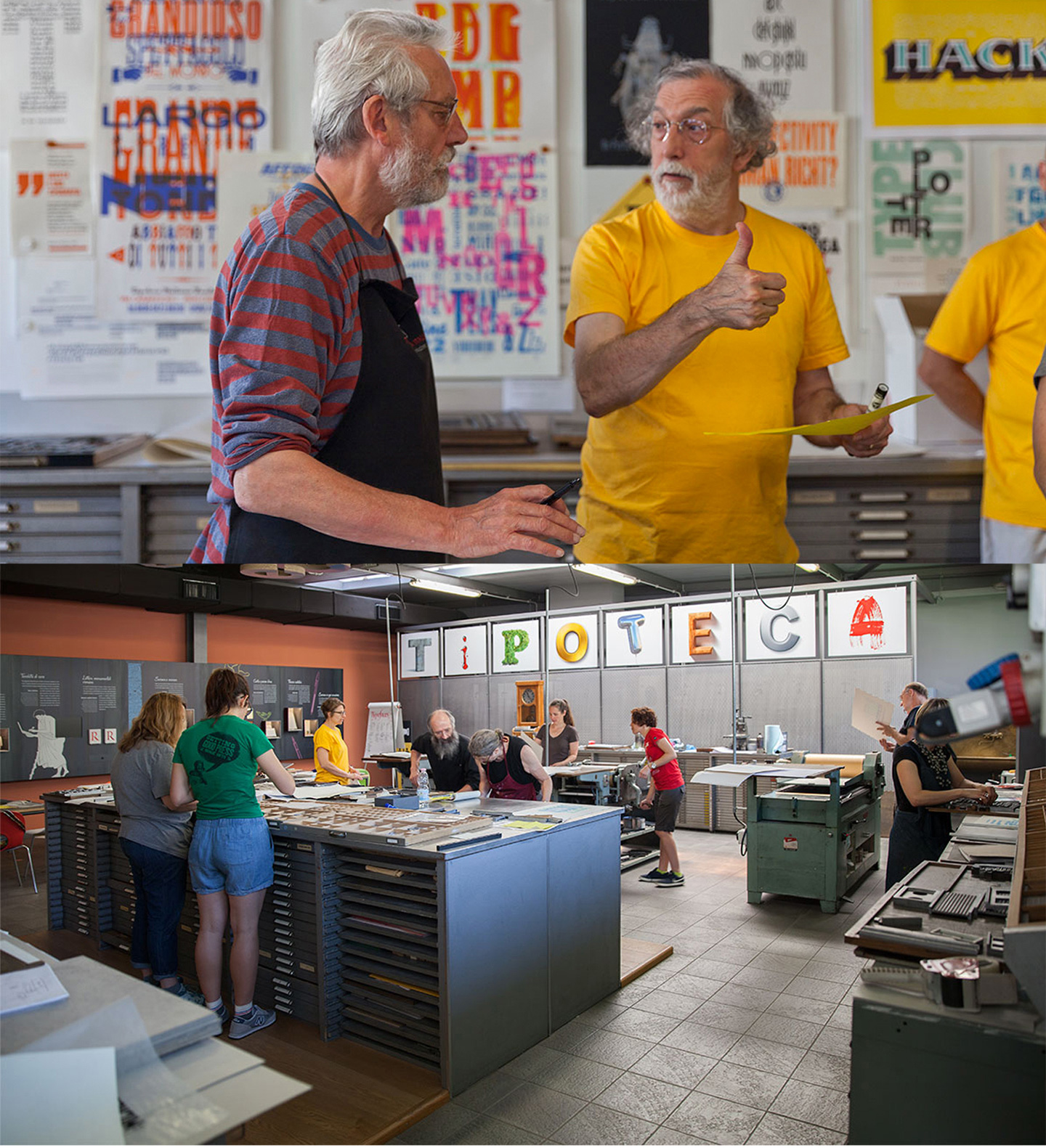
This years’ workshop was lead by Erik Spiekermann, Susanna Dulkinys and Ferdinand Ulrich, with lots of help and input from Paul and Alta.
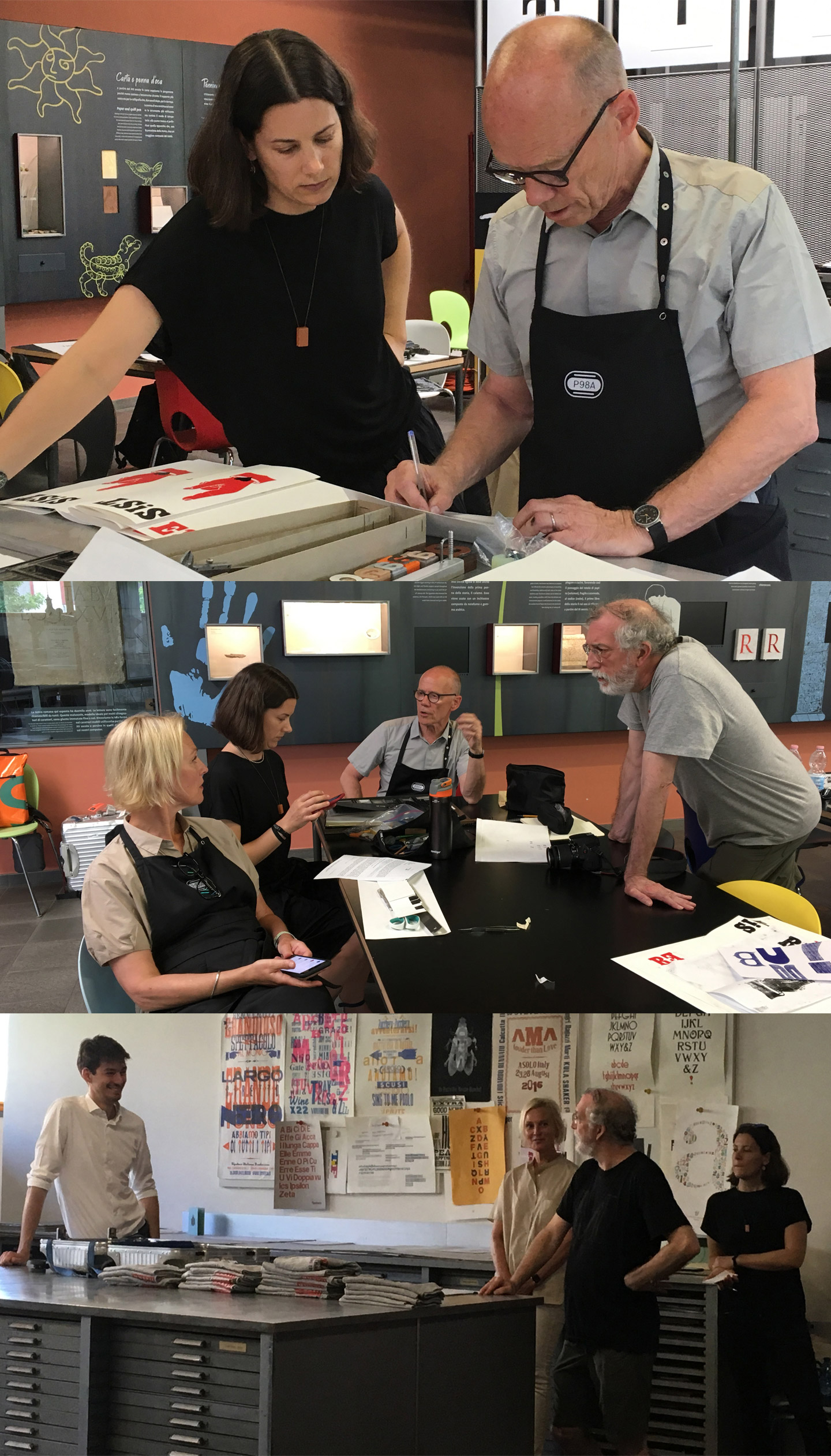
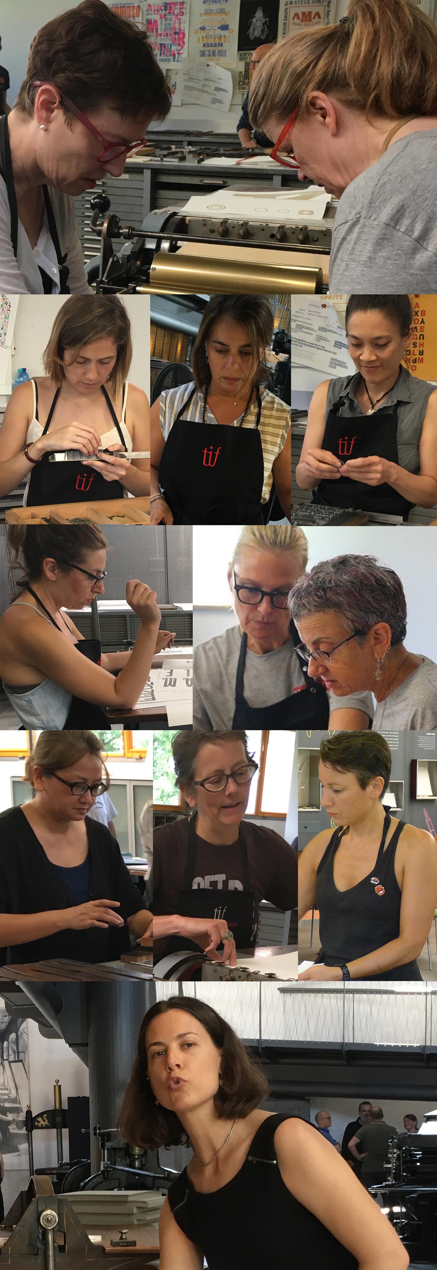
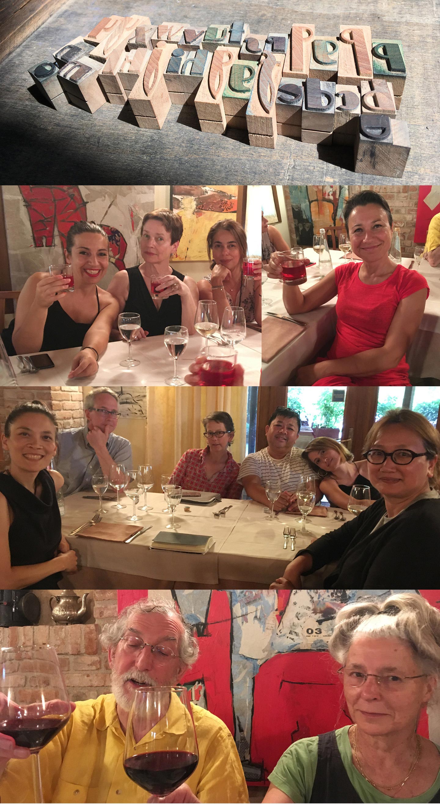
The 14 participants came from around the world (Kuwait, Hong Kong, Chile, Germany, Italy and the USA) and included seasoned letterpress printers, graphic designers and design educators, a financial planner, a sculptor and a retired superintendent for a home builder.
Tipoteca’s location could not be more unlikely. The facility is nestled is the comune of Cornuda, in the province of Treviso, not far from Venice. Cornuda is a sleepy pastoral town of about 6,400 residents in a region whose claim to fame is the production of prosecco and grappa and the invention of tiramisu. On my first visit to Cornuda and my first attempt to find Tipoteca, after walking for what felt like hours past farmland, vineyards, homes and orti (Italy’s version of a garden/farm) and convinced that I was completely lost, I asked, a local resident who was out working in his garden, in Italian, if he could direct me to Tipoteca. He looked completely perplexed. I asked again, assuming he had misunderstood my Italian, but quickly realized that he had no idea what or where Tipoteca was. I pressed on, only to discover I was a merely a ditch and a vineyard away.

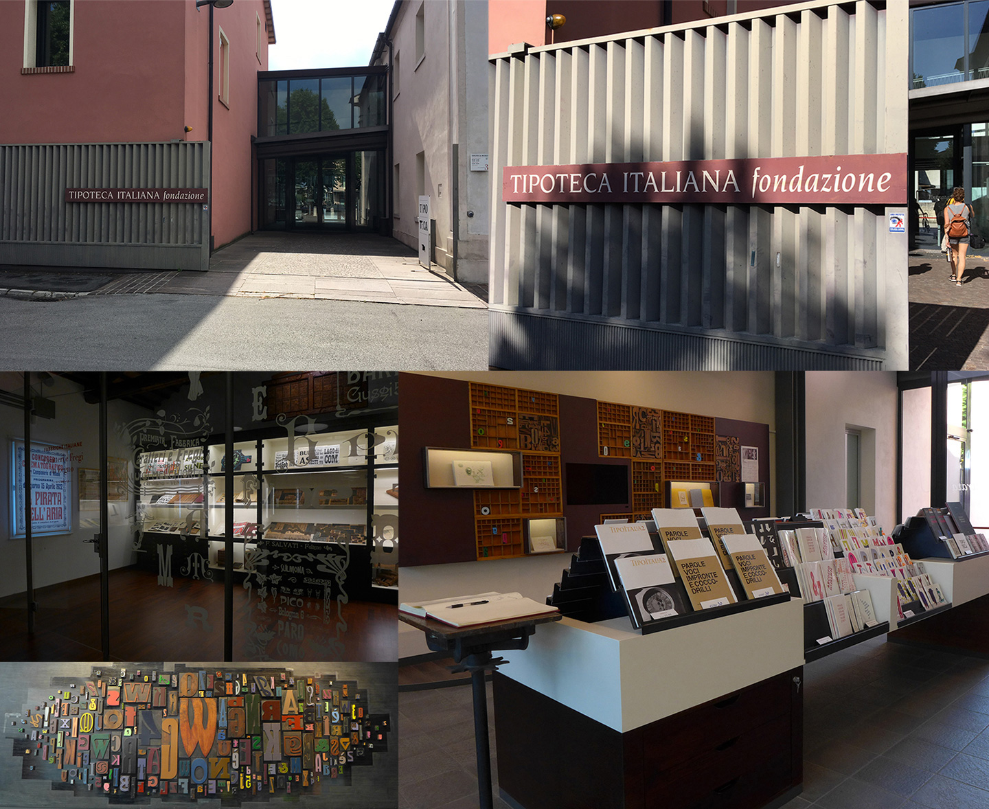
Although the local residents still may not know of it’s existence, Tipoteca is in it’s 15th year. In 1995, Silvio Antiga and his three brothers (who own the nearby printing plant Grafiche Antiga) founded the Tipoteca Italiana Fondazione to document and preserve Italy’s rich history of type production and printing. After seven years of exploring, excavating, collecting and restoring, they opened to the public in 2002.
DAY ONE:
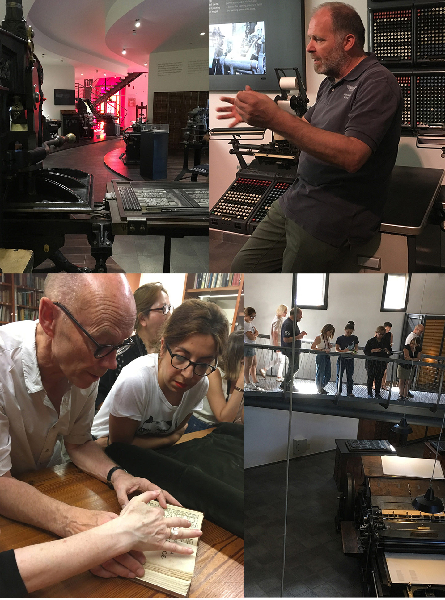
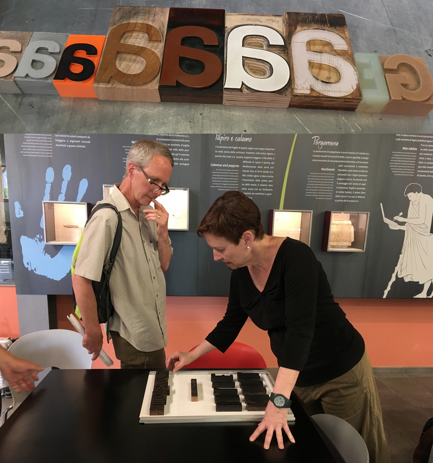
Tipoteca houses not only an exceptional collection of metal and hand-cut wood typefaces, but also maintains an archive, a printing museum, a working print studio, and an extensive library—all housed in one meticulously designed building. As an introduction to the facility Sandro Berra, who coordinates the activities of the foundation, took us on a guided tour. The 23,000 square foot building holds more than 180 printing presses and typecasting machines, and upwards of 1,000 lead fonts, 2,000 woodtype fonts and 1,500 matrices accredited to a long list of impressive typographers.
After acquainting ourselves with the facility, we convened in the print shop to discuss and develop the parameters of the workshop project. Before arriving in Italy all of the participants received some (enticing but playfully mysterious) instructions from Erik, Susanna and Ferdinand;
“We want to look at letters closely to see where meaning ends and type becomes image. We’re including some examples of words and word plays that ask for an adequate typographic treatment. Once you have decided which message you want to communicate, we’ll go and look at the great typefaces in the Tipoteca collection. We then pick what takes our fancy, rings true with the message or simply needs to be brought out of the cases. A letter has six sides; it can be turned around, back to front, upside down or top to bottom. The process of picking up a letter, looking at it from all sides and placing it in the chase often starts an idea. Please come to Cornuda with your word, sentence or page already in your luggage so we can start giving meaning to shape immediately.”
Armed with some initial concepts for our individual parts in the still enigmatic larger project, we were now confronted with the next piece of the puzzle, a form needed to be established for the collective output. As a starting point, Paul showed the group what had been designed by the 2015 workshop. Our groups’ final product was going to be a collective folio called ‘WordPlay / Gioco di Parole / Wortspiele’. A dynamic conversation followed, full of ideas and more questions. Should it be bound? If so how, and how big should it be? What about color? And most importantly how could we efficiently collectively print and produce 25 copies in five days? One thing was for sure, we all had to get the end product home, in the same luggage that carried the formless initial concepts. As we debated, Erik quietly masterminded a plan—a fold out sheet for each contributor, (adding an unanticipated hide/reveal) all of which would ultimately be bolted together between carefully constructed covers and section breaks, to create the folio. There were to be some color limitations as well, you guessed it, black and red, (it was Erik Spiekermann after all), with a touch of gold or silver (those aren’t really colors are they?) for the naughty. A mock-up for the final form was constructed. ‘Wordplay’ had now taken on a shape, and a few new twists and turns.
After some rethinking, reworking and resketching, we set out to investigate all of those great typefaces in the Tipoteca collection. We were forewarned to take good notes regarding where we found our letter forms, and for those of us, who in our excitement neglected to record detailed location specifics, there was some serious regret come clean-up.
DAYS TWO & THREE:
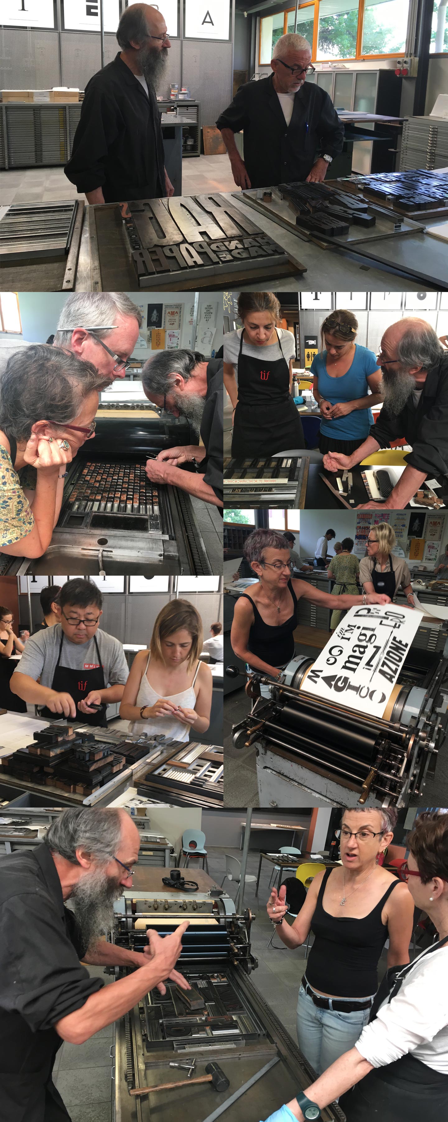
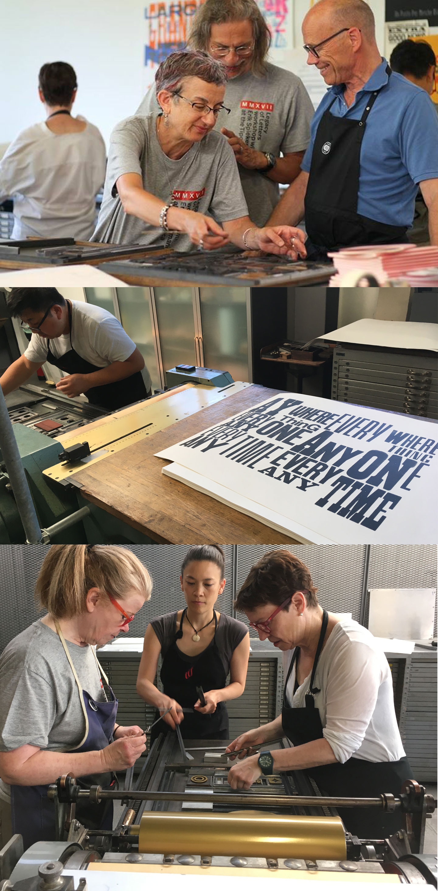
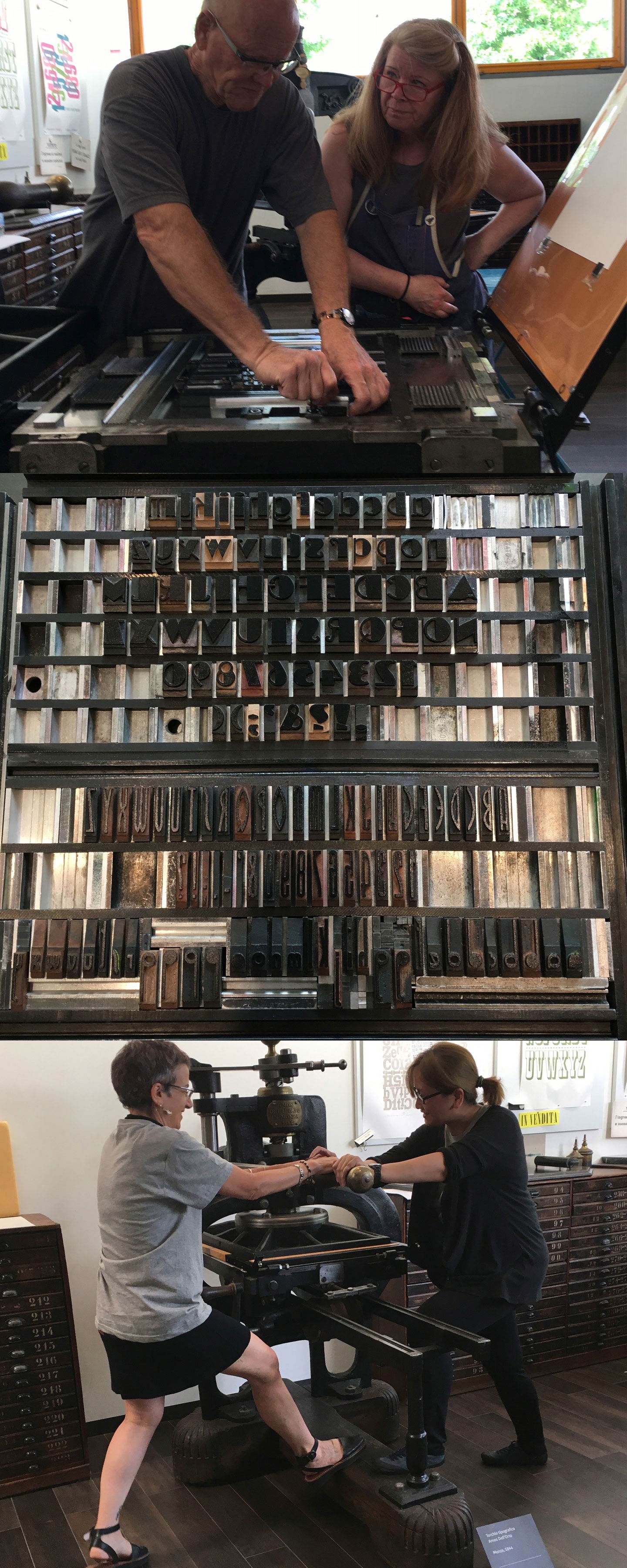
After a brisk early morning walk, or bike ride from Agriturismo Villa Bolzonello (our Cornuda lodgings), we set up in the print shop and got to work specing type, refining our designs, deciding how to coordinate printing and press time, and getting design feedback and technical assistance. Fortunately, we also had the benefit of two well seasoned Tipoteca pressmen, Lucio and Daniele. If you want to learn how to scientifically lock up and make ready a chase for printing, these guys are the bomb. Having some Italian language skills helped, but everyone managed.
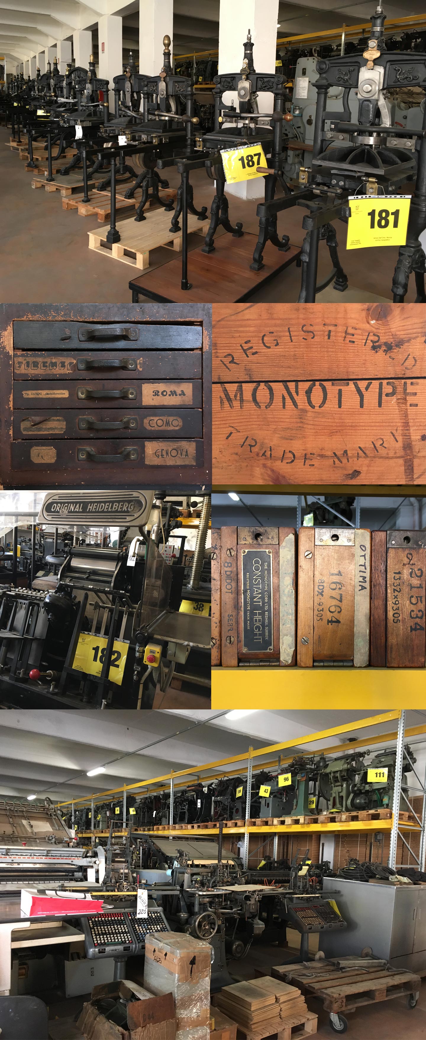
In the heat of the afternoon on day three we got a tour of Grafiche Antiga, as well as the nearby warehouse where all of the overflow of printing equipment and type resides. Grafiche Antiga is a massive facility that services a wide range of international clients on projects from commercial to cultural.
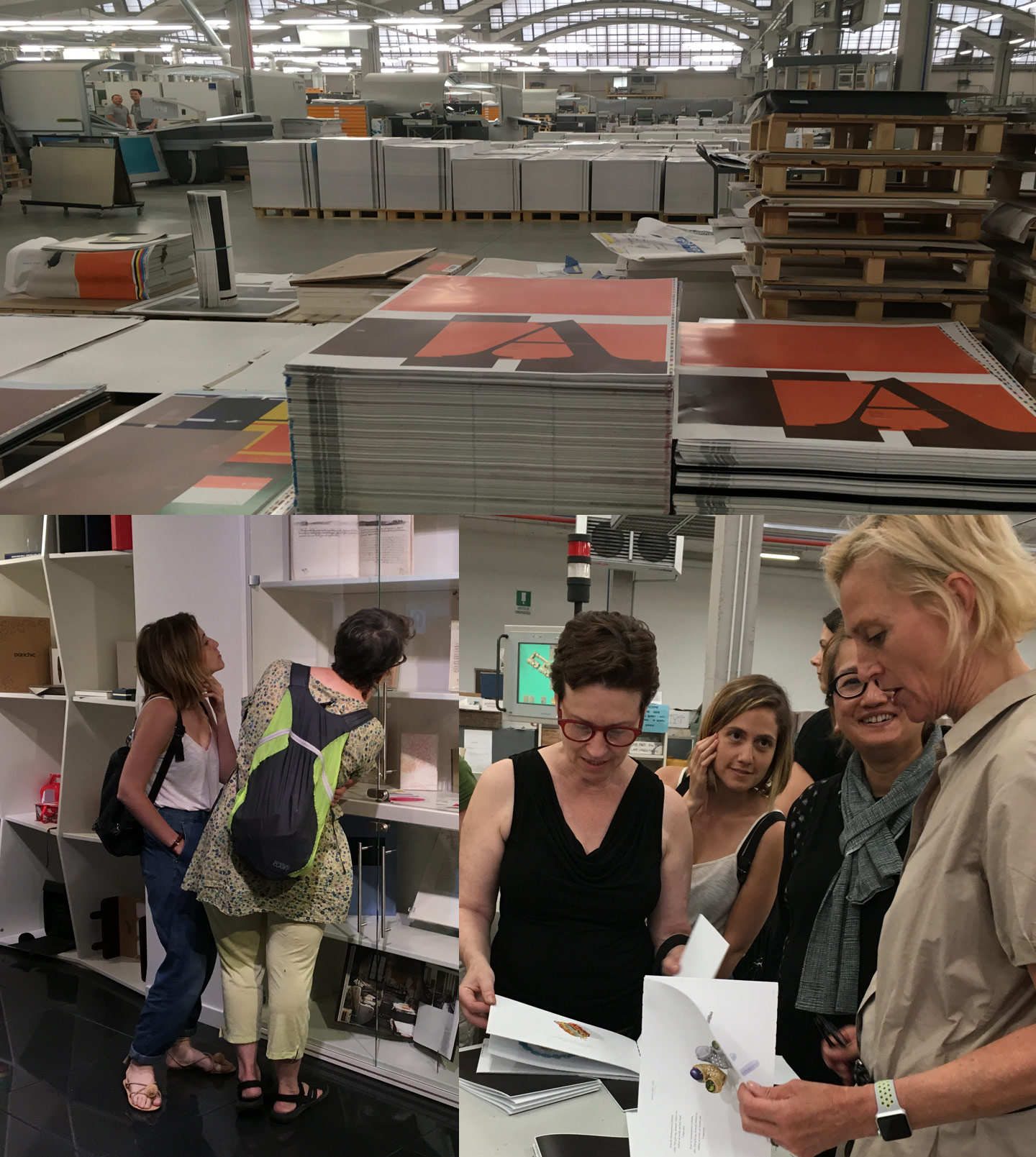
Between the two facilities it’s a toss up for which is larger and more packed with equipment. Certainly there is no question as to which one is more profitable.
DAY FOUR:
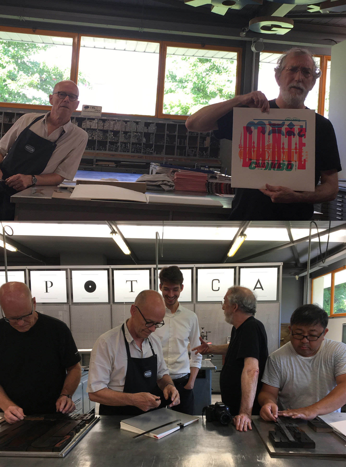
Day four was about finishing the printing and strategizing how to assemble the folio. Alta, Erik and Suzanna spearheaded the details; the setting of credits, designing of end pages, cutting templates and hole punching. The rest of us finished printing, assisted others with printing or production, or took to the task of returning the wood and metal type and furniture to their respective homes.
Letterpress printing was new to many of us, so each participants’ pacing differed based on chosen level of difficulty (or unanticipated difficulty) technical and aesthetic concerns, and levels of skill and experience. One of the beauties of the printing process is that it can be done alone, or in teams. Some of the most intensive parts of the learning happened here. A good momentum was gained through sharing and collaboration, as newbies teamed up with more experienced printers.
Some of us also managed to squeeze in some extracurricular activities, like learning to use the hand presses (and lots of elbow grease) to make specimen sheets from some of Tipoteca’s fascinating alphabets.
DAY FIVE:
Day five was all about production—collating, coordinating, adjusting, readjusting, assembling and bolting…
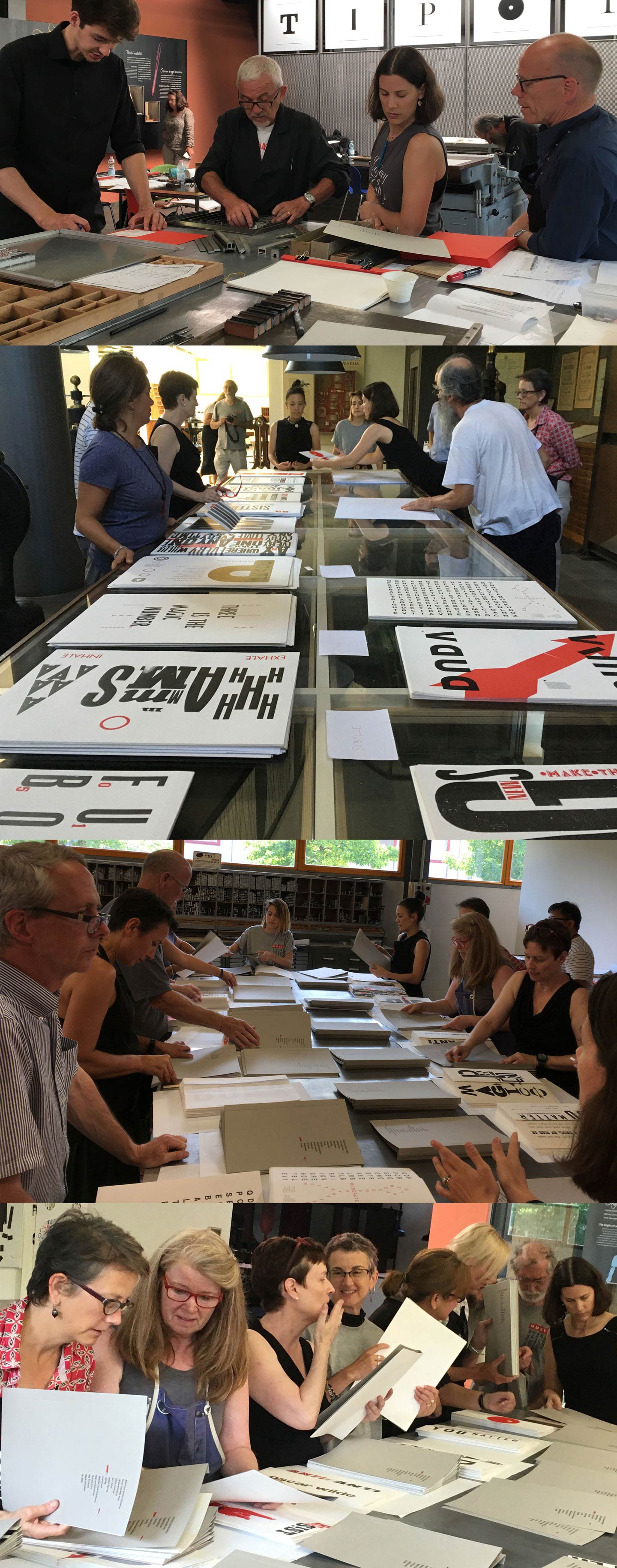
and of course, constructing the final folio!
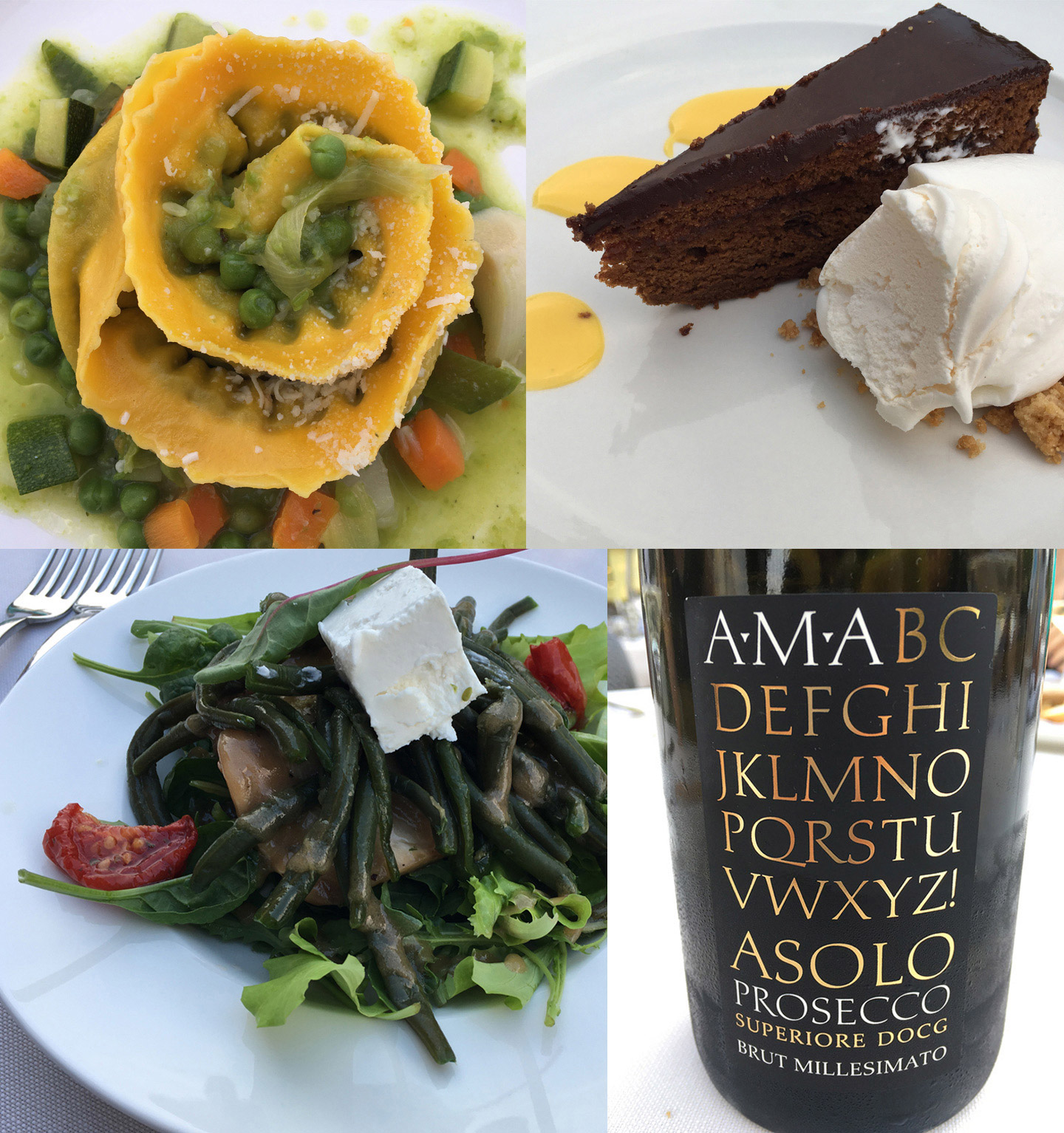
At the end of the day there were sad good byes, over drinks and food and more drinks and more food. The Antiga brothers also own a restaurant, ‘La Corederie’, across the way from Tipoteca. The food and presentation are equal to the standards of Tipoteca, robust and bursting with character and integrity, yet sophisticated and flawless.
Happy Holidays to all and until next time—
Saluti a tutti da Legacy of Letters, Tipoteca and Cornuda! Ci vediamo presto!!
Oh, and wait….one final addition…an Alphabettes Exclusive —
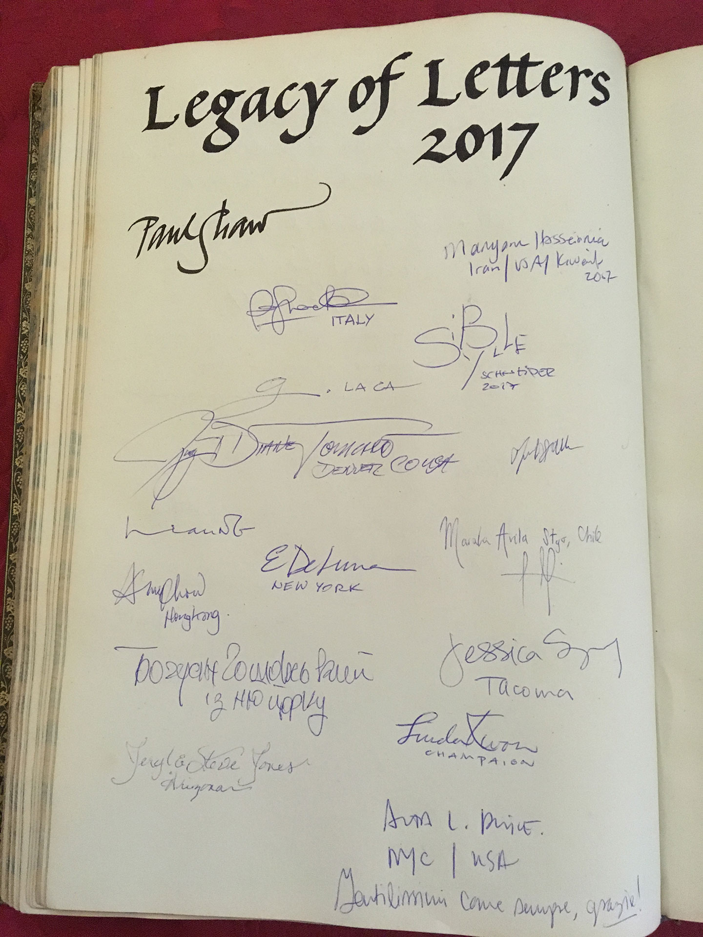
Legacy of Letters 2017 Women at Work Honor Roll!