A Letterpress Calendar for 2024

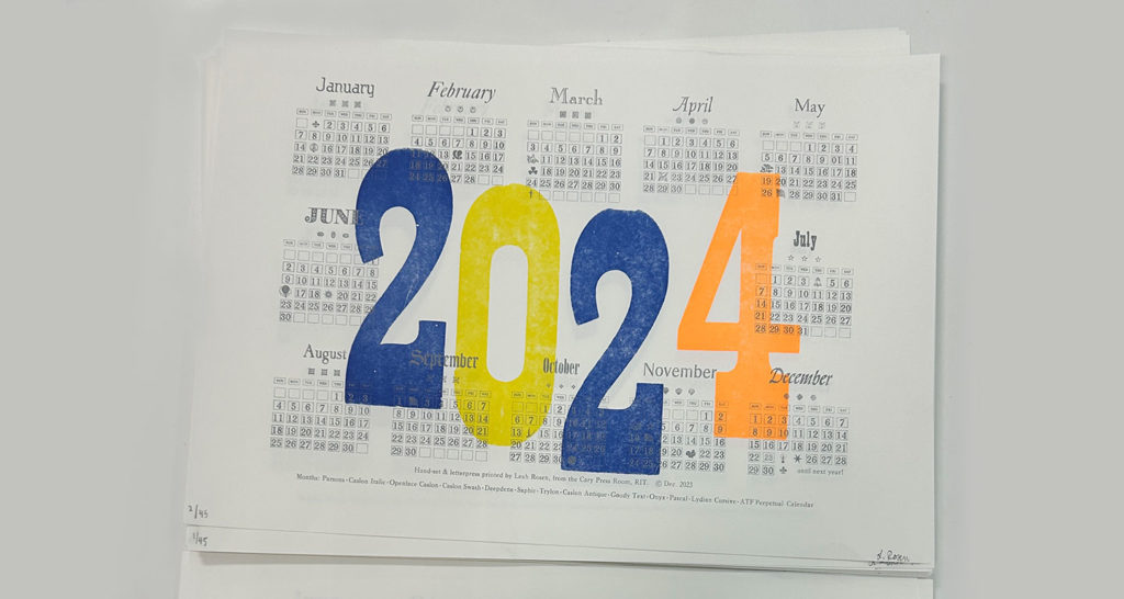
Leah Rosen is a fourth year Industrial Design and Psychology student at the Rochester Institute of Technology, in Rochester, New York, USA. Since 2020, she has been a Student Assistant in the RIT Cary Graphic Arts Collection. Her roles vary from setting up the new Cary Pressroom, shelving rare books and handling archival items in the collection. This year Leah was also the Teaching Assistant in RIT’s Letterpress Printmaking course. She initiated a personal letterpress project. Despite her busy schedule, she was not discouraged to dedicate a significant amount of time and effort to typesetting and printing a calendar for 2024. She shares her process, challenges, and some valuables lessons. The outstanding outcome speaks for itself.

The 2024 letterpress Calendar by Leah Rosen.

Continue reading

Book Review: Natural Enemies of Books: A Messy History of Women in Printing and Typography

I pre-ordered Natural Enemies of Books: A Messy History of Women in Printing and Typography immediately when I stumbled upon on the ‘forthcoming titles’ page of publisher Occasional Papers’s website. I knew the the title was a reference to an essay in a book designed and printed by a number of women in 1937—Bookmaking on the Distaff Side. I had recently learned about it in my own research and had only just succeeded in getting my hands on a copy from the edition of 100 after many dead ends. Thank you, interlibrary loan, and thank you, UC Berkeley!

Bookmaking on the Distaff Side was a unique piece of collective work in which women printers were invited by a committee to submit signatures they’d printed to be bound into an edition, which contributor, Kathleen Walkup, refers to as a pot-luck format. This means each submission is printed on unique paper, with varied colors, type, and illustration styles. It’s diminutive size and deckled edges with unique papers (and colors) make it such a treat to hold and leaf through. Content focuses generally on printing and typography, whether it be type theory, history of women and printing, or humorous piss-takes about the famous typographic men of that era. Perhaps my own greatest surprise in reading the book was the shade thrown at male printers and typographers. Though it is often tempered with some clarifying diplomatic statement, it’s clear the women who put this volume together had opinions and knew humor was a clever way to couch their critical opinions.

Continue reading

Remember December:
Oh, the Places I’ve Gone!
Oh, the Places I’ll Go!

I am a fan of Oh, the Places You’ll Go! by Dr. Seuss. It is a children’s book laden with metaphors for adults and one that comes to my mind every time I finish something. Or start something, since when we finish, we also begin. This year, I started working at Morisawa’s first U.S.-based design office, which Cyrus Highsmith aptly named the Providence Drawing Office. (We are in Providence, Rhode Island, and we draw.) And again, I thought of Dr. Seuss.

You have brains in your head.
You have feet in your shoes.
You can steer yourself
any direction you choose.
You’re on your own. And you know what you know.
And YOU are the [girl] who’ll decide where to go.

I decided to go to Typeland with my brains and feet. And type has definitely taken me places this year. Lots of places.

NEW CITIES

In June, I returned to my favorite city, NYC, for Typographics again. But this year, type has flown me abroad, too—a short flight to Montréal for ATypI, and a long one across our biggest ocean to Japan and Taiwan, for work.

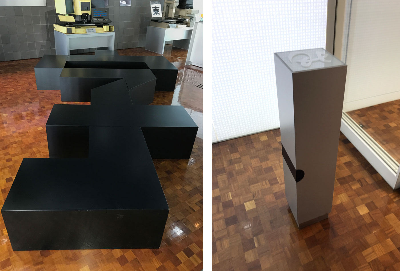
A bench in the shape of the Chinese character “zi,” which means “character/letter” (left), and the employee ID card scanner in the shape of a piece of metal type (right). Morisawa’s Osaka Headquarters.

A bench in the shape of the Chinese character “zi,” which means “character/letter” (left), and the employee ID card scanner in the shape of a piece of metal type (right). Morisawa’s Osaka Headquarters.


Continue reading

Remember December: Tipoteca with Legacy of Letters 2017

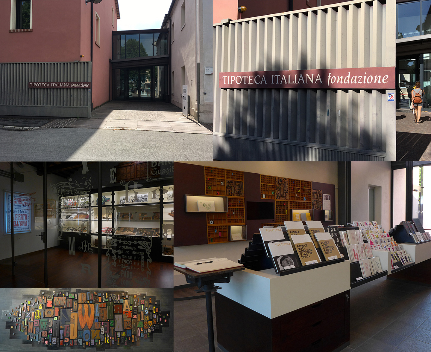
The typographic highlight of my year was a July workshop at Tipoteca in Cornuda, Italy. The workshop was the culmination of the 2017 Legacy of Letters tour lead by design historian, writer and educator Paul Shaw and publishing consultant and translator Alta Price. Anyone lucky enough to visit Tipoteca Italiana Fondazione is rewarded with a vibrant and immersive connection to the history of printing and type. For lovers of type, Tipoteca is a bucket list must, for lovers of type and lovers of Italy, Tipoteca, and the Legacy of Letters tours, can become a bit of an addiction.
Continue reading

Japanese typography & Motogi

In the context of writing a master dissertation about Japanese culture at the Inalco (Paris), I dived into the history of Japanese typography, focusing on the figure of Motogi Shōzō. As there are only few sources in English about the development of Japanese typography, I want to share here some of the elements I discovered. (This article was first published on the blog of Émilie’s type foundry, www.aisforapple.fr)

In Europe, we learn at school that printing has been invented by Gutenberg, in Germany, in 1460. Johannes Gutenberg, thanks to his strong will and by dint of mysterious research, is believed to have invented from scratch the way of making books on a large scale, and to be at the origin of the democratization of knowledge in Europe. Whereas the city of Mainz keeps the printing technique a secret, it is ransacked in 1462 and printers spread out all over Europe. This is how other printing centers are created, starting with Rome (1465), Venice (1468) and Paris (about 1470). 1
When we say “printing”, it is a shortcut that means in reality “typographic printing”, that is to say printing pages of text using metal letters. This technique is divided in different successive steps : engraving one sample of each letter in metal, reproducing identically these samples dozens of time, setting text using these signs made of metal, et then finally printing the typographic composition on paper.

In 1460 in Germany, the technique of engraving metal was already in use for the making of medals, and the printing press was well known : images were engraved in wood and printed using a press. Gutenberg, pictured in history textbooks as a brilliant inventor, based his invention on existing techniques. His creation has been to bring these techniques together and to finalize the production of metal letters thanks to a specific mould. Furthermore, he did not work alone, but had business partners. 2

In the same way that we turned Gutenberg into a symbol, Japan considers that the “father of Japanese typography” is Motogi Shōzō (本木昌造, 1824-1875). Magata Shigeri 3 paid tribute to this man in a short biography in English, published 18 years after Motogi’s death : “After years of toil and experiment, [Motogi] invented types for Japanese characters and for the first time made printing a business. We owe, indeed, to him alone the success and prosperity of Japanese typography in modern times. He is therefore most deserving of our esteem, as the Father of Japanese Typography.” 4
This idea then spread out.

Continue reading