After a long break, we are returning with the interview series. I am well aware that life is busy and that you probably feel like there is much to do in all areas in life. It’s rare to see someone focusing only on one thing, and structuring the days with a single repeating activity. It is the combination of different activities that make our lives unique and interesting, and so very often, we clearly see how one action in our days affects the other in a big pile of, well, life.
Elena’s name pops up whenever someone mentions writing, research, design, and publishing. She is a woman of many traits that made me fascinated by how in reality this works for her.
The warmup
Write three sentences about you
– I’ve always told stories: written (when I was little I used to write short stories and later as a trained journalist non-fiction stories), visually (when I was even younger I loved to make little videos, and I still love photography as a way to tell stories), and now using graphic language.
– I live in a continuous contradiction: I want to be both a hedonist and an epicurean; I am not just Spanish anymore nor truly British, yet I am both; I dislike tea but I love the act of drinking tea; when my work becomes too visual I miss my writing, when it is too text-based I want my visual life back. And so on.
– I’ve lived in a few cities (Getxo a small city in the Basque Country, Setúbal in Portugal, Madrid, and Valencia, Reading, and London) and way too many houses to keep counting (somewhere between 30 and 40). Although I hate moving, there is something about moving that I love, the possibility of starting again on many levels, from decluttering to meeting the new neighbours, finding a new frutería, discovering new streets, new places, and of course, new public lettering.
What is your soundtrack while working?
Less and less music, more and more the noises happening around me: the drilling from the neighbour’s work-in-progress loft, the sound of my flatmate typing on her keyboard when she is at home, the sound of the rain, and other new noises that I am discovering in the place where I have been living since last December. Sometimes I listen to music, and it is something calm, like Wilco, Beirut or Fleet Foxes (and similar bands using Spotify radio), very occasionally classical music. Once a year I suffer from extreme nostalgia for horrible Spanish music, like 1970s rumba, and I end up listening to Los Chichos and worse. This happens usually in the Summer.
Name three locations: a current location, a location you love, and a fantasy location
– Current location, London, where I have lived since 2011.
– A location I love, a small village in the Spanish countryside, where it is hot in the summertime and cold in the wintertime, where the soil smells like soil, the sky is blue and the tomatoes taste like tomatoes. With that description it could be almost anywhere in the world, it is just the one I know, it is not better than others, but it is the one I love.
– Fantasy location, a remote island where it is always sunny.
A favourite script to use and the most challenging one?
Growing up in a Latin-alphabet environment with no real contact with other scripts until a few years ago means that visually the Latin alphabet is so fixed in my brain that any using any other script becomes a visual challenge, and a technical one. Part of my job involves creating type specimens, and for these it’s essential to find a balance: they must be visually engaging while technically accurate and useful. Hebrew and Thai have completely taken me out of my comfort zone, both technically and aesthetically. Working with different scripts also mean that you need to trust your team 100%, it is really teamwork. And a favourite, I am really falling for Arabic and Devanagari.
What is something you did that you are proud of?
Ask me in thirty years! I find this question hard to answer, I haven’t finished my PhD research yet. If I ever manage to conclude it that will be my greatest accomplishment.
The visual
A photo of your favorite beverage, and something to eat with it
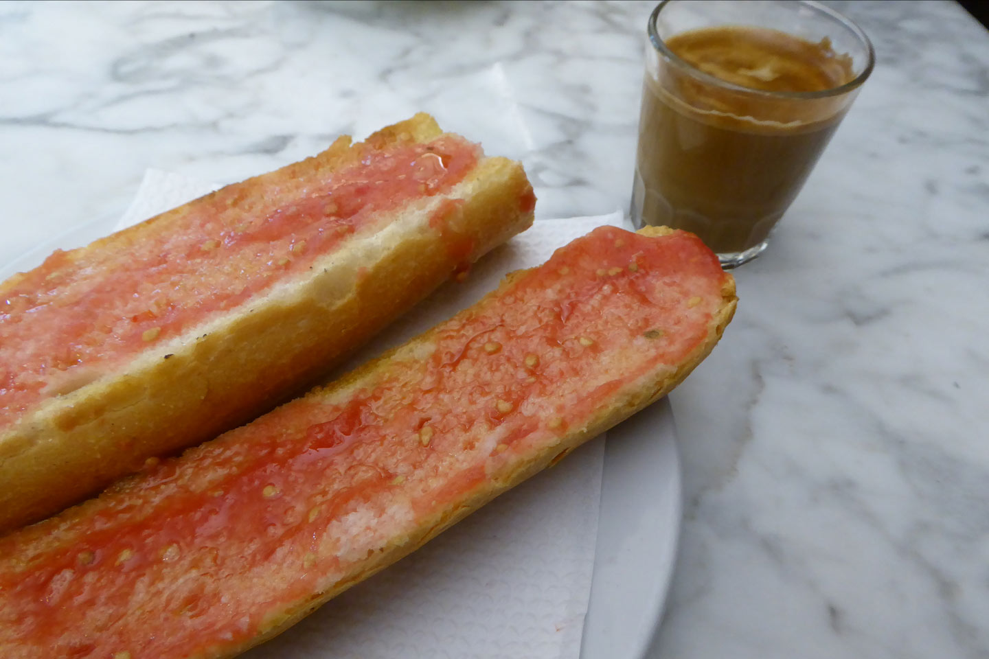
A definite favourite is café cortado with cold milk and bread with tomato and olive oil — pan tumaca in Catalan. / Note added March 21, 2019: it turns out that ‘pantumaca’ is not the Catalan way to say bread with tomato, it is the Spanish (as in Spanish speakers) interpretation of the Catalan term, pà amb tomàquet. I got this wrong my entire life, but it is never too late to learn something new.
A photo of your design process
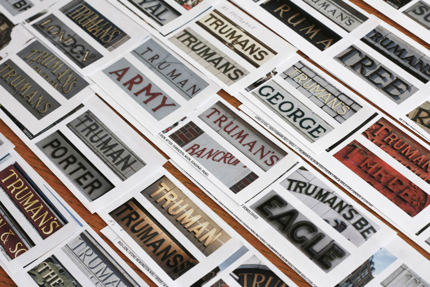
In this picture I am showing part of my research as PhD candidate: how was architectural lettering used on commercial buildings? What was the link to branding and corporate identity? As you can see, the London based brewery Truman Hanbury & Buxton is my main case study.
A photo of your desk, working space
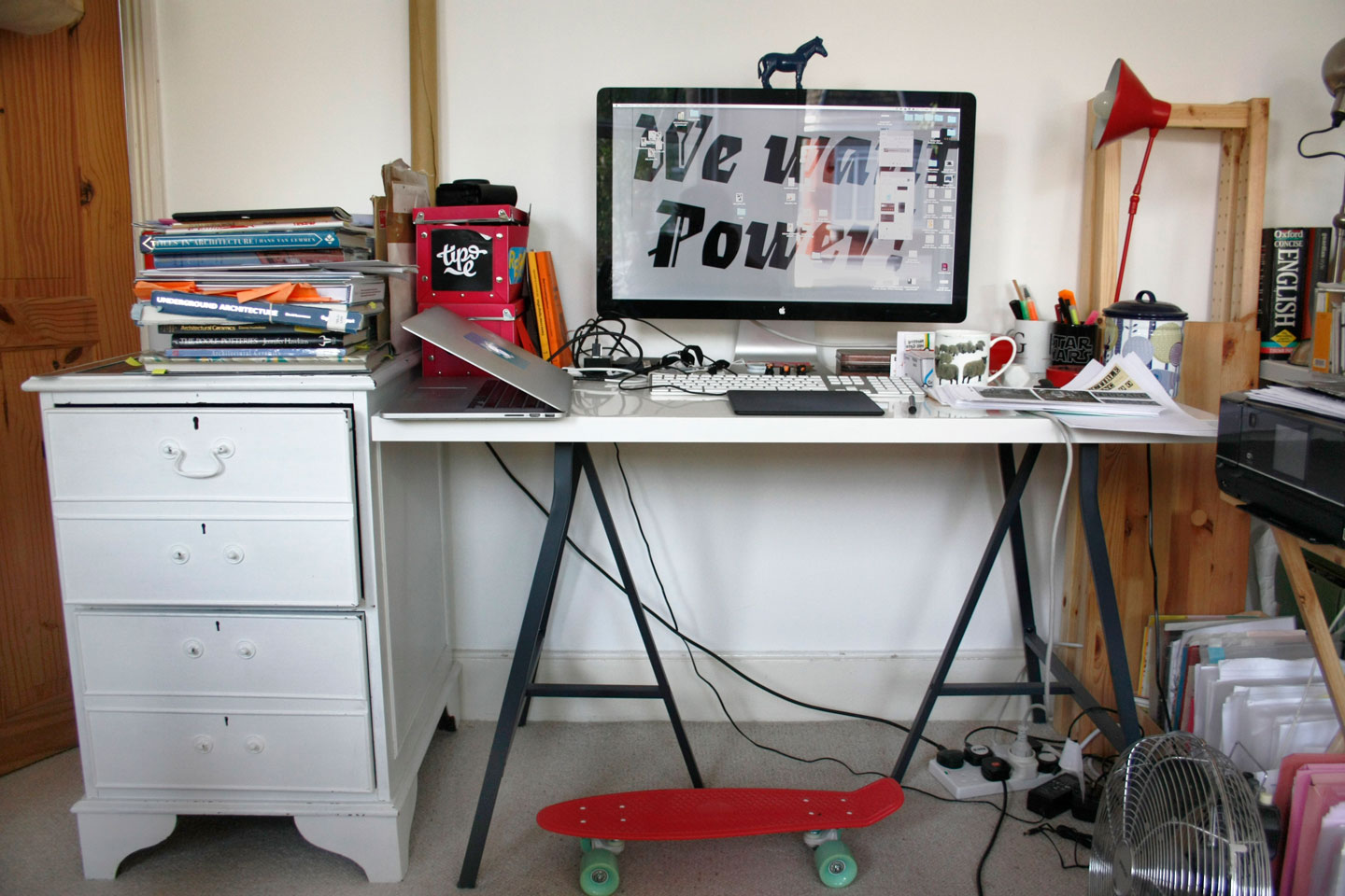
I have to admit that I first tried tidying it up, but when I saw the pictures of an ‘almost immaculate’ desk I wondered, who works here? Definitely not me! So I took it back to its original look. This is mostly my research desk. At the co-working office where I work for TypeTogether’s job, my desk is neater.
What do you see from your window?
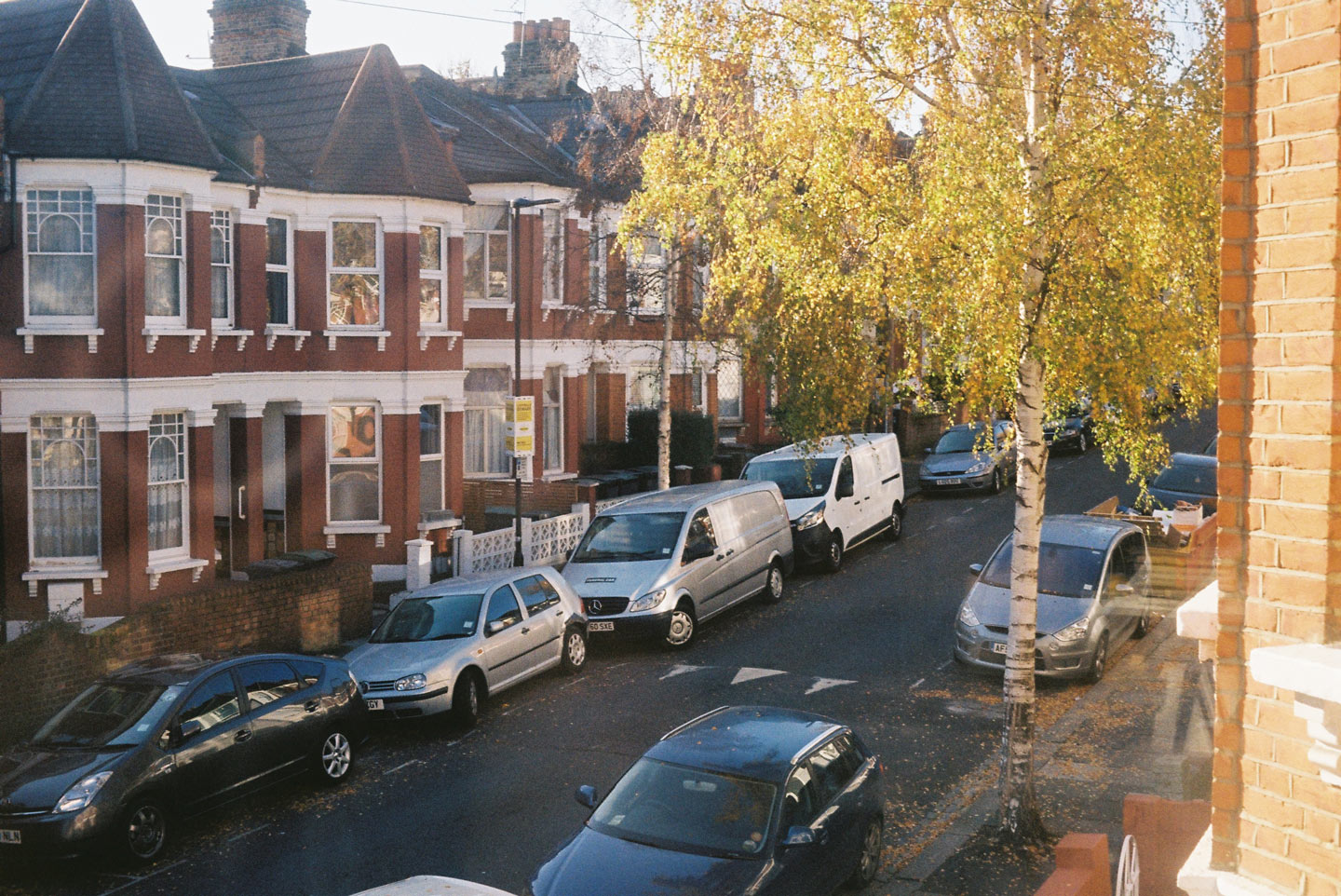
I see The Harringay Ladder, North London.
A pile of books
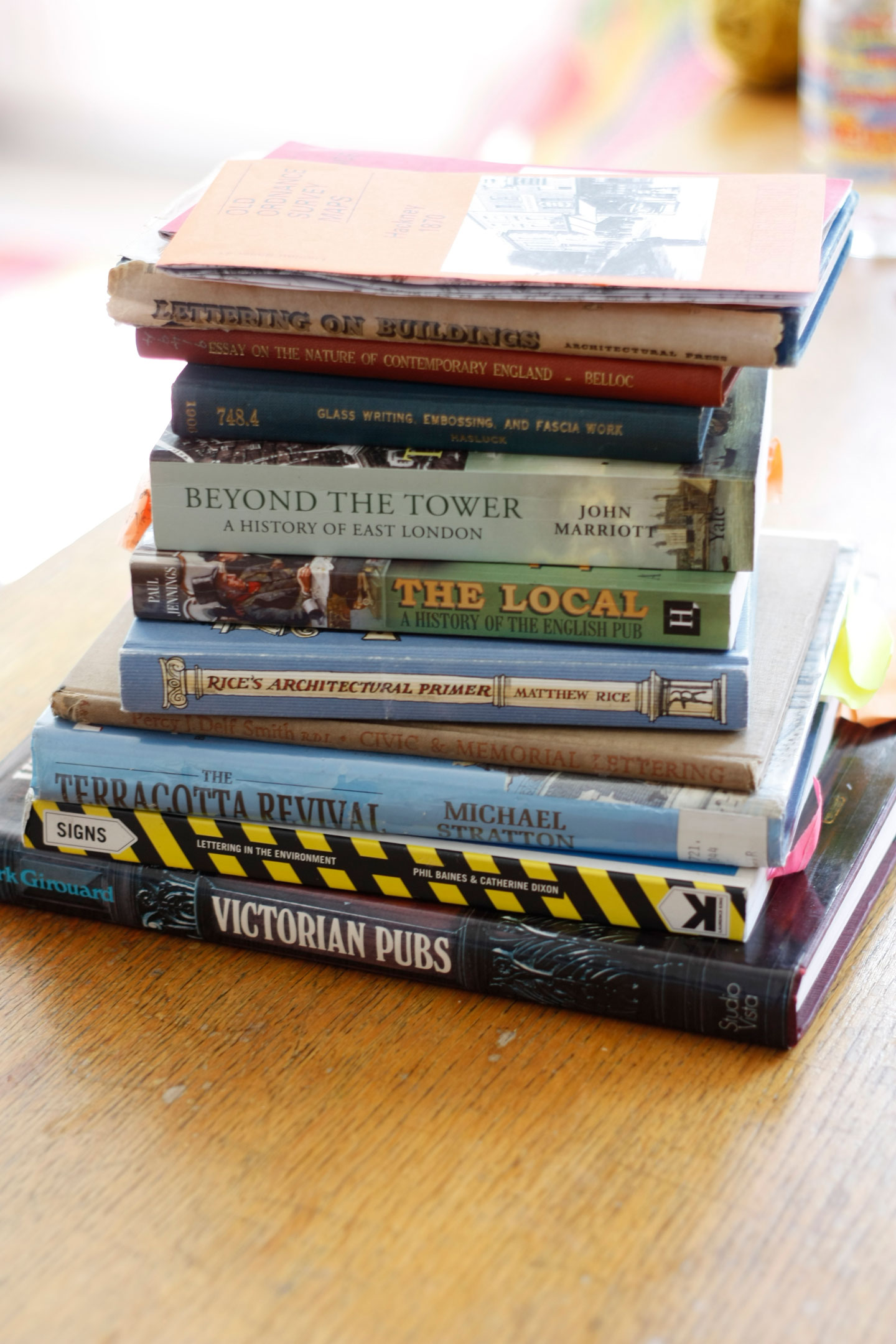
Not much time for books other than PhD-related, hence I’ve tried to summarise my investigation in a few books. Clearly, there had to be some public lettering books: it was difficult to choose only a few, but Nicolete Gray’s seminal book is a must. She wasn’t the first one researching and recording the graphic environment, but with her public lettering become a field of study. A more recent book, Catherine and Phil’s Signs. Lettering in the environment, a more pragmatic approach that is hard to surpass. Lastly, Percy Delf Smith might be less known now but was a relevant figure in his time, and his book exists somewhere between practice and theory. Public houses are the core of the research, so I have added to the pile Girouard’s classic Victorian Pubs, and a non-academic text that narrates the history of pubs and it is very easy to read. Materials and techniques are also key aspects of the research so I have included Hasluck’s handbook on Fascia Work, Stratton’s book, that clarifies many processes on architectural ceramics, and Rice’s visual primer on architecture that I found very helpful to start understanding how to read buildings. Lastly, Marriots and Belloc’s books about the social history of London that provides the context for my research. Here I could have added more books and more sections, particularly those for advertising and branding, but this makes for a good starting point.
References: Mark Girouard, Victorian Pubs, 1975; Catherine Dixon & Phil Baines, Signs. Lettering in the Environment, 2005; Michael Stratton, Terracotta Revival: building innovation and the image of the industrial city in Britain and North America, 1993; Percy Delf Smith, Civic & Memorial Lettering, 1946; Mathew Rice, Rice’s Architectural Primer, 2009; Paul Jennings, The local, a history of the English pub, 2007; John Marriot, Beyond the Tower, 2011; Paul N Hasluck, Glass Writing, Embossing and Fascia Work, 1908; Hilaire Belloc, Essay on the nature of contemporary England, 1937; Nicolete Gray, Lettering on Buildings, 1963; and some Ordnance Maps from East London reprinted from the originals of early 20th century.
The longer bits
Let’s start with, Luisa’s question for you:
You have a wide variety of type-related practices: running a publishing house, researching, designing type specimens, and more. Is this compartmentalised (researcher by day, designer by night!), or do your different lines of work influence each other (and how)?
When I started working on these three areas concurrently they were somehow compartmentalised: the publishing house, where I don’t write but, together with my partner at Tipo e, we do everything else (designing, editing, coordinating, distribution); then my on-going research as a PhD candidate, focused on architectural lettering; and then my primary job at TypeTogether which is specifically about communicating the foundry’s work.
However, at some point, those three large drawers that were perfectly separated started to mix and to inform each other. First, it was transferable skills such as structure, writing, organising. The research was informing the work. Next, everything I’ve learned so far at TypeTogether permeated into my Ph.D., and here I refer to technical aspects about type design and a better understanding of the letterforms. Manuel and I have had some busy times and so publishing new books is on hold right now, but I have a notebook with ideas for new books that are totally influenced by my job, that is all I can say about it for now.
I am so interested in you as a publisher. What made you want to publish books on type in Spanish?
Publishing felt like a completely natural step. After I graduated as a journalist I worked for a magazine focused on design, then with some friends we launched a magazine about typography, and after that, the publishing house just happened, (Tipo e). There were never doubts about it. All this was mixed with the love of books and letterforms that I share with my partner at Tipo e, Manuel Sesma. By publishing books, we were able to spread that love. Also, in Spain, not many publishers are devoted to typography, and a large part of the books are translations from English or German. Our goal was to create original content created in Spanish and publish books in Spain and Latin America. Additionally, there was a selfish reason, in Tipo e we publish the books that we would like to read but don’t exist yet. Although these books are published for the readers, they are secretly for us.
Let’s talk about you venturing into a part-time PhD, self-funded. What is the motivation and how does it feel?
Although undertaking a PhD self-funded is really hard, I would talk about its advantages, as there are a few. Employing your own economic resources (or your family’s) instead of public money can be liberating: I feel no external pressure to finish it by a certain date or even to finish it at all. Funded students have a responsibility; they need to deliver in a particular timeframe. I have an obligation too, but it is to myself, my family, and my supervisors. Another advantage is that you need to earn an income. How is that an advantage? Well, you won’t spend four, five or six years away from practice. It might be fine if the final aim is pursuing an academic career, but if that is not the purpose, then it is certainly too long. Having a job while doing a PhD is also mentally healthy as it keeps you focused. When the job and the research are related, as in my case, they also inform each other.
Additionally, I know there are people who would love the opportunity of doing a PhD but cannot. I see my position as a privilege.
I am sure you are looking at vernacular type differently since you started the PhD. What is something that you learned about it that not many know?
I’ve realised that I know more about pubs (public houses) that I thought possible! Surely my understanding would be a bit different to others, as I will be thinking of the use of that particular letterform in that particular lettering, or even worse, I will be trying to find some ceramic marks in the walls. I’ve also become very good at spotting Truman’s pubs in films and BBC dramas. Take me anywhere in London and I’ll find you a Truman’s pub!
Continuing on this, is there anything that someone wanting to transform their typeface to a three-dimensional form should know?
They should know that lettering is not type, and different contextual factors apply. A piece of three-dimensional lettering would be created for a particular use, and therefore there are particular questions that need to be addressed: is it for external use or internal? Would it be under the rain or the sun? Is it intended to be read or just seen? What purpose is it intended to fill, marketing? Poetic? Informational? Where is it be sited? How will it be lit? What will be it be made of?
I was so interested in what you called “to record an undocumented aspect of the ‘graphics memory’ in the 20th century”. Today, there are so many photographs on the web of vernacular type, and as gorgeous as they may be, I’ve always found it unsatisfying to just look at them without enough context and analysis. (Something that does happen in type walks for instance). How are you working on this and growing beyond a formal fascination with the beautiful letters you see all day long?
This is one of the challenges of today, how to document and preserve the graphic memory of a place in a meaningful way. We have gone from virtually no records, or very few and in specific fields, to an endless amount of imagery, as you say, without context or analysis. In the future, researchers will have to find a way to address this through technology. But today we need to work on producing rigorous methods to record and preserve graphic memory that are useful for practitioners, researchers, and anyone interested in the field (nostalgia lovers, designers, and type aficionados). Last month (February 2019) there was a conference in Barcelona focused on the policies of museums and institutions for the future of design preservation.
One of the main questions is who should be in charge of preserving this material? Does it lie in the hands of institutions? private or public? should it be a private company’s endeavour to protect their own legacy? Is it in the hands of the public to keep photographic memories of everything we see? Are the companies responsible for taking care of the preservation and record of their heritage? Or should it be a combination of them all? In the digital world, attempts have been made in this direction but none of them offer more universal solutions. The digital platforms that I have encountered all have enormous disadvantages: the institutional platforms are not engaging for the general public and quickly become technologically outdated; platforms open to public participation tend to incur in a deficit of information and rigour; some academic resources can be undecipherable (even for other academics); platforms run by companies can be easily biased. Is there a solution? In my own research, something way more humble than those platforms, a driving force is finding a method for studying architectural lettering in a way that can be valuable for other researchers and which can be applied to other case studies.
Oh well, I have the feeling that I have answered like Groucho Marx.
I am curious about your writing. Since you studied journalism, I will assume you were always comfortable writing. Does writing for different purposes (PhD, blog, type together) differ in process or mindset for you? Do you feel you improved over the years? And do you have a tip for a designer who is very keen on writing but not sure it will be good enough?
Writing feels like home, in my native language, Spanish, of course. Writing in English is a very different thing. Basically, in my case, there are two different kinds of writing, underpinned by the level of required thinking. When the writing involves a particular thinking process, for example, when I am writing my PhD, I need a quiet environment and a mindful state that I need to build towards every weekend. Although writing helps in the process of thinking, I am used to doing exactly the opposite, chewing a subject over my head for a long time, until it is clear and I am ready to write it up in one go. Unfortunately, that isn’t possible with a project as large as a thesis, but it works for shorter pieces.
Then there is the professional writing, for example, an article, or work-related text. One of the best pieces of advice I got from uni (journalism) was to be a professional and don’t wait for inspirational moments.
For designers, or anyone, who wants to improve their writing the best advice I can give them is to practice, commencing with light exercises, and take it from there. In the past, I used to go everywhere with a notebook and a pencil, and I challenged myself with little activities. One was to choose something apparently insignificant and to write a short piece about it without too much thinking. Insects were generally a top subject. The texts were of dubious quality but helpful in releasing the pressure of writing. Another great exercise was to summarise one article from the newspaper every day. It was excellent for boosting writing speed, as well as helping with blank page fear.
You can see Elena’s work here.
Next interviewee …
Elena is nominating the next lady to be interviewed:
The person I choose to be the next interviewee is Petra Černe Oven.
Hi Petra! I saw your presentation at AtypI Warsaw about Ciciban — a Slovenian children magazine published during the 20th century that was editorially and typographically exceptional — and I loved it. It comes back to me from time to time, and more than a question it’s a long term proposal, why not starting a collaborative research in search of Cicibans in other countries? Typography for the young readers across Europe. Surely it is a good time for that.
Part of your work has been put into making diacritics in typography better, where do you think are we standing now? Has professional type design reached a mature status in that sense?
On a personal note:
The fact of how deep she is invested in each of her activities doesn’t seem to harm their span. What I find that is happening to me at times, is that I get too excited by everything. In Elena, there is a sense of calm, a way of rethinking and evaluating how the division of time should be spent, and what each moment is dedicated for. Instead of trying to do it all at the same time, this is perhaps the most sustainable way to not give up on either of the exciting things.
Thank you, Elena, for sharing with us your thoughtful answers.