
How is it possible that it’s August again??? This summer, we wanted you to travel with us (for free!) around the world and enjoy some typographic curiosities we have around us (check out this map by Indra). Those posts will be scattered throughout the month, marked with a passport stamp on the first image for quicker spotting. This is a perfect excuse for a tomato juice! Here we go:
Scripts don’t live in a void. They live together, interlaced, in Israel’s urban environment: Hebrew, Arabic and English. Each script is affected by surrounding scripts, which in turn influences them back, a symbiotic relationship. Examining trilingual signage in Haifa provides an opportunity to discover meaning among the different alphabets; an additional benefit is that it is a good excuse to show some of what surrounds me in my hometown.
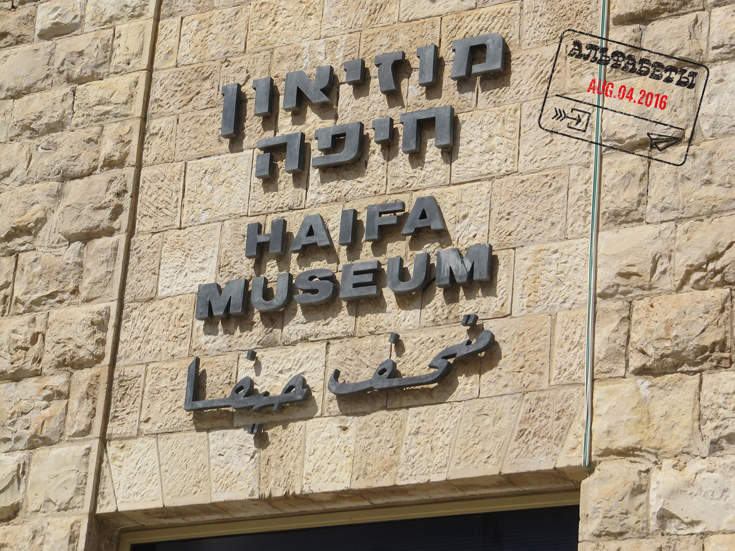
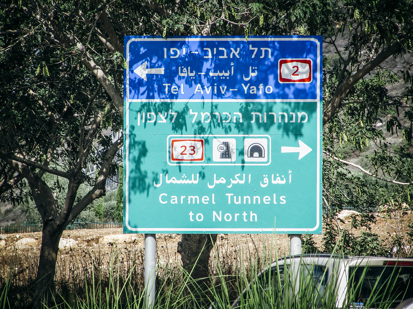
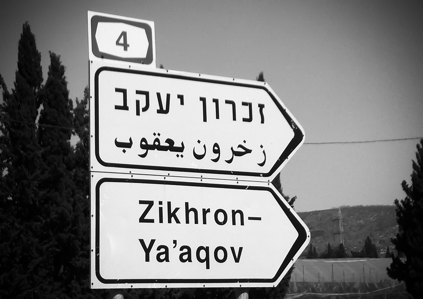
In Israel, most signage, in particular official signs for roads and streets, features text in three languages. Even though the typography is usually cluttered, we never miss our exit on the highway, because we are so accustomed to identifying in a fraction of a second the script we read best.
A short paragraph from history: In 1922’s legal instrument The British Mandate for Palestine it was declared that English, Arabic and Hebrew (in this order) would be the official languages of the land, that will later become Israel. In the collection of laws The Palestine Order-in-Council, it was even decided that each official document or announcement will be written in those three scripts. In 1948 the use of English was redefined to not obligatory, but it became the norm to add it as a diplomatic and international language.
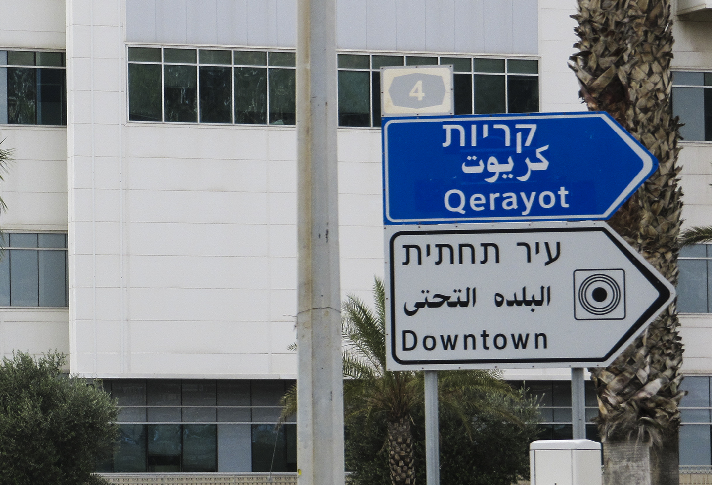
When looking at official signage, there appears to be an attempt to present the three languages equally. However, this attempt is usually weak, and in many situations we can see that in matters of hierarchy, there is one important script (usually Hebrew) and the other two will be placed somewhere, somehow.
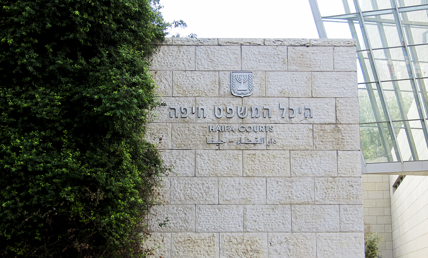
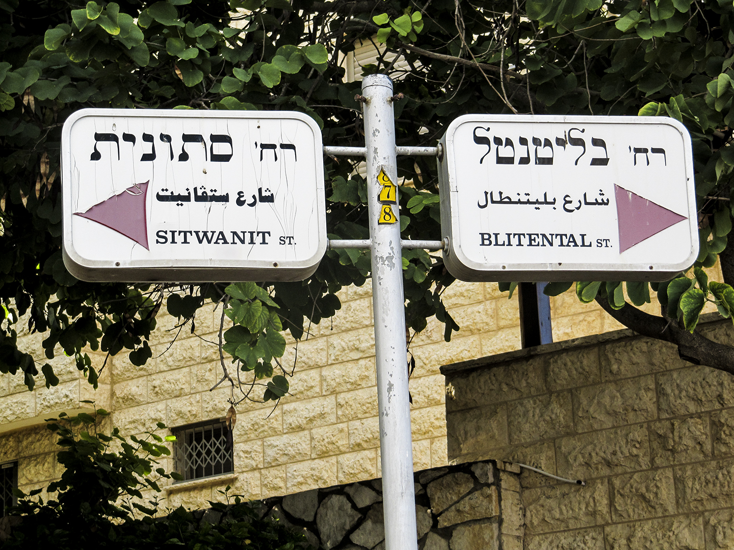
Moreover, there will seldom be a connection between the chosen typefaces for each script. Calligraphic typefaces next to sans serifs demonstrate a default, and therefore lazy, choice. Sometimes, there is not even even a decision in selecting one typeface for each script, as observed in street corner signs.
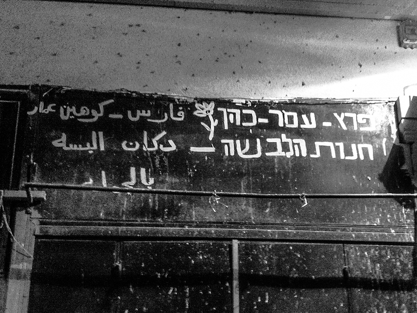
However, non-formal signage, is a great place to discover interesting and authentic solutions for three coexisting scripts. The purpose of the sign beyond typical formal demands is the typographic priority: practical, commercial and instinctive. The questions asked before making those signs are related to daily life, therefore, the solutions are natural and fit the location rather than forced within it. Who is the audience for the sign? What should they read? From how much of a distance? What is the aim? The priority is that a sign should be readable. In many cases, store owners decide that only one or two scripts are necessary, and those choices are practical and not political.
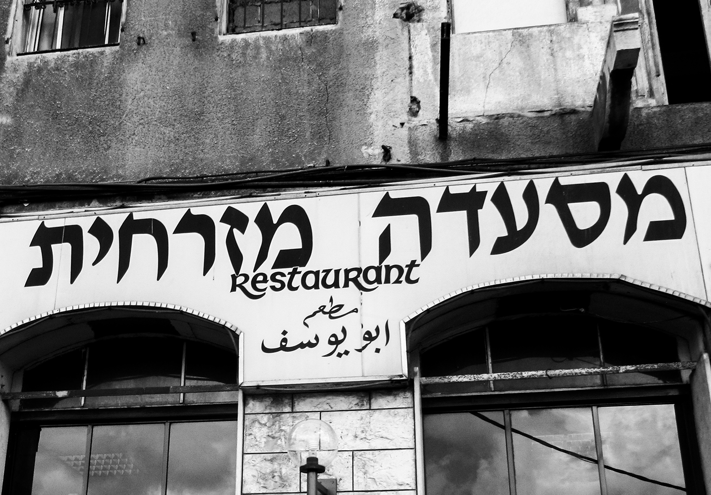
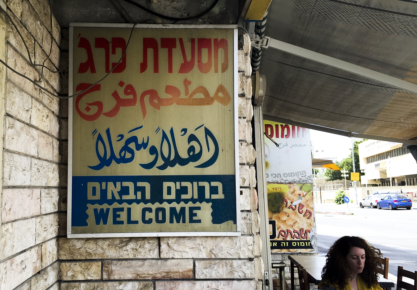
Multilingual signage in Haifa integrates daily needs. Restaurant and shop signs in the three scripts are common and can be found mostly in mixed areas of Arabic and Hebrew speakers. Strangely enough, not only the scripts are visually different, but the content also changes according to the audience. In the case of “Abu Yusuf” eatery the Arabic type says “Abu Yusuf restaurant”. However, when other languages are added to the sign, the details diminish. In Hebrew, only words that describe the genre of the place exist: “oriental restaurant”. The English wording goes ever further and stays with a solitary “restaurant” that communicates that this is a place that serves food and if you are a tourist, thus is all you need to know.
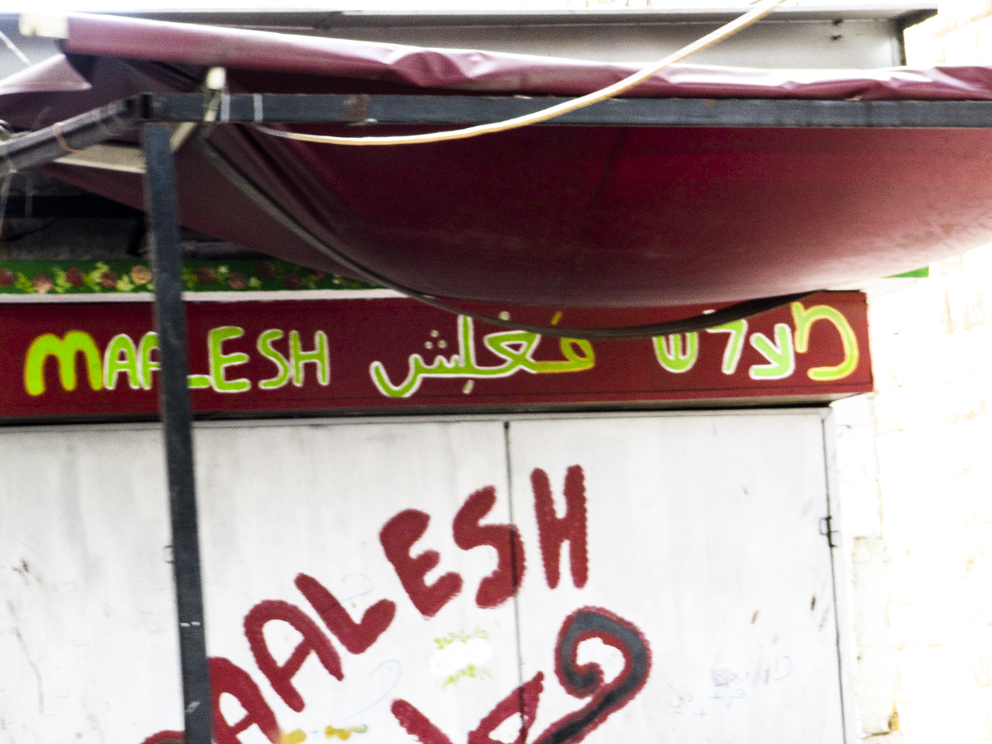
As opposed to a printed sign, where the level of harmonization between the scripts is planned (or at least, one would hope!), it is in the handwritten ones where we tend to see a strong correlation between the scripts. The writing tool, combined with the style of the painter’s hand, creates the letters. With these signs, a spontaneity is present that strengthens the authenticity, and should serve as a model for official signage with its harmonization between the scripts.
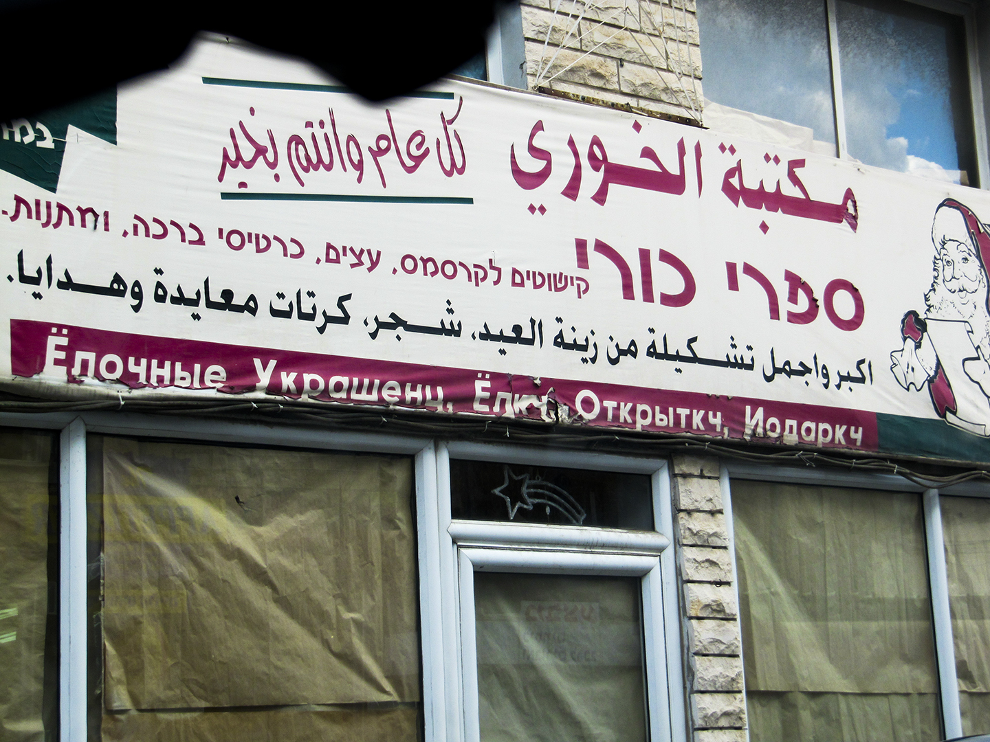
Here we can see that the store owners saw no use of Latin but chose to add Cyrillic
Signs are a daily part of our lives and their role usually doesn’t require a long gaze at the letterforms. It is crucial to examine how the scripts are working side by side both in a quick look (as the sign is typically viewed) and carefully. Ask questions: What would be the best way to set three different scripts? Could we succeed in giving a respectable platform for each? These questions are not only relevant to us typographers and typeface designers, they are essential in how we perceive ourselves and how others see us as well.
It is a part of the Greetings from series. See the other posts here.