
Halfway through 2016, as I was finishing my undergrad Graphic Design studies, I became very interested in the idea of researching the relationship between language and type. Fortunately, I stumbled upon Bianca’s dissertation, which helped me greatly as I could build upon her thoughts, draw my own conclusions and hopefully design a typeface based on language as criteria.
My process naturally steered towards the analysis of my native language, Spanish. A previous approach to the design of a typeface used to set Spanish texts, Fontana ND, was made by the Argentinian designer Rubén Fontana. It was not only different in terms of its typographic shape, but also in the cultural and political reflections that were part of its design: Fontana argued that as Latin American designers normally use typefaces that were conceived from other languages (such as German, French or English). He called for letterforms that acted as interpreters of “our sounds, customs, and cultural habits”.
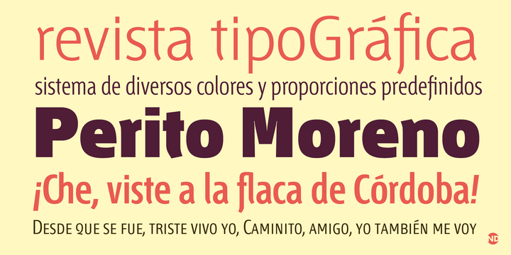
Fontana ND, by Rubén Fontana. Note the ch and fl ligatures.
Inspiring as these thoughts are, in my view they don’t necessarily prompt a type design process influenced by language. Fontana ND includes some beautiful ligatures directly related to Spanish sounds and letter pairings, such as ch and ll, which used to be considered letters and and distinctive part of the “Spanish alphabet” in their own right. Nevertheless, the design process of this typeface does not necessarily show a direct link between language and the typeface’s visual features or legibility considerations.
This left me with a question: beyond ideological considerations, how could I make objective design decisions that took advantage of a language’s visual peculiarities? I knew already from Bianca’s research that each latin-based language looks different, however I decided to work on my own understanding of the problem, which led to the construction of my own language profiles.
I devised three features to help me describe a group of ten European languages in a more systematized, verifiable and comparable way. First, I defined the dominant stroke shape of each language — whether rounded, arched, diagonal or vertical— based on which letters were more frequent. Afterwards I analyzed the most prominent construction axes depending on ascender, descender and diacritic frequency. The last characteristic comprised the amount of white space in each text, determined by word length and the frequency of characters that “invade” the leading space.
Thanks to this structure, I was able to recognize several features that dominate Spanish texts: rounded strokes; a shortage of ascenders, descenders and diacritic marks; and high amounts of whitespace both between text lines and words.
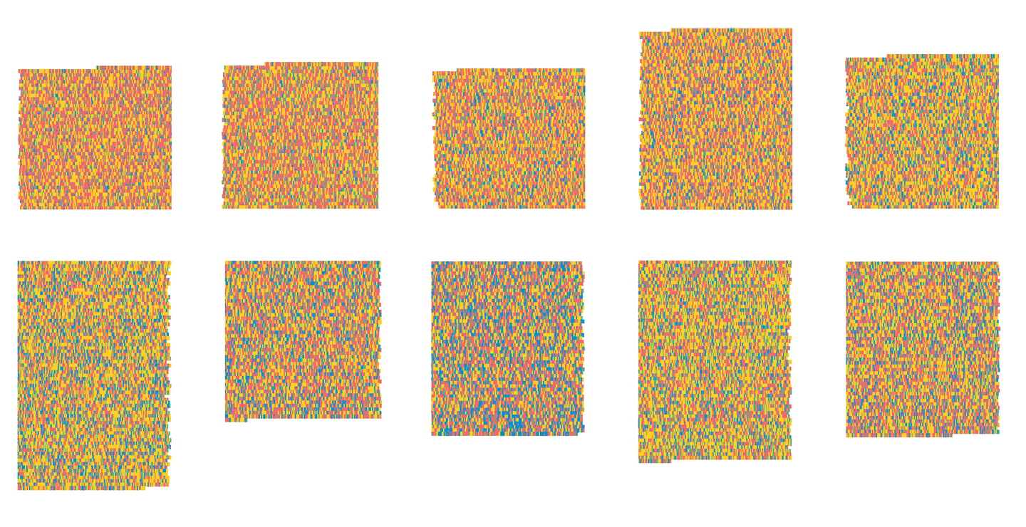
Heat map-like visualization of stroke shape frequencies and text length of ten European languages. Red shows a high frequency of rounded strokes, yellow for arched strokes, and blue for diagonal strokes.
Clockwise: Spanish, Italian, English, German, Icelandic, Hungarian, Turkish, Polish, Czech, and Finnish.
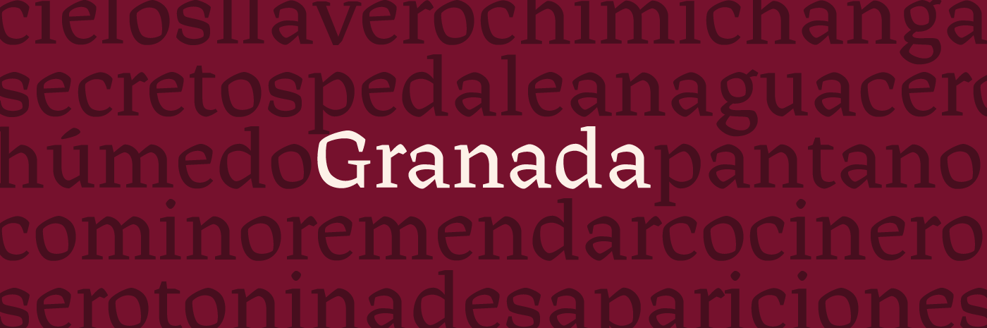
To design Granada, a text typeface, I interpreted these features in order to achieve maximum legibility for Spanish; my main concern was dynamizing the round stroke pattern through angular shapes, irregular counters, and slanted contrast. Even though Granada is an unpublished project, I am very pleased with the outcome as I believe both the initial objectives of understanding my language from the perspective of typography and designing a typeface based on my findings, were fulfilled. I regard this methodology as a source of creativity and inspiration for my own future projects and hope to see its effectivity tested in the future.

To know more about the project and the methodology used you can read the whole document here.
Pingback: Granada: Verbluffend werk gericht op de Spaanse taal – Letterpress Forum