
Valentine’s Day. The day of love, lust, and crushes. Maybe the first time you saw the object of your affection was across a room, at a party or a bar or on the street. Your heartbeat quickened, your palms began to get slippery, your mouth went dry … because you were in the presence of something that spoke to you, that you felt a chemical connection with, something that made you feel understood and less alone in the world. Well, that’s how I feel when I find a piece of beautiful printed type.
When you visit a flea market, there is great furniture, handmade wares, and delicious street food … and then there are the antique booths. If you’re anything like me, the paper ephemera portion of these booths create the same effect as if I was to see David Beckham across the room. Once upon a time, when I lived in Williamsburg, Brooklyn, I visited the Brooklyn Flea just to encounter such a corner of such a booth. I can’t remember exactly how the conversation began as my memory isn’t what it used to be, but I ended up in a deep conversation with the owner of the booth about some copies of Avant Garde magazine she had for sale.
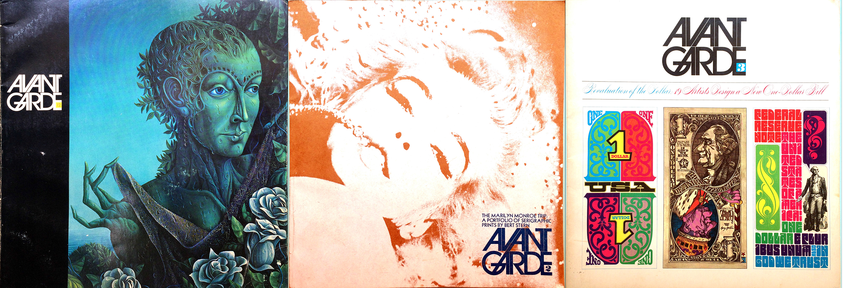
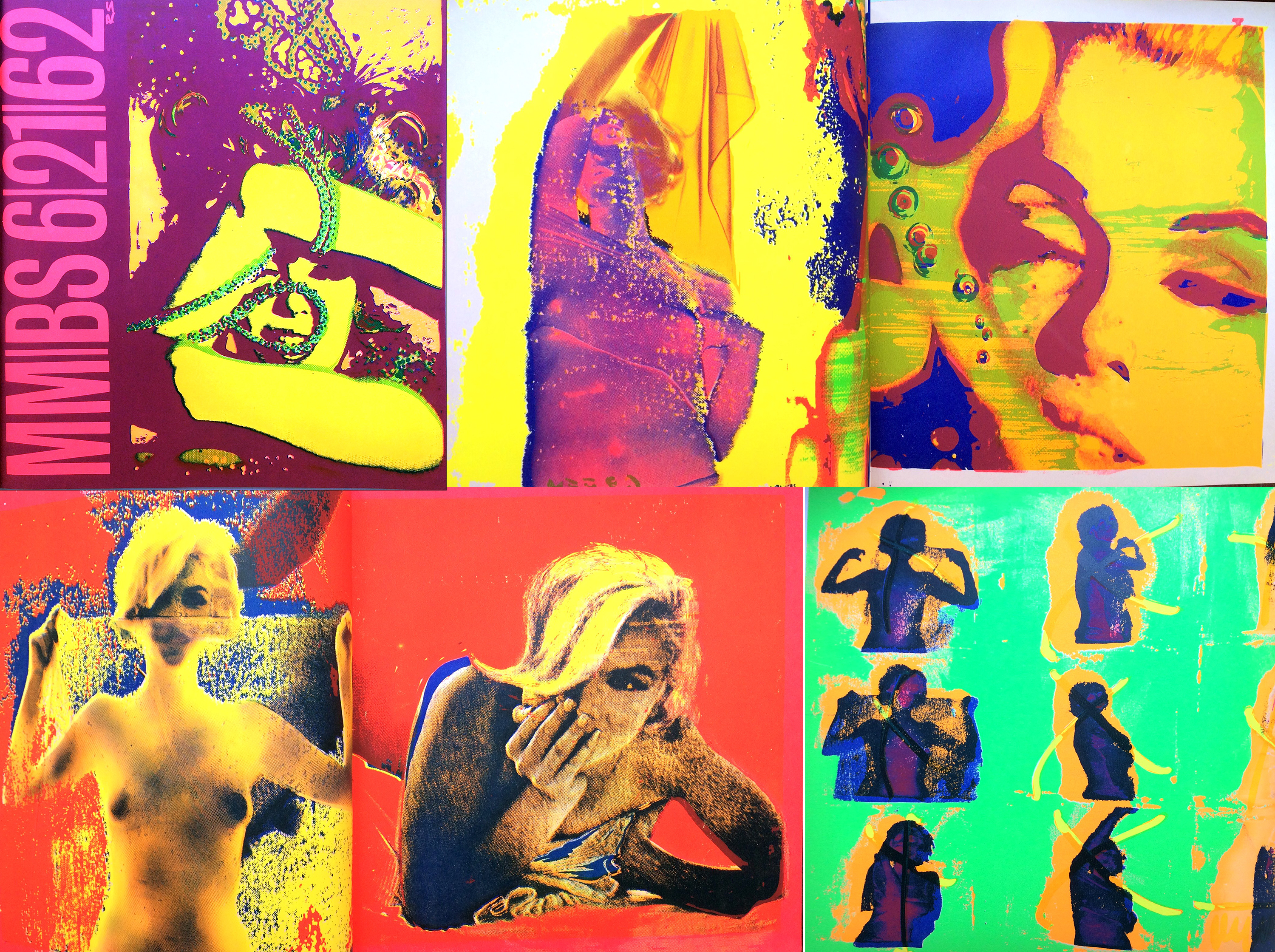
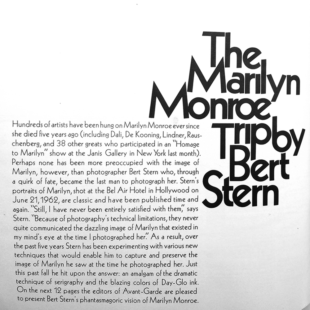
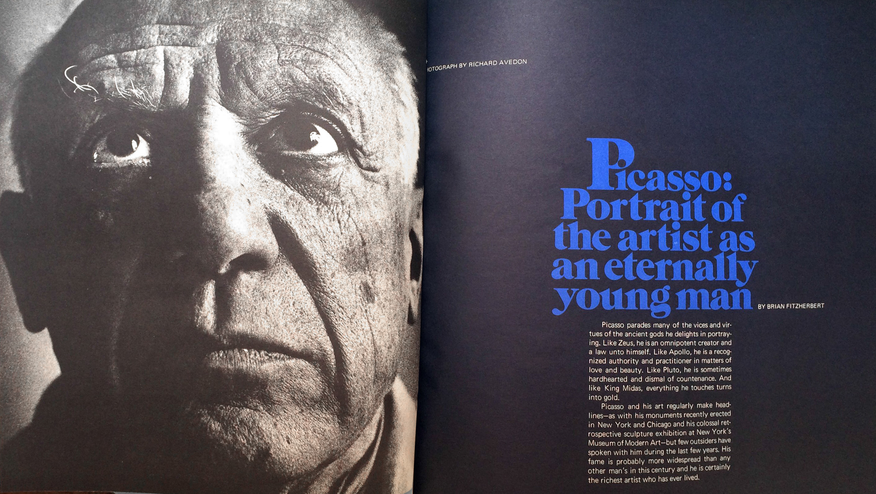
I blacked out and can’t remember exactly how long we were talking, but it was enough that my friend and flea market accomplice had given up on me and wandered off on her own while I reveled in the story of Herb Lubalin and Ralph Ginzburg’s editorial endeavors. The two engaged in a mission of publishing content on the subjects of sex and love in Eros, then went on to publish political content in Fact, and, while the two were short-lived and shut down due to legal issues, their third publication brought the two subjects together and enjoyed a three-year life span. Although Avant Garde was not prosecuted for obscenity like its predecessor, Eros (which you should google, because it has some beautiful type happening as well), the subject content was still pretty racy. I spent a pretty penny on three issues. But what’s money when you’re in love? One of these issues was the Marilyn Monroe issue and featured serigraphs created from the last photo shoot ever taken of Monroe in bright neon.
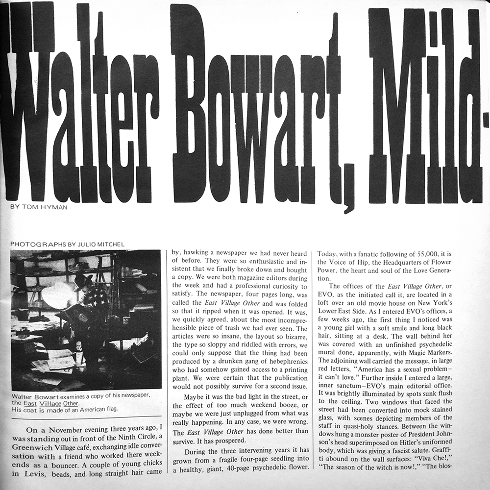
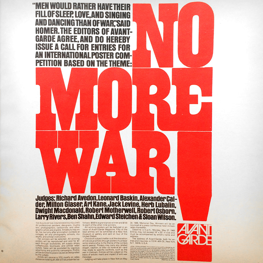
My love starts with the timely letterforms, reminiscent of the 60s and 70s, and continues with the ballsy nature of the large type. I am especially turned on by type that takes up space, type that reacts to its surroundings; so, while the letterforms on their own are interesting and full of character, part of their appeal is how they work on the page and within their allotted space.
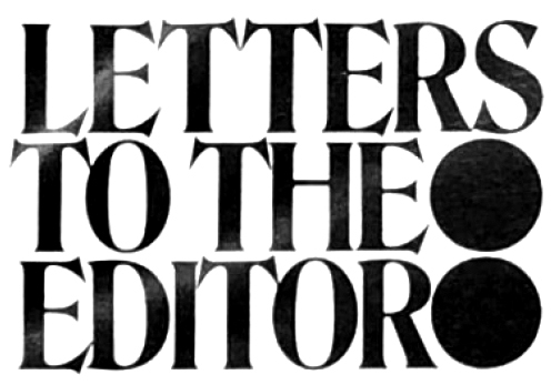
It feels like each typographically designated area is treated like a holy space to be curious and let the letters explore each other and themselves. Each lock-up is a tiny puzzle that Lubalin carefully explored and solved, sometimes in way where it seems like he threw out the instructions and said, “F— it, this looks good! It’s weird! But good! Send to print!” (I love people/design like that.)
Also, while the serigraphs are not typography (obviously), I find that my work is frequently informed by texture and color. And these pages are full of juice that drives me to make the lettering I create live and breathe. So I’m including them as they inspire your work! I hope you find love, lust or a crush on some beautiful printed pages today, and everyday. Enjoy!