
When I first started brainstorming header ideas, I knew I wanted to execute it by hand. There is something comforting in the unpredictability and uniqueness of a linocut print. During my time at Starbucks Global Creative, I had the opportunity to explore linocut block printing in quite a bit of my work. What interested me was mixing lettering and linocuts, much like letterpress.
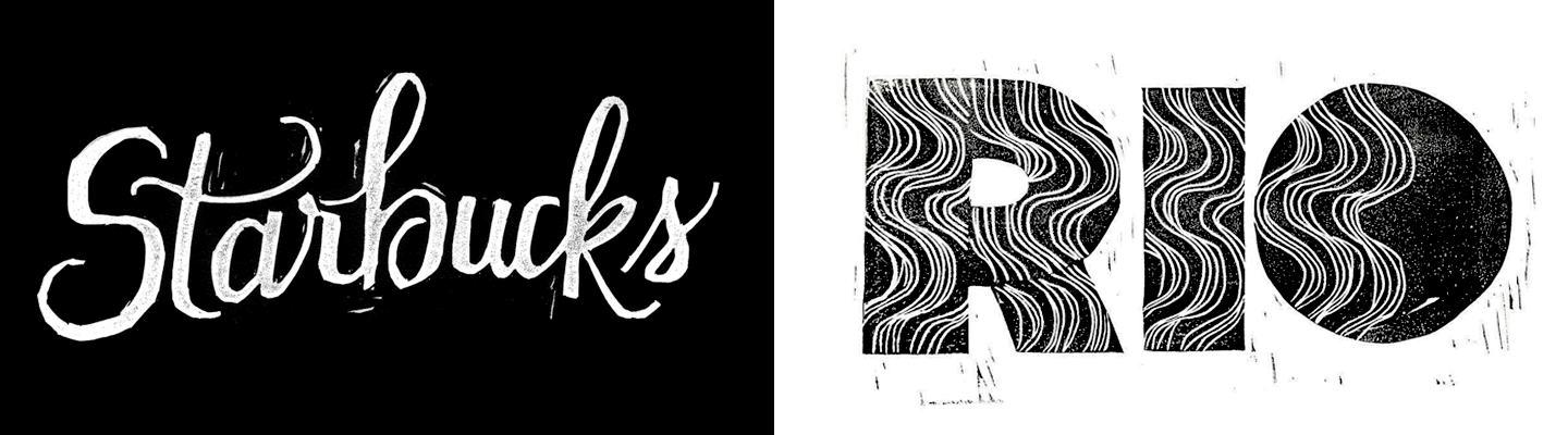
Samples of my work from my time at Starbucks Global Creative.
Recently, I’ve found myself drawn to the lettering styles used in the automotive industry during the 1950-1970s, and it reminded me of a car my dad had when I was young. It was a 1968 Chevrolet Camaro that he fixed up before trading it in for our family car. I remember it as this beat up green monster that my mother hated. He lovingly called it ‘El Pepino’ which means, the cucumber, in Spanish. Recalling the story of my dad and his beloved ‘Pepino’ it only made sense to continue in the direction of a chromeography inspired lettering piece.
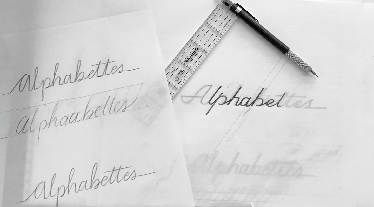
Initial sketches on the left, refined sketch on the right.
Script lettering in the automotive industry was popularly seen well until the 1970s. Most of the chrome badge techniques showcase them as cut from a single continuous line, most likely for manufacturing purposes. I made this the focus of my lettering piece as well for it to work for a linocut print.
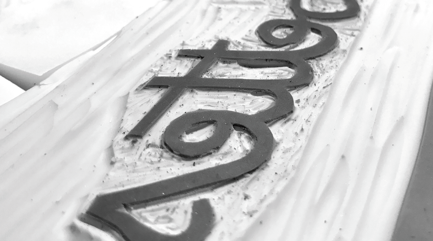
 Carving the first of two weights to see which held up better.
Something that I admire about chromeography is how well they hold up over time. The level of care and detail put into chromeography from car emblems to household appliances is rarely seen today. With linocut, I love that I can recreate a little bit of that history and look forward to creating more.
