
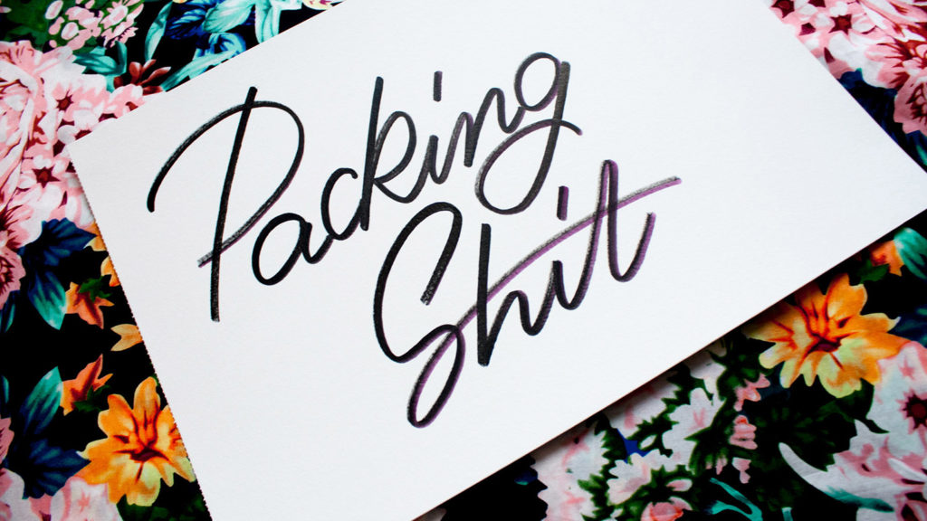
This is the transcript of my talk at TYPISM Conference on September 30, about facing fear and getting out of your comfort zone. You can watch me losing my shit here, but I wanted to make the written version available for anyone who’d find that useful. Enjoy!
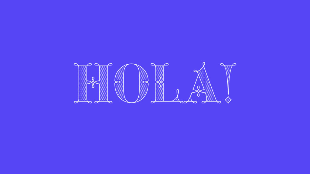
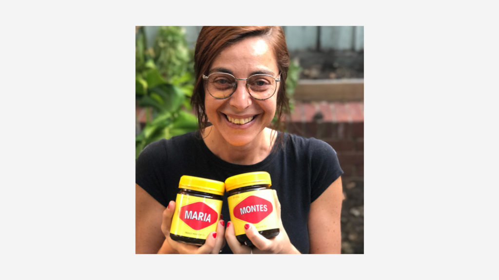
Hola! My name is Maria Montes and I am incredibly honoured to be here and share my journey with all of you.
First of all, thanks to Dominique, George and the entire TYPISM community for your ongoing support, it means the world to me.
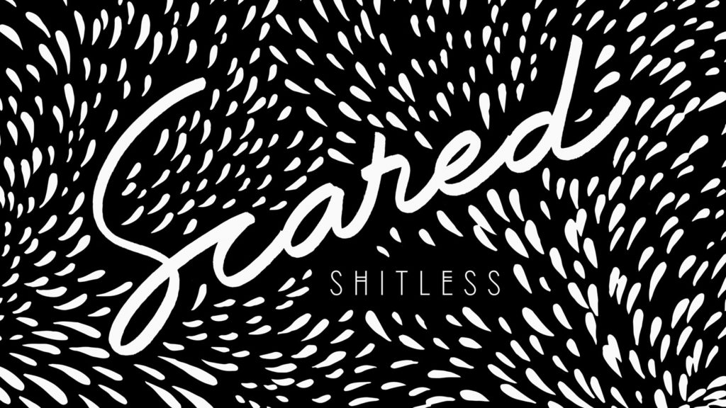
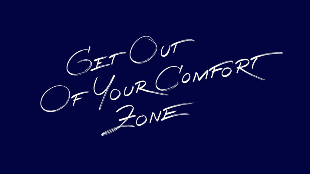
My talk is called Scared Shitless–which is how I feel right now. This is my first time speaking on a big stage, so excuse me if I lose it at any point during the next thirty minutes.
This talk is a very personal journey starting in my hometown and ending on this stage today.
I was born in Blanes, a small town 70 km north of Barcelona. My father used to work for a pharmaceutical company and every Christmas, the company organised a drawing competition for the employee’s children to take part in.
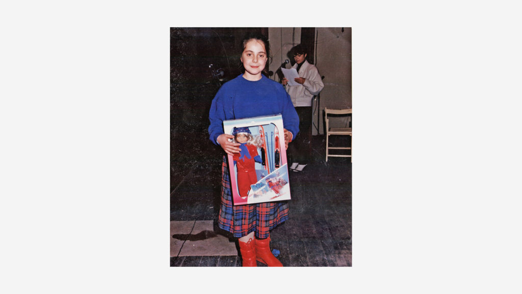
I loved drawing so my father took me to the contest every year. He is very competitive and I only ever won the second prize, which he was not happy about it.
At the age of six, I started figure roller skating. I was training every second day, a total of twenty hours a week. I loved everything about skating except the competition season.
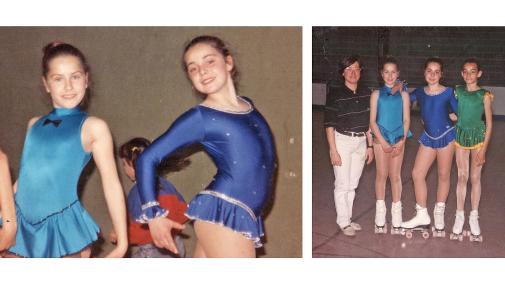
My trainer was really tough on all of us. I remember one day going to compete and feeling sick. I don’t know if I was really sick or just completely freaked out, but I was throwing up in the toilette while the MC was calling my name on the microphone. So, I ran outside, performed my two-minute program and went back to the toilette again.
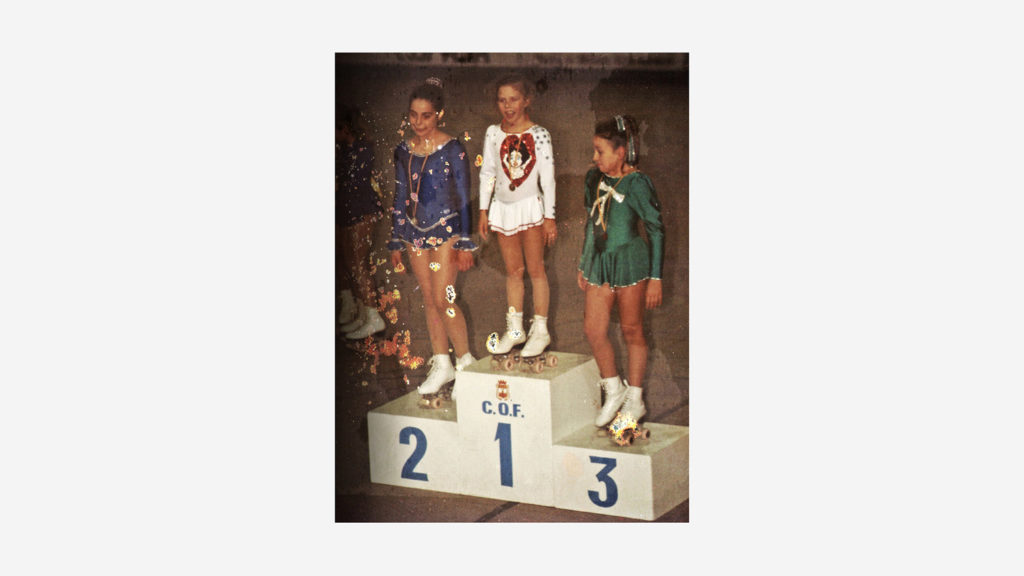
That day I finished second, and as you can imagine, neither my trainer nor my father were really impressed about it. After that day, I started to hate skating.
After many years I realised, that I am only competitive against myself. My goal is becoming a better version of myself as a human being as well as a designer.
So, my first message for all of you today –and paraphrasing Nicole Phillips– is: “Be generous, share your knowledge and do not compete with your peers, but work in collaboration with them”.
At the age of twelve, my parents were severely injured by a man who randomly threw a molotov cocktail through my mum’s car window. I was just around the corner when it happened and I saw my parents coming out of the car in flames.
I was scared to death.
Since that moment onwards, fear became a huge part of my life and I have spent all these years fighting it and pushing through it.

My grandmother has been a huge influence in my life. She was a fashion designer and a dress maker. With her assistance, at the age of sixteen I started to cut and sew my own garments, and I loved it.
So at the age of eighteen I applied for a fashion degree. I was not convinced that you can make a living as a fashion designer, so I decided to enrol for a graphic design degree simultaneously –as everyone in this room knows that graphic designers make soooo much more money! (LOL).
That year, I spent my days drawing fashion silhouettes and my nights typesetting in Pagemaker and QuarkXpress.
Paco Rabanne was one of my first big fashion influences. He was born in Basque Country and fled Spain for France with his mother after Franco won the war, in 1939.
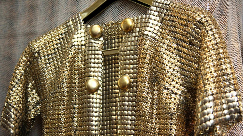
He uses unconventional materials in his designs such as metal, plastic, and paper.

In 1995 –while studying fashion and graphic design–, Paco Rabanne released XS. I remember discovering the perfume’s packaging. Something about these letters caught my attention and I could not stop thinking about them for months.
I have only looked at these letterforms again for the first time in many years, while putting this presentation together a couple of weeks ago, and I thought that is really scary to see the resemblance between this design and my Green Fairy font.
By the end of that academic course, I decided to only specialise in graphic design as I would have the opportunity to learn more about letterforms.
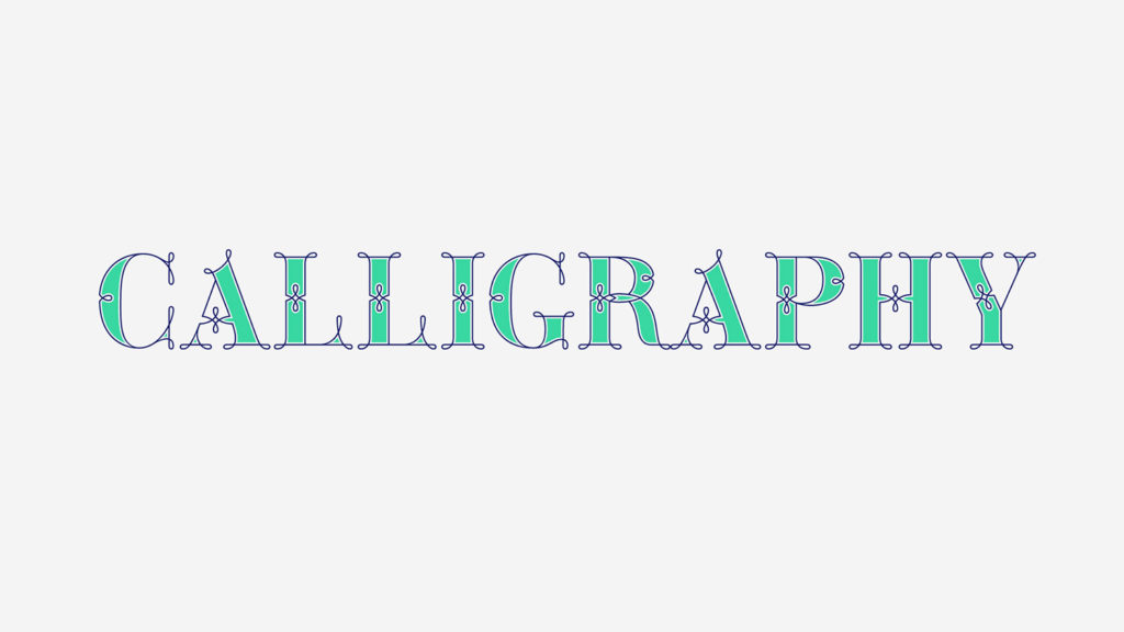
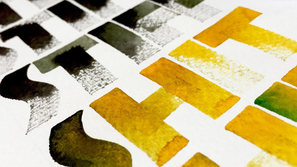
I learnt calligraphy for the first time in 1996. Calligraphy was a 9-month compulsory subject as part of my BA in Graphic design. I learnt about ductus, rhythm, contrast and composition through the art of writing.
At that time, calligraphy wasn’t a trend at all, more of the opposite. The Apple Macintosh was kicking hard into the market and everyone knew that the computer was the way to go, so writing calligraphy in that time didn’t make sense to many people.
I graduated in 2000 and five years later, I found myself working in Barcelona at a graphic design studio with two Germans, an Italian and a French designer. They all spoke their mother language plus English, Spanish and they all understood Catalan.
I felt very weak as I realised I was living in a comfort zone and not challenging myself enough. I was also ashamed because I could not speak English.
It took me twenty-nine years to find the courage to pack my bag and book a one-way ticket overseas. I was so scared of feeling homesick and running back home at the first chance, that I decided to fly to the furthest destination possible—as it would cost me an arm and a leg to book my return ticket back home.
The twenty-eight-hours flight from Barcelona to Brisbane was one of the scariest things I have ever done in my life.
I landed in Australia in 2006 with no friends, no family and very little English. My first memories of Australia are beautiful blue skies and embarrassments.
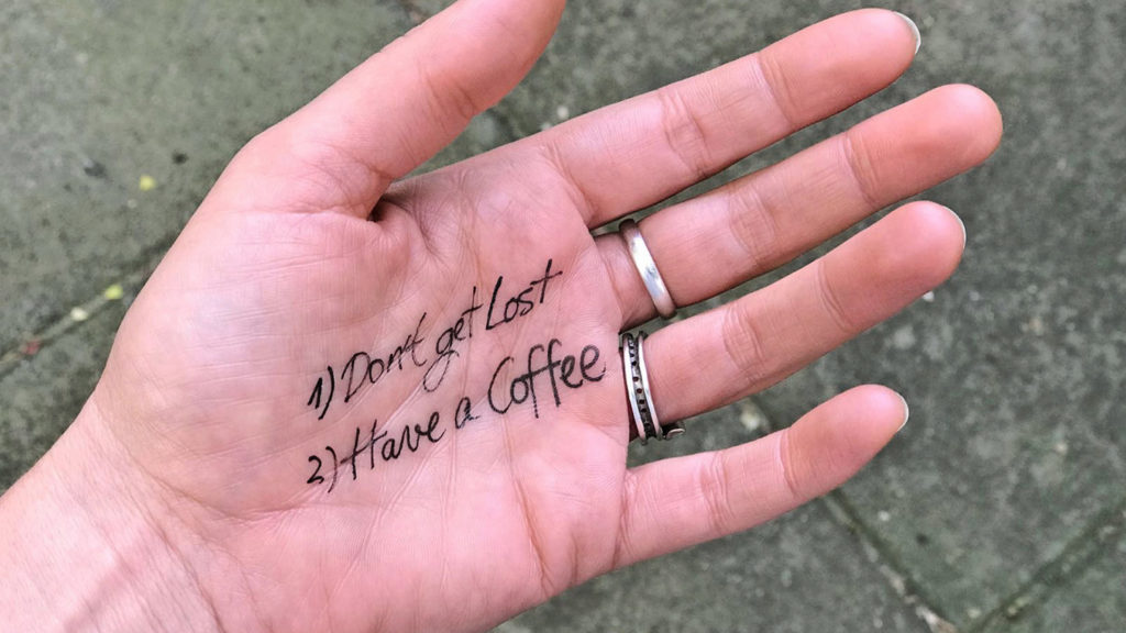
In my first day in Australia I only had to accomplish two goals:
1) Do not get lost;
2) Have a coffee.
I was successful at the first one so I felt pretty good about the second task. At the English school where I enrolled, I asked about types of coffee in Australia and what they meant. I only had to memorise “small flatwhite, thanks”.
I walked in the coffee shop. There was a long line-up of people ordering take away so the longer I stood in line, the more nervous I became. Finally, my turn arrived and I said confidently “small flatmate, thanks”.
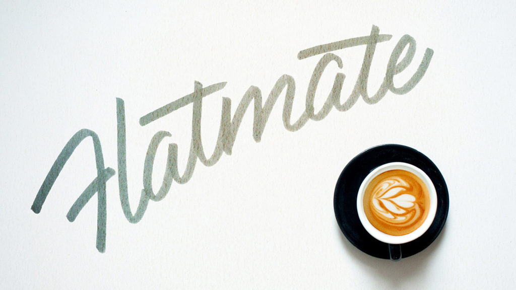
The bartender looked at me with big open eyes and shook his head. I was like “what? what’s the problem?… OK, my pronunciation is rubbish but surely he got what I said, right?! Wait… is this a coffee shop?”… I was so confused! A couple of seconds later, I realised what I said, and for the next three years I only ordered lattes although I hate latte’s foam.
Living so far from my comfort zone was hard. Being away from friends and family, and learning a new language at the age of twenty-nine was a huge challenge, but loads of good things came along the way.
Three months after landing in Brisbane and speaking a very basic English, I found a company to sponsor me as their lead graphic designer.
For the ones here today dealing with Australian visas, believe, I know how it is: I know the pain, the money and the stress you are going through. In 2006, Spanish citizens did not have a working-holiday visa agreement with Australia, so being a student or being sponsored by a company was my only chance to live and work in the country.
My three years sponsored in Brisbane were not easy. I felt alone most of the times and I was not proud of my work at all. I did not know how to reach the gap between where I was and where I wanted to be.
After spending eleven years working as a full-time graphic designer, I decided to go back to the foundations.
I consider typography the main tool for a graphic designer and I felt that I needed to up-skill my knowledge, so in 2011 I went back to Barcelona for six months to study a Postgraduate Course in Advanced Typography.
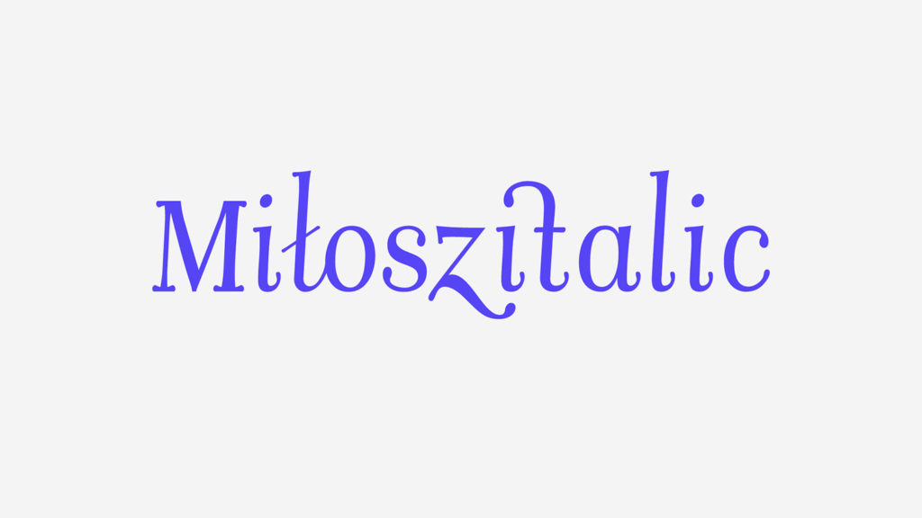
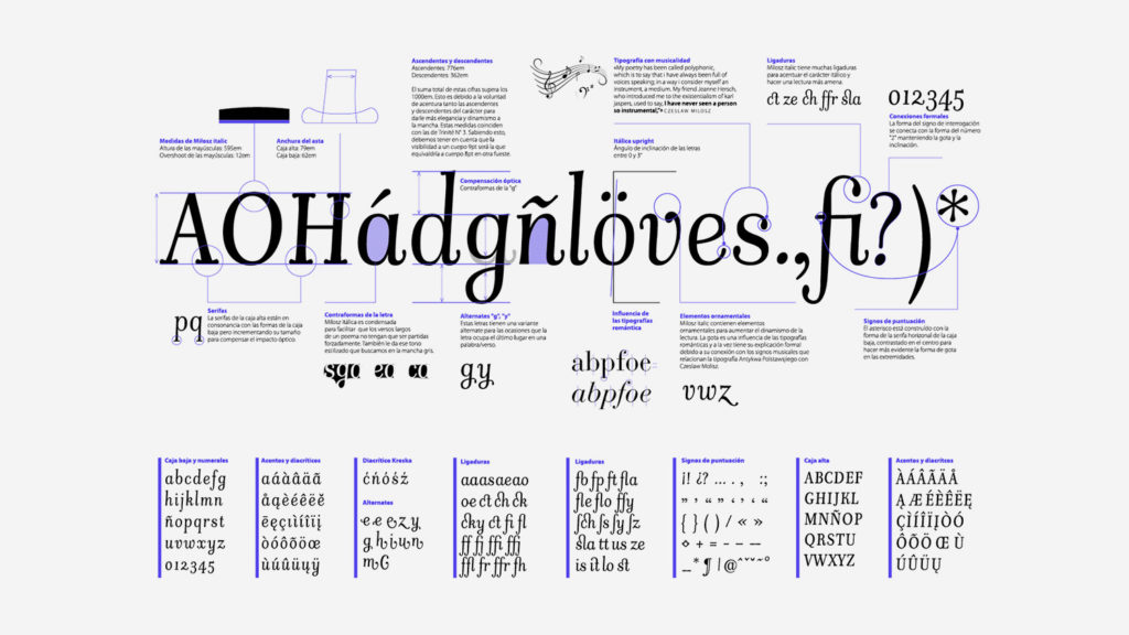
During the course, I developed my first unfinished typeface design called Miłosz Italic.
After my post graduate course in Barcelona finished, I moved to Melbourne for the first time. I was planning on specialising in typography, but something very different was awaiting for me around the corner.
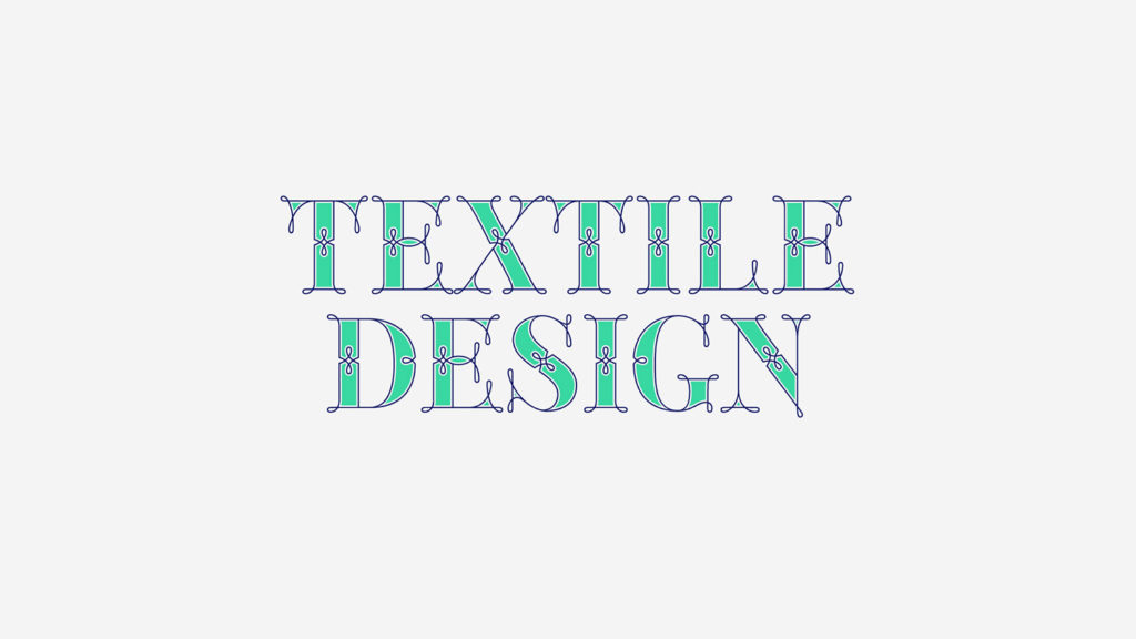
A fashion designer friend of mine from Barcelona, offered me to collaborate on a project about textile prints.
I knew nothing about textile design, and I hadn’t drawn organic shapes in ages. To be honest, I was really scared of starting something new, but I didn’t have work and Laura Piera encouraged me a lot and I said yes.
Our work during that first month gave us very positive results so Laura invited me to be part of a collaborative partnership altogether with a company in Asia who produced, delivered our textiles and paid for our work.
I was new in Melbourne and I set up my desk in my bedroom. Working from home in solitude throughout most of the day, while learning independently how to become a professional textile designer were some of the biggest challenges of my career.
Six months into my textile design journey, I could not stop thinking about typography, so I decided to enrol for a six-week Typeface Design Condensed Program at Copper Union in New York City.
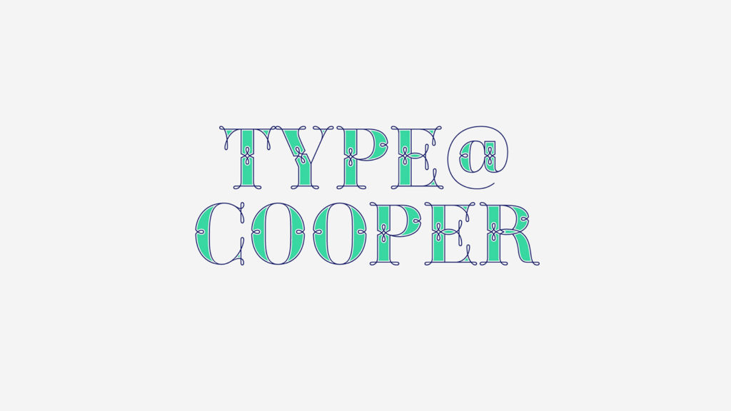
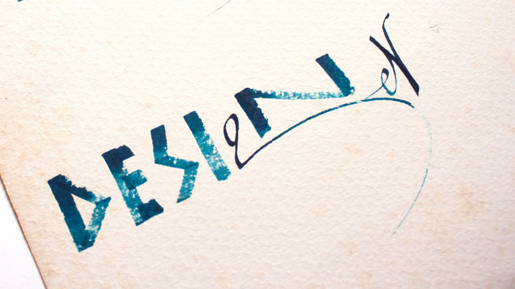
Type@Coopper was a great learning curve professionally and personally. Being admitted at Cooper Union gave me the motivation to go back to my broad nib and pointed pens and start writing calligraphy as a daily exercise.
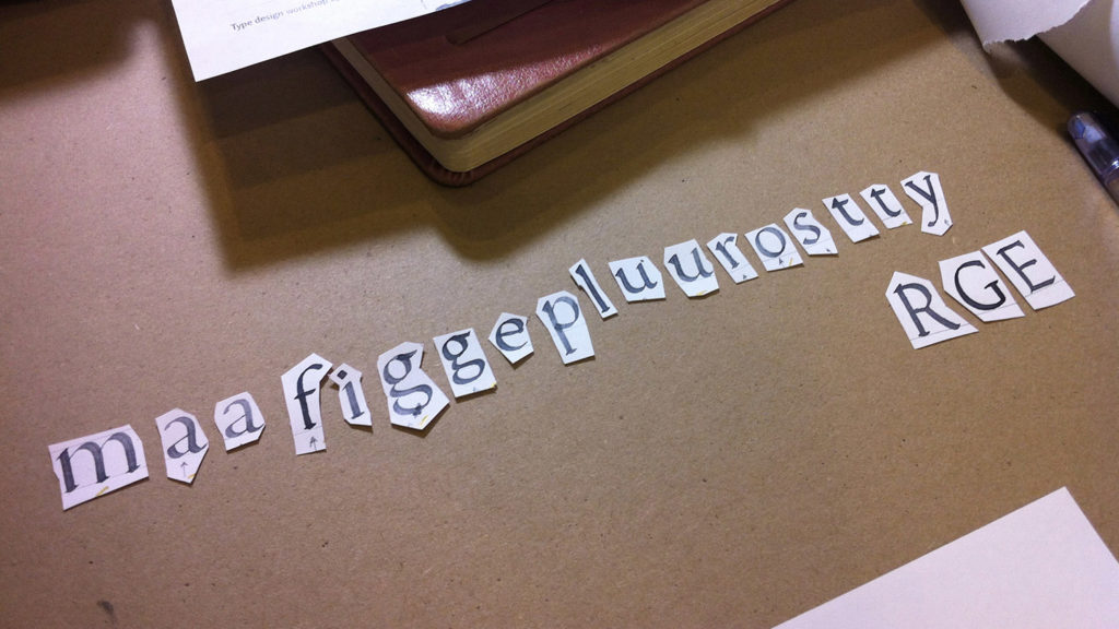
This gave me a huge advantage as during the course we designed a humanistic typeface based on our own calligraphy.
We wrote calligraphy for a couple of days and then, we selected our best letters, cut them, scanned them and redrew them by hand at 7cm x-height.
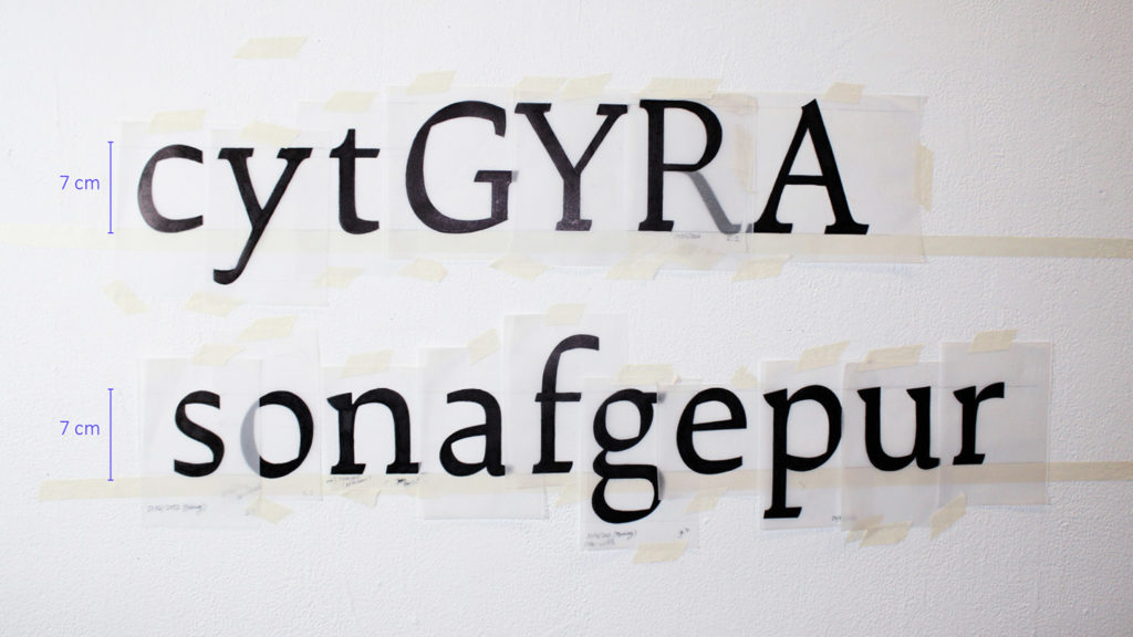
We spent a couple of weeks drawing type by hand. Once the letterforms were defined, we jumped on the computer and started to vectorise them using Fontlab or Robofont.
The hand drawings were extremely refined so I felt that the vectorisation process was very straight forward.
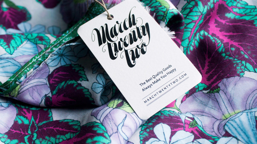
During the course, I had the opportunity of developing my second unfinished typeface design called March 22. Unfinished, doesn’t mean unused!
I use my design in every opportunity I have. Of course, no one knows; and of course, no one asks “oh man!… which font did you use?” but in my head I am like “hell yeah, this is my font!” and my heart is happy.
When we talk about lettering, we are talking about the art of drawing letters, and this can be done by hand or by computer.
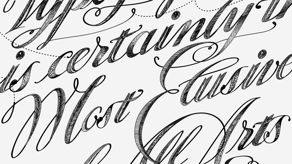
The piece below was my first lettering piece designed in 2013 and inspired by the work of Gemma O’Brien. I applied the same process I learnt at Type@Cooper with Jean François Porchez.
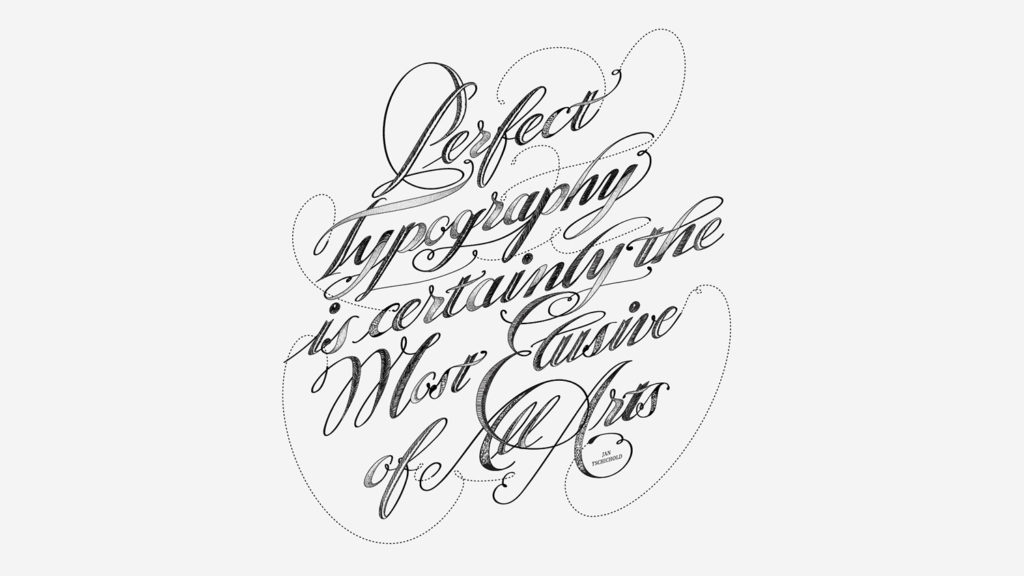
I first wrote the quote using a ruling pen. As you can see, the calligraphic sketch does not have to be amazing at all –this one even has a spelling mistake as I was mixing Catalan and English in the word “tipography”.
You don’t need to be a calligrapher to be able to draw letters but understanding the structure, where the thin and thicks are and why, it is going to help you a lot in your design process.
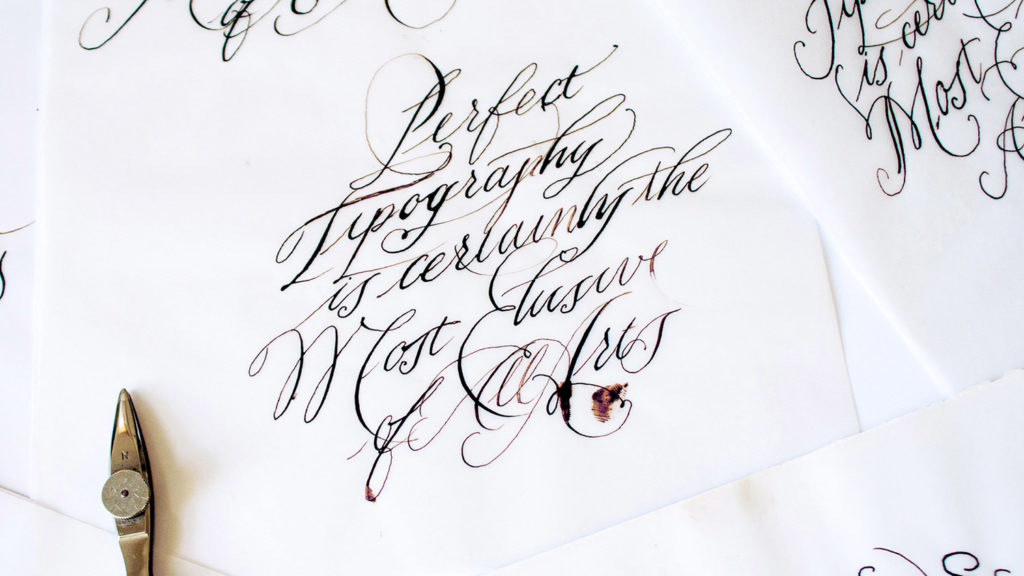
Once I was happy with the sketch, I used tracing paper to draw on top of my calligraphy adding weight and contrast.
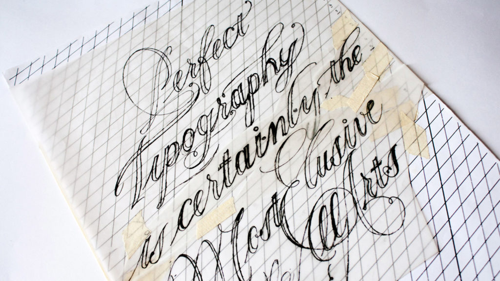
Once the hand sketch was detailed and balanced enough, I scanned the original and redrew everything in vector format using Illustrator.
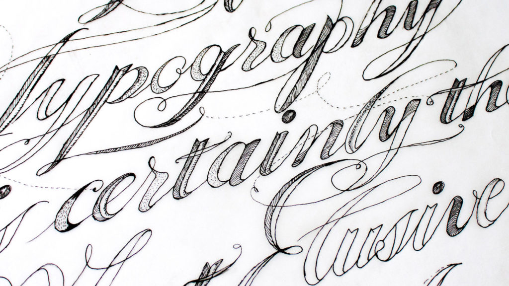
With this piece, I wanted to explore the visual possibilities of creating a vector lettering piece with a very strong hand-drawn feeling.
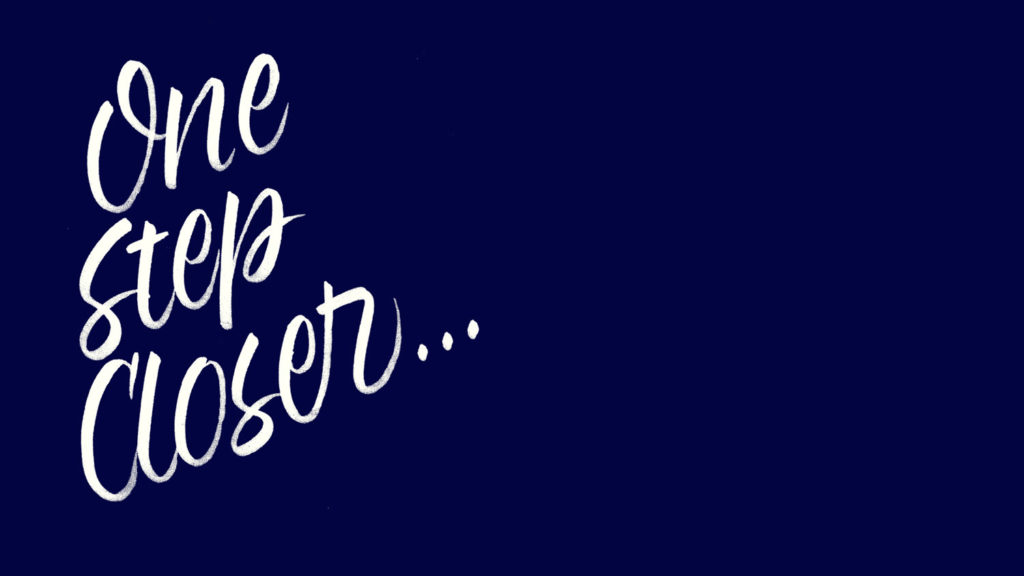
I remembered looking at this piece and feeling really proud of my work for the first time. I told myself “I am now one step closer”.
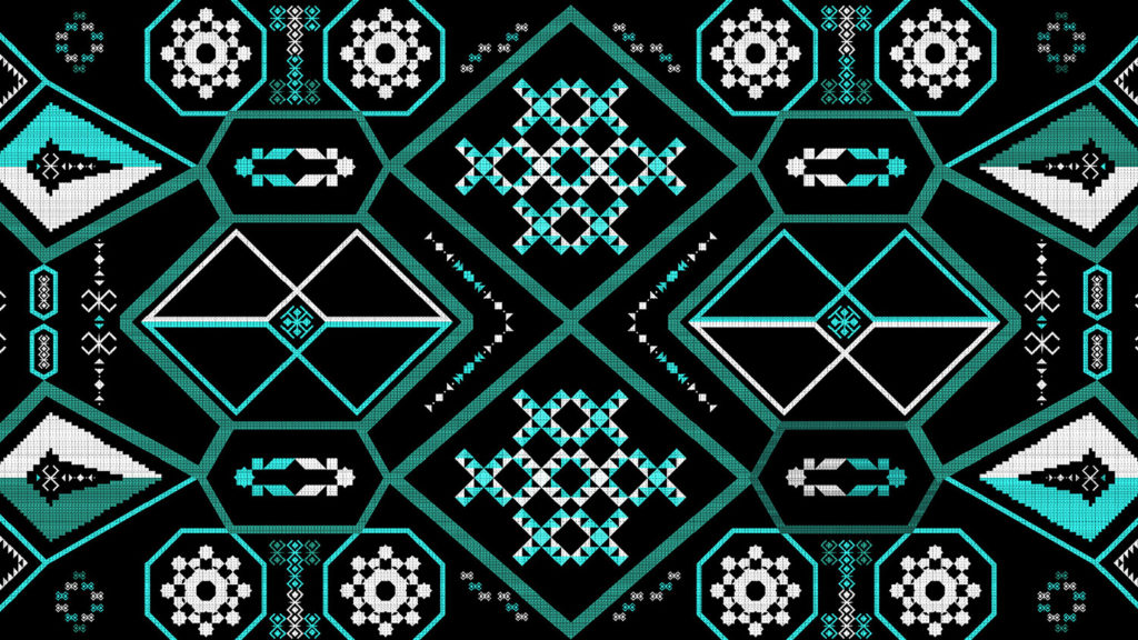
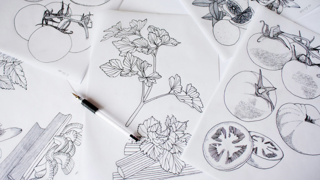
Two years into my textile design journey, I was illustrating all day, every day.
I was implementing the same process as I had used for my lettering work:
1) Starting with hand drawings using tracing paper;
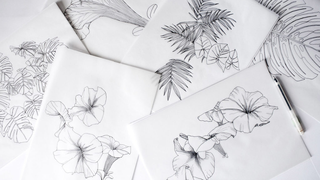
2) Then scanning these drawings and applying colour in Photoshop;
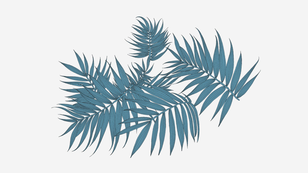
3) And using Illustrator for the final layout.
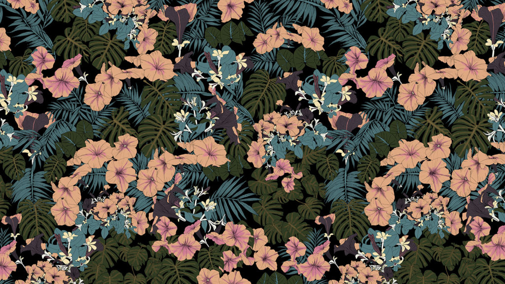
At that time we were doing very well. We were so busy that I had to stop all my other graphic design work to only focus on textiles.
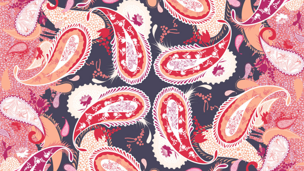
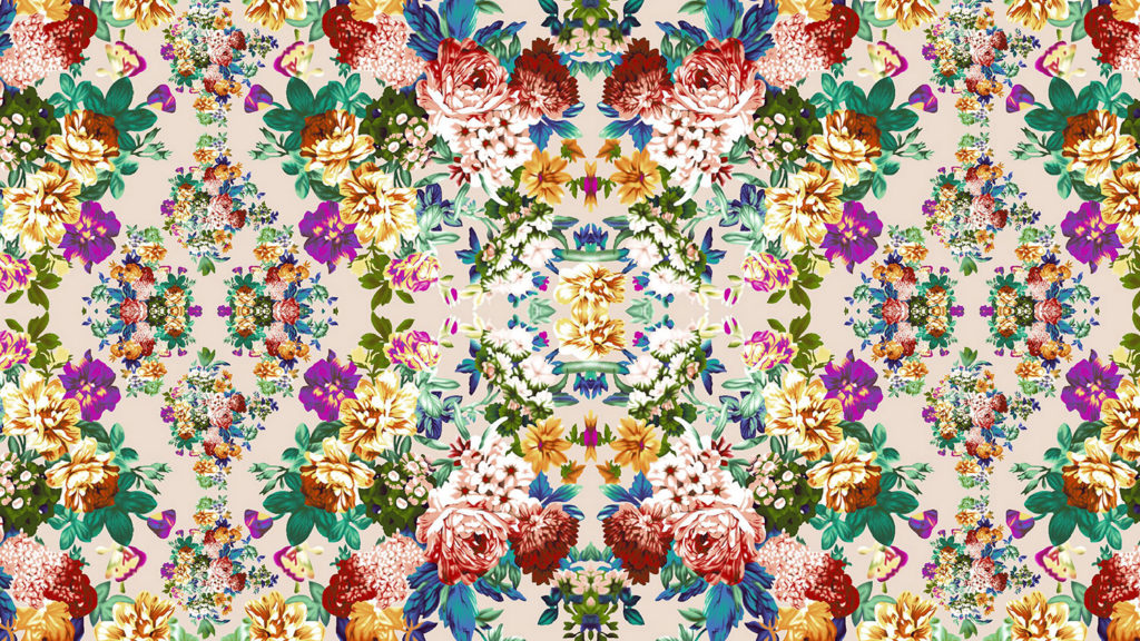
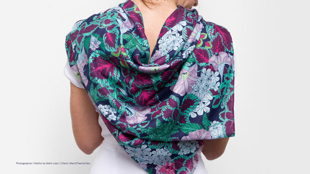
We were designing for big international fashion houses and our scarves were sold around the world.
In January 2014, I received an email from the Mongolian company we were collaborating with, telling me that they no longer needed my services and wishing Happy Chinese New Year.
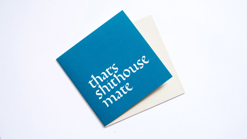
That was shithouse! All of a sudden, I lost of all my clients and had no work and no money coming in at all.
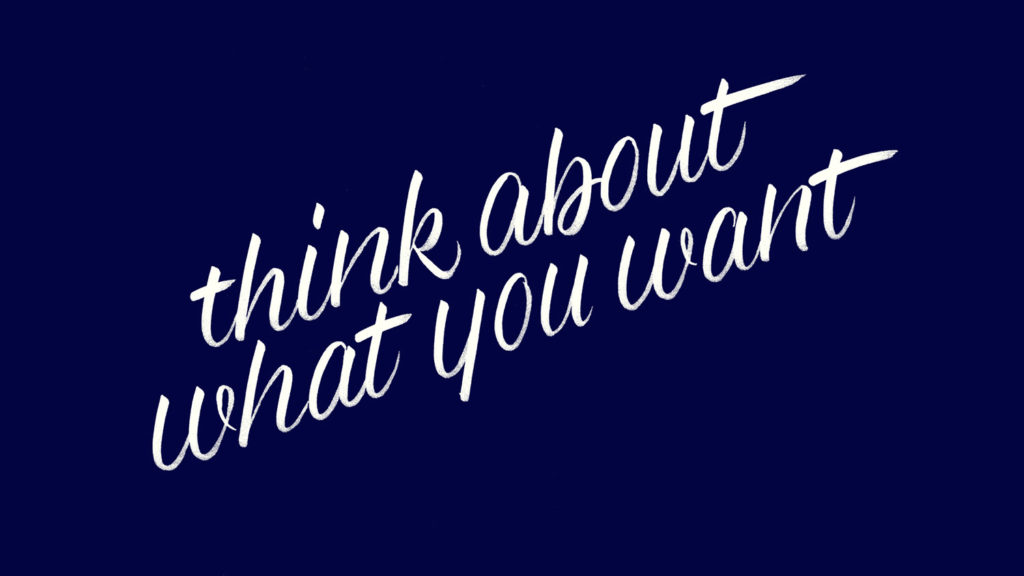
I panicked. My first reaction was pumping up my folio and looking for a full-time job, but my partner told me “please Maria, take time to think about what you want”.
So I took six months off to reflect and create self-generated work for the first time in my life.
At the beginning was hard getting into the mindset of working long hours and not getting paid a cent for it, but once I got used to the idea I started to enjoy the fact that no one was telling me what to do or how to do it.
My partner was paying our house expenses and I was living out of my savings only spending $600 a month which included food and my very affordable desk space in Melbourne.
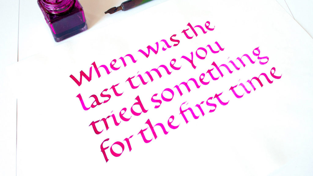
I followed the same schedule as I had before I’d been fired, and I kept writing calligraphy as a daily exercise.
Moving from my bedroom to a creative space was instrumental for me. Magic Johnston was a huge co-working space with over forty freelance designers. I didn’t know many people in Melbourne at that time, so sharing a desk in a creative space gave me the opportunity of networking, getting massively inspired, and meeting amazing designers that have now become close friends.
Some of these designers stopped at my desk at Magic Johnston asking me what I was doing, and I was like “what do you mean? I’m writing” and some of them answered: “can you teach me?”
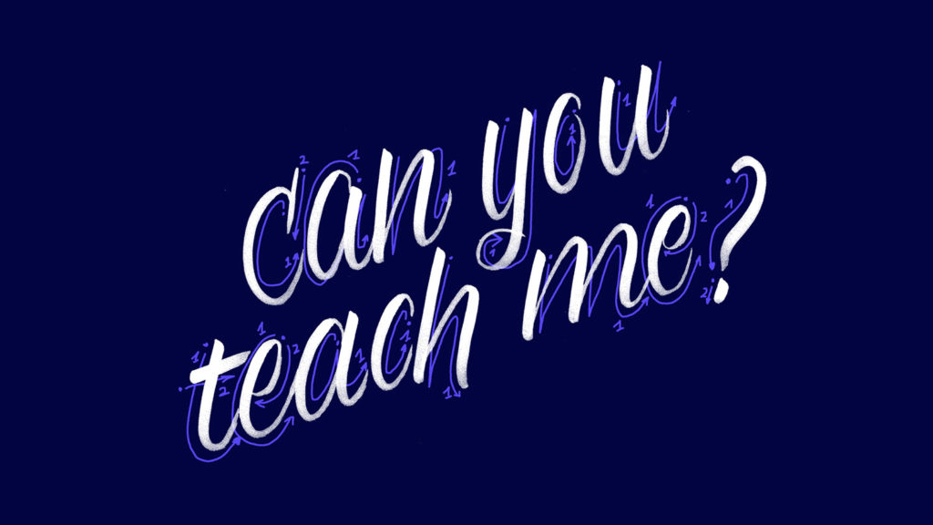
I had never taught before and all my calligraphy lingo was in Catalan. I had no idea how to start but I told myself “let’s try new things again”.
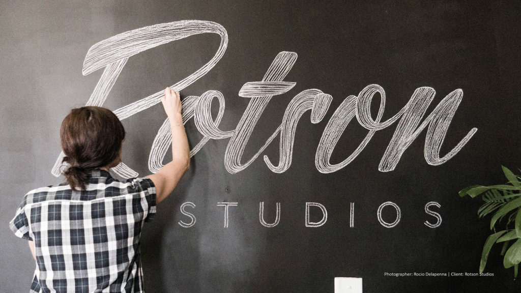
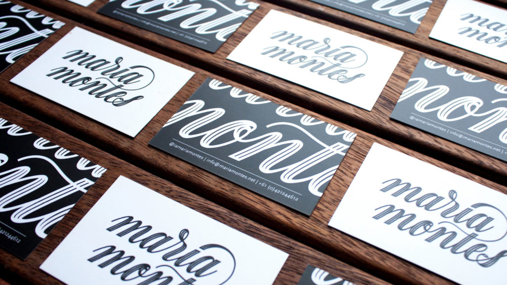
So, with the help of my good friend Lauren Vilitati, I put together my first calligraphy course at Rotson Studios in Melbourne, at the amazing rate of $20 for four hours of tuition.
My first class was the scariest thing I’d done in a long time. I thought I was going to faint –I guess like today on this stage–, but I survived and learnt heaps of new things.
Many friends of mine came to my first classes and they all encouraged me to keep going.
During that time of uncertainty, I asked for advice from as many people as I could. In that time, I met Bobby Haiqualsyah and he was an instrumental help.
I remember showing him my textile and lettering work and we talked about mixing them both. And that’s how my first illustrated cocktail artwork was born.
The piece took over one month. I drew by hand every element separately on tracing paper.
Then, I scanned every ingredient and coloured them individually in Photoshop.
Using my calligraphy as a base, I wrote the sentence “A Bloody Mary a day keeps the doctor away”.
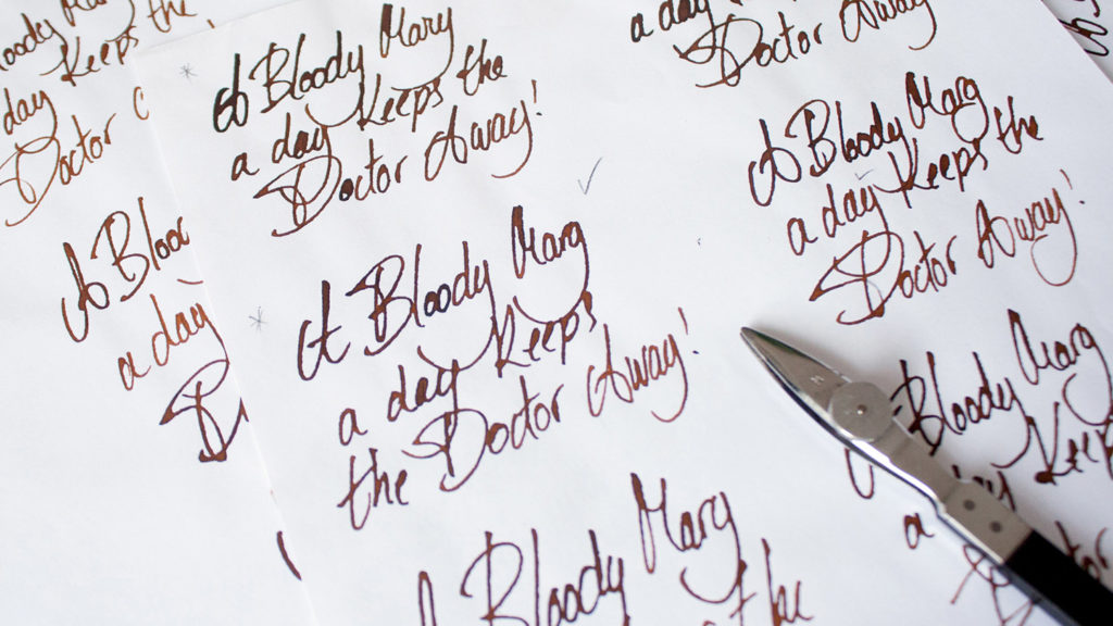
Once the calligraphic sketch was interesting enough, I used tracing paper and started to re-draw the letterforms on top.
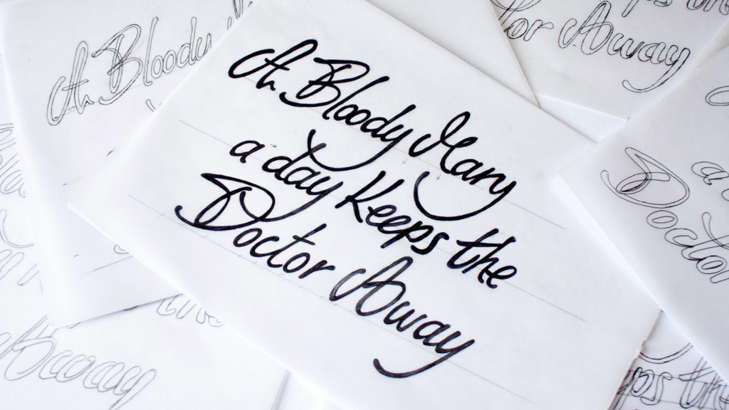
Every tracing paper worked as an analog layer where I added or removed weight, adjusted letter spacing, or changed letter shapes.
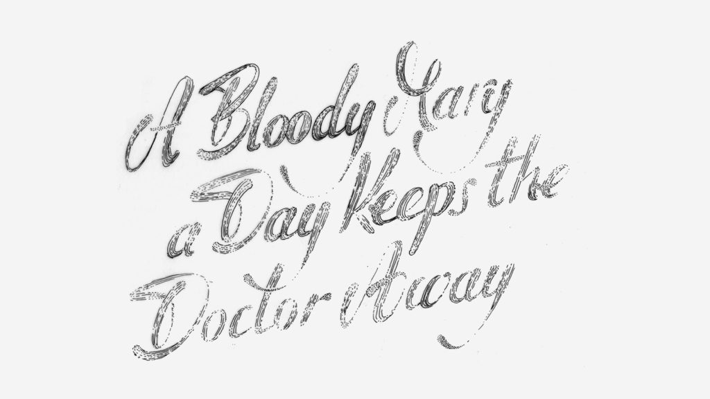
Once the hand-lettering was close enough, I scanned the original and I redrew the shapes again in Illustrator.
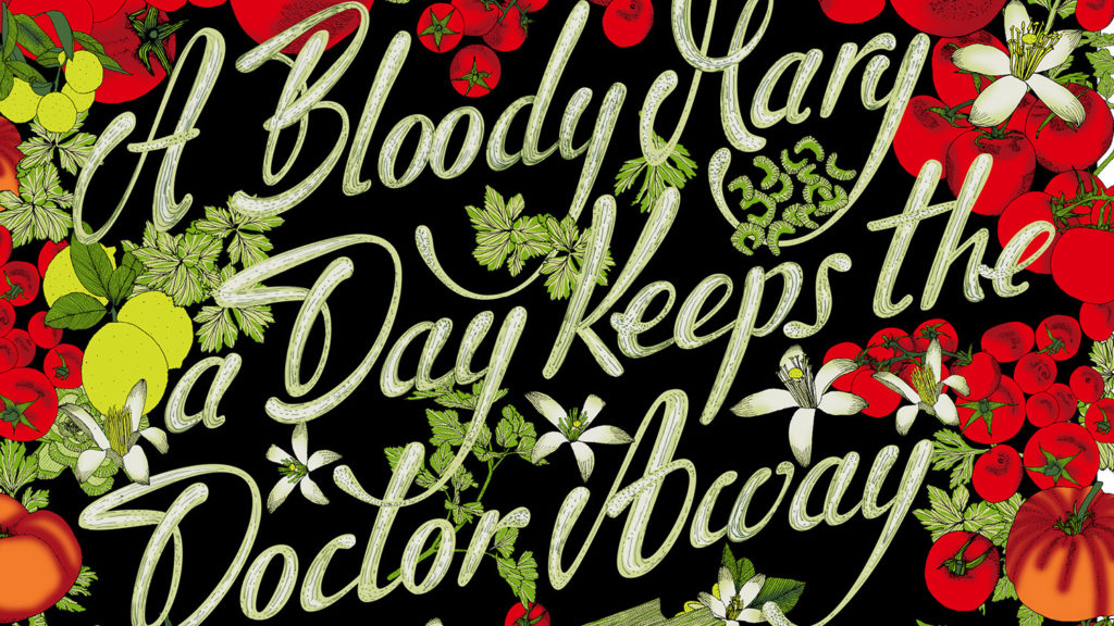
The process was long and painful but once I finished the piece I felt really proud of it.
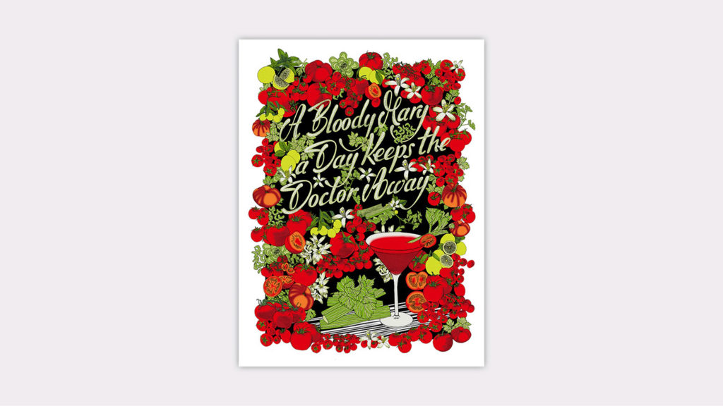
A copy of my Bloody Mary artwork was sold at a group exhibition in Melbourne called Supergraph. A few months later, three more reproductions of my artwork travelled to Pick Me Up London art fair, where I sold them all. At that time, I was visiting Barcelona and a couple of friends of mine asked me to create a G&T piece, as Gin and Tonics have been the drink par excellence in Barcelona in recent years.
So I did, and more good shit happened!
This time the ingredients of the cocktail were drawn directly on the computer but the lettering followed the same approach:
1) I started with my own calligraphy;
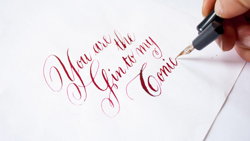
2) Followed by hand lettering;
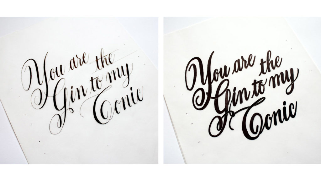
3) And I finalised the piece in vector format.
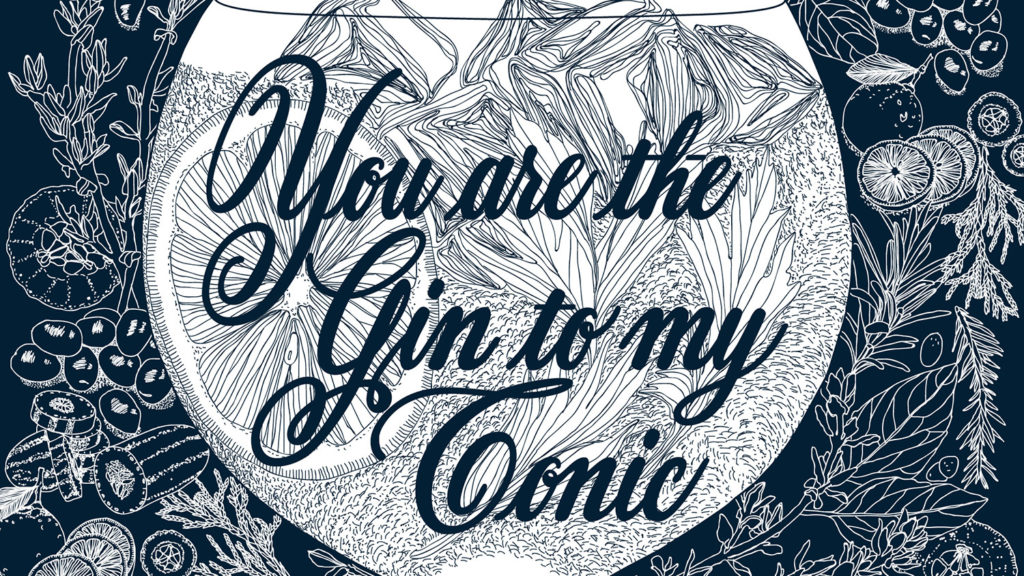
Once I finished the artwork, I sold a few copies straight away and I had that intuition again: “I am now two steps closer”.
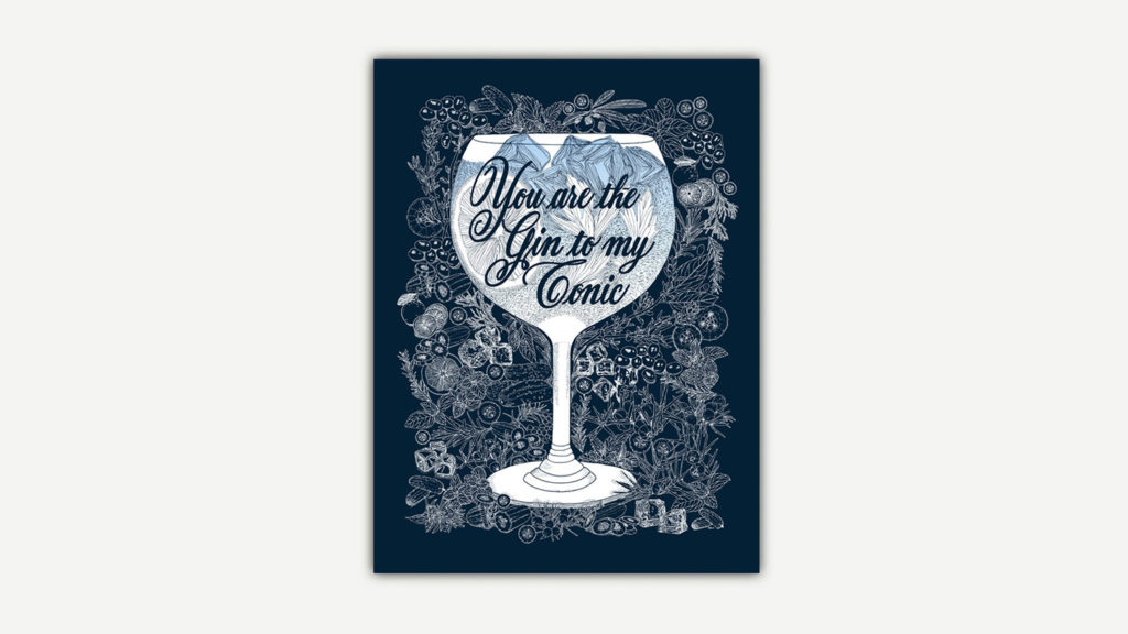
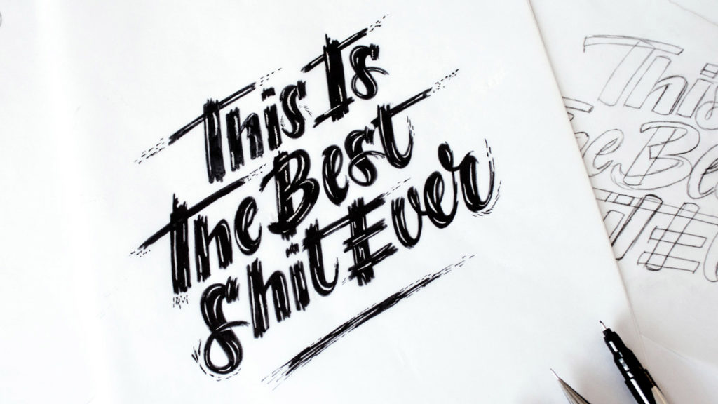
And then something great happened: I received an emailed from a cocktail venue in Melbourne called Nieuw Amsterdam, offering me their space for a solo exhibition. So I was in my head “This. Is. The. Best. Shit. Ever!”
I spent the next six months working on a series of illustrated cocktail artworks and patterns prints for my first solo exhibition in Melbourne.
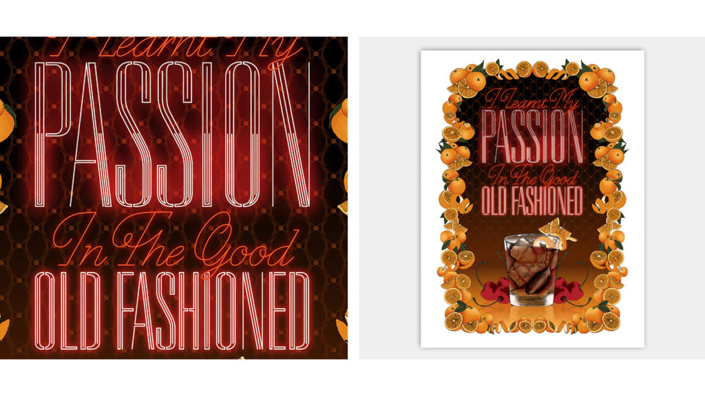
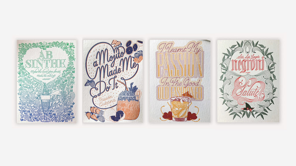
The piece below is my cocktail artwork number three called All Passion, featuring an Old Fashioned drink. The lettering is inspired by a Queen’s song called “good old fashioned lover boy”.
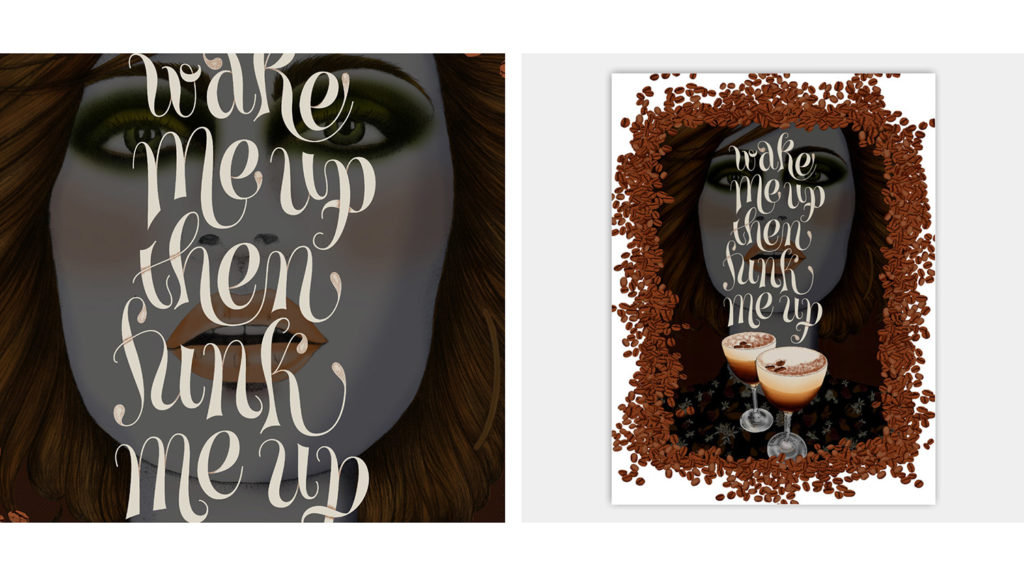
My next cocktail is called The Stimulant and features an Espresso Martini drink. The inspiration for this cocktail is the story behind its British origins.
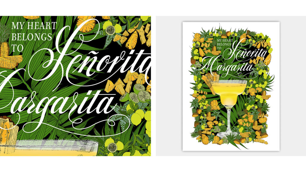
This artwork is called Señorita Margarita. The Pineapple Margarita twist is inspired by Nieuw Amsterdam cocktail menu. If you were wondering –probably not, though–, the message “my heart belongs to” is set in Miłosz Italic, my first unfinished typeface design.
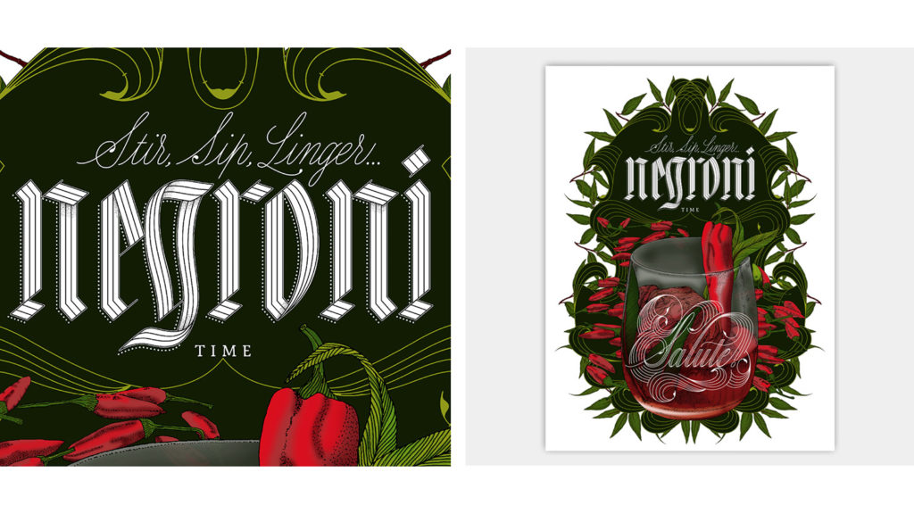
The next one is called Ciao Negroni! featuring a chilli-chocolate twist of the original drink and it incorporates the colours of the Italian flag. The word “time” is set in March 22, my second unfinished typeface design, so now you know!
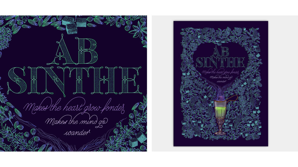
My next cocktail artwork is a French Absinthe and I will talk more about this piece in a few minutes.
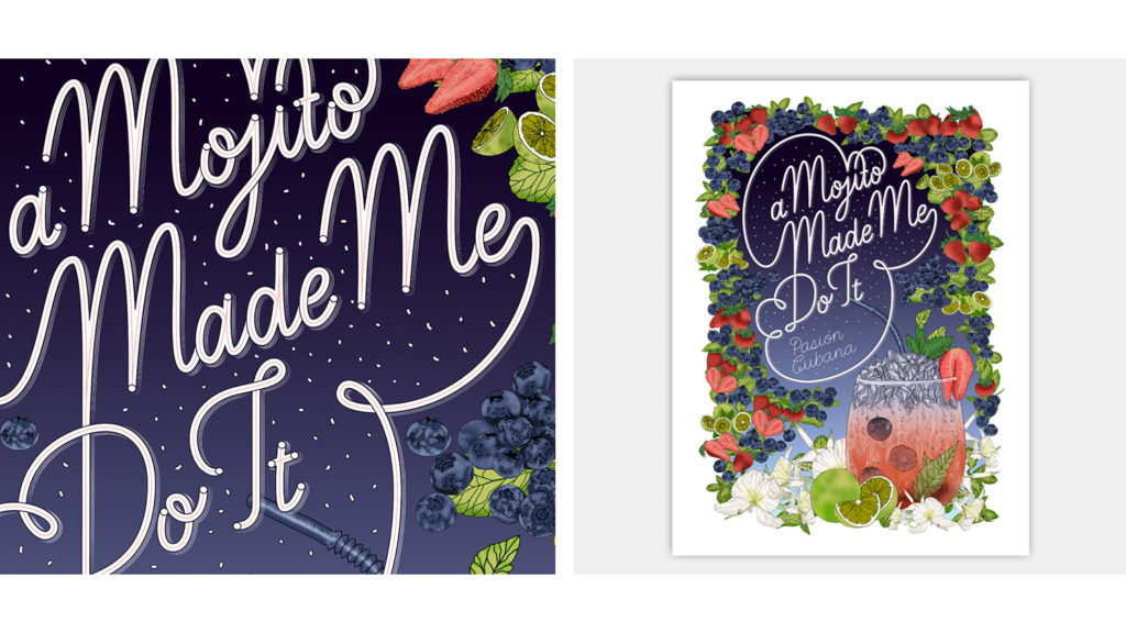
And the last one is called A Mojito Made Me Do It, featuring the classic Cuban drink.
Four of my cocktail artworks were also letterpress printed by the amazing Amy Constable from Saint Gertrude Fine Printing. I really love these prints.
My exhibition’s opening night was a great celebration of facing fear and overcoming obstacles but right after that day things started to change in my head.
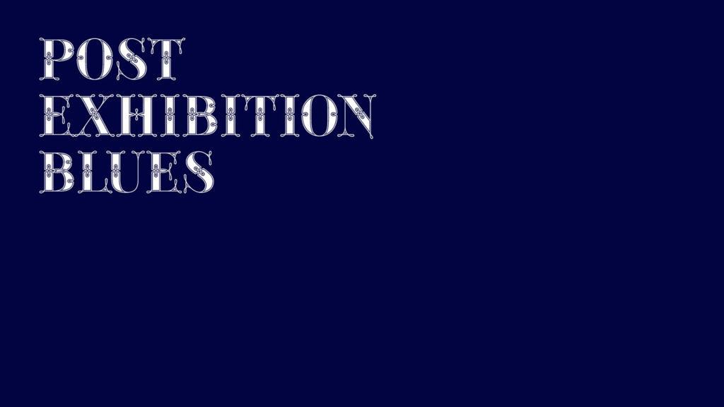
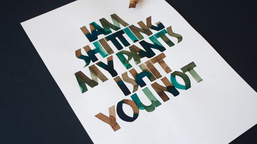
“I am shitting my pants, I shit you not” is all about my feelings after my solo exhibition.
Having a six-month project ahead with a specific deadline helped me to be motivated and extremely focused. After the exhibition I felt really lost, looking around and asking myself way too many questions: “what’s next? When am I going to get paid again? Where am I going now?” I was really scared.
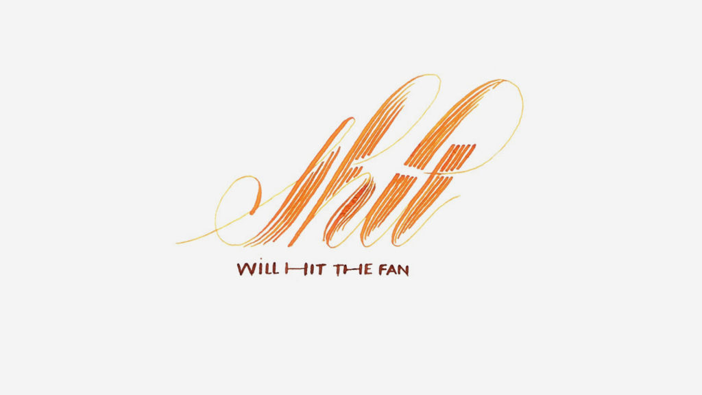
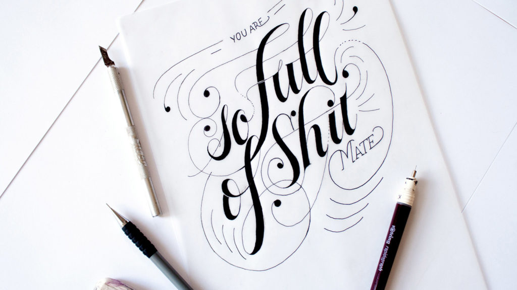
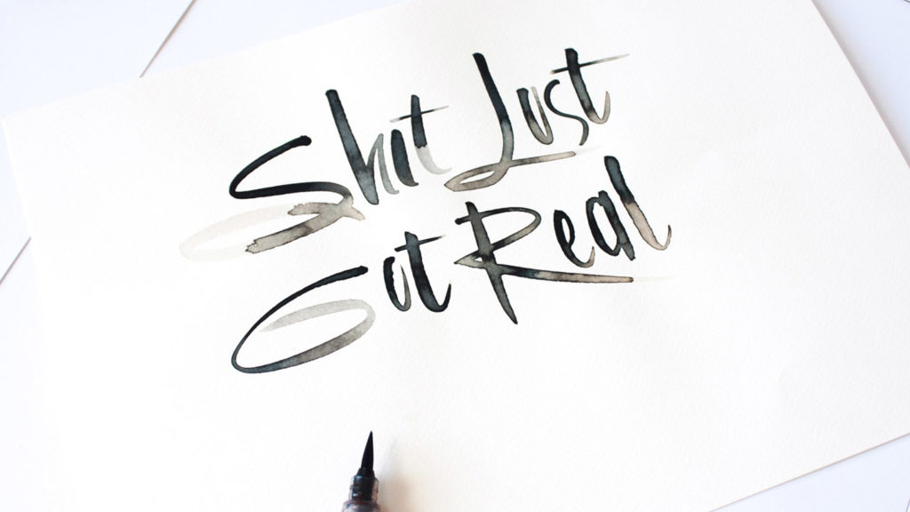
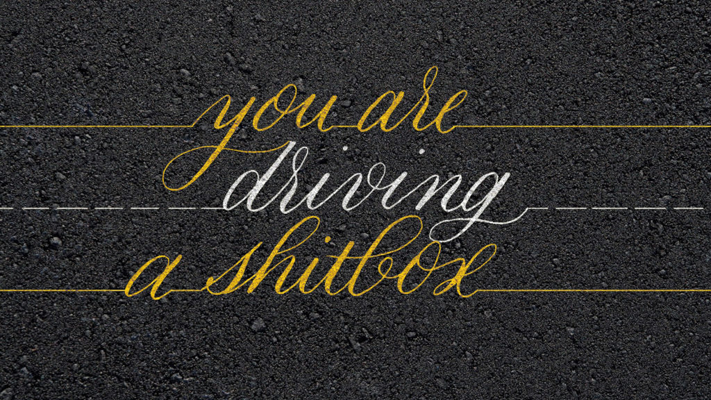
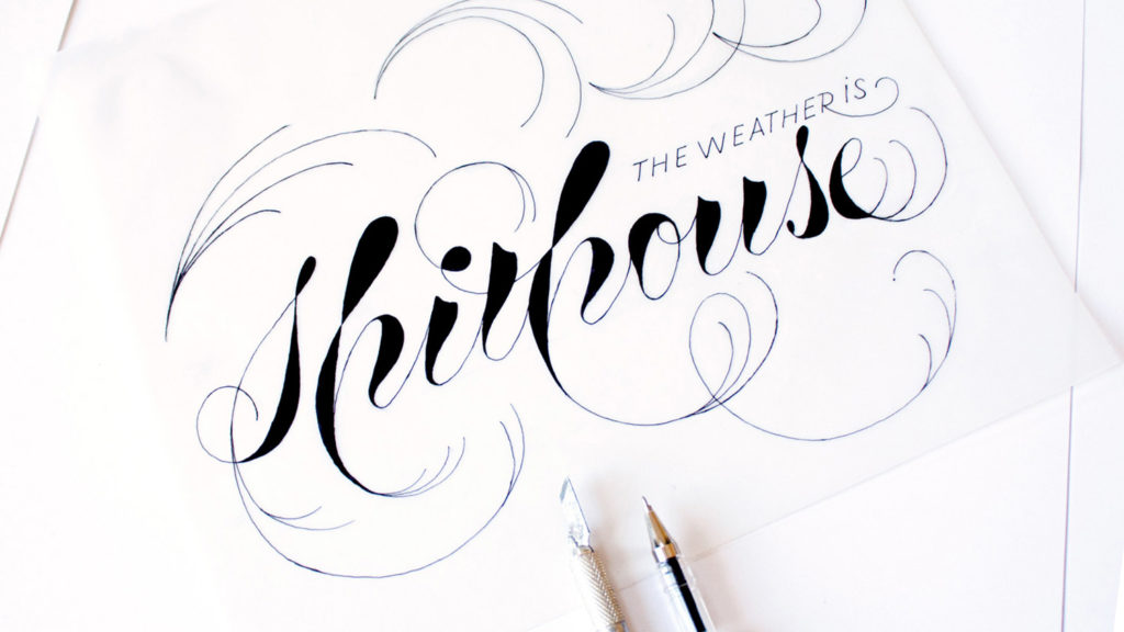
I started 2016 feeling really tired. I wasn’t motivated at all and I started to let myself go into a mental black hole. Nothing positive was coming to my mind and one day I sketched this: “shit will hit the fan”, as if it was a premonition for the amount of shit that was just about to come.
A few days later I sketched a second one, and then a third one… And suddenly, I was receiving messages from friends saying, “I love your shit series!” and I was like:
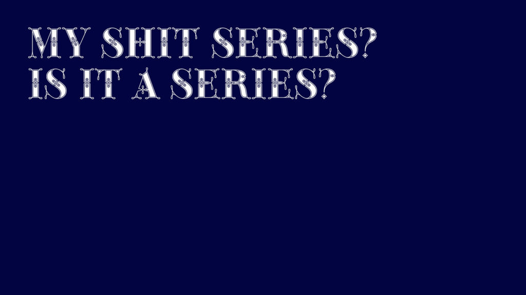
“My shit series? Is it a series?… Yeah, it could be a series… Of course, it is going to be a series!”
So, I kept going. No particular style, no deadlines, just kept going!
As the project was grabbing attention, I was gaining momentum and slowly getting out of my mental black hole.
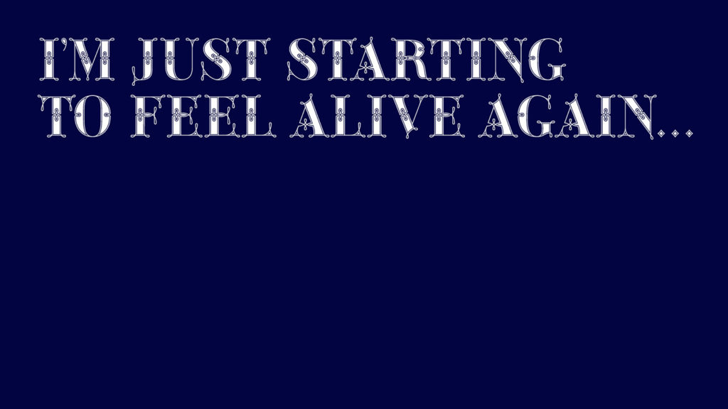
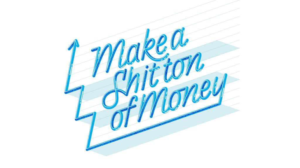
By October last year I started to feel better for the first time. People kept asking me “what’s next? Are you going to do a fuck series?” and I was only thinking, “I’m just starting to feel alive again”.
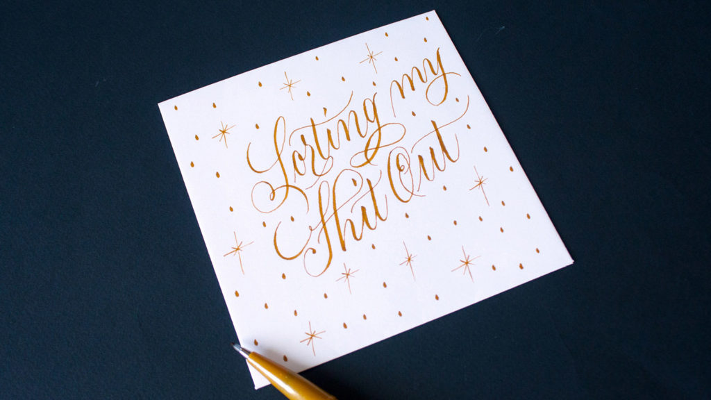
The Shit Series has been growing organically, creating a post whenever I feel like it and using calligraphy, hand lettering, vector lettering or typography randomly.
Up to date, I have created ninety-two posts and I have decided to finish at one hundred.
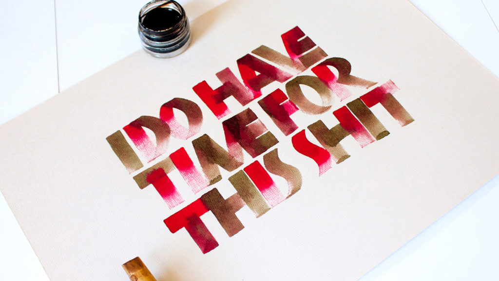
This project has made me realised the importance of being creatively fit: A commercial client can ask you to deliver a job in a couple of days, sometimes less than that. Delivering a job with such a tight deadline is like running a marathon of forty-eight hours: unless you are not training daily and keeping your body in a good shape, you won’t make it.
The Shit Series has been part of my weekly routine for over twenty months now. Some of these posts have taken me days while others have taken me only minutes.
Being able to stop a commercial project and squeeze in two hours of self-generated work has freshened things up and it has made me creatively fitter, and I recommend it to everyone.
At the beginning of this year, something amazing happened: After holding a student visa, a 457 sponsorship visa, a defacto visa and a permanent residency for past 10 years… Me, myself and I became Australian, and I was on top of the moon! A week later I turned forty and I thought that my citizenship was the best present ever.
Releasing a font commercially has been on my to-do list since I first studied typeface design.
In the past, I have tried to finish my first typeface design without succeeding. I have also tried to finish my second typeface, but the task felt really daunting and I never had the guts to do it. So, I guess I feared failing and disappointing myself for the third time. But then, I thought of this man who is my all-time inspiration.
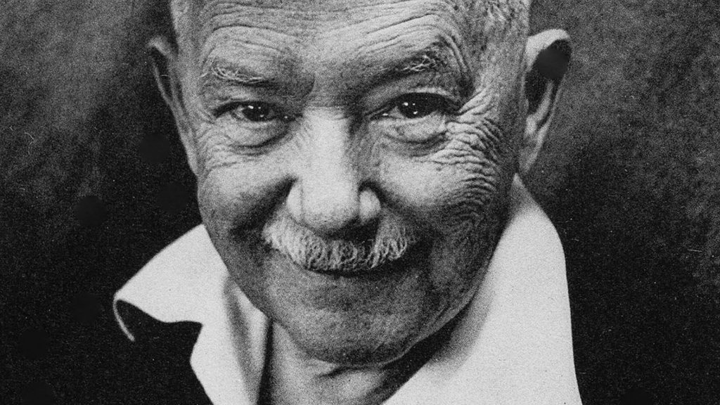
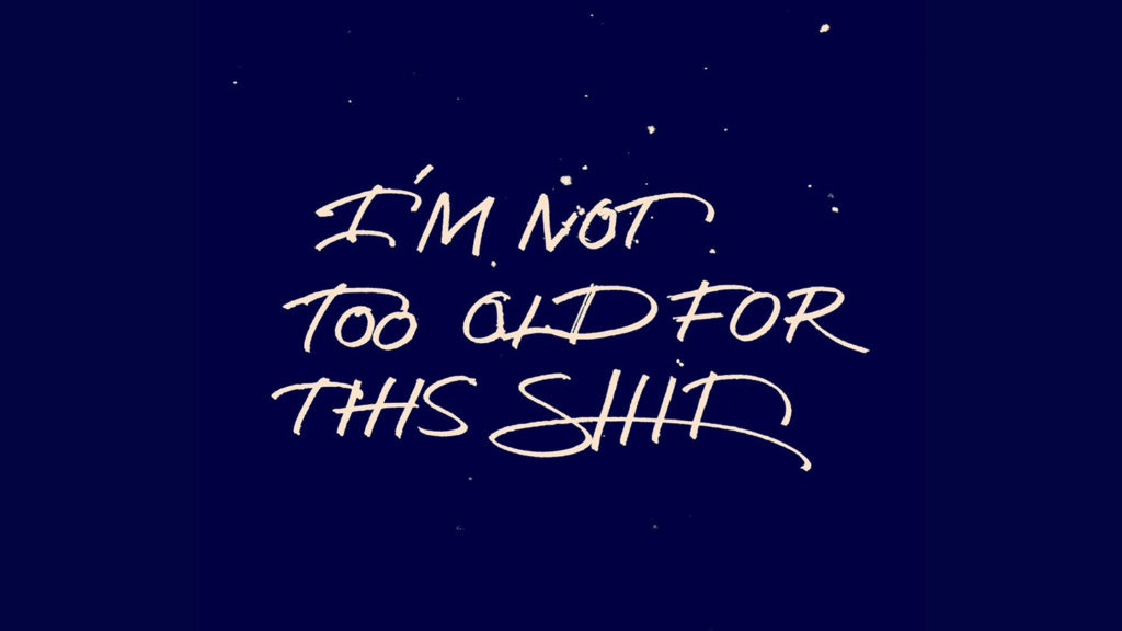
His name is W.A. Dwiggins, and he was a prolific American book designer, calligrapher and type designer who coined the term graphic designer for the first time in 1922. He also released his first commercial typeface in his forties so I told myself: “I am not too old for this shit!”
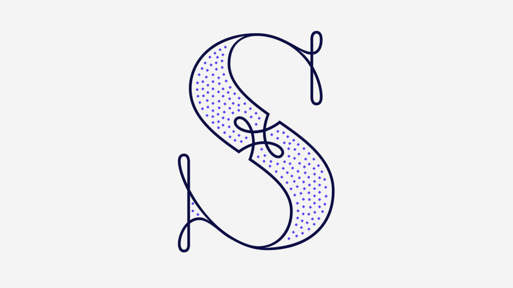
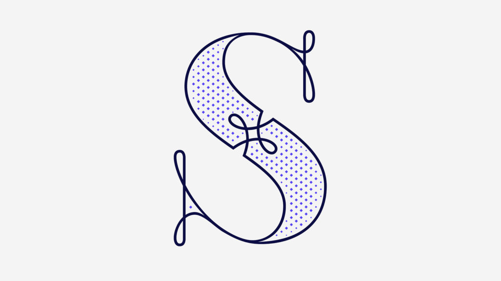
As you saw earlier on, I designed an illustrated cocktail artwork called Absinthe.
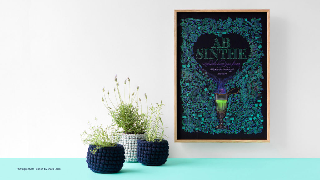
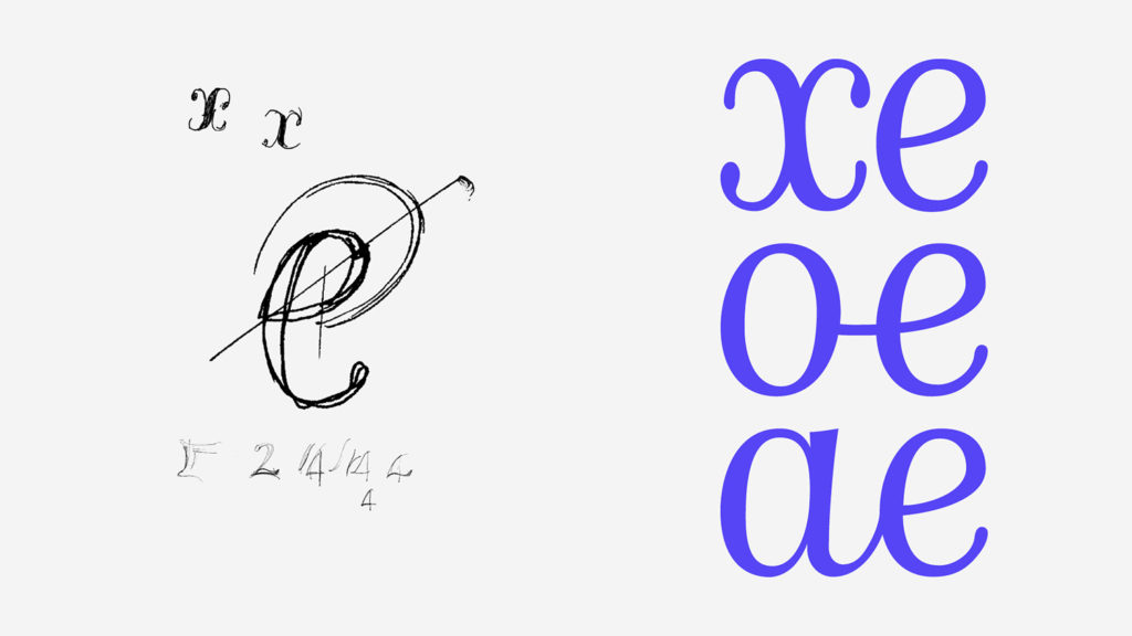
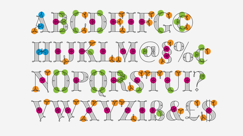
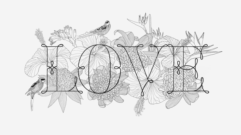
The lettering “absinthe” got stuck on my mind and a year later, I went back to it and drew the rest of the twenty-six letters of the uppercase alphabet using Illustrator.

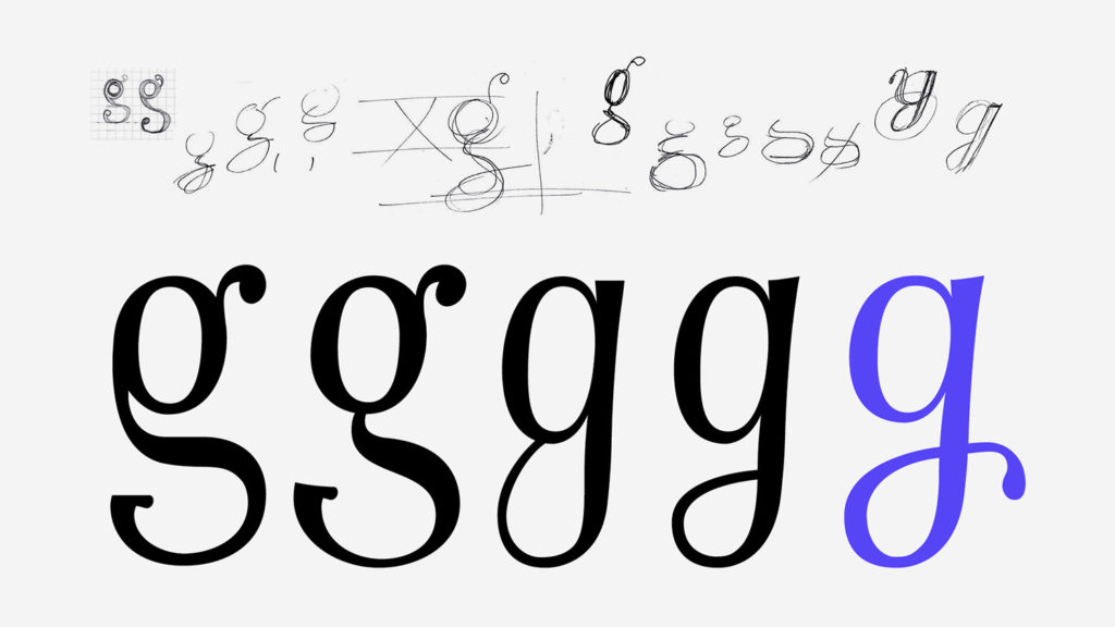
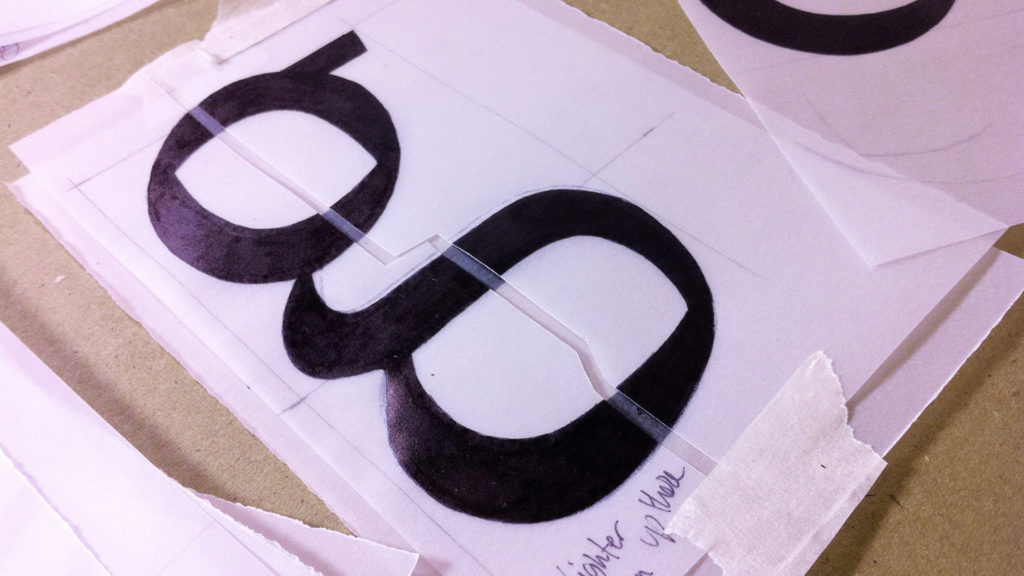
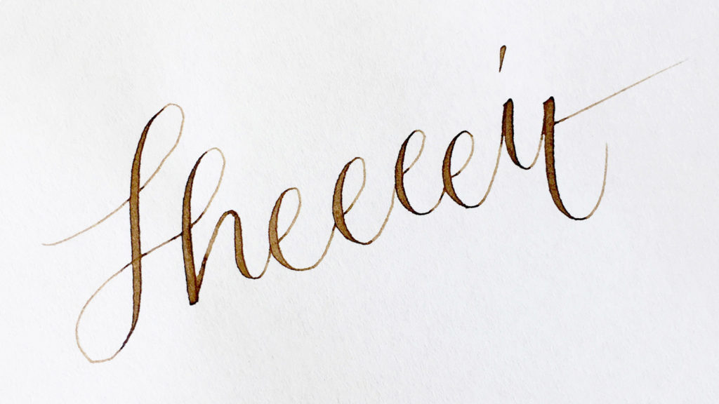
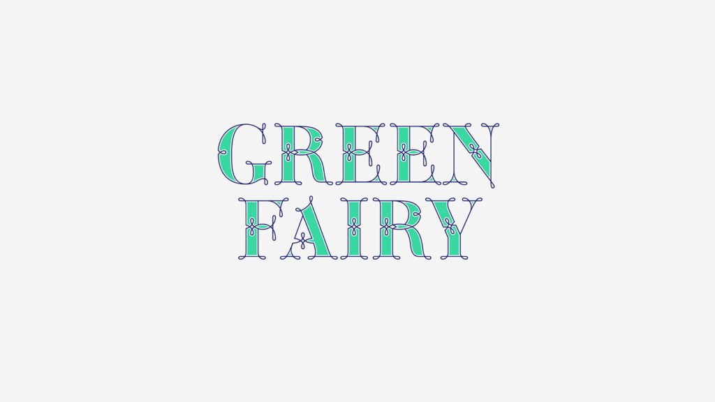
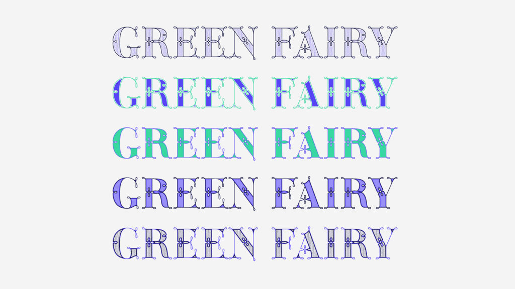
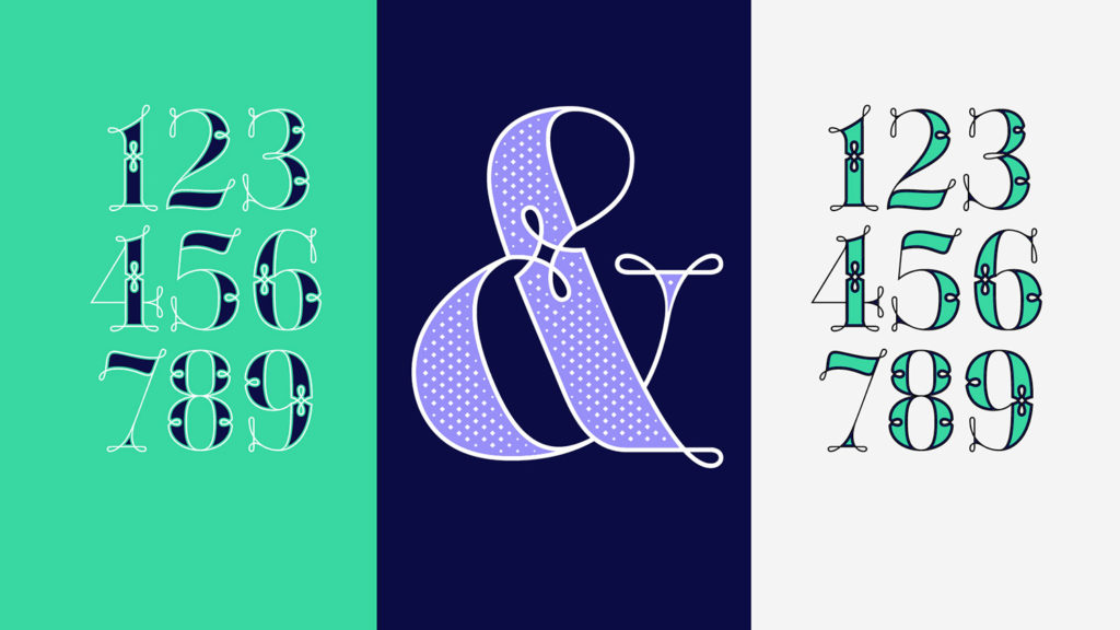
I started 2017 having my first two calligraphy courses sold out, so I took this amazing opportunity to devote myself to my baby for a few months. My baby is called Green Fairy. I purchased the font software Glyphs and I started to re-draw all twenty-six letters of the uppercase alphabet again. I told myself, “this time is going to be easy, it is only an uppercase design after all!” and then “sheeeeeeit…”
I was so wrong! Green Fairy started being one weight, but quickly turned into a layered/chromatic font.
Things were going more or less fine till I arrived to the Dots weight. I started drawing squares following a grid;
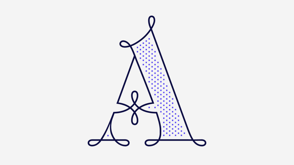
Then, the squares turned into diamonds following the same grid;
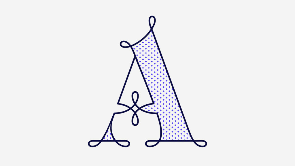
Then, the grid wasn’t working so well on the round letters so I tried randomising the position of the diamonds but it didn’t work;
So I went back to the grid, and this time scaled down the size of the diamonds creating a visual half-tone effect.
I spent over four weeks working on the Dots weight and I felt like I was in the middle of a very long tunnel and I couldn’t see the light at the end.
I encountered many other problems along the way but by June this year, I felt I was back on track again.
I kept working, tweaking, re-drawing and re-adjusting, and then the diacritics came on board…
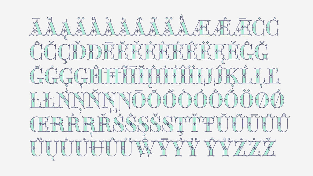
And then more re-drawing, re-tweaking, re-adjusting and then numbers…
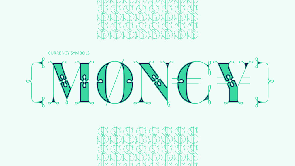
And then spacing, symbols, and currencies…
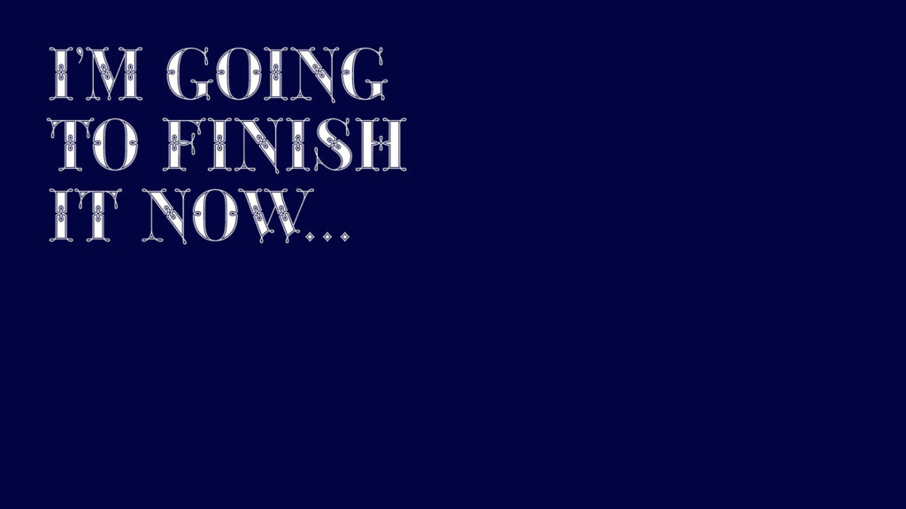
And then more spacing, kerning, contextual kerning for triplets… This month of September I told myself “that’s it, I’m going to finish it now!”
But guess what? More re-tweaking, testing, hinting, testing, rendering, testing…
I would love to tell you that my Green Fairy font is finalised and available on the market but it is not ready yet. Although I am really close… Although I have said that many times before… But seriously, I am really really close this time!!! And I can assure you that I am not going to stop till it is commercially out there, and you all will know about it.
For those of you not familiarized with typeface design, it is extremely time consuming and it requires a lot of hard work, focus and determination. This project could not have been possible without the help of these legends:
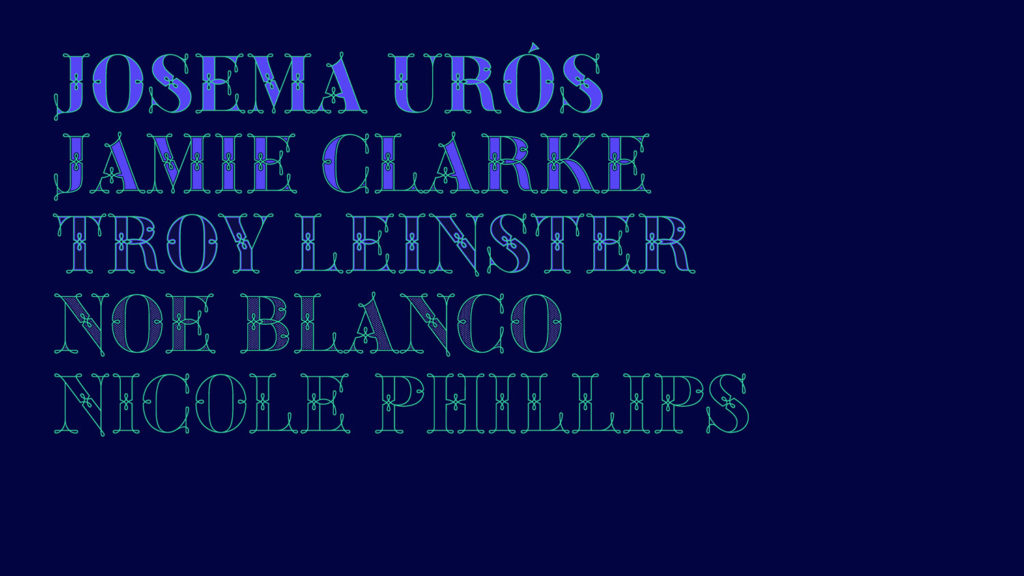
Jose Manuel Urós, typeface designer based in Barcelona and my teacher twice in the past; Jamie Clarke, freelance letterer and typeface designer who has released a couple of chromatic fonts recently; Troy Leinster, Australian full-time typeface designer living and working in New York City; Noe Blanco, full-time typeface designer and hinting specialist based in Catalonia; And Nicole Phillips, typographer currently relocating from Australia to New Zealand. To all of you “thank you very much”.
Nowadays, my professional practice sits between three main categories. The first one is commissioned work.
This is my co-working space called Rotson Studios. I have been at Rotson for over two years now. I share this space with sixteen other designers, photographers, videographers, film directors, copywriters and entrepreneurs. I feel very lucky to be in a space where everyone respects and supports my practice.
I also do illustration commissions in a bigger and smaller scale.
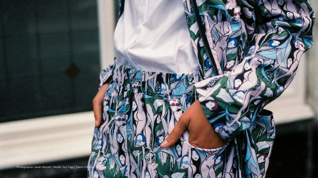
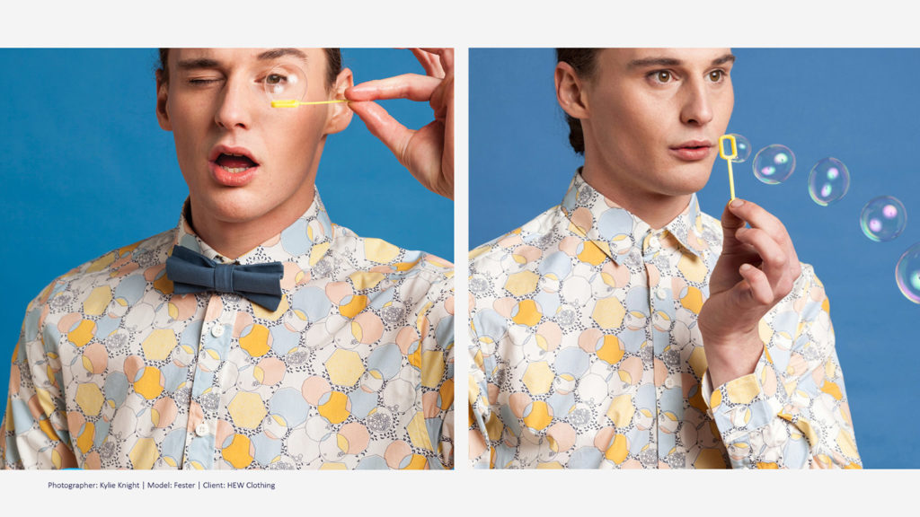
And I keep my textile design practice going. This time collaborating with independent fashion labels, with whom I share an aligned vision and have a good relationship.
My second big category is self-generated work.
My partner collects skateboards. We have over forty-five decks hanging from on the walls in our house. Every now and then, I become a better girlfriend by designing skateboards for our anniversaries, and he loves it!
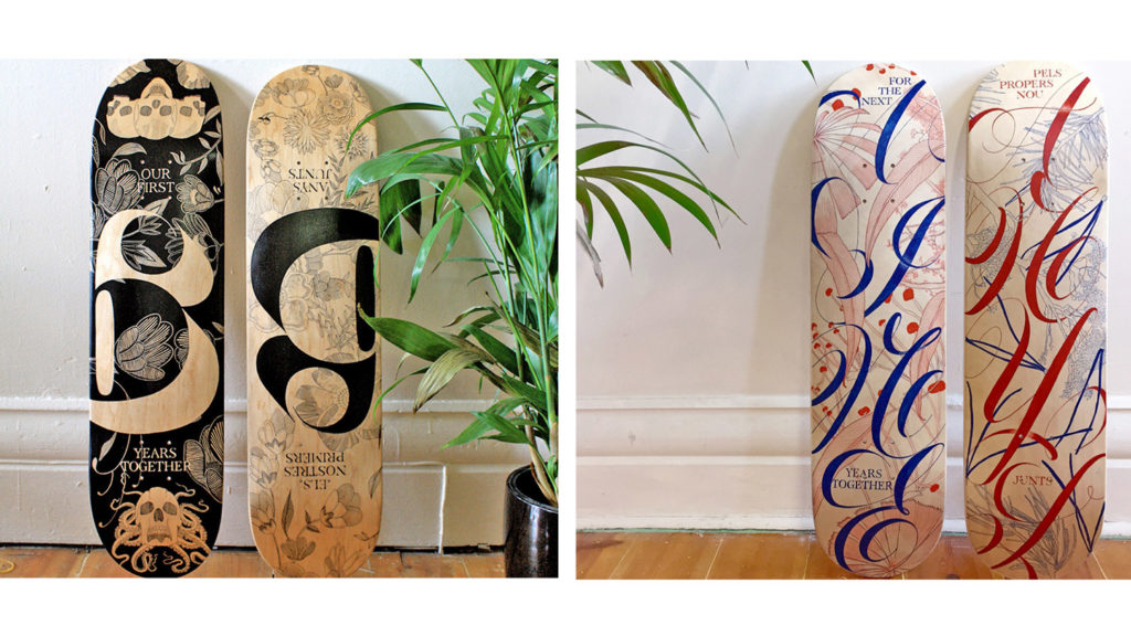
This is a wedding gift for my good friends Filipe and Lauren Vilitati.
And this is what I call “rebranding yourself, and the pain that goes with it” And if you have ever done this exercise, you know exactly what I am talking about.
My third category is education.
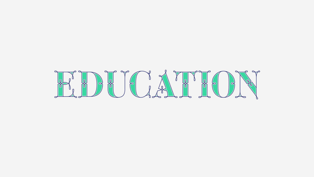
I love being a student as much as being a teacher. Every year I go back to Europe to learn calligraphy from my all-time favourite teachers Amanda and Keith Adams.
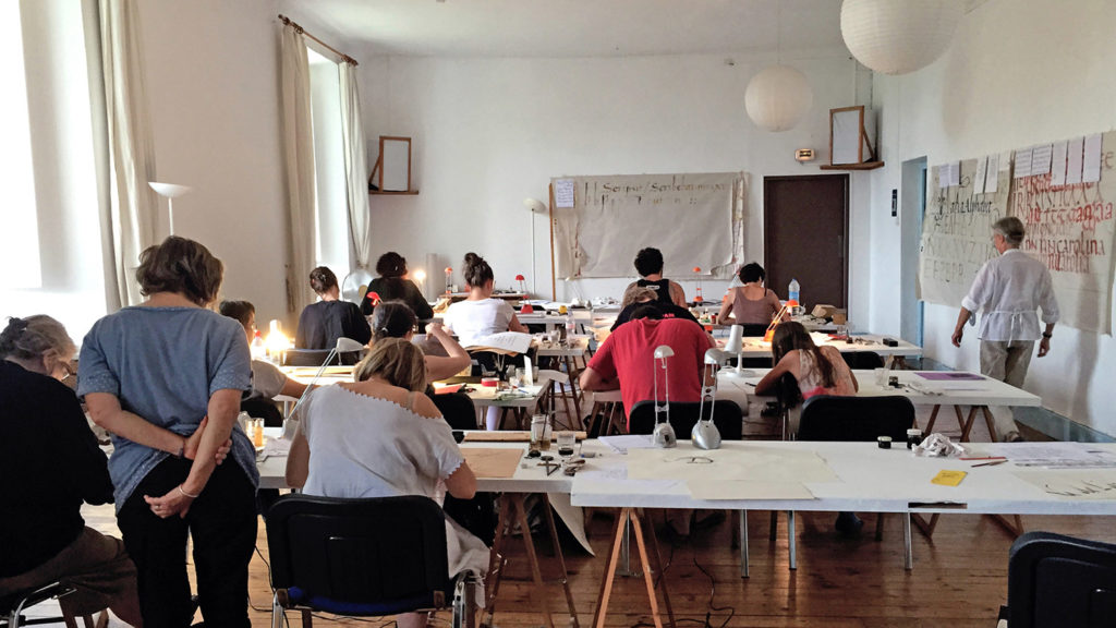
Being on this side of the classroom –on the student’s side of the room– makes me a better instructor.
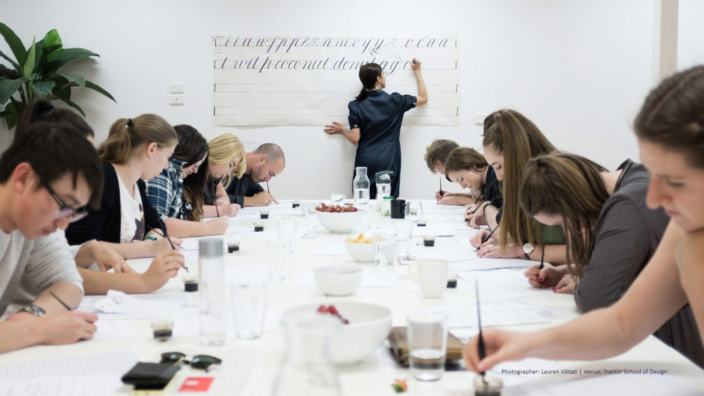
Finally, for the last four years I have been teaching calligraphy workshops in Australia and I am really enjoying the experience.
So… what now? As you have seen, my journey is not a straight line. There are some successes and some setbacks. There are days when you feel like you are winning, and other days when you feel like you are losing all your confidence… Maybe some of you in this room have been through similar experiences, and I would love to hear all your stories.
As for me, I am still scared of what’s coming, but I am determined and I am not giving up!
So guys, do not give up.
Thanks for sharing Maria, the post is very lighthearted and I found some very inspiring advice here as I am going through a similar path in my career as when you first moved to Australia, only I made the move to Barcelona, where I am glad to share with you the experience of having Josema, Noe and Keith Adams as teachers.
I hadn’t heard of your work before but I am glad I did, you seem to transition seamless between these different fields — textiles, lettering, calligraphy and type design — and escape the so-called «type vaccuum» with excellent work in all of them, and that is a major major major inspiration to me.