December 2009
I am now a graduate in Type Design from Reading University; pleased but somehow empty. After handing in my master thesis on the last day, September 17th (also my birthday), and after celebrating typography in Mexico City at ATypI in October, I was already back in Paris, my hometown, for a month. Not having yet found any job, I registered at the Job Center, aka Pôle Emploi. My experience happened to be quite schizophrenic when I was told my Resume was most likely too sad, too black and white. The Job Center office suggested me thereafter to follow a Resume layout training. I do not think my qualifications were even recognized in this state organization.
The future was not looking that bright for me; I was clueless about what to do next. One evening I met up with a few friends; amongst them was Titus Nemeth. We talked about different things but most importantly … travel to the place where the writing system I have studied in Reading is used. A few weeks later I had tickets to New Delhi in my pocket, ready for a Devanagari overflow!
Preparing the trip, I started learning Hindi; that aim was never really successful, unfortunately. On the other hand, it was encouraging and positive to meet Mayank, my French-Hindi tandem partner. He put me in touch with his dad, who came to meet me at the New Delhi airport with his chauffeur. My Hindi was quite ridiculous and neither Mayank’s dad nor the young chauffeur could articulate words in English. They dropped me off at my hotel.
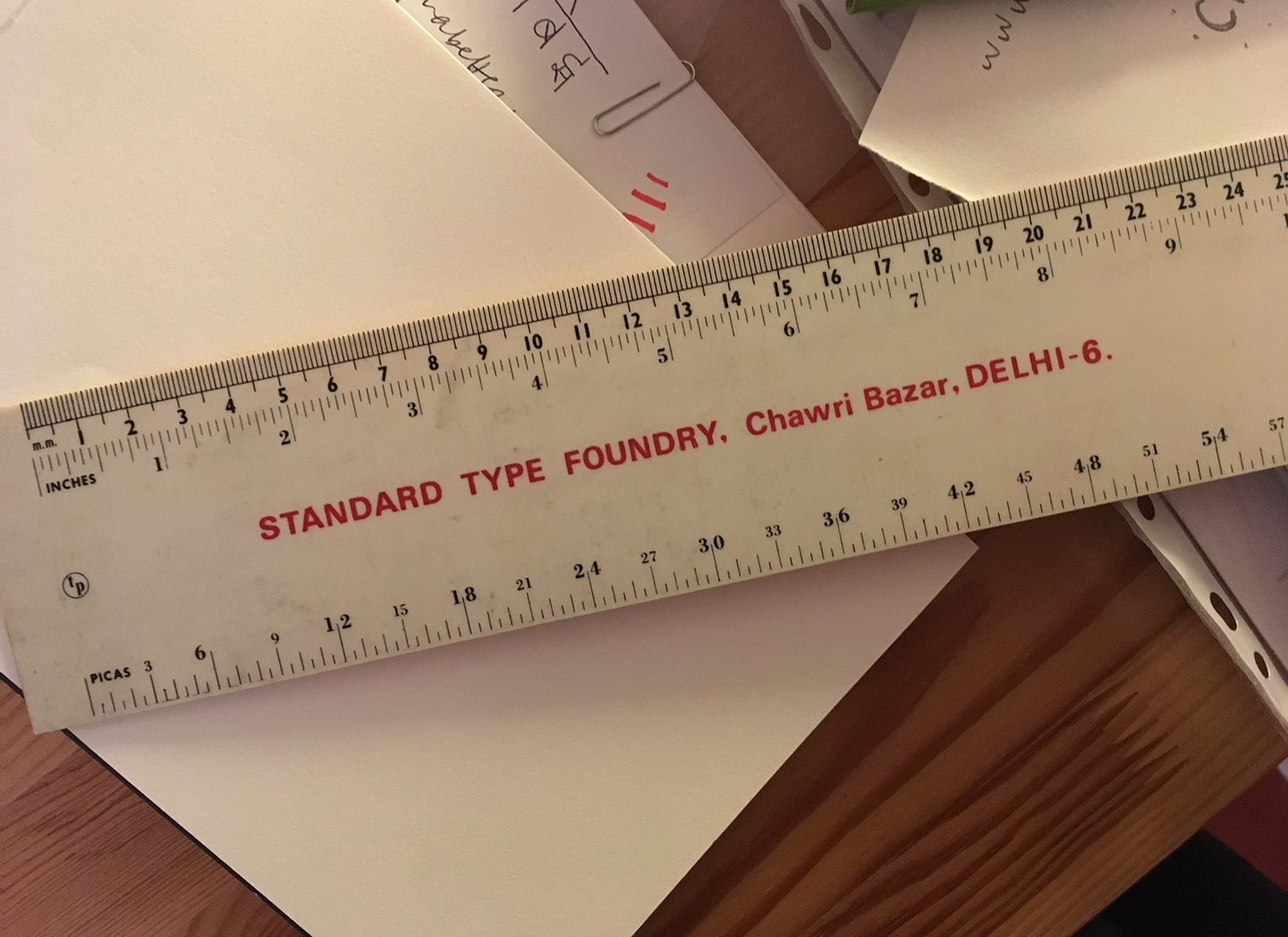
After acclimating to New Delhi – the weather was exceptionally warm for March, around 42°C (108°F) every day – I realized that traveling around the country on my own would be difficult, more likely, impossible. Instead, I decided to focus on researching type in Delhi. First and foremost, I visited the small design studio of Ishan Khosla. There, I was warmly welcomed and Ishan gave me a ruler he got from someone, mentioning that “the foundry may still exist in Old Delhi”. The Standard Type Foundry. That is all I needed at that time: a challenge!

Remember December: Standard Type Foundry, New Delhi
Continue reading →


