There are designers and creatives who are capable of delving into many analog mediums at once (this maybe calligraphy, or origami, or whatever.) Their projects seem to have exciting new approaches, often narrated by nuances of the medium used. However, I have almost always been more of a digital designer. This post is a small window into my process of designing the signage for Royal Academy of Art’s (KABK) Library in The Hague.
Towards the end of last year as I was applying and looking for work, I tried keep myself busy by engaging in stone carving lessons at KABK. Sanne Bereen (the letterpress instructor at KABK) who was also taking these lessons, brought up that the school’s library could use a signage system. And without thinking much of it, I offered to help out and we began to discuss further. I thought this project would keep me busy until something more concrete turned up. At least I would be drawing letters. If it turned out well, it could certainly add to my portfolio since I had never explored material and letters this way. At the same time, Sanne had a lot of experience in the field and it would be an opportunity to learn.
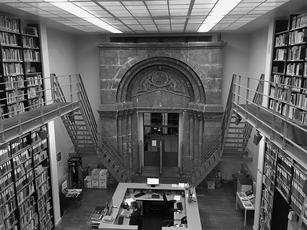
Prior to this, I had had very minimal interaction with the librarians and while I was studying, used the library only a few times. It was under renovation at the time and I remember being terrified while I was exploring the upstairs type section, with scaffolding all around. I’d like to blame the scaffolding for never visiting again. Up until December 2018 – when I saw a small, well lit, and a neat space that was very loved by the people who used it regularly.