Finding my lessons to teach

A nearly full calendar year of mandatory work from home has been a mixed bag for me. I’m good at working from home, and have a long freelance career behind me, so that wasn’t really the tough part. Working at an agency, but from home, was a bit harder. In the typical office setting you’re collaborating, and you’re sharing a lot of the small stuff, the stuff that makes the work better in hard-to-measure ways. But at some point this year, I did start to try and measure those ways.

And what I found was, sure, the lockdowns and social anxieties are not helping my general mood, but there was something else that was eating at me. It took me a while to realise that, in the transition from a 50-colleagues office to a one-dog-on-my-lap office, I lost the little moments of education. The sharing of arcane design tool knowledge, the brief can-you-come-have-a-look sparring… the education. The teaching that we do, back and forth, while we work to answer design questions together. And suddenly a lot of my frustration made sense. I wanted to teach more than I could. Continue reading
Dear Alphabettes: what defines a ‘Book’ weight?

Dear Alphabettes,
Is ‘Book’ supposed to be lighter or bolder than ‘Regular’?

Lisa

Hey Lisa,

Thanks for asking! And no thanks for making me answer this. We put out a poll asking our peers what they think it’s supposed to be, and you’re not going to like the results. 58% of the votes claim it should be lighter, while 42% claim it should be darker. There are historic, conceptual and technical considerations for why it might be so uneven.

The reasoning for ‘Book’ to be lighter than ‘Regular’ is as good as the one for it to be bolder. A lighter weight ‘Book’ style may have been made to counteract the print gain of paperback printing, and a darker ‘Book’ style may have been made to look better when smaller (just as optical sizes tend to gain weight towards the smaller end). I find both of these lines of reasoning persuasive and logical. (And then there are also the instances where it’s neither reason, but something else entirely, or just legacy.) And then we’re back to why you asked the question in the first place.

There is also a technical problem with some software interpreting ‘Book’ to be the same weight as ‘Regular’. That means that the styles will be sorted differently – or even ignored – depending on the application you’re using. Software doesn’t care about the logical conundrum, or which side of the Twitter poll gets slightly more votes. If software got to decide, we’d just name all our weights with numbers instead.

If it is reasonable for a weight to be two different things, perhaps the best solution is to avoid the name ‘Book’, at least in combination with ‘Regular’. Type designers should then skip the term, and instead either commit to a more thorough system for optical sizes, or adopt more distinct names. Some favourites include ‘Blond’ (as Fred Smeijers likes to call his slightly-lighter-than-regular weights) and the rather literal ‘Blanca’, ‘Gris’ and ‘Negra’ pairing that PampaType do in their fonts. I guess I’m partial to poetic names.

Lisa, I’m sorry, but I’m gonna have to give you the most common [citation needed] answer in type design: It depends!

Love,
Robin

Remember December: the Pride parade

The Pride Parade has always had a complicated place in my heart. I have long found it incredibly difficult to attend: my own queerness, being both bisexual and transgender, has itself been a difficult truth to live at times. When I am there, I am always consistently and completely overwhelmed: the amount of love, in the eyes of a world that has long threatened many queer people’s existence, is always going to make me cry. But these emotions are mine to deal with, and in that sense the parade helps me.

And Pride works for me. I am served by it; this is how I formed my plan for this year’s pride. I could already walk for myself. I could proudly be out and walk with my friends. But not all of us are so lucky. So I decided to walk for others as well.

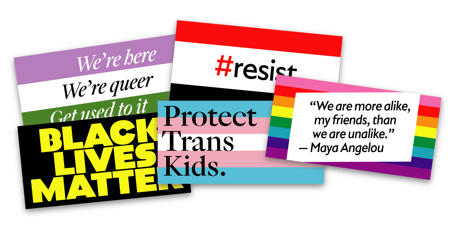
Five banners designed for the Oslo Pride parade

I gathered five slogans that I felt would encapsulate issues bigger than myself, issues that deserve year-round attention and awareness. I printed them in dozens of copies and in various sizes, from postcard to A3 on foamcore. With that, I also mobilised friends and friends of friends to carry other people’s messages with them.

Pride is complicated for me. I cry in sorrow at its necessity, and in joy at its plentiful honesty and beauty. I long wondered if it was for me, and when I found it in myself I quickly became attached to it. But I am proud. I’m a very proud and open and, frankly, loud woman. I can speak for myself. So to stand in my strength and pride, on a hot summer’s day, with the world smiling at me, I carried a big-ass Black Lives Matter banner and did my best to speak loudly for others.