
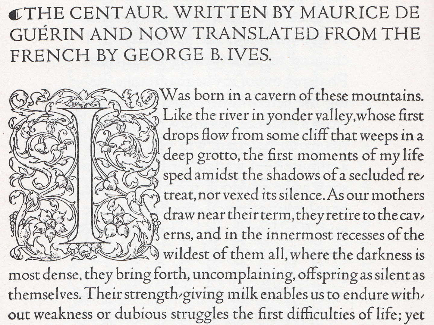
You are surely aware of the titling caps that the great Mr. Bruce Rogers has drawn for the Metropolitan Museum of Art in New York (what is that I hear about a logo? No, these were great). It is fantastic news that he decided to add a lowercase: 1915 saw the expansion of the design into a masterful 14-point text face, which was cut by Robert Wiebking (of Goudy fame) and privately cast by Barnhart Brothers & Spindler. The face was first used by Rogers in his recent edition of Maurice de Guérin’s The Centaur, published in just 135 copies by Carl P. Rollins’ Montague Press. (Get it if or while you can, I’m pretty sure this one’s gonna be popular.)
Based on the centuries-old work of Jenson that’s so back en vogue now, this face can be seen as a refinement of Rogers’ earlier, larger Montaigne type. Rogers was never fully satisfied with the cutting of Montaigne; and while he still finds little faults with Centaur, he does overall seem to be happy with it. Everybody else, of course, is raving: some critics call this the best recutting of the Jenson letter of all, or one of the finest typefaces of our century. How about both. I’m almost tempted to say people can stop reviving Jenson for the time being because guys that task has been SOLVED.
I don’t even really know where to start describing how accomplished it is. It’s refined and lively, and the color is just right. It is obvious that Rogers has studied Jenson’s work in depth and beautifully redrawn and reinvigorated it for the media and printing of our time. His Centaur is full of character, but never mannered: Rather than just using humanist forms as a foil to transport hip ideas of the moment, this is a truly thoughtful revival — one that I think can carry the excellent example of humanist types forward even past our century. Imagine if Mr. Rogers could be convinced to release this outstanding design on the retail market! Pretty sure this would have a lasting impact on designers everywhere. Especially if it were accompanied by a solid italic — and of course it would need a really good digitization too…
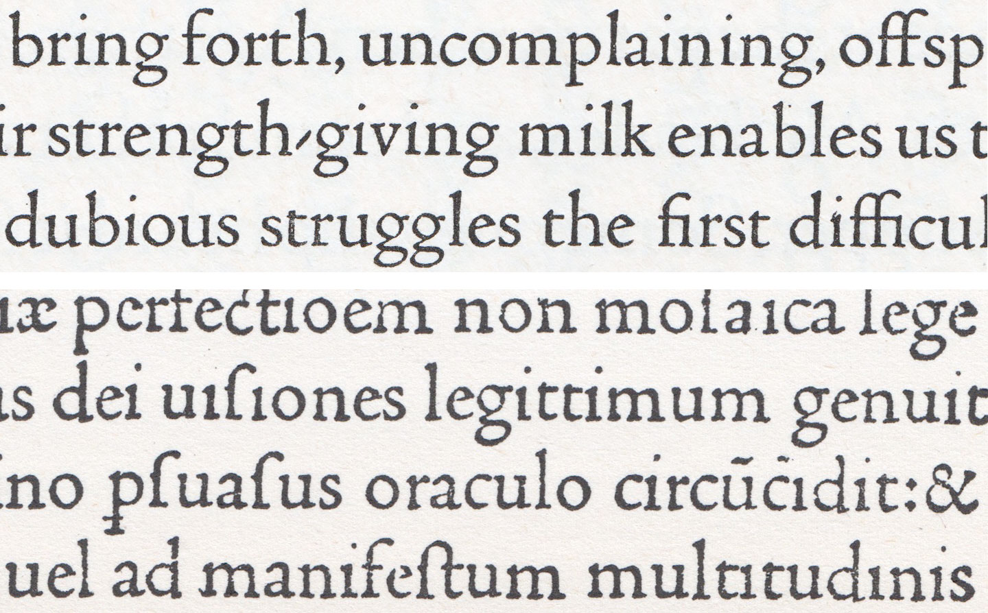
Jenson’s Roman type of 1470 (bottom) forms the basis of Bruce Rogers’ masterful Centaur, shown on top. That ‘g’! 😍