
When ‘Santiago’ is mentioned, many will first think of Chile; however, this Santiago is located in northwestern Spain. Santiago de Compostela has an official population of less than 100,000 inhabitants and is known internationally as one of the most important pilgrimage destinations in the world. In 1985 the old town was declared a World Heritage Site and, in 1987, the “Camino” was named the First European Cultural Itinerary by the Council of Europe. There are numerous books written in numerous languages regarding the ‘Camino de Santiago’, so I will refrain from images of the cathedral and other tourist traps.
Signage, an important element of urban landscapes, becomes a particularly interesting topic with regard to environments where the protection of historical buildings is a must. In Santiago, a 2012 sign regulation defines the size, placement, and other features. There is no typographic requirement although it is mentioned that the design must be well-integrated into the historical environment. A better control is needed as many commercial signs infringe the rules and some have just been abandoned. (If we really want to preserve our artistic-historical heritage, we should care a bit more about its maintenance.)
Some structures, formerly for hanging signs, remain even when they lack a function creating metal arrows that seem to be point nowhere.
The aesthetics, materials, and shapes used for urban signage can vary from one locale to another. The most common material in the Santiago historical centre is forged metal, which is a great demonstration of the Galician blacksmithing skill. Traditional crafts have survived in the region and there are still artisans who work ceramics, metal, wood, or stone.
Forged metal is an integral part of the Galician identity. It can be found on balconies, handrails, gates, and other house elements in both rural and urban environments. Other materials like wood, glass, or stone can be used for commercial signs in the old town, although metal seems to be the preferred choice. Plates with commercial names typically hang from ornamented bars.
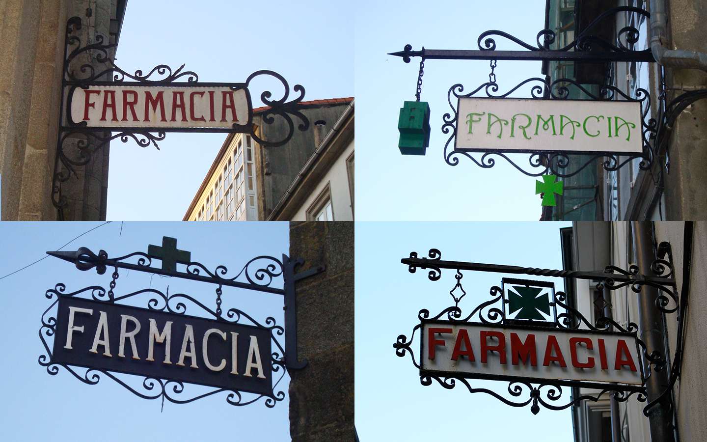
Examples of pharmacy signs.
The university is also an important part of Santiago, as around 30,000 students live in the city during the academic year. As you may have guessed, tourists and students are the perfect audience for the numerous cafés, restaurants, and tapas bar in the old town. From the many pictures I have taken of their signs, I have discovered that the oldest and most traditional ones share some features in that the signs almost always have a rectangular shape, usually have a second layer of metal white letters over the black plate, and they tend towards squarish monospace uppercase letters.
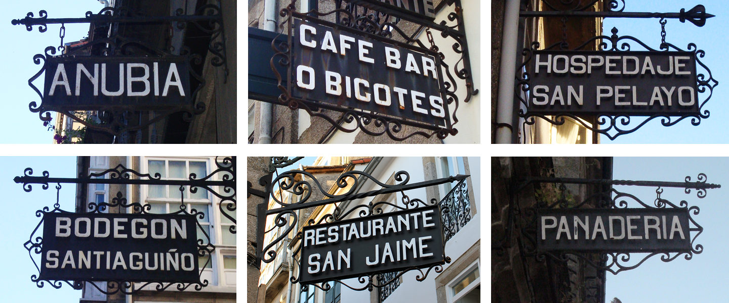
A few examples of signs for restaurants, hostels or bakeries.
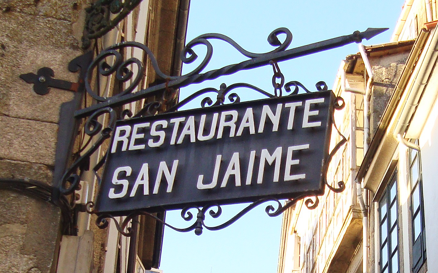
Note how the letters protrude from the surface creating a three-dimensional appearance with their shadows.
The old town is also an area with many small shops that often have more creativity with their signs. They use different colors and shapes, and they sometimes utilize lettering pieces made of metal.
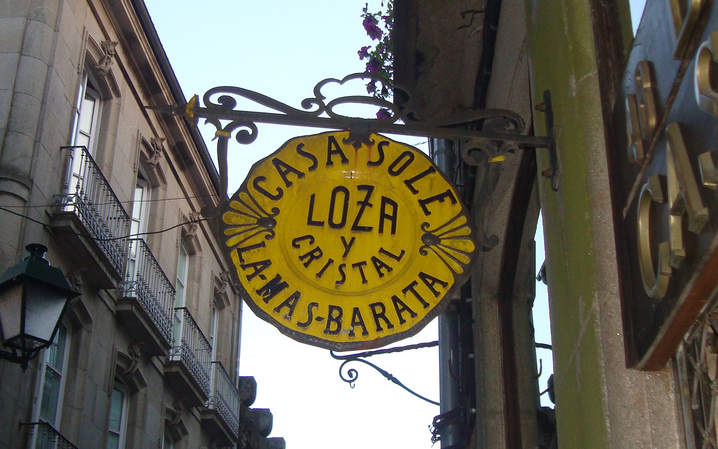
Round and oval signs are more rare and typically demonstrate more complex and creative compositions.
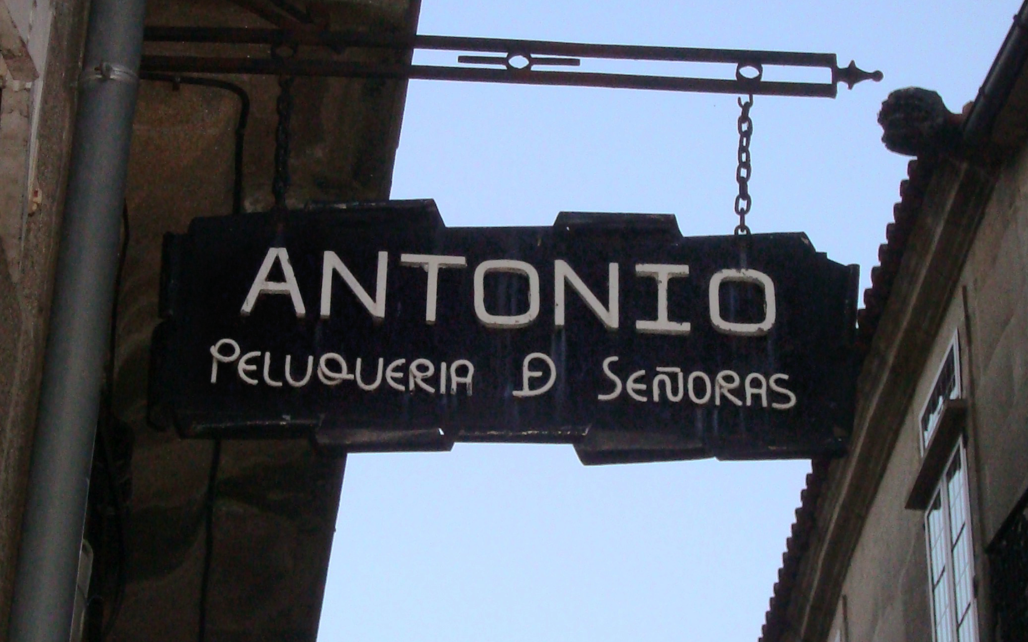
This sign for a hairdresser has caught my attention because of the way the letters in the second line have been created. The designer has even created an new shape with the letters D an E together as a single character.
There is much diversity in the design of these metal signs. Letters can be cut, painted, or printed in the main area. They apply a wide range of typographic and lettering styles, mix metal with other materials like wood, and sometimes include other elements that are immediately recognizable.
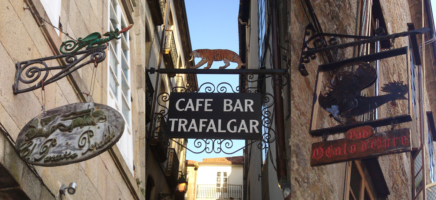
Three examples of the animals and creatures that one can find in the signage of local bars.
These signs have the human imprint of the artisans who have created them. They may not strictly follow typographic conventions, but they remain fascinating in their craft.
This post is part of Greetings from, a series in which Alphabettes share typographic curiosities from around the world. Look out for a passport stamp in the photos to spot posts from the series, or read them all here.