
This post is about sharing my love for lettering on book covers that I’ve discovered and some collected over the last few years. That’s the easy part, but making a selection is quite hard, because there are lots of them I love. I hope you will enjoy it. I will start with two fabulous books I got in Warsaw.
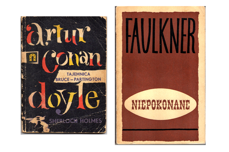
‘artur conan doyle’, book cover by Andrzej Czeczot, 1959. ‘Niepokonane’ book cover by Aleksander Stefanowski, 1964.
My favorite classics
The brush letters of Hans Tisdall
Hans Tisdall, German born in 1910, moved to London in 1931, specializing in textile designs and murals. He designed book jackets for Jonathan Cape, showing his skills in brush lettering together with the illustrations done in sharply drawn color separations. I discovered Hans Tisdall from a lecture that Michael Harvey, also book cover designer, gave at ATypI Rome in 2002. He was also so fascinated by this lettering that he decided to digitize and publish it as a digital font named “Tisdall Script”. He died in 1997.
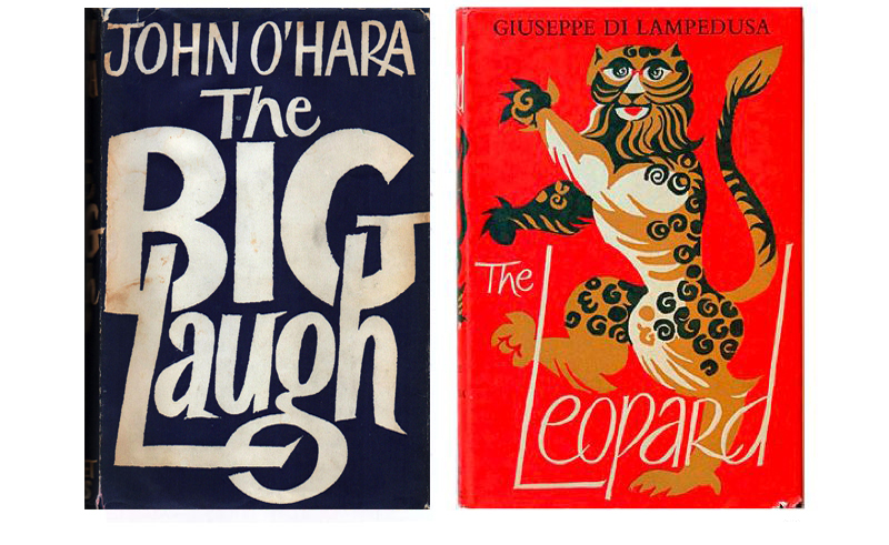
Some book covers by Hans Tisdall. The Big Laugh, 1962. The Leopard, 1960
The book covers by Michael Harvey
Michael Harvey, born 1931, was an English lettering artist, teacher and writer specialised in typography, calligraphy, drawing, type design and letter carving. His work appears in many English cathedrals and on the front of the National Gallery. I have always been amazed by his ability to draw with different kinds of lettering styles and tools. He designed over fifteen hundred lettered book jackets and some alphabets as well. He died in 2013.
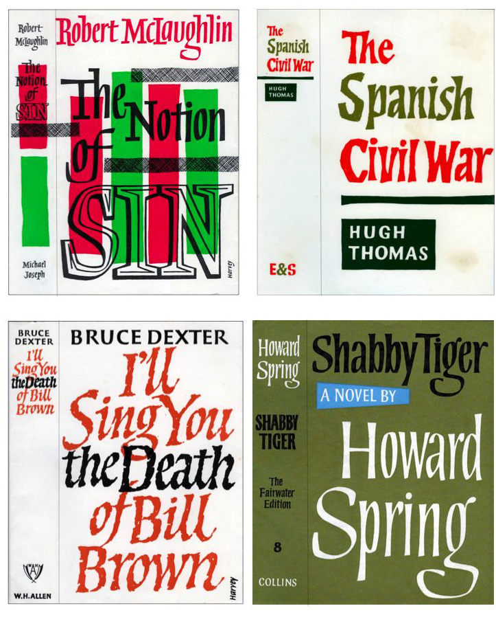
Some book covers by Michael Harvey, 1958–1966.
A more local scene
This process of searching, collecting and researching always happens in second-hand book markets and shops. One of my favorite locations in Barcelona is The Sant Antoni book market, which takes place on Sundays around the perimeter of the Mercat de Sant Antoni food and clothes market.
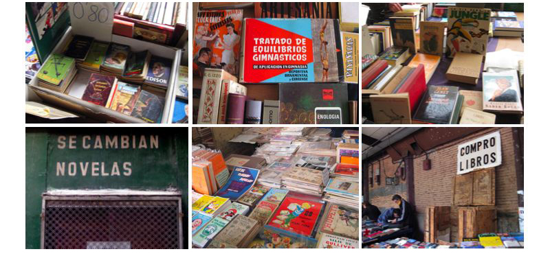
The Sant Antoni Book Market, now under renovation.
There you can buy vintage books, coins, postcards, vinyl records, Spanish magazines and photographs. It’s good fun especially if you are interested in the Spain and Barcelona of yesteryear. Sadly, some of the artists are anonymous so I cannot identify them but I love the freshness and idiosyncrasy. I think it was a time when designers didn’t have as many resources, but instead had total creative freedom. They probably had a simple brief: attractive and cheap.
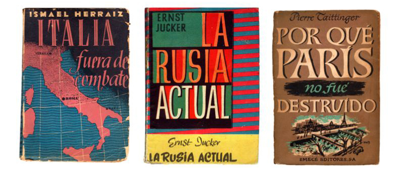
Different book covers. Unknown designers, 1944–1950.
I discovered some local designers like Miguel Pedraza, who did work ranging from calligraphy and diplomas, to postcards and labels. He was the author of five lettering manuals in folders, one of the few methods of learning available in those years that covered the needs of a Spain that was perched between poverty and grandeur. He was quite criticized by his avant-garde colleagues for his “corny virtuosity”.
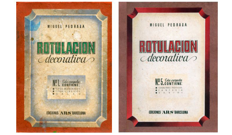
Miguel Pedraza. Rotulación decorativa (decorative lettering). Ediciones Ars,1942–1945.
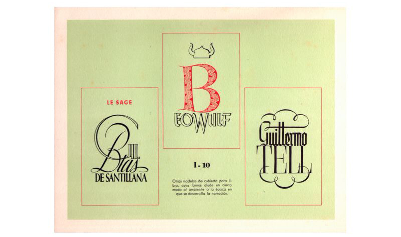
Many illustrators were working as letterers too, resulting in a total integrated composition. See some examples.
Book covers by Armand. Círculo de lectores, 1962.
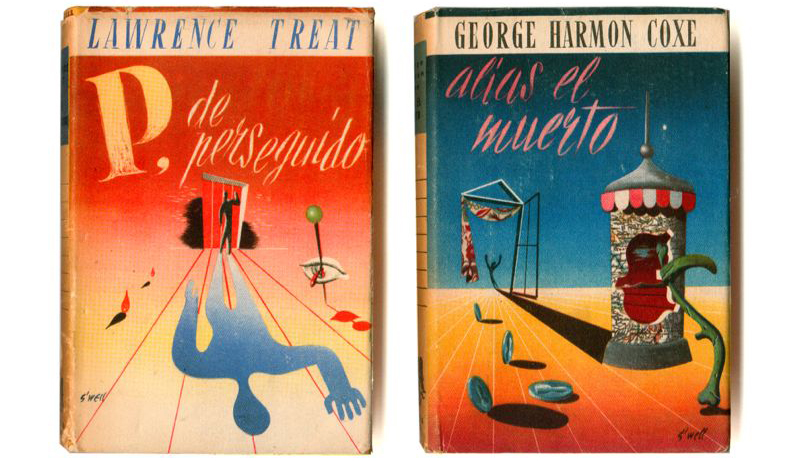
Book covers by S’well. Janés Editor, 1950–1951.
Or suddenly you find this amazing piece of art, absolutely based in lettering!
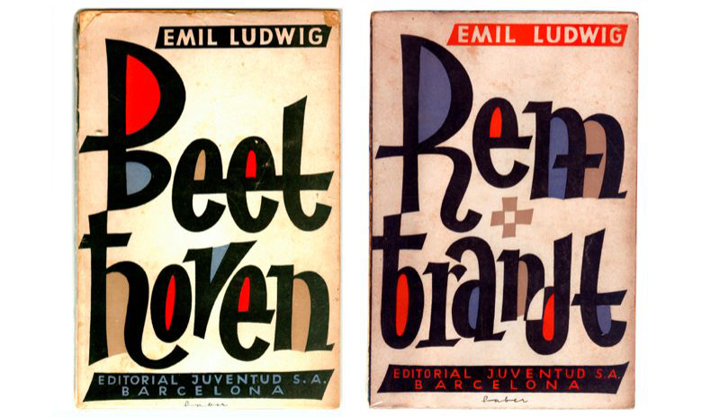
Book covers by Faber. Editorial Juventud, 1968
All these discoveries helped me learn about the lettering work of some local designers who were not unknown at all, and who deserve a ‘chapter’ apart.
Mauricio Amster (1907–1980)
Mauricio Amster was a typographer born in Poland, who studied graphic communication there and in Vienna, and typography and book design in Berlin, at the Reimann School of Applied Art. He began his professional career in Madrid, around 1930. At that time, the graphic arts in Spain needed suitable people to push through a process of change which was intended to have a radical impact on the technical and aesthetic aspects of publishing. Apart from Barcelona, which had a great tradition in graphic arts, there were no professionals working exclusively in publishing. This may be why printers and publishers engaged artists to design their book covers and titles, even though they had almost nothing to do with designing the typography and layout of the interior of the book. At this time there were two major type foundries in Spain, one, Neufville, set in Barcelona in 1885 as a subsidiary of Bauersche Giesserei in Frankfurt and the other, directed by the austrian Richard Gans, established in Madrid in 1881.
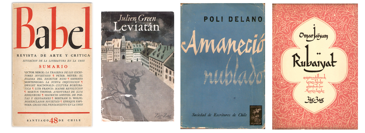
Some book covers by Mauricio Amster, 1931–1932.
Both had incorporated the graphic formulas of Art Nouveau in their alphabets. But also in the 30s they were competing to introduce new ideas, in many cases connected to Futura, designed by Paul Renner for Bauer Foundry. At that time there was a common confusion with the way the avant-garde models were applied.
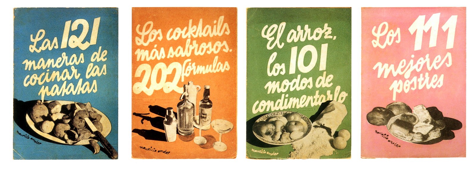
“Colección gastronómica”. Agencia General de Librería y Artes Gráficas, Madrid 1932.
Amster was not looking for a specific style but professional solutions in line with what was most used in Europe at that time. Consequently his first designs contain references to Russian constructivism, German realism, fotomontage and the elementary figurative style of French poster designs.
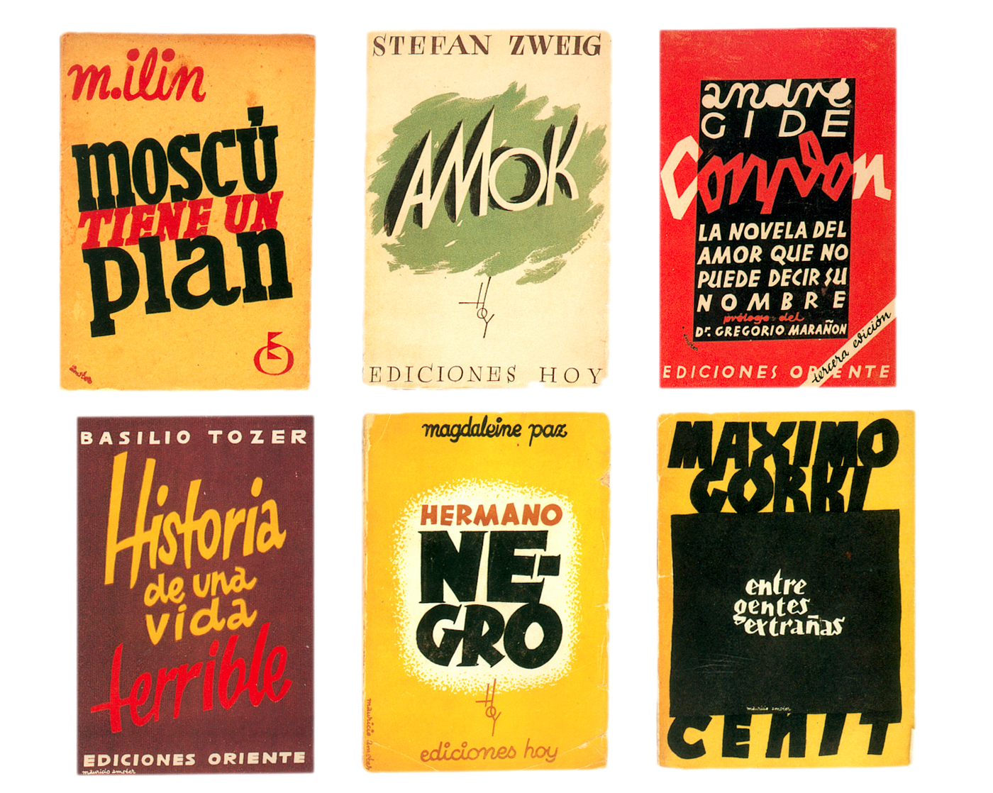
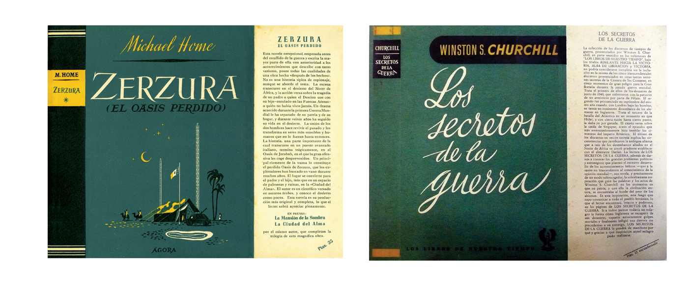
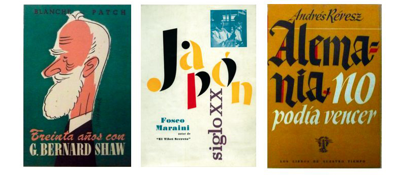
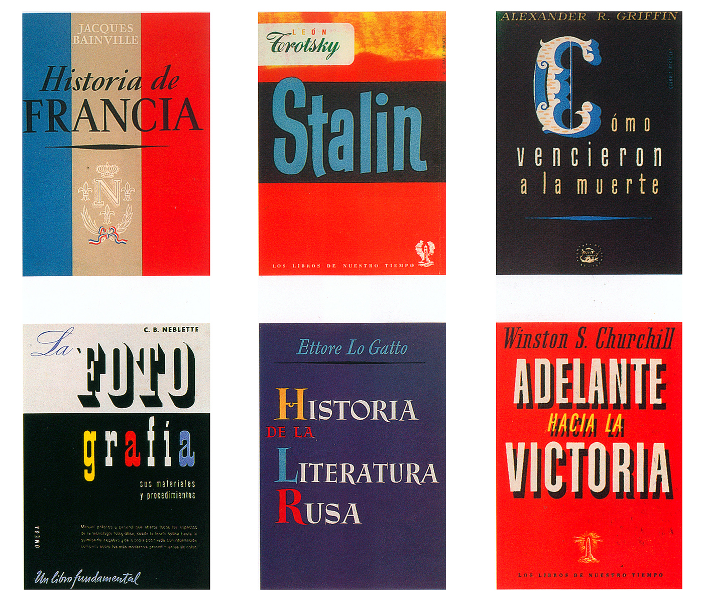
Some covers by Mauricio Amster, around 1960s.
After the Republican defeat, Amster and his wife travelled to France. And later, thanks to the intervention of Pablo Neruda, they moved to Chile where he developed most of his career.
Ricard Giralt Miracle (1911–1994)
He was born in Barcelona in 1911 and worked as as a trainee in Seix Barral from 1926. Ricard Giralt Miracle was initially a ‘noucentista’ and later a rationalist, but his career was cut like many others, by the Civil War. Since the 30’s, he was devoted to the creation of posters, brochures, book covers, bibliophile editions and worked on numerous advertising campaigns, book jacket design and in poster design, where he made more than one hundred creations achieving numerous awards.
Some book covers by Ricard Giralt Miracle, around 1940.
His first designs reflect the influence of art, illustration and calligraphy. He worked for the most relevant publishing houses as Josep Janés, Lluis Miracle, Aymá, Argos, Omega, etcétera. He also printed some issues of the avant-garde catalan magazine “Dau al Set”, along with books and catalogues for artists like Miró, Tápies and for the most relevant writers. So, we can say that he was totally connected to the intellectual figures of that time.
Some book covers for Lluis Miracle Editors, around 1950.
Some book covers by Ricard Giralt Miracle, 1940–1960.
In 1947 he founded Filograf, Institut d’Art Gràfic, where he combined tradition and innovation to create trademarks, “plaquettes”, kaleidoscopes, etc., as well as typefaces. He put all his resources into the service of typographical experimentation, and performed a work that helped define him as the first professional “graphic designer” in Spain.
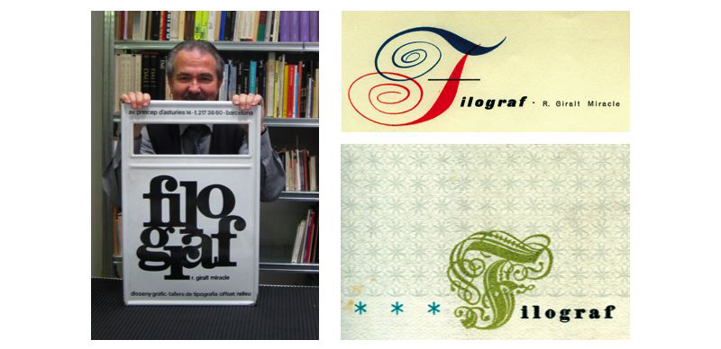
Some pieces from Filograf, show by his son Daniel Giralt Miracle. I express my infinite gratitude to him.
· If you want to keep reading about Ricard Giralt Miracle and his work, and other Spanish designers from that time, I highly recommend that you visit this site Graphic Pioneers by Emilio Gil.
· More covers by Mauricio Amster in Flickr
· More on Michael Harvey by Paul Shaw
· Further references for some other favorite lettering artists:
Berthold Wolpe, Boudewijn Ietswaart