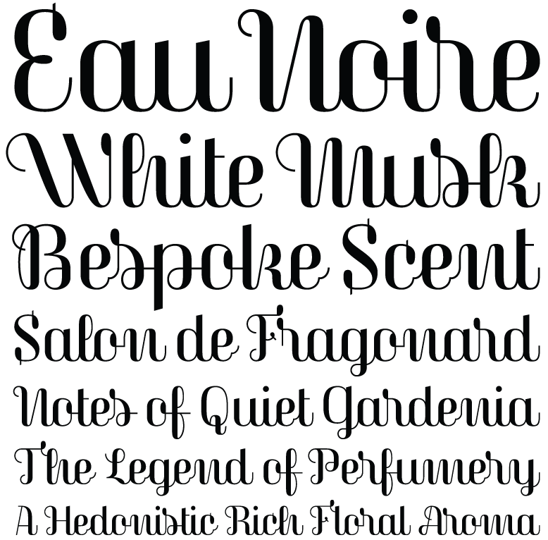
To say that Magasin is not your average script font is stating the obvious. It is quirky and totally irreverent. It sits stock-straight upright and follows very few rules when it comes to connection between the letterforms. You get a real sense of Mid-Century Modern and French perfume packaging, along with the echoes of Quirinus/Corvinus and Fluidum in its contrast and terminals.
But don’t confuse Laura Meseguer’s Magasin for some dusty script revival. It is rigorous and modern, portraying a fierce independence as it easily sets itself apart from all the script fonts being released right now, dancing to its own atonal, syncopated rhythm.
Anyone daring enough to use Magasin will find a useful amount of alternates, ligatures, and swashes that create captivating and playful word shapes. (If anything is missing, I’d say Magasin could use more terminal forms.) I can imagine it deployed large in magazines and small on packaging. Don’t worry about the unorthodox letter shapes; instead, consider them an asset, because they will make people look twice. Additionally, the proud x-height assists, along with the context, in making Magasin legible enough at text sizes.
If you want a taste of what is possible, check out the specimen Meseguer created, along with the article she wrote for I Love Typography. They clearly demonstrate the different things that are possible with this idiosyncratic typeface design.